2.9.16
Coherent GT
A modern user interface library for games
The sample demonstrates how you can make Item Shop UI with Coherent GT's components and data binding systems. The component system allows you reuse UI pieces and stitch them together whereas the data binding system lets you easily synchronize the values in the UI with the game. The item shop shows a sortable grid of purchasable items, split between several pages. Items can be purchased as long as the user has enough currency and this is instantly reflected in the grid. The pagination, sorting and data come from the back-end and they are accessed through the front-end.
Switching between pages tells the back-end to return another set of items according to the page. Sorting returns the items in order according to given criteria - by price or by ownership.
Navigation is done using the mouse, keyboard or gamepad. Navigating updates the preview panel - item image, name, quality, type, description and icon.
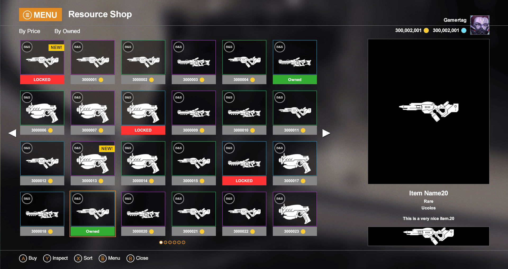
Double clicking an item, hitting ENTER on the keyboard or A on the gamepad, opens a modal message and disables further grid navigation to prevent the user from selecting another element while the message is still active.
Once bought, this is reflected on the back-end side which changes the owned state of this item.
Closing the message re-enables navigation through the items. To close the message click on the No button, press Esc on they keyboard or B on the gamepad.
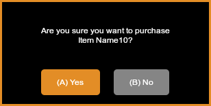
While the confirmation dialog box is opened - Yes changes the modal message and after some delay this action buys the item with game.buyItem(inventory.resources[currentIndex].id). The performed action tells the back-end to change .isOwned to true.
To confirm the purchase click on the Yes button with the mouse, use the keyboard's Enter key or press the A on the gamepad.
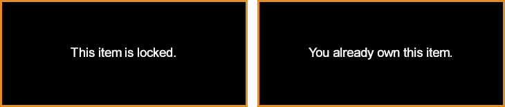
Locked or already owned items cannot be bought - "if" statements check the resource isOwned and isLocked state and a notification appears to the user that the action cannot be executed.
Given that the HTML is ready and styled, lets start with the front-end part of the integration.
The data-bind-value will set the div's text content taking the name from the inventory.name resource.
<div class="shop-name" data-bind-value="{{inventory.name}}"></div>
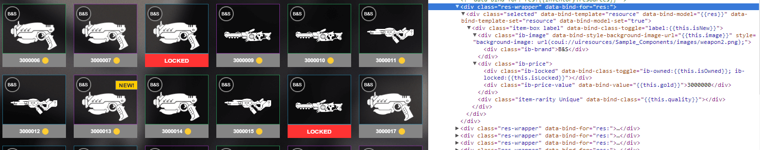
Since we'll have a lot of items we can create an item component and reuse that for all of them. Here's the code for the component:
<script type="text/html" id="resource-template"><div class="item-box" data-bind-class-toggle="label:{{this.isNew}}"><div class="ib-image" style="background-image: url(images/u10.png);"><div class="ib-brand">Brand & Set</div></div><div class="ib-price"><div class="" data-bind-class-toggle="ib-owned:{{this.isOwned}}"></div><div class="" data-bind-class-toggle="ib-locked:{{this.isLocked}}"></div><div class="ib-price-value" data-bind-value="{{this.gold}}"></div></div></div></script>
The <script> tag is required as otherwise it will be parsed as a regular element but instead we want to just define it as a component. Note how we use data-binding system inside with {{this.isNew}}. this here refers to each item or in our terminology - the component's model. When the component is instantiated it will be bound to a model (in our case, an item) and the data will be synced with the model's data.
Now that we have the component, let's use it. Creating the entire grid of elements is as simple as:
<div class="res-wrapper" data-bind-for="res:{{inventory.resources}}"><div class="selected" data-bind-template="resource" data-bind-model="{{res}}"></div></div>
Note how we use data-bind-for above. This will cause the inventory.resources array to be iterated and its contents repeated. The pair of data-bind-template / data-bind-model on the inner <div> will cause an instance of the "resource" component to be spawned for each item.
To learn more on how each of the data-bind-for and other data binding attributes work see our native SDK docs.
The template is registered automatically with the attribute data-bind-template-name.
This is the ResourceComponent.html file in components folder :
<script type="text/html" data-bind-template-name="resource"><div class="item-box" data-bind-class-toggle="label:{{this.isNew}}"><div class="ib-image" style="background-image: url(images/u10.png);"><div class="ib-brand">Brand & Set</div></div><div class="ib-price"><div class="" data-bind-class-toggle="ib-owned:{{this.isOwned}}"></div><div class="" data-bind-class-toggle="ib-locked:{{this.isLocked}}"></div><div class="ib-price-value" data-bind-value="{{this.gold}}"></div></div></div></script>
We import this file with <link rel="import" href="components/ResourceComponent.html" into the main html file - shop_components.html
The items-container element is the wrapper inside which the components will be populated.
<div id="items-container" class="items-container layer"><div class="res-wrapper" data-bind-for="res:{{inventory.resources}}"><div class="selected" data-bind-template="resource" data-bind-model="{{res}}"></div></div></div>
This wrapper contains the populated items and sets some styles for their arrangement. It is also used to control the grid behaviour.
The end result should look like this:
To learn more about component system see our native documentation - Data Binding - Components.
For each page the inventory has, an element will be created. Using data-bind-for:
<div id="navDots" class="pagination layer"><div class="page-button" data-bind-for="page:{{inventory.pages}}"></div></div>
The main idea is that only the visible resources are exposed to the front end.
In the C++ we have an ResourceInventory class responsible for sorting and pagination. When an item is bought we set its isOwned property to true. When a request for sorting is sent we sort all the items in the inventory, after that we change the ExportedInventory which contains only the resources that are visible on the current page. The front end has access only to this visible resources and displays them. When changing page we place the visible items on this page in the ExportedInventory.
Every resource has an ID. The selling of a resource is done by this ID property. Sold resources have a boolean IsOwned property set to true.
Each resource needs to be updated with UpdateWholeModel when its properties change, for example when sorting, changing the page or buying an item. After updating the resources - SynchronizeModels must be called.
Four main objects are used which are also exported to the JavaScript.
Resource which contains all the needed information for the resource like, Quality, Type, Description, IsLocked and so on.void CoherentBind(Coherent::UIGT::Binder* Binder, Resource* Resource){{type.Property("gold", &Resource::Gold).Property("isLocked", &Resource::IsLocked).Property("isOwned", &Resource::IsOwned).Property("isNew", &Resource::IsNew).Property("id", &Resource::ResID).Property("quality", &Resource::Quality).Property("type", &Resource::Type).Property("name", &Resource::Name).Property("description", &Resource::ItemDescription).Property("image", &Resource::ImageName);}}
We also have the following helper classes:
Page - represents each page. We store an array of these objects to represent each page with a circle dom element in the front-end using data-bind-for which works with arrays.ResourceInventory - represents the resources and pages that are exported to the front-end.ExportedInventory - represents the resources that are curently visible on the selected page.void CoherentBind(Coherent::UIGT::Binder* Binder, ResourceInventory* Inventory){{type.Property("name", &ResourceInventory::Name).Property("resources", &ResourceInventory::ExportedInventory).Property("pages", &ResourceInventory::Pages);}}
Game -> The main object which has the logic -> changePage, sort, sortByOwner, buyItem and so on.void CoherentBind(Coherent::UIGT::Binder* Binder, ComponentBinding* Game){{type.Method("changePage", &ComponentBinding::ChangePage).Method("sort", &ComponentBinding::SortByGold).Method("sortByOwner", &ComponentBinding::SortByOwnership).Method("buyItem", &ComponentBinding::BuyItem);}}
At the beginning, initialization of all the needed objects is done with random values.