1.14.0.5
Hummingbird
A modern user interface library for games
HTML5, CSS3 and JavaScript are very large standards. We have identified the subset of the standards that are best suited for the creation of game user interfaces. Removing some of the properties/tags allows us to concentrate on the best way to develop UI and provide the maximum performance for those code-paths.
For a complete list of supported HTML/CSS/JavaScript properties and methods please consult the PDFs available in the current folder. Each new Hummingbird version expands the supported features and improves compatibility with classic web browsers.
Currently Hummingbird has full support for the FlexBox layout, which is the most powerful yet most simple layout standard supported by CSS. FlexBox allows creating responsive UIs in a more intuitive way than the classic "Box" HTML layout. For more information on FlexBox, please consult the documentation of the Visual Editor or the following links:
display: flex; and flex order column, even if their display is block and box-sizing: border-box;.Media queries are a great feature that allows the development of responsive user interfaces. Certain CSS styles will be enabled/disabled according to the current properties of the Hummingbird View - the width and the height. Through media queries UI designers can radically change how the user interface looks on certain resolutions or when a handheld device is in portrait/landscape mode. Designers can opt for high-resolution images on powerful devices, while going for low-res on less capable ones - all within the same UI.
Hummingbird supports the version 3 of the Media Query standard https://www.w3.org/TR/css3-mediaqueries. You can learn more on media queries here: https://www.w3schools.com/css/css_rwd_mediaqueries.asp.
The expressions in the media query use the Width and Height of the View to evaluate.
The example above shows a simple media query. All DOM elements with the class "mybutton" will by default be red, however if the Width of the View is above 1280px, the media query rules will take effect and the color will change to blue. If the Width shrinks below 1280px, the media rules will again get disabled and the elements revert to being red.
Size-related expressions that Hummingbird supports include min-width,max-width,min-height, max-height, orientation. You can also chain multiple expressions with the and operator.
The orientation expression supports the values landscape and portrait and can be used to alter the UI design depending on the width/height ratio of the View.
Hummingbird does not support the media types that are listed in the standard as print, screen etc., because it always displays in the "screen" media.
Hummingbird also supports adding whole CSS files conditionally under the "media" rules. It can be achieved with the following syntax:
All the rules from sheet.css will be activated/deactivated according to the expression in the media attribute. Note that @font-face and @keyframes rules are always added. The media only applies to CSS rulesets.
Note that the media attribute affects only link elements created with it from the HTML file. Adding/removing the media attribute from and already created link element from JavaScript will not have any effect.
Hummingbird departs from the HTML/CSS standard in some feature implementations. This is done in cases where we feel that a slightly different implementation will give better performance or more intuitive workflow. For this reason it is possible that the same page rendered in Hummingbird looks different when rendered in a web browser.
The most prominent difference compared to a traditional browser is that every element in Hummingbird has display: flex; and box-sizing: border-box;. These are not the default values in the HTML5 standard but are more convenient for UI development.
FlexBox on all elements makes their layout more intuitive. The border-box sizing means that all width and height CSS properties include the padding and border of the element.
The last difference is linked to the usage of % (percent) on absolute positioned elements. By standard the percent are resolved against the first absolutely positioned parent of an element. In Hummingbird it is resolved against the direct parent. This is a measure that improves performance and is more intuitive.
To achieve the same visuals in a traditional browser, add the following CSS style at the beginning of the page:
Text is one of the areas where Hummingbird departs from the CSS standard. The HTML standard requires breaking the layout of an in-line box in lines, wrap the text and allow for other elements to happen inside. In Hummingbird we implement single text runs (along with the style) as text boxes laid out with flex-row with wrapping. This has several advantages:
Currently <br> tags work only when inside a text run. We have disabled <br> between tags because it leads to bad HTML design and is error-prone. The same result can be achieved much more cleanly with flex items and coefficients.
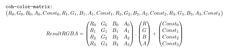
The filter CSS property allows usage of predefined filters such as blur, contrast and others. Most effects can be achieved with the standard filters, but in case something custom is needed Hummingbird supports the custom coh-color-matrix filter which accepts a 4x5 color matrix in the form of 20 numbers like so:
The color matrix can be animated with CSS animations. The animation is done by linear interpolation of each matrix component.
The resulting color is computed using the following equation (assuming the input is the RGBA vector):
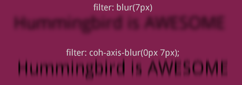
The filter CSS property supports the blur filter, which is limited to applying only omnidirectional blur. Hummingbird introduces the custom filter coh-axis-blur, which allows blurring per axis. The filter has two parameters: blur values for the X and the Y axis. The directional blur can be animated with CSS animations.
The following CSS code will cause the elements with class visualStyle to be blurred both in the X and Y direction. However, the blur for the Y direction will be stronger.
Specifying blur only for one axis (direction) is possible and happens by plugging the 0 value for the other axis.
Here is a comparison between the standard blur filter and the coh-axis-blur one:
Properties parentNode and parentElement on the nodes are not guaranteed to return the parent when it is not present in the DOM tree and is not referenced from JS.
Hummingbird introduces a special display mode named simple. The goal of the display: simple mode is to improve the performance of the layout by implementing a very simple algorithm.
To enable the simple layout, you have to use the display: simple CSS style on the BODY element.
Example:
This is the only way to get the simple layout to work. In all other cases when the BODY has standard display values (static, block, flex), Hummingbird will use the standard algorithms as per CSS standard.
The user has to specifically opt-in for the simple layout. This avoids accidentally using the simple layout and getting inconsistent results compared to the standard.
Descendants of a BODY with simple layout can have the flex layout mode and they'll be laid out in the standard way.
Example:
The simple layout will only work in pages where most elements have absolute or relative position with set top and left values and width and height. If an element has width: auto or height: auto, their value will be calculated as the sum of the sizes of all their children in the DOM. If the page has mostly absolutely positioned elements and additional performance is needed, it's a good idea to think about using simple layout. You can still have sub-trees in the DOM that use the standard layout modes. Those subtrees have to start with an element that has display: flex.
A major difference compared to the standard CSS layout modes is how the simple layout is applied.
Simple layout is used only if the BODY has display: simple. The display: simple algorithm will be applied to all children elements and subtrees (no matter their display property) unless an element has display: flex. In that case the whole sub-tree of the display: flex element will use the default CSS standard rules.
Elements with display: none are not displayed at all.
The position of each element is:
position: static, position: fixedtop/leftposition: absoluteSizes:
auto as per CSS 2.2 standardauto as per CSS 2.2 standardThe Size of the element (width/height) is calculated:
Width = calculated (per standard) width + border-left + padding-left + border-right + padding-rightHeight = calculated (per standard) height + border-top + padding-top + border-bottom + padding-bottomwidth or height is autoWidth = SUM(children width) + border-left + padding-left + border-right + padding-rightHeight = SUM(children height) + border-top + padding-top + border-bottom + padding-bottom