Gameface UI version 1.0.0 released
7/10/2025
Martin Bozhilov
We’re excited to announce that
GameFace UI is growing!
In this update, we’ve added new components to make your prototyping experience even faster and more flexible.
Below, you’ll find details about the newly introduced components.
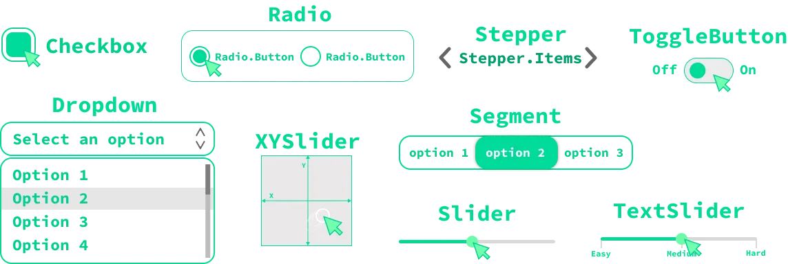
Checkbox
The Checkbox component provides a customizable checkbox input. It supports three states — checked, unchecked, and disabled.
In addition to basic usage, the Checkbox component offers flexible slots for deeper customization:
Labelslot to customize or reposition the checkbox’s label.Controlslot to style or replace the checkbox control itself.Indicatorslot to modify the checked state indicator.
Programmatic control is also available via a ref, allowing developers to retrieve values or set the state of the checkbox through code when needed.
Documentation
📚 For more information and detailed examples, please refer to the Checkbox documentation
Radio and radio button
The Radio component acts as a wrapper that allows you to render a set of mutually-exclusive options Radio.Buttons.
The Radio allows you to programmatically control or retrieve the value of the selected option via ref or the onChange prop.
Just like the Checkbox, the Radio.Button component offers flexible slots for deeper customization:
Labelslot to customize or reposition the checkbox’s label.Controlslot to style or replace the checkbox control itself.Indicatorslot to modify the checked state indicator.
Documentation
📚 For more information and detailed examples, please refer to the Radio and Radio.Button documentations.
Dropdown and Dropdown Options
The Dropdown component lets you display a list of selectable options, making it ideal for menus, filters, or game settings.
Key features include:
- Scrollable options list: If there are too many options, the list becomes scrollable.
- Programmatic control: Use a
refor theonChangeprop to get or set the selected value.
The Dropdown component also supports several slots for customization:
Trigger: Customize the dropdown’s trigger button.Placeholder: Show a placeholder when no option is selected.Icon: Add or customize the icon inside the trigger.Track: Customize the scroll track of the dropdown.Handle: Customize the scroll handle.
These features make the Dropdown component flexible and easy to adapt to your UI needs.
Documentation
📚 For more information and usage examples, please refer to the Dropdown documentation and Dropdown.Options documentation .
Stepper and Stepper Items
The Stepper component lets users move through a sequence of options, one at a time.
You can control the Stepper programmatically using a ref or the onChange prop to get or set the current value.
For customization, the Stepper provides a Control slot. This slot allows you to style or reposition the arrow buttons—place them before or after the stepper
options as needed.
To define the selectable options, use the Stepper.Items component inside Stepper, with each option represented by a Stepper.Item.
Documentation
📚 For more details and examples, see the Stepper documentation and Stepper.Items documentation .
Segment and Segment Button
The Segment component displays a group of mutually exclusive options, similar to the Radio component. Users can select only one option at a time.
You can control the selected value programmatically using a ref or the onChange prop.
For customization, the Segment component provides an Indicator slot. This slot lets you style the indicator element, which animates when the selected option changes.
To define the selectable options, use the Segment.Button component for each option.
Documentation
📚 For more information and detailed examples, see the Segment documentation and Segment.Button documentation .
Slider
The Slider component lets users select a numeric value from a defined range by dragging a handle along a track.
Key features:
- Customizable range: Set
minandmaxvalues to define the slider’s limits. - Step control: Specify the increment between values using the
stepprop. - Grid display: Optionally show tick marks along the track.
- Programmatic control: Access or update the value via a
refor theonChangeprop.
The Slider component offers several slots for advanced customization:
Track: Customize the appearance of the slider track.Fill: Style the filled portion of the track.Handle: Change the look of the draggable handle.Thumb: Display the current value above the handle.Grid: Show tick marks or value indicators along the track.
These features make the Slider component highly adaptable for different UI needs.
Documentation
📚 For more details and examples, see the Slider documentation
ToggleButton
The ToggleButton component is a flexible UI control that lets users switch between two states, such as “on” and “off.”
Key features and customization slots include:
LabelLeft: Customize the label displayed on the left side of the toggle.LabelRight: Customize the label displayed on the right side of the toggle.Control: Change the appearance of the toggle button in its unchecked state.Indicator: Style the indicator that appears when the toggle is active.Handle: Customize the handle that users drag to toggle the state.
You can also control the ToggleButton programmatically using a ref, allowing you to get or set its state in your code.
Documentation
📚 For more information and detailed examples, see the
ToggleButton documentation
TextSlider
The TextSlider component allows users to select a string value from a list of predefined options by dragging a handle along a track.
Key features:
- Programmatic control: Easily get or set the selected value using a
refor theonChangeprop.
The TextSlider component supports several slots for customization:
Track: Change the appearance of the slider track.Fill: Style the filled portion of the track.Handle: Customize the draggable handle.Thumb: Show the current value above the handle.Pol: Adjust the look of the poles that mark each selectable value.
Documentation
📚 For more details and examples, see the TextSlider documentation
XYSlider
The XYSlider component lets users select a value within a two-dimensional space, making it ideal for scenarios where both horizontal and vertical input are needed.
Key features:
- Customizable range: Define the slider’s limits using
minX,maxX,minY, andmaxYprops. - Custom background: Easily change the background to fit your UI.
- Programmatic control: Use a
refor theonChangeprop to get or set the current value.
The XYSlider component provides slots for advanced customization:
Background: Change the appearance of the slider’s background.Handle: Customize the look and feel of the draggable handle.
These features make the XYSlider component flexible and easy to adapt to your UI needs.
Documentation
📚 For more details and examples, see the XYSlider documentation
What’s Next
We’re continuously expanding the Gameface UI component library! Stay tuned for upcoming releases featuring even more components.