3D Subtitles
3/28/2024
Veneta Kochovska
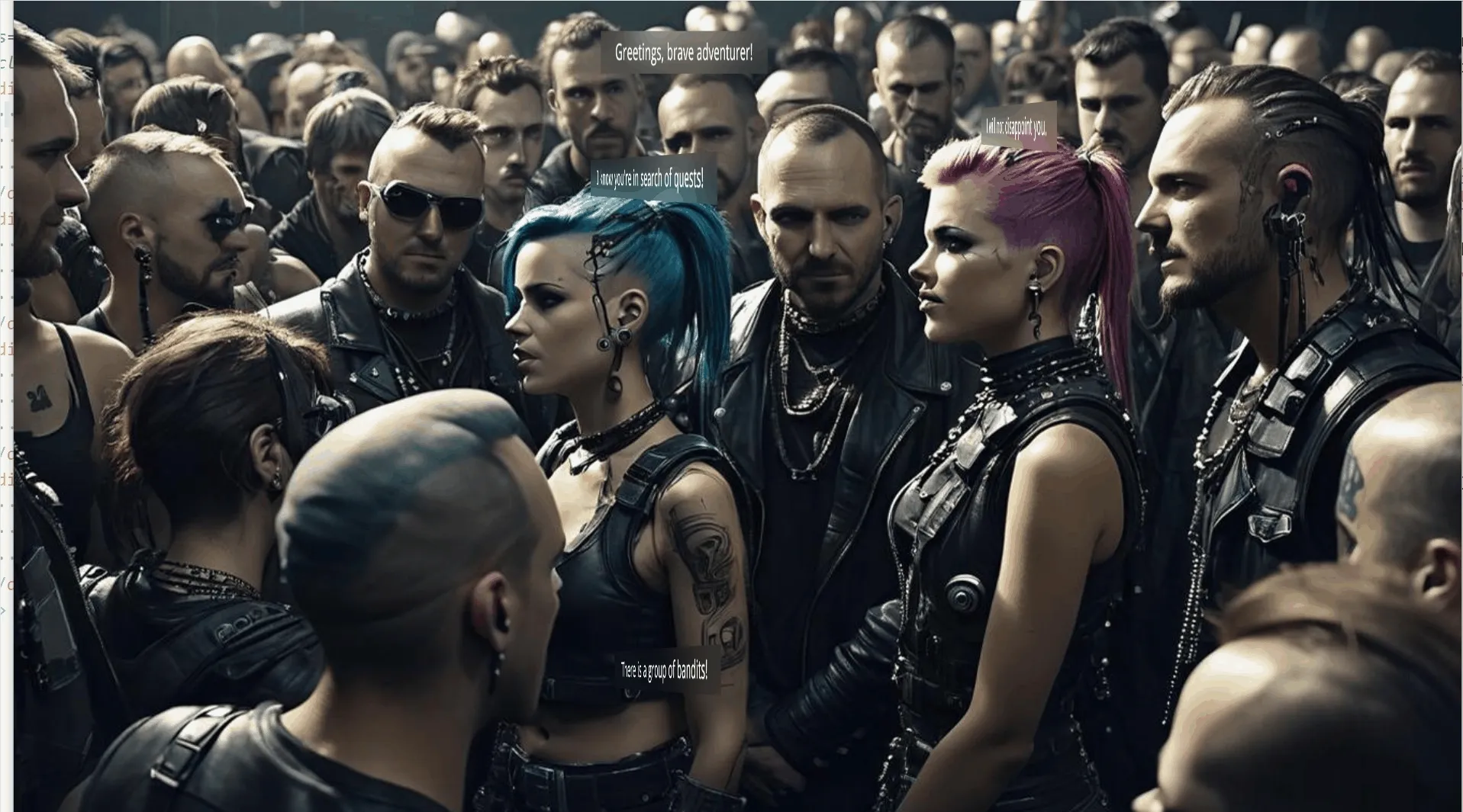
This is a sample that shows how to create 3D subtitles in Gameface:

The subtitles are div elements that use CSS transform with perspective .
Using CSS transformations you can rotate the subtitles in the same way that the character that is speaking is facing. 3D effects can emphasize the source of speaking. This sample uses a background image for simplicity, but it illustrates interesting ways of subtitle positioning.
The subtitle container is an absolutely positioned element that has perspective: 1000px. Refer to the documentation for more information regarding css perspective.
1<div class="container player-0 popup">2 <p class="subtitle">Greetings, brave adventurer!</p>3</div>1.container {2 position: absolute;3 perspective: 1000px;4 perspective-origin: center;5}The subtitle element is a <p> element that has backdrop-filter: blur(7px); style. The backdrop filter creates a blur effect on the background without affecting the text itself. The rotation is achieved using CSS transform: rotateY(310deg);. The perspective style applied to the parent of the paragraph is what makes the rotated subtitle look 3D:
1.subtitle {2 backdrop-filter: blur(25px);3 margin: 0px;4 padding: 10px 40px;5 font-size: 30px;6 color: aliceblue;7}The pop-up effect is a CSS animation. It moves the subtitle over the Y axis and scales it from 0 to 1 which makes it look as if it appears from bellow:
1.popup {2    animation-duration: 2s;3    animation-name: popup;4    animation-iteration-count: infinite;5    animation-timing-function: linear;6}7
8@keyframes popup {9    from {10        transform: translateY(50px) scaleX(0);11    }12    50% {13        transform: translateY(0px) scaleX(1);14    }15    100% {16        transform: translateY(0px) scaleX(1);17    }18}
The last keyframe stays on the same styles just to create a delay effect before the next iteration starts.