Making a 3D compass
9/11/2024
Martin Bozhilov
In this tutorial, we’ll show you how to create a responsive 3D compass for player navigation using the power of CSS 3D transforms. We’ll guide you through every step, ensuring you can enhance your UI with a dynamic and visually appealing 3D compass.
Previewing the sample
To see the sample live you can find the whole project in the ${Gameface package}/Samples/uiresources/UITutorials/Compass directory.
Building the Base for the 3D Scene
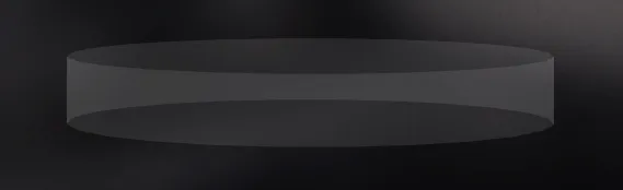
To begin, we need to set up the scene that will act as a container for our 3D transformations. This container will provide the 3D space in which the compass will live. Most importantly, this is where we’ll define the perspective, giving our compass the depth and realism of a 3D environment.
In our CSS we’ll add:
1.scene {2 text-align: center;3 position: absolute;4 top: 85%;5 left: 50%;6 transform: translateX(-50%);7 width: 3vw;8 height: 6vh;9 perspective: 2500px;10 perspective-origin: 0% -300%;11}And in the HTML we will add:
1<div class="scene"></div>Key CSS properties
-
perspective- This property is crucial because it creates the illusion of depth. The lower the value, the more extreme the 3D effect will be (objects will appear closer). A value of 2500px gives us a subtle but realistic 3D scene. -
perspective-origin- This property defines the vanishing point for our 3D scene, simulating the effect of viewing the compass from a top-down perspective. The 0% moves the origin horizontally (no shift), while -300% pushes the perspective’s vertical origin far above the actual scene, mimicking a bird’s-eye view.
Creating the compass planes
HTML and CSS setup
After our scene setup is ready we can begin implementing the compass itself.
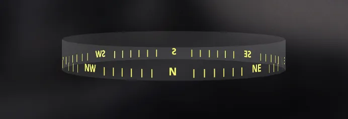
The key to achieving the 3D illusion of a circular shape is to create a polygon made up of multiple “planes” (or faces). The more planes we use, the smoother the circular effect will appear. For this example, we will use 24 planes, which gives us a 360-degree compass, where each plane represents 15 degrees (360 / 24 = 15°).
In our html we will define the compass
1<div class="scene">2 <div class="compass"></div>3</div>Next, we need to ensure that 3D transformations are properly applied to the compass by adding transform-style: preserve-3d in the CSS.
1.compass {2 width: 100%;3 height: 100%;4 transform-style: preserve-3d;5 transition: transform 0.1s linear;6}For the planes themselves we need to ensure that they stack on top of one another with position: absolute and that they take 100% width of their parent.
1.compass-plane {2 width: 100%;3 height: 100%;4 position: absolute;5 background-color: rgba(255, 255, 255, 0.1);6}Initial JS setup
1const scene = document.querySelector(".scene");2const compass = scene.firstElementChild;3const PLANE_COUNT = 24;4const THETA = 360 / PLANE_COUNT;5
6const planes = [];7let planeWidth, radius;
In this setup, we define:
PLANE_COUNT: Set to 24 for smooth circular movement.THETA: The angle between each plane, calculated as360 / PLANE_COUNT.
Calculating the Angle and Radius
To correctly position each plane, we need to calculate two key values:
- The rotation angle (theta) for each plane.
- The radius, which determines how far each plane is “pushed out” along the Z-axis. Without this, the planes would overlap at the center.
Here’s how we calculate the radius, adapted from a formula found here::
1function updateCompassLayout() {2 ({width: planeWidth} = scene.getBoundingClientRect());3 const precision = 1; // Adjusts for rendering precision, avoids overlap4 radius = Math.ceil(planeWidth / 2 / Math.tan(Math.PI / PLANE_COUNT)) + precision;5}planeWidth is the width of the scene because the planes have 100% width of the scene.
Here, Math.tan(Math.PI / PLANE_COUNT) computes the tangent of the angle between the planes, and dividing the width of the scene by this tangent gives us the distance (radius)
to space the planes out.
The Math.ceil and + precision help adjust for precision in rendering, ensuring that the planes don’t visually overlap due to rounding.
Creating and Positioning the Planes
Now that we have the radius, let’s create and position each plane:
1function createCompassPlanes() {2  for (let i = 0; i < PLANE_COUNT; i++) {3    const plane = document.createElement("div");4    plane.classList.add("compass-plane");5    compass.appendChild(plane);6
7    calculatePlaneTransform(plane, i);8    planes.push(plane);9  }10}11
12function calculatePlaneTransform(plane, index) {13  const planeAngle = THETA * index;14  plane.style.transform = applyTransformation(planeAngle, radius);15}16
17function applyTransformation(angle, radius) {18 return `rotateY(${angle}deg) translateZ(${radius}px)`;19}rotateY: Rotates each plane by a specific angle around the Y-axis. This spreads them out in a circular arrangement.translateZ: Moves each plane outward along the Z-axis by the calculated radius, preventing them from stacking on top of each other.
The applyTransformation function ensures that both the rotation and the outward translation are applied to each plane.
And with that we should have the base of our compass ready!
Adding Points of Interest and Navigation Markers
Time to populate our shell of a compass with markers and some points of interest.
Adding directions and navigation markers
First off lets define an array with the world’s directions
1const DIRECTIONS = ["N", "NE", "E", "SE", "S", "SW", "W", "NW"];Next we will enhance our compass-plane class.
In our case, each of the 24 planes covers 15 degrees (360 / 24 = 15°). Since we want 3 evenly spaced marks per plane, each mark will represent 5 degrees.
By using display: flex and justify-content: space-around, the marks are automatically spaced evenly within each plane, corresponding to these 5-degree intervals.
1.compass-plane {2  width: 100%;3  height: 100%;4  position: absolute;5  font-size: 1vw;6  font-weight: bold;7  text-align: center;8  background-color: rgba(255, 255, 255, 0.1);9  color: rgb(243, 243, 109);10  overflow: hidden;11  display: flex;12  justify-content: space-around;13  align-items: flex-end;14  padding-bottom: 0.5vh;15  z-index: 1;16}17
18.compass-mark {19  font-size: 0.8em;20  width: 0.1vw;21  background-color: rgb(243, 243, 109);22}
Now back to the javascript we will enhance our createCompassPlanes function and add a new one for creating the marks.
1function createCompassPlanes() {2  for (let i = 0; i < PLANE_COUNT; i++) {3    const plane = document.createElement("div");4    plane.classList.add("compass-plane");5    compass.appendChild(plane);6
7    if (i % 3 === 0) {8      plane.textContent = directions[i / 3];9    } else {10      createCompassMark(plane);11    }12
13    calculatePlaneTransform(plane, i);14    planes.push(plane);15  }16}17
18 function createCompassMark(plane) {19  for (let j = 0; j < 3; j++) {20    const mark = document.createElement("div");21    mark.textContent = "|";22    mark.classList.add("compass-mark");23    plane.appendChild(mark);24  }25}
The logic here is to add a cardinal direction on every 3rd plane and marks on every other.
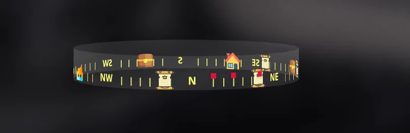
Populating compass with points of interest
In order to be able to move our pois dynamically we will use
data-bind-for
with a model to mimic data from a game.
1const compassModel = {2  pois: [3    {4      name: "Quest",5      angle: 90,6      content: `./assets/quest.png`,7      transform: "",8    },9    {10      name: "Base",11      angle: 150,12      content: `./assets/base.png`,13      transform: "",14    },15    {16      name: "Landmark",17      angle: 290,18      content: `./assets/landmark.png`,19      transform: "",20    },21    {22      name: "Treasure",23      angle: 200,24      content: `./assets/treasure.png`,25      transform: "",26    },27    {28      name: "Enemy",29      angle: 35,30      content: `./assets/enemy.png`,31      transform: "",32    },33    // Feel free to add as much POIs as you wish.34  ],35}36
37engine.on("Ready", () => {38  updatePois();39  engine.createJSModel("compass", compassModel);40  engine.synchronizeModels();41});42
43function updatePois() {44  compassModel.pois.forEach((poi) => {45    poi.transform = applyTransformation(poi.angle, radius);46  });47}
Here we represent each POI with an object. We add a property for name, angle, content and transform.
The transform is left empty upon initialization. On engine ready we will use the angle of the POI along with the already calculated radius to update
the transform property of each POI the same way we did with the faces of the compass.
Now let’s add some styles and connect everything in the html.
1.poi{2  transform-style: preserve-3d;3  position: absolute;4  bottom: 0%;5  z-index: 2;6}7
8.poi-content{9  width: 3.5vh;10  height: 3.5vh;11  background-position: center;12  background-repeat: no-repeat;13  background-size: contain;14  transition: transform 1000ms ease-in-out;15}16
17.poi-enemy{18 width: 1vh;19 height: 1vh;20 margin-bottom: 2vh;21 box-shadow: 0px 0px 5px 1px #0000003b;22}1<div class="compass" >2 <div class="poi" data-bind-for="poi: {{compass.pois}}">3 <div4 class="poi-content"5 data-bind-class-toggle="poi-enemy:{{poi.name}} === 'Enemy';"6 data-bind-style-background-image-url="{{poi.content}}"7 data-bind-style-transform="{{poi.transform}}">8 </div>9 </div>10</div>We make use of data-bind-class-toggle
to dynamically add the class for the enemy pois and data-bind-style-transform to apply the transformation for each POI.
Hiding the backside of the compass
To achieve the clean, polished look of the compass shown in the article’s image, we need to ensure that the backside of each plane is not visible when the compass rotates. This is particularly important in 3D environments, where the reverse sides of the elements can be exposed.
We can hide the backside of all compass elements with just one CSS property:
1.compass * {2 backface-visibility: hidden;3}This property ensures that the back side of each plane is hidden from view, so when the compass rotates, only the front-facing elements are visible
And with that our compass is ready to be used!
Mocking enemy movement
In most games, objects (like enemies) move constantly around the map, and the compass must update in real-time to reflect accurate information for the player. To simulate this, we’ll use an interval to randomly adjust the positions of our points of interest (POIs) to mimic enemy movement.
To make our POIs move, we simply update the transform property in the POIs array within our model:
1setInterval(() => {2  compassModel.pois.forEach((poi) => {3    if (poi.name === "Enemy") {4      const angle = Math.floor(poi.angle * Math.random()); // Generate a random angle5      poi.transform = applyTransformation(angle, radius); // Update the transform6    }7  });8  updateModel(compassModel);9}, 1000);10
11function updateModel(modelName) {12  engine.updateWholeModel(modelName);13  engine.synchronizeModels();14}
Here we create an interval of 1 second where we will just assign a random value to the POI’s angle and
update the transform property with the new angle and the already calculated radius.
After recalculating the transform for each POI, the updateModel function is called to update the compassModel and synchronize it with the Player.
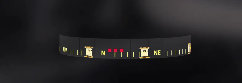
Now our compass should look something like this
Keep in mind
In a real game environment, the engine itself would handle the movement and calculations of objects like enemies. You would need to:
- Perform all position and angle calculations within the game engine.
- Build a transformation string in the format:
rotateY(${angle}deg) translateZ(${radius}px). - Pass this transformation to the appropriate attribute (such as
data-bind-style-transform) to reflect the changes in the compass.
Rotating the compass
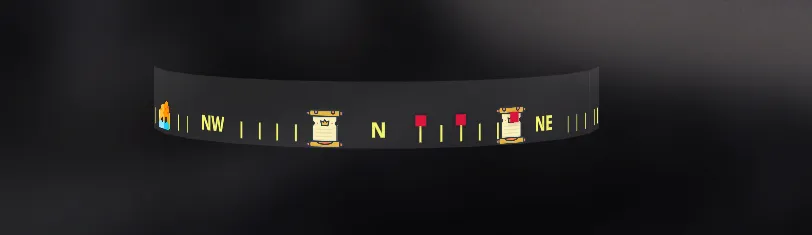
To rotate the compass all you need to do is apply a transform: rotateY() CSS style to the compass element.
In our demo we will do it with our compassModel. First let’s add a property to store the rotation value.
1const compassModel = {2 rotate: '',3 // Rest of the model4}Then we will mock a player rotation with mouse movement. In our JS let’s add
1document.addEventListener("mousemove", (event) => {2  const mouseX = event.clientX;3
4  let rotateY = (mouseX / window.innerWidth) * 360; // Maps mouse X to 360 degrees5
6  compassModel.rotate = `rotateY(${rotateY}deg)`;  // Update the rotation value7  updateModel(compassModel);8});
Here we are making the width of the screen represent 360 degrees rotation. Now when the mouse is at the leftmost part of the screen the rotation will be 0° and at the rightmost part, the rotation will be 360°, completing a full circle.
Once the rotation value is updated, we need to ensure it is reflected on the compass element. We’ll use data binding to achieve this:
1<div class="compass" data-bind-style-transform="{{compass.rotate}}">2<!-- Rest of the compass -->3</div>Here we simply update the value like we did with the POIs movement.
Now you can move the compass using your mouse!
In a real game environment, you’ll need to calculate the player’s rotation based on actual input (such as the player’s movement or camera rotation)
and then pass that angle to the compass in the following format: rotateY(${rotateY}deg).
Bind this transformation to the data-bind-style-transform attribute to ensure that the compass updates in sync with the player’s movements.
Making it responsive
When building a compass for various screen sizes, we need to ensure that the layout adapts to the viewport changes. As the viewport shrinks or expands, the distance between the planes (and the POIs) needs to adjust accordingly. If the planes are too close, they will overlap; if too far apart, there will be gaps between them.
To make the compass responsive, we start by adding an event listener that detects when the window is resized. This allows us to recalculate and reapply the radius and plane positions dynamically:
1window.addEventListener('resize', updateCompassLayout);After adding the event listener for resize we will extend our updateCompassLayout function to also update each plane and the POIs with the newly calculated radius.
1function updateCompassLayout() {2  ({width: planeWidth} = scene.getBoundingClientRect());3  const precision = 1; // Adjusts for rendering precision, avoids overlap4  radius = Math.ceil(planeWidth / 2 / Math.tan(Math.PI / PLANE_COUNT)) + precision;5
6  planes.forEach((plane, i) => calculatePlaneTransform(plane, i));7  updatePois();8}
And now if you try to resize your screen the compass should respond to the viewport changes.
Something to consider
While we have ensured that the compass responds to changes in the viewport size, there is a known issue with responsiveness: at certain viewport widths,
the value we get from the radius formula ((planeWidth / 2) / Math.tan(Math.PI / PLANE_COUNT)) isn’t perfectly accurate. This results in the planes either overlapping by 1 to 2 pixels
or being spaced too far apart, as shown below:
This is the reason we added a precision variable with a value of 1 when calculating the radius, to make a small adjustment that ensures proper translation on full screen.
As of now there isn’t a way to deal with this issue. If you plan to use the compass in a real project, you’d have to manually adjust the translateZ value for the
viewport widths you plan on using to ensure accurate spacing between the panels.
However, if you plan to go with a non-transparent compass design, the slight overlap will not be visible, you will just need to subtract 4 - 5 pixels from the radius to ensure they are never spaced out. In contrast, if the planes are opaque or semi-transparent (as in our demo), the overlap will be more noticeable, requiring finer adjustments to prevent visible gaps or overlaps.
Here’s a demonstration with background-color: black
In conclusion
In this tutorial, we’ve explored how to create a responsive 3D compass for player navigation using CSS 3D transforms and JavaScript. We covered everything from building the base of the compass and positioning planes, to adding points of interest and simulating dynamic player and enemy movement.
While building a fully functional compass in a real game environment would require more precise calculations and adjustments, especially for responsiveness across different viewports, this guide provides a solid foundation to create a visually engaging and interactive 3D compass UI.
Feel free to customize and expand upon this setup to fit your project’s needs. Happy coding!
Assets and resources
Assets
The icons used for the compass’ points of interest were taken from Flaticon
List of icons
- Algarve icons created by Freepik - Flaticon
- Home icons created by Vectors Market - Flaticon
- Rpg icons created by David Carapinha - Flaticon
- Treasure chest icons created by Freepik - Flaticon
Resources
- You can learn more about 3D transforms at this Intro to CSS 3D Transforms website.
- For more details on the radius formula, check out the Carousel section of the same site.