Manager UI (part 1): Creating a draggable grid in Gameface
3/7/2025
Martin Bozhilov
In this tutorial series we will create a Football simulator game. The game will allow you to take control of a team and be able to rearrange the players, set the tactics, see statistics and more. The base of the game will be a grid where the player will be able to rearrange the game screens and resize them.
We’ve found other manager games having a lot of information in their UI that doesn’t have good accessibility. Using Coherent Gameface we can show you that you are able to have a modular UI that is easy to change and rearrange, mitigating one of the main issues many games of this type have.
Prerequisites
In this tutorial, we will use the following technologies:
- Gameface UI A set of UI components for rapid UI game development and prototyping.
- Solid JS.
- TypeScript.
Overview
We will create a draggable grid component that will allow us to rearrange the game screens.
The grid will have the following features:
- Drag and drop grid items
- Swap grid items
- Resize grid items
- Load and save grid state (item positions and sizes)
Source location
Once the whole UI is completed, you will be able to find the complete sample source within the
${Gameface package}/Samples/uiresources/UITutorials/ManagerUI directory.
Project setup
To initialize our project, we will follow the guide in the
Gameface UI documentation .
Since Gameface UI uses SolidJS and TypeScript, they will come bundled with the project.
Once we have our project set up, we can start creating our UI in the HUD component.
Grid component
The grid component will be the core interaction component of the UI. We will begin by creating a Grid.tsx and Grid.module.css files in the custom-components directory.
1import { Component } from "solid-js";2import styles from './Grid.module.css';3
4const Grid: Component = () => {5    return (6        <div class={styles.Grid}></div>7    )8}
And import it in the Hud.tsx file.
1import styles from './Hud.module.css';2import Layout from '@components/Layout/Layout/Layout';3import Grid from '@custom-components/Grid/Grid';4import Row from '@components/Layout/Row/Row';5import { Column11, Column1 } from '@components/Layout/Column/Column';6
7const Hud = () => {8  return (9    <Layout>10      <Row class={styles.Hud} >11        <Column1></Column1>12        <Column11>13          <Grid />14        </Column11>15      </Row>16    </Layout>17  );18};19
20export default Hud;
The Layout, Row, and Column components are part of the Gameface UI library and are used to setup a layout without the need of any CSS.
Setting grid model
Before adding any logic to our grid, we need to define the state of the grid. We are going to utilize a model object to mock game data.
Our model will contain a gridItems array containing objects with the following properties:
id- a unique identifier for the grid itemname- the name of the grid itemx- the x position of the grid itemy- the y position of the grid itemcol- the starting column of the grid itemrow- the starting row of the grid itemsizeX- the width of the grid itemsizeY- the height of the grid itemminSizeX- the minimum width of the grid itemminSizeY- the minimum height of the grid itemmaxSizeX- the maximum width of the grid itemmaxSizeY- the maximum height of the grid itemactive- a boolean indicating if the grid item is active and should be displayed
1const GridDataModel = {2 gridItems: [3 {4 id: 1,5 name: "Team Roster",6 x: 0,7 y: 0,8 col: 0,9 row: 0,10 sizeX: 1,11 sizeY: 1,12 minSizeX: 1,13 minSizeY: 1,14 maxSizeX: 3,15 maxSizeY: 3,16 active: true,17 },18 {19 id: 2,20 name: "Match Tactics",21 x: 0,22 y: 0,23 col: 1,24 row: 1,25 sizeX: 2,26 sizeY: 2,27 minSizeX: 2,28 minSizeY: 1,29 maxSizeX: 3,30 maxSizeY: 3,31 active: true,152 collapsed lines
32 },33 {34 id: 3,35 name: "Team Settings",36 x: 0,37 y: 0,38 col: 2,39 row: 0,40 sizeX: 1,41 sizeY: 1,42 minSizeX: 1,43 minSizeY: 1,44 maxSizeX: 3,45 maxSizeY: 3,46 active: true,47 },48 {49 id: 4,50 name: "Player Stats",51 x: 0,52 y: 0,53 col: 0,54 row: 0,55 sizeX: 1,56 sizeY: 2,57 minSizeX: 1,58 minSizeY: 1,59 maxSizeX: 3,60 maxSizeY: 3,61 active: false,62 },63 {64 id: 5,65 name: "Match Calendar",66 x: 0,67 y: 0,68 col: 0,69 row: 0,70 sizeX: 1,71 sizeY: 2,72 minSizeX: 1,73 minSizeY: 1,74 maxSizeX: 3,75 maxSizeY: 3,76 active: false,77 },78 {79 id: 6,80 name: "Team Morale",81 x: 0,82 y: 0,83 col: 0,84 row: 0,85 sizeX: 1,86 sizeY: 2,87 minSizeX: 1,88 minSizeY: 1,89 maxSizeX: 3,90 maxSizeY: 3,91 active: false,92 },93 {94 id: 7,95 name: "Financials",96 x: 0,97 y: 0,98 col: 0,99 row: 0,100 sizeX: 2,101 sizeY: 1,102 minSizeX: 1,103 minSizeY: 1,104 maxSizeX: 3,105 maxSizeY: 3,106 active: false,107 },108 {109 id: 8,110 name: "Transfer Market",111 x: 0,112 y: 0,113 col: 0,114 row: 0,115 sizeX: 3,116 sizeY: 2,117 minSizeX: 1,118 minSizeY: 1,119 maxSizeX: 3,120 maxSizeY: 3,121 active: false,122 },123 {124 id: 9,125 name: "Match Stats",126 x: 0,127 y: 0,128 col: 0,129 row: 0,130 sizeX: 1,131 sizeY: 3,132 minSizeX: 1,133 minSizeY: 1,134 maxSizeX: 3,135 maxSizeY: 3,136 active: false,137 },138 {139 id: 10,140 name: "Team News",141 x: 0,142 y: 0,143 col: 0,144 row: 0,145 sizeX: 2,146 sizeY: 3,147 minSizeX: 1,148 minSizeY: 1,149 maxSizeX: 3,150 maxSizeY: 3,151 active: false,152 },153 {154 id: 11,155 name: "Scouting",156 x: 0,157 y: 0,158 col: 0,159 row: 0,160 sizeX: 3,161 sizeY: 1,162 minSizeX: 1,163 minSizeY: 1,164 maxSizeX: 3,165 maxSizeY: 3,166 active: false,167 },168 {169 id: 12,170 name: "Manager Stats",171 x: 0,172 y: 0,173 col: 0,174 row: 0,175 sizeX: 2,176 sizeY: 2,177 minSizeX: 1,178 minSizeY: 1,179 maxSizeX: 3,180 maxSizeY: 3,181 active: false,182 },183 ];184}185
186export default GridDataModel;Storing the grid’s information in a model will allow us to preserve the state of the grid. In a real world scenario where the model is not mocked this will allow you to save the player’s
ordering of the grid.
Next up, we need to create the model in the engine.whenReady event. We will create an index.js file in the models directory where we are going to initialize all of our models.
1import GridDataModel from './grid-data-model';2
3engine.whenReady.then(() => {4    engine.createJSModel('GridData', GridDataModel);5    engine.synchronizeModels();6});
After this in the index.tsx in the hud folder we need to import cohtml.js (make sure to include it in your project) and the models.
We also need to make sure to wrap the render function in the engine.whenReady event to make sure all our models are loaded before we start rendering the UI.
1import { render } from 'solid-js/web';2import './index.css';3import Hud from './Hud';4import '../../cohtml.js';5import '../../models/'6
7const root = document.getElementById('root');8
9engine.whenReady.then(() => {10    render(() => <Hud />, root!);11});
Creating a store to hold the grid state
To manage the grid state, we will create a SolidJS store
that will hold the grid items array and an additional itemRefs Map object that will hold a reference to the html element of each grid item.
Let’s initialize our state by create a GridStore.ts file in the stores directory.
1import { createStore, produce } from "solid-js/store";2import type { gridState, Item, Position } from "../types/types";3import styles from '@custom-components/Grid/Grid.module.css'4
5const MAXROWS = 3;6const MAXCOLS = 5;7
8const [gridState, setGridState] = createStore<gridState>({9    itemRefs: new Map<number, HTMLElement>(),10    items: []11});
Initially, we will have an empty array of items and an empty Map object. Also, we defined the MAXROWS and MAXCOLS constants that will be used to limit the grid size.
Now in the Hud.tsx we need to populate our store with the data from the GridData model.
1import { setGridState } from '../../store/gridStore';2
3setGridState('items', GridData.gridItems)4
5const Hud = () => {
With that out of the way, we now can start setting up the logic of the grid component.
You can refer to the last section for the typescript types
Populating the grid with cells
To create the grid, we will use a 2D array of GridCell objects.
Each cell will have a reference to the html element and a property occupiedBy that will hold the id of the grid item that occupies the cell. We will be using the html element
of the cell to get their DOM top and left position and assign them to the grid items.
Let’s define the cells in the gridStore.ts file.
1const cells = initGridCells(MAXROWS, MAXCOLS)We will create a helper function initGridCells that will initialize the 2D array of cells.
1import { GridCell } from "../types/types";2
3export const initGridCells = (maxRows: number, maxCols: number) => {4    const cells: GridCell[][] = [];5
6    for (let row = 0; row < maxRows; row++) {7      const rowCells: GridCell[] = []8      for (let col = 0; col < maxCols; col++) {9          rowCells.push({ occupiedBy: undefined, element: undefined });10      }11      cells.push(rowCells);12    }13
14    return cells;15}
Now, we can import the cells 2D array in the Grid component and render all the cells.
1import { Component, onMount, onCleanup, For, createMemo } from "solid-js";2import styles from './Grid.module.css'3import { Item, GridCell, Position } from "../../../types/types";4import { gridState, removeItem, setGridState, isCellBlockValid, clearCell, occupyCell, MAXCOLS, MAXROWS, cells, updateModel } from "../../store/gridStore";5
6const Grid: Component = () => {7    let gridRef!: HTMLDivElement;8
9    const initCell = (cell: GridCell) => {10        return (11            <div12                ref={el => cell.element = el}13                class={styles.Cell}>14            </div>15        )16    }17
18    return (19        <div ref={gridRef} class={styles.Grid} >20            {cells.flat().map(cell => initCell(cell))}21        </div>22    );23};24
25export default Grid;
Here we loop through all items in the cells array and call the helper function initCell which will render a div element for each cell and assign the ref to the element property.
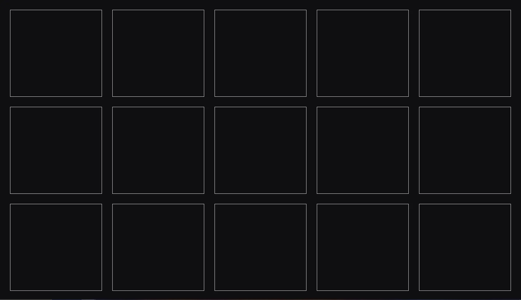
Let’s add some styles to visualize the grid.
1.Grid {2    width: 100%;3    height: 100%;4    display: flex;5    padding: 1%;6    flex-wrap: wrap;7    position: relative;8}9
10.Cell {11    width: 18%;12    height: 30%;13    margin: 1%;14    border: 1px solid white; /* Add a border to visualize the grid cells */15}
The end result should look like this:
Displaying grid items on the grid
The next step is to populate the grid with items. Each item will consist of:
- A wrapper div element that will be placed absolutely and will have the top and left position set to the item’s
yandxproperties. - A predefined size class that will set the width and height of the item.
- A resize handle that will allow the user to resize the item.
- A close Icon that will allow the user to remove the item from the grid.
Let’s begin by defining the size and icon styles
1.CellItem {2 background-color: #004b8c; /* placeholder color for visualization */3 position: absolute;4 transition: opacity 0.5s ease-in-out, left 0.25s ease-in-out, top 0.25s ease-in-out;5}6
7.Active {8 opacity: 1;9}10
11.Inactive {12 opacity: 0;13 pointer-events: none;14}15
16.CellItem-drag {17 opacity: 0;18 border: 10px solid white;19 border-left-color: transparent;20 border-top-color: transparent;21 position: absolute;22 right: 3px;23 bottom: 3px;24 transition: opacity 0.2s ease-in-out;25}26
27.CellItem-close {28 opacity: 0;29 position: absolute;30 right: 3px;31 top: 3px;32 padding: 0.25vmax 0.5vmax;33 cursor: pointer;34 color: white;35 font-weight: bold;36 transition: opacity 0.2s ease-in-out;37}38
39.CloseIcon {40 transform: scaleX(1.3);41}42
43.CellItem-drag:hover,44.CellItem-close:hover {45 opacity: 1;46}47
48.Dragging {49 opacity: 0.8;50 z-index: 999999;51 box-shadow: 0 2px 6px 1px rgba(0,0,0,0.5);52 transition: none;53}54
55.Item-1x1 {56 width: 18%;57 height: 30%;58}59
39 collapsed lines
60.Item-1x2 {61 width: 18%;62 height: 63.5%;63}64
65.Item-1x3 {66 width: 18%;67 height: 97%;68}69
70.Item-2x1 {71 width: 38%;72 height: 30%;73}74
75.Item-2x2 {76 width: 38%;77 height: 63.5%;78}79
80.Item-2x3 {81 width: 38%;82 height: 97%;83}84
85.Item-3x1 {86 width: 58%;87 height: 30%;88}89
90.Item-3x2 {91 width: 58%;92 height: 63.5%;93}94
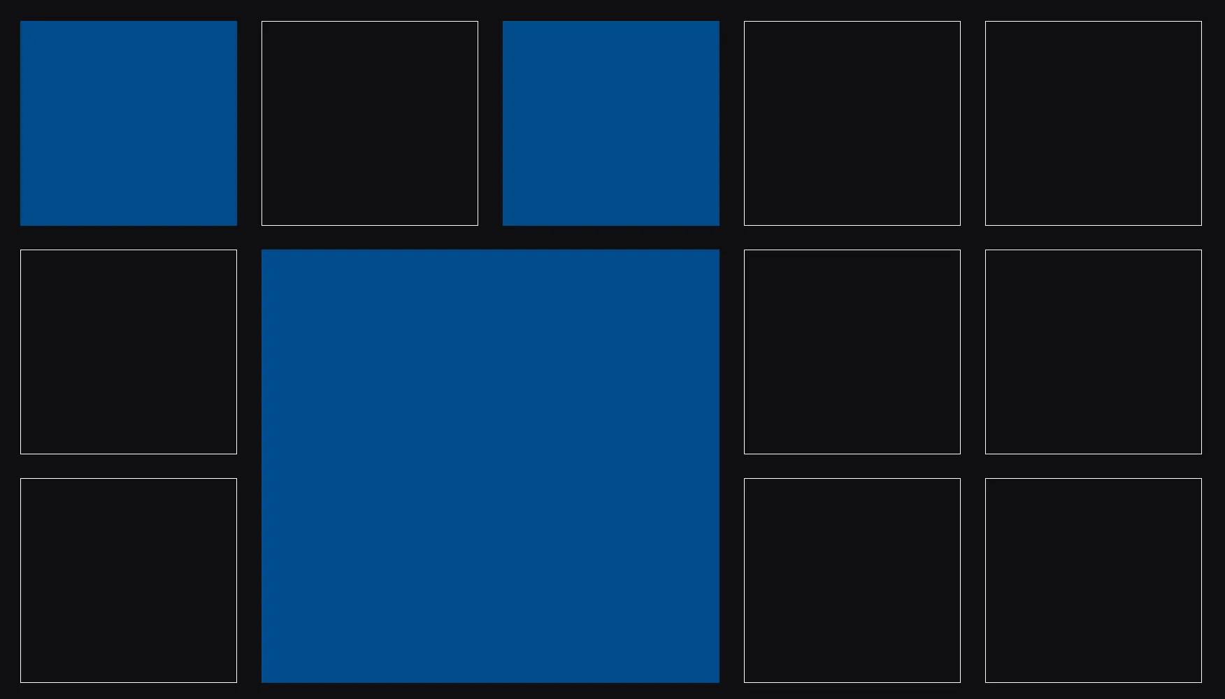
95.Item-3x3 {96 width: 58%;97 height: 97%;98}We can now loop through the items in the gridState store and render the element for each item. We are going to use the Active class to show only the items marked as active.
1return (2    <div ref={gridRef} class={styles.Grid} >3        {cells.flat().map(cell => initCell(cell))}4
5        <For each={gridState.items} >6            {(item) => {7                return (8                    <div9                        ref={(el) => gridState.itemRefs.set(item.id, el)}10                        style={{11                            top: `${item.y}px`,12                            left: `${item.x}px`,13                        }}14                        class={`${styles[`Item-${item.sizeX}x${item.sizeY}`]} ${styles.CellItem} ${item.active ? styles.Active : styles.Inactive}`}>15                        <div class={styles['CellItem-drag']} ></div>16                        <div class={styles['CellItem-close']}>17                            <div class={styles.CloseIcon}>X</div>18                        </div>19                    </div>20                )21            }}22        </For>23    </div>24);
One final thing to do is to add an initItems function which will:
- set the
xandyproperties of the items based on the cell position (rowandcol) they are occupying in the grid. - Mark the cell the item is placed at as occupied.
1const initItems = () => {2    setGridState('items', produce((items) => {3        items.forEach((item) => {4            item.x = cells[item.row][item.col].element?.offsetLeft!;5            item.y = cells[item.row][item.col].element?.offsetTop!;6        })7    }));8
9    gridState.items.forEach((item) => {10        if (item.active) {11            occupyCell(item.row, item.col, item)12        }13    })14}15
16onMount(() => {17    delayExecution(() => {18        const firstCellElement = cells[0][0].element;19        if (firstCellElement) {20            initItems();21        }22    })23});
We do this in the onMount lifecycle event and wrap all the logic with the delayExecution helper function to make sure that the model has loaded. The delayExecution function
will allow us to wait 3 frames before doing anything with the model’s data.
1export const delayExecution = (callback: () => void, delay: number = 3) => {2    if (delay === 0) {3        callback();4        return;5    }6
7    requestAnimationFrame(() => {8        delayExecution(callback, delay - 1);9    });10}
Now let’s implement the occupyCell function in the gridStore.ts file.
1const occupyCell = (newRow: number, newCol: number, item: Item) => {2 for (let row = 0; row < item.sizeY; row++) {3 for (let col = 0; col < item.sizeX; col++) {4 const cell = cells[newRow + row][newCol + col];5 cell.occupiedBy = item.id;6 }7 }8}The occupyCell function will loop through the cells that the item is occupying and set the occupiedBy property to the item’s id.
Now if you save the changes you should see your grid populated with items.
Dragging grid items
With our grid cells in place, we need to let users click and drag an item around. The core idea is to track:
- Which item is being dragged -
dragging - Whether we are currently dragging an item -
draggedItem - The initial position of the mouse when the drag starts to calculate the offset from the top left corner of the item -
dropPosition
First we need to get the width and height of the cells as well as the gap between them. We will use these values to calculate the current row and col of the dragged item.
We’ll create a separate store that will contain the drag state of the grid,
and three event handlers— handleMouseDown, handleMouseMove, and handleMouseUp to track the mouse from press, through movement, to release.
Additionally, we will define helper variables to store the initial mouse position and the offset from the top left corner of the item.
Finally, we will add a DropCell component which will be used to visualize the drop position of the item while dragging.
Let’s start by defining the helper variables.
1const DRAG_THRESHOLD: number = 5;2let startLeft: number = 0,3    startTop: number = 0,4    startMouseX: number = 0,5    startMouseY: number = 0,6    offsetX: number = 0,7    offsetY: number = 0;8
9const Grid: Component = () => {10    let cellWidth: number;11    let cellHeight: number;12    let gapX: number;13    let gapY: number;
Now let’s implement the interactions store:
1import { createMutable, modifyMutable, produce } from "solid-js/store";2import { gridInteractionType, Item, Position } from "src/types/types";3
4export const gridInteractionState = createMutable<gridInteractionType>({5    dragging: false,6    draggedItem: null as Item | null,7    dropPosition: null as Position | null,8    shouldDrag: true,9});
Notice how for this store we are using Solid’s createMutable function.
The reason we do this is to ensure that we’ll trigger a state update even if objects such as dropPosition change. Because if done with a normal createStore, updating the properties of the object won’t trigger a state update.
Another benefit that comes from this is that we don’t need a setter function with createMutable and we can update properties like we normally do.
With that out of the way, the last thing to do is to get the cells width and height and the gap between them in the onMount event. As well as add the event handlers.
1onMount(() => {2    delayExecution(() => {3        const firstCellElement = cells[0][0].element;4        if (firstCellElement) {5            cellWidth = firstCellElement.clientWidth;6            cellHeight = firstCellElement.clientHeight;7            gapX = firstCellElement.offsetLeft;8            gapY = firstCellElement.offsetTop;9            initItems();10        }11    })12
13    window.addEventListener("mousemove", handleMouseMove);14    window.addEventListener("mouseup", handleMouseUp);15});
And remove the event handlers in the onCleanup event.
1onCleanup(() => {2 window.removeEventListener("mousemove", handleMouseMove);3 window.removeEventListener("mouseup", handleMouseUp);4});Now let’s define the event handlers.
Mouse down event
On the mousedown event we are going to check if the user clicked on an item and
if so we are going to set the dragging state to true and store the initial mouse position and the offset from the top left corner of the item.
This way we will keep the item’s position relative to where the user clicked.
1const startDragging = (item: Item) => {2    startLeft = item.x;3    startTop = item.y;4    offsetX = startMouseX - startLeft;5    offsetY = startMouseY - startTop;6    gridInteractionState.dragging = true;7}8
9// Start dragging when mousedown occurs on an item10const handleMouseDown = (e: MouseEvent, item: Item) => {11    if (!gridRef || !gridInteractionState.shouldDrag) return;12
13    gridInteractionState.draggedItem = item14    const currentItemElement = gridState.itemRefs.get(item.id)15
16    // Store the initial mouse position17    startMouseX = e.clientX;18    startMouseY = e.clientY;19
20    const clickedElement = e.target as HTMLElement;21    if (clickedElement.closest(`.${styles.CellItem}`)) startDragging(item)22
23    e.preventDefault();24};
One thing to note is the flag shouldDrag we defined in our store earlier. This flag enables us to have control from the outside over whether an interaction with the grid should trigger.
This will be useful to have in the future if we want to have interactions inside the components of the grid items.
Mouse move event
On the mousemove event we are going to:
- Calculate the new position of the item based on the mouse position and the offset from the top left corner of the item.
- Get the
rowandcolthe item is currently hovering on. - Check if the new
rowandcolare valid and if not we are going to return the item to its previous position.
Additionally we will attach a dragging class to visualize the interaction and set a safety check and check if the mouse has moved more than the DRAG_THRESHOLD. This is done to prevent
accidental drags if the user holds their mouse and drags a little.
1// Update drop target based on mouse position2const handleMouseMove = (e: MouseEvent) => {3    if (!gridInteractionState.draggedItem || !gridRef) return;4
5    const dx = Math.abs(e.clientX - startMouseX);6    const dy = Math.abs(e.clientY - startMouseY);7    // Only trigger actions if the pointer has moved enough8    if (dx < DRAG_THRESHOLD && dy < DRAG_THRESHOLD) return;9
10    const mouseX = e.clientX11    const mouseY = e.clientY12
13    const itemleft = mouseX - offsetX;14    const itemTop = mouseY - offsetY;15
16    const currentItem = gridInteractionState.draggedItem;17
18    gridState.itemRefs.get(currentItem!.id)?.classList.add(styles.Dragging)19    // Pass them as fallback to return to prev place20    const currentItemRow = currentItem?.row21    const currentItemCol = currentItem?.col22
23    if (gridInteractionState.dragging && currentItem) {24        const { col, row } = getGridPosition(itemleft, itemTop, MAXCOLS, MAXROWS)25
26        changeItemPosition(currentItem!, mouseX, mouseY);27
28        const prevPosition = gridInteractionState.dropPosition;29        if (!prevPosition || row !== prevPosition.row || col !== prevPosition.col) {30            gridInteractionState.dropPosition = {col, row}31        }32
33        if (!memoizedCellValidation()) {34            gridInteractionState.dropPosition = { col: currentItemCol, row: currentItemRow } // fallback35        }36    }37};
To achieve the following we will need a couple of helper functions.
getGridPosition- calculates therowandcolbased on the mouse position and the grid cells.changeItemPosition- continuously updates the item’sxandybased on the current mouse position.memoizedCellValidation- checks if the new position of the item is valid. It triggers only when the row or col changes decreasing the executions of the function and improving performance.
1function getGridPosition(itemLeft: number, itemTop: number, maxCol: number, maxRow: number) {2    const adjustedColWidth = cellWidth + gapX;3    const adjustedRowHeight = cellHeight + gapY;4
5    return {6        col: clamp(Math.floor((itemLeft - (gapX / 2)) / adjustedColWidth), maxCol, 0),7        row: clamp(Math.floor((itemTop - (gapY / 2)) / adjustedRowHeight), maxRow, 0)8    };9}
As you can notice, we are using a clamp function to limit the row and col values between the max grid size or 0.
This will ensure that the item will not go out of bounds. Let’s define the clamp function in our ‘utils’ folder.
1export const clamp = (value: number, maxValue: number, minValue: number) => {2 return Math.max(minValue, Math.min(value, maxValue))3}Now to update the item’s position:
1const changeItemPosition = (item: Item, mouseX: number, mouseY: number) => {2    if (item) {3        // Compute the new position while keeping the original offset4        const deltaX = mouseX - startMouseX;5        const deltaY = mouseY - startMouseY;6
7        // New position should maintain the original top-left corner offset8        const newLeft = startLeft + deltaX;9        const newTop = startTop + deltaY;10
11        setGridState('items', currItem => currItem.id === item.id, {12            x: newLeft,13            y: newTop,14        });15    }16}
And finally the memoizedCellValidation function. For this one we are going to utilize the
createMemo function from Solid JS to wrap the isCellBlockValid function which
will be responsible for veryfying if the cell we are trying to place an item in is valid by checking whether the cells occupiedBy field is true and different from the passed item’s id.
Let’s first define the isCellBlockValid function in the gridStore.ts file.
1const isCellBlockValid = (newRow: number, newCol: number, item: Item, sizeX: number, sizeY: number) => {2    for (let row = 0; row < sizeY; row++) {3        for (let col = 0; col < sizeX; col++) {4            const resultRow = newRow + row;5            const resultCol = newCol + col;6            if (resultRow >= MAXROWS || resultCol >= MAXCOLS) return false7
8            const cell = cells[resultRow][resultCol];9            if (cell.occupiedBy && cell.occupiedBy !== item.id ) {10                return false;11            }12        }13    }14
15    return true16}
And since we don’t wish to run ths 2D array loop on every mouse move event when we haven’t even moved the item out of its own cell,
we are going to memoize the function and make it run only if the cell (drop position) has changed.
1const memoizedCellValidation = createMemo(() => {2    const item = draggedItem();3    const position = dropPosition();4
5    if(!item || !position) return false6
7    return isCellBlockValid(position.row, position.col, item, item.sizeX, item.sizeY)8})
Mouse up event
What’s left from the dragging logic is to handle the mouseup event. After we’ve verified that the new position of the item we are dragging is valid, we are going to:
- Update the item’s
rowandcolproperties and mark the new cells as occupied by the item. - Remove the
draggingclass from the item. - Assign the
offeSetLeftandoffSetTopproperties to the item’sxandyproperties (in order to make the item appear as being ‘slotted’ into its new position). - Update our
GridDatamodel with the new item’s properties. - Reset all drag states.
1const dropitem = () => {2    const currentItem = gridInteractionState.draggedItem;3
4    if (!gridInteractionState.dropPosition || !currentItem) return5
6    gridState.itemRefs.get(currentItem!.id)!.classList.remove(styles.Dragging)7    resetItemElement(currentItem)8
9    const newCol = gridInteractionState.dropPosition!.col;10    const newRow = gridInteractionState.dropPosition!.row;11    const newX = cells[newRow][newCol].element?.offsetLeft!;12    const newY = cells[newRow][newCol].element?.offsetTop!;13
14    setGridState('items', item => item.id === currentItem.id, {15        x: newX,16        y: newY,17        col: newCol,18        row: newRow,19    });20
21    clearCell(currentItem)22    occupyCell(newRow, newCol, currentItem)23    updateModel(GridData);24}25
26// On mouse up, update the item's position if there is a valid drop target27const handleMouseUp = () => {28 dropitem();29 resetInteractionState()30};1export const resetInteractionState = () => {2 modifyMutable(3 gridInteractionState,4 produce((gridInteractionState) => {5 gridInteractionState.dragging = false;6 gridInteractionState.draggedItem = null;7 gridInteractionState.dropPosition = null;8 })9 )10}The clearCell function will remove the occupiedBy property from the cells the item is currently occupying.
1// Frees cell or cells spot2const clearCell = (item: Item) => {3 for (let row = 0; row < MAXROWS; row++) {4 for (let col = 0; col < MAXCOLS; col++) {5 const cell = cells[row][col];6 if (cell.occupiedBy === item.id) cell.occupiedBy = undefined;7 }8 }9}And of course we need to update our model. We will define a helper function for this - updateModel
1export const updateModel = (model: object) => {2 engine.updateWholeModel(model);3 engine.synchronizeModels();4}Now if you save the changes you should be able to drag the items around the grid.
Dropcell component
To help better visualize the grid’s interactions we are going to add a DropCell component which will be used to visualize the drop position of the item while dragging it.
1import { Component, Show } from "solid-js";2import {cells} from '../../store/gridStore';3import styles from './Grid.module.css';4import { gridInteractionState } from "../../store/gridInteractionStore";5
6const DropCell: Component = () => {7
8    return (9        <div class={styles.DropCellContainer}>10            <Show when={gridInteractionState.dropPosition} keyed>11                {(position) => {12                    const { col, row } = position;13                    const cellToShow = cells[row][col]14                    const currentItem = gridInteractionState.draggedItem;15                    return (<div16                        style={{ top: `${cellToShow?.element?.offsetTop}px`, left: `${cellToShow?.element?.offsetLeft}px` }}17                        class={`${styles[`Item-${currentItem?.sizeX}x${currentItem?.sizeY}`]} ${styles.DropCell}`}>18                    </div>)19                }}20            </Show>21        </div>22    )23}24
25export default DropCell
Add some styles
1.DropCell {2    position: absolute;3    top: 0;4    left: 0;5    background-color: #d9d9d979;6    pointer-events: none;7}8
9.DropCellContainer {10    position: absolute;11    width: 100%;12    height: 100%;13}
The DropCell component will use the dropPosition and draggedItem states from our gridInteractionStore and will render a div element with the same size as the
dragged item and position it on the cell the item is currently hovering on. If the position is invalid the DropCell will show on the initial position of the item. And since we have access to the
current item we can use its size to set the size of the DropCell.
To make it all work we are utilizng the Show SolidJS component that lets us conditionally render components. In our case
Show will render the DropCell only if the dropPosition state is not null.
Now let’s import the DropCell component in the Grid.tsx file and render it.
1import DropCell from "./DropCell";2
3return (4    <div ref={gridRef} class={styles.Grid} >5        {cells.flat().map(cell => initCell(cell))}6
7        <DropCell />8
9        <For each={gridState.items} >
Swapping grid items
To make the grid’s interactions more intuitive we are going to add the ability to swap items. When the user drags an item over another item we are going to swap their positions, if it’s possible.
Currently if two items on the grid overlap, the dragged item will fallback to its starting position.
We are going to extend the handleMouseMove function to swap their positions if there is an overlap by calling a handleOverlap function.
1if (!memoizedCellValidation()) {2 handleOverlap(row, col, currentItem)3 gridInteractionState.dropPosition = { col: currentItemCol, row: currentItemRow }4}We are going to handle the whole swapping interaction in our handleOvelrap function. The process will be as follows:
- Find which item is being overlapped by the dragged item.
- Calculate the new positions of both items based on the direction of the overlap.
- Check if the new positions are valid.
- If the swap is valid, execute the swap, update the item’s state, update the cell’s
occupiedByproperty to match the new positions of the items and set a cooldown flag to avoid rapid swaps on every mouse move.
Add a isSwapCooldown state to the store avoid rapid swaps
1export const gridInteractionState = createMutable<gridInteractionType>({2 dragging: false,3 draggedItem: null as Item | null,4 dropPosition: null as Position | null,5 isSwapCooldown: false,6 shouldDrag: true,7});1const handleOverlap = (row: number, col: number, currentItem: Item) => {2 // Avoids rapid swap if items still overlap3 if (gridInteractionState.isSwapCooldown) return4
5 const overlappedItem = gridState.items.find(i => i.id === cells[row][col].occupiedBy)6 // Early exit if trying to overlap with itself7 if (!overlappedItem || overlappedItem === currentItem) return8
9 // Calculate new positions regardless of direction10 let newCurrentRow = currentItem.row;11 let newCurrentCol = currentItem.col;12 let newOverlappedRow = overlappedItem.row;13 let newOverlappedCol = overlappedItem.col;14
15 // Horizontal movement logic16 if (currentItem.col !== overlappedItem.col) {17 if (currentItem.col < overlappedItem.col) {18 // Current item is coming from left19 const sizeDifferenceX = overlappedItem.sizeX - currentItem.sizeX;20 newOverlappedCol = currentItem.col;21 newCurrentCol = overlappedItem.col + sizeDifferenceX;22 } else {23 // Current item is coming from right24 const sizeDifferenceX = currentItem.sizeX - overlappedItem.sizeX;25 newOverlappedCol = currentItem.col + sizeDifferenceX;26 newCurrentCol = overlappedItem.col;27 }28 }29
30 // Vertical movement logic31 if (currentItem.row !== overlappedItem.row) {32 if (currentItem.row < overlappedItem.row) {33 // Current item is coming from top34 const sizeDifferenceY = overlappedItem.sizeY - currentItem.sizeY;35 newOverlappedRow = currentItem.row;36 newCurrentRow = overlappedItem.row + sizeDifferenceY;37 } else {38 // Current item is coming from bottom39 const sizeDifferenceY = currentItem.sizeY - overlappedItem.sizeY;40 newOverlappedRow = currentItem.row + sizeDifferenceY;41 newCurrentRow = overlappedItem.row;42 }43 }44
45 // Check grid boundaries for both items46 if (!isWithinGrid(newOverlappedRow, newOverlappedCol, overlappedItem) ||47 !isWithinGrid(newCurrentRow, newCurrentCol, currentItem)) {48 return;49 }50
51 // Validate swap for both items in their new positions52 if (!isSwapValid(newOverlappedRow, newOverlappedCol, overlappedItem, currentItem) ||53 !isSwapValid(newCurrentRow, newCurrentCol, currentItem, overlappedItem)) {54 return;55 }56
57 // Execute the swap58 const hasSwapped = swapItemPositions(59 currentItem, overlappedItem,60 newCurrentRow, newCurrentCol,61 newOverlappedRow, newOverlappedCol62 );63
64 if (hasSwapped) {65 clearCell(currentItem);66 clearCell(overlappedItem);67 occupyCell(currentItem.row, currentItem.col, currentItem);68 occupyCell(overlappedItem.row, overlappedItem.col, overlappedItem);69 gridInteractionState.isSwapCooldown = true70 setTimeout(() => gridInteractionState.isSwapCooldown = false, 500);71 }72}In addition, we need to implement three helper functions to make the swap possible.
isWithinGrid- checks if the new position of the item is within the grid boundaries.isSwapValid- checks if the swap is valid by verifying if the new position of the item is not occupied by another item.swapItemPositions- swaps the positions of the two items by updating their state in thestore.
1const isWithinGrid = (row: number, col: number, item: Item) => {2 return row >= 0 && (row + item.sizeY - 1) <= MAXROWS && col >= 0 && (col + item.sizeX - 1) <= MAXCOLS;3}In the isSwapValid function we are going to loop through all the grid cells and check if the new position of the item is not occupied by another item.
Excluding the overlapped and the dragged items.
1const isSwapValid = (newRow: number, newCol: number, item: Item, overlappedItem: Item) => {2    for (let row = 0; row < item.sizeY; row++) {3        for (let col = 0; col < item.sizeX; col++) {4
5            const resultRow = newRow + row;6            const resultCol = newCol + col;7            if (resultRow >= MAXROWS || resultCol >= MAXCOLS) return false8
9            const cell = cells[resultRow][resultCol];10            if (cell.occupiedBy && cell.occupiedBy !== item.id && cell.occupiedBy !== overlappedItem.id) {11                return false;12            }13        }14    }15
16    return true17}
Finally, in the swapItemPositions function we are going to update the items’ state in the store and return a boolean indicating if the swap was successful. The function will accept all the new
calculated row and cols for both items. We will move the common logic for state updating into its own separate function setGridItemState to reduce code repetitiveness
1const swapItemPositions = (currentItem: Item, overlappedItem: Item, newCurrentRow: number, newCurrentCol: number, newOverlappedRow: number, newOverlappedCol: number) => {2    // Set new locations for overlapped item3    setGridState('items',4        item => item.id === overlappedItem.id,5        produce(setGridItemState(newOverlappedRow, newOverlappedCol))6    );7
8    // Set new locations for current item9    setGridState('items',10        item => item.id === currentItem.id,11        produce(setGridItemState(newCurrentRow, newCurrentCol))12    );13
14    return true;15}16
17const setGridItemState = (newRow: number, newCol: number) => {18    return (item: Item) => {19        item.row = newRow;20        item.col = newCol;21        item.x = cells[item.row][item.col].element!.offsetLeft;22        item.y = cells[item.row][item.col].element!.offsetTop;23    }24}
Now if you save the changes you should be able to swap the items on the grid.
Resizing grid items
The final grid functionality we are going to implement will be the ability to resize the grid items.
The process will be similar to the dragging logic. We are going to create a resizing state in our interaction store to track if the item is being resized and a couple of helper variables to store:
- initial width and height of the item -
startWidth,startHeight - the new size of the item -
newSizeX,newSizeY
1let startLeft: number = 0,2 startTop: number = 0,3 startMouseX: number = 0,4 startMouseY: number = 0,5 startWidth: number = 0,6 startHeight: number = 0,7 newSizeX: number = 0,8 newSizeY: number = 0,9 offsetX: number = 0,10 offsetY: number = 0;1export const gridInteractionState = createMutable<gridInteractionType>({2 dragging: false,3 resizing: false,4 draggedItem: null as Item | null,5 dropPosition: null as Position | null,6 isSwapCooldown: false,7 shouldDrag: true,8});Next, we are going to extend the handleMouseDown function to check whether the user is dragging or resizing. We will check if the clicked element is the resize handle
and set the resizing state to true.
Additionally, we are going to store the rect object of the grid element and assign it’s left and top properties as X and Y offset. We do this to ensure that the coordinates of the mouse
are relative to the grid element.
1const handleMouseDown = (e: MouseEvent, item: Item) => {2    if (!gridRef || !gridInteractionState.shouldDrag) return;3
4    gridInteractionState.draggedItem = item5    const currentItemElement = gridState.itemRefs.get(item.id)6
7    // Store the initial mouse position8    startMouseX = e.clientX;9    startMouseY = e.clientY;10
11    const clickedElement = e.target as HTMLElement;12
13    if (clickedElement.closest(`.${styles.CellItem}`)) startDragging(item)14
15    if (clickedElement.closest(`.${styles['CellItem-drag']}`)) startResizing(currentItemElement);16    else if (clickedElement.closest(`.${styles.CellItem}`)) startDragging(item)17
18 e.preventDefault();19};1const startDragging = (item: Item) => {2 startLeft = item.x;3 startTop = item.y;4 offsetX = startMouseX - startLeft;5 offsetY = startMouseY - startTop;6 gridInteractionState.dragging = true;7}Next, we are also going to extend the handleMouseMove function to handle resizing the item. We are once again going to get the new position of the mouse and return the relevant row and col
of the grid. And then we are going to call the changeSize function which will calculate the new size of the item based on the mouse position.
1const handleMouseMove = (e:MouseEvent) => {2    // Dragging logic3
4    if (gridInteractionState.resizing && currentItem) {5        const { col, row } = getGridPosition(itemleft, itemTop, MAXCOLS - 1, MAXROWS - 1)6        changeSize(currentItem, mouseX, mouseY, col, row);7        gridInteractionState.dropPosition = { col: currentItemCol, row: currentItemRow }8    }9}10
11const changeSize = (item: Item, mouseX: number, mouseY: number, col: number, row: number) => {12    const itemElement = gridState.itemRefs.get(item.id);13
14    if (item && itemElement) {15
16        const newWidth = startWidth + (mouseX - startMouseX);17        const newHeight = startHeight + (mouseY - startMouseY);18
19        itemElement.style.width = `${newWidth}px`;20        itemElement.style.height = `${newHeight}px`;21
22        newSizeX = clamp((col - item.col) + 1, item.maxSizeX, item.minSizeX);23        newSizeY = clamp((row - item.row) + 1, item.maxSizeY, item.minSizeY)24
25        if (isCellBlockValid(item.row, item.col, item, newSizeX, newSizeY)) {26            setGridState('items', (currentItem) => currentItem.id === item.id, {27                sizeX: newSizeX,28                sizeY: newSizeY29            })30        }31    }32}
In the changeSize function on every mouse move we are updating the width and height of the item’s html element so the user can see the resize in real-time.
Also, since we want our items to have minimum and maximum size we are using the clamp function to limit the new size of the item.
Finally, we will check if the new size of the item is valid and not overlapping with another item by calling the isCellBlockValid function.
If the new size is valid we are going to update the item’s state.
The last thing to do to complete the resize functionality is to reset the resizing state and the html element’s width and height styles we changed during the dragging process.
1const dropitem = () => {2    const currentItem = gridInteractionState.draggedItem;3
4    if (!gridInteractionState.dropPosition || !currentItem) return5
6    gridState.itemRefs.get(currentItem!.id)!.classList.remove(styles.Dragging)7    resetItemElement(currentItem)8
9    const newCol = gridInteractionState.dropPosition!.col;10    const newRow = gridInteractionState.dropPosition!.row;11    const newX = cells[newRow][newCol].element?.offsetLeft!;12    const newY = cells[newRow][newCol].element?.offsetTop!;13
14    setGridState('items', item => item.id === currentItem.id, {15        x: newX,16        y: newY,17        col: newCol,18        row: newRow,19    });20
21    clearCell(currentItem)22    occupyCell(newRow, newCol, currentItem)23    updateModel(GridData);24}25
26const resetItemElement = (currentItem: Item) => {27    const itemElement = gridState.itemRefs.get(currentItem!.id)!;28
29    itemElement.classList.remove(styles.Dragging)30    itemElement.style.width = ''31    itemElement.style.height = ''32}
And don’t forget to add the resizing state for reset in our store’s helper function - resetInteractionState
1export const resetInteractionState = () => {2 modifyMutable(3 gridInteractionState,4 produce((gridInteractionState) => {5 gridInteractionState.resizing = false;6 gridInteractionState.dragging = false;7 gridInteractionState.draggedItem = null;8 gridInteractionState.dropPosition = null;9 })10 )11}Now if you save the changes you should be able to resize the items on the grid.
Conclusion
We have created a grid component with drag and drop functionality. We have implemented the ability to drag, swap, and resize items on the grid.
In the next part of this tutorial series,
we will create a side navigation component to add and remove items from the grid. Additionally, we will implement utility components such as a toast and tooltip.
TypeScript types
1export interface Item {2    id: number;3    name: string;4    x: number;5    y: number;6    row: number;7    col: number;8    sizeX: number;9    sizeY: number;10    minSizeX: number;11    minSizeY: number;12    maxSizeX: number;13    maxSizeY: number;14    element?: HTMLElement;15    active: boolean;16}17
18export interface Position {19  row: number;20  col: number;21}22
23export interface GridCell {24  element?: HTMLDivElement;25  occupiedBy?: number;26}27
28export interface gridState {29  itemRefs: Map<number, HTMLElement>30  items: Item[]31}32
33export interface gridInteractionType {34  dragging: boolean,35  resizing: boolean,36  draggedItem: Item | null,37  dropPosition: Position | null,38  isSwapCooldown: boolean,39  shouldDrag: boolean,40}
To setup the types for cohtml.js you can follow this guide
Model types setup
Since the models are created at runtime, we need to define them as global types. We can do this by creating a global.d.ts file in the src folder, where we are going to define the types for all our models.
1import { Item } from "./types/types";2
3declare global {4    let GridData: {gridItems: Item[]};5}6
7export {};
To make typescript recognize it as a global type, we need to add the following code in the tsconfig.json file.
1{2 "compilerOptions": {3 // other options4 },5 "include": ["src", "src/global.d.ts"],6}