How to: Create action buttons for a mobile UI
7/24/2024
Mihail Todorov
Welcome to our comprehensive tutorial on creating dynamic action buttons for your game! In this guide, we will walk you through the process of designing three distinct types of action buttons: a shooting button, a heavy shot button, and a special attack button. These buttons will enhance your game’s interactivity and provide a more engaging experience for your players.
Previewing the sample
To see the sample live you can find the whole project in the ${Gameface package}/Samples/uiresources/UITutorials/MobileControls directory.
Creating the base for our buttons
Before we start with each button we’ll make a base style that will serve as the background for all of our buttons.
In our CSS we’ll add
1.button-base {2 background-image: url(../assets/button-base.svg);3 background-repeat: no-repeat;4 background-size: contain;5 display: flex;6 align-items: center;7 justify-content: center;8 position: relative;9}We’ll also be adding a buttons container, that will place all of our buttons in the bottom right of the screen.
1<div class="buttons-container"></div>and style it
1.buttons-container {2 position: absolute;3 bottom: 1vmax;4 right: 1vmax;5 width: 20vmax;6 height: 20vmax;7 display: flex;8 justify-content: flex-end;9 align-items: flex-end;10}Action buttons
The action buttons will be our shooting and heavy shot buttons.
What we want for these buttons is the ability to swap them out with each other. To do this we’ll need to group them.
So we’ll just add an attack button container and a button base for each and add all of this to the buttons container
1<div class="attack-buttons-container">2 <div class="button-base attack-button action-button"></div>3 <div class="button-base secondary-button action-button"></div>4</div>1.attack-buttons-container {2 position: absolute;3 bottom: 16vmax;4 right: 14vmax;5}6
7.action-button {8 position: absolute;9 transition: all 1s;10}And since we want to position the active button to the left and have it bigger than the inactive one, we’ll add the following styles
1.attack-button {2  width: 10vmax;3  height: 10vmax;4  z-index: 2;5}6
7.secondary-button {8  width: 10vmax;9  height: 10vmax;10  transform: translate(50%, -50%) scale(0.55);11  z-index: -1;12  opacity: 0.7;13}
Where attack-button is the active and secondary-button is the inactive one.
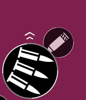
The shooting button
The shooting button should fire a shot when pressed, but we want it for the player to be able to choose if they should fire a singe or a burst shot. They can do that by swiping on the button in any direction and it should change the mode.
Setting up the look of the button
To get started we’ll add a container that will not allow the images to overflow so that any images bellow or above will be hidden.
1<div class="attack-button-image"></div>1.attack-button-image {2 width: 100%;3 height: 100%;4 overflow: hidden;5 border-radius: 50%;6}And inside we’ll add a wrapper with our buttons.
1<div class="wrapper">2 <div class="bullet-image"></div>3 <div class="bullets-image"></div>4 <div class="bullet-image"></div>5 <div class="bullets-image"></div>6</div>The wrapper is the element we’ll be moving when you swipe. Interestingly, even though we only have 2 modes, there are actually 4 buttons. This is because we need to duplicate the first button and place it at the end, and duplicate the last button and place it at the beginning. This way, when you swipe to the end of the modes, there is an extra button that makes it look like you’re seamlessly continuing to the next mode.
We’ll style those by doing the following:
1.bullets-image {2  width: 10vmax;3  height: 10vmax;4  background-image: url(../assets/bullets.svg);5  background-repeat: no-repeat;6  background-size: 90%;7  background-position: center;8}9
10.bullet-image {11  width: 10vmax;12  height: 10vmax;13  background-image: url(../assets/bullet.svg);14  background-repeat: no-repeat;15  background-size: 90%;16  background-position: center;17}18
19.wrapper {20  transform: translateY(-10vmax); /*so that the first mode is the birst mode instead of the single shot*/21}
Adding decorations
To indicate that the button can be swiped we can add arrows pointing up and down with an animation
In our html we’ll add the arrows
1<div class="button-base attack-button action-button">2 <div class="arrows arrows-up">3 <div class="arrow-1 arrow"></div>4 <div class="arrow-2 arrow"></div>5 </div>6 <div class="attack-button-image">7 <div class="wrapper">8 <div class="bullet-image"></div>9 <div class="bullets-image"></div>10 <div class="bullet-image"></div>11 <div class="bullets-image"></div>12 </div>13 </div>14 <div class="arrows arrows-down">15 <div class="arrow-1 arrow"></div>16 <div class="arrow-2 arrow"></div>17 </div>18</div>And style them:
1.arrows {2  position: absolute;3  width: 3vmax;4  height: 3vmax;5  display: flex;6  align-items: center;7  flex-direction: column;8}9.arrows-up {10  top: -1.5vmax;11  left: 50%;12  transform: translate(-50%, 0);13}14
15.arrows-down {16  bottom: -1.5vmax;17  left: 50%;18  transform: translate(-50%, 0) rotate(180deg);19}20
21.arrow {22  width: 2vmax;23  background-repeat: no-repeat;24  background-position: center;25  background-size: cover;26}27
28.arrow-1 {29  height: 0.75vmax;30  background-image: url(../assets/arrow-1.svg);31}32
33.arrow-2 {34  height: 0.5vmax;35  background-image: url(../assets/arrow-2.svg);36}
We’ll also create an animation in our style.css:
1@keyframes arrows {2  from {3    transform: translateY(0%);4  }5
6  to {7    transform: translateY(-50%);8  }9}
and add it to our arrow:
1.arrow {2 animation: arrows 1s alternate infinite ease-out;3}Writing the logic for sliding the buttons to change the mode
We’ll first need to get the wrapper and set the active button so we can follow which is the active mode in our UI.
1const wrapper = document.querySelector(".wrapper");2
3let activeButtonIndex = 1;
To change the images on swipe, we’ll add a swipeDown and swipeUp function.
1function swipeUp() {2  if (activeButtonIndex === wrapper.childElementCount - 1) { //Check if the activeButton index is the last in available buttons3    activeButtonIndex = 1; //If it is we reset it to the first index4    //And remove any transforms5    wrapper.style.transform = "";6    wrapper.style.transition = "";7  }8  ++activeButtonIndex;9  swipe(); //We change the styles so that it slides10}11
12function swipeDown() {13  if (activeButtonIndex === 0) { //Here we check if it's the first element instead14    activeButtonIndex = wrapper.childElementCount - 2; //If it is we set the activeButtonIndex to the penultimate index15    wrapper.style.transform = `translateY(-${16      (wrapper.childElementCount - 2) * 1017    }vmax)`; //We set the shown mode to be of the penultimate button and remove the transitions18    wrapper.style.transition = "";19  }20  --activeButtonIndex;21  swipe();22}
To create the illusion of a smooth infinite transition we need to the following:
1function swipe() {2 requestAnimationFrame(() => {3 requestAnimationFrame(() => {4 wrapper.style.transform = `translateY(-${5 10 * activeButtonIndex6 }vmax)`;7 wrapper.style.transition = `transform 1s`;8 });9 });10}Where we wait 2 frames for the Layout to happen and the styles to be changed (this is needed when we reset the styles) and then apply the new styles.
Now if we run each of those functions we can see how the modes would change by swiping.
Adding the swiping interaction
But we don’t want our users to run functions, instead we want them to interact with the UI. So to do that we’ll take advantage of the Interaction Manager library and more specifically the touch gestures.
We’ll start by downloading the touch gestures library and adding it to our index.html
1<script src="./src/touch-gestures.min.js"></script>and then we can take advantage of the swipe function:
1const actionButtonsContainer = document.querySelector(2  ".attack-buttons-container"3);4
5touchGestures.swipe({6  element: actionButtonsContainer,7  callback: handleSwipe,8});
Since the callback itself will provide us with the direction, we’ll need another function to handle it:
1function handleSwipe(direction) {2 if (direction === "top") swipeUp();3 if (direction === "bottom") swipeDown();4}And now if we swipe on our UI we can see that modes change.
The heavy shot button
Compared to the shooting button, the heavy shot is more straightforward. Here we only need to add the image:
1<div class="button-base secondary-button action-button">2 <div class="shell-image"></div>3</div>1.shell-image {2 width: 100%;3 height: 100%;4 background-image: url(../assets/artillery-shell.svg);5 background-repeat: no-repeat;6 background-size: 80%;7 background-position: center;8}Which will look like this now:
Swapping the buttons
Swapping the buttons can also be easily achieved by swapping the classes of our buttons like so:
1let swipeActive = true;2
3function swapButtons() {4    swipeActive = !swipeActive;5  actionButtonsContainer.children.forEach((child) => {6    child.classList.toggle("attack-button");7    child.classList.toggle("secondary-button");8  });9}
We also add a flag called swipeActive so that whenever the heavy shot is swapped in, we shouldn’t swipe to change the shooting button. In our handleSwipe function we can add the following check:
1function handleSwipe(dir) {2 if (!swipeActive) return;3 if (dir === "top") swipeUp();4 if (dir === "bottom") swipeDown();5}Finally we need to make it so that by double tapping on the buttons they will be swapped. This will be achieved by using the touchGestures from the Interaction Manager library again.
1touchGestures.tap({2 element: ".buttons-container",3 callback: swapButtons,4 tapsNumber: 2,5});Creating the special attack button
The special attack button will allow users to press and hold it to fill up a bar. When the bar fills it will play an animation.
Setting up the button
To set up the button we’ll do the same as the shooting and heavy shot buttons and make a base with an image inside. And since we want to have a bar filling up we will add an SVG:
1<div class="button-base special-ability">2 <svg class="special-ability-outline" viewbox="-5 -5 310 310">3 <path4 d="M150,0 A150,150 0 1,1 150,300 A150,150 0 1,1 150,0"5 class="special-ability-outline-bar"6 fill="none"7 stroke="#F8A245"8 stroke-width="15"9 />10 </svg>11 <div class="rocket-button"></div>12</div>1.special-ability {2 margin-right: 12vmax;3 width: 7vmax;4 height: 7vmax;5}6
7.special-ability-outline {8 position: absolute;9 top: 0;10 left: 0;11 width: 100%;12 height: 100%;13}14
15.rocket-button {16 width: 100%;17 height: 100%;18 mask-image: url(../assets/incoming-rocket.svg);19 mask-repeat: no-repeat; /*We are using masks here so that we are able to change the background color later and so the image color*/20 mask-position: center;21 mask-size: cover;22 border-radius: 50%;23 background-color: white;24}Which will result in something like this:
Since by default we want the bar hidden, we’ll add the following style:
1.special-ability-outline-bar {2 stroke-dasharray: 1000;3 stroke-dashoffset: 1000;4}Filling up the bar
When the user puts their finger on the button it should start to fill up the bar until it completes, if they lift their finger before the bar completes it should start to gradually empty.
To do that we’ll add a touchstart and touchend events to the button
1const specialAbilityButton = document.querySelector(".special-ability");2const rocketButton = document.querySelector('.rocket-button');3const specialAbilityOutline = document.querySelector(".special-ability-outline-bar");4
5function specialAbilityTouchStart() {}6
7function specialAbilityTouchEnd() {}8
9specialAbilityButton.addEventListener("touchstart", specialAbilityTouchStart);10specialAbilityButton.addEventListener("touchend", specialAbilityTouchEnd);
We also need to add the fill of the bar and because the bar needs to fill gradually and then empty, we’ll need to create an interval:
1let specialFill = 1000;2let specialInterval;Something to note here is that the initial fill is 1000 and the reason for that is that the stroke-dashoffset property needs to go from 1000 to 0 to fill up.
We can now add the logic to the touchstart and touchend functions
1function specialAbilityTouchStart() {2  if (specialInterval) clearInterval(specialInterval); //We check if the interval is running and if it is, we clear it3  if (specialFill < 0) return; //If the bar is already full we don't need to fill it anymore4
5  specialInterval = setInterval(() => { //We create an interval that will fill up the bar each 100 milliseconds6    specialFill -= 50;7    if (specialFill < 0) { //If the bar is full8      clearInterval(specialInterval); //We clear the interval so it doesn't continue9      return;10    }11    specialAbilityOutline.style.strokeDashoffset = `${specialFill}px`;12  }, 100);13}14
15function specialAbilityTouchEnd() {16  clearInterval(specialInterval); //After our finger is lifted, we clear the interval from the other function17
18  specialInterval = setInterval(() => {19    specialFill += 50;20    if (specialFill > 1000) {21      clearInterval(specialInterval);22      return;23    }24    specialAbilityOutline.style.strokeDashoffset = `${specialFill}px`;25  }, 100);26}
If we now put and lift our finger from the button we’ll see this:
Adding an animation if the bar is full
Since we want the special ability to activate when the button bar is filled, we also need to add an animation to it.
1@keyframes backgroundAnimation {2  0% {3    background-color: red;4  }5  25% {6    background-color: orange;7  }8  50% {9    background-color: red;10  }11  75% {12    background-color: orange;13  }14  100% {15    background-color: red;16  }17}18
19.rocket-animation {20  animation: backgroundAnimation 2s alternate 10 linear;21}
This will change the color of the special attack button image rapidly and repeat it 10 times.
We have the animation, be we also need to add it when the bar fills. This is why we’ll add a new flag isAnimated and add the following logic to our functions
1let specialInterval, isAnimated;2
3function specialAbilityTouchStart() {4  if (specialInterval) clearInterval(specialInterval);5  if (specialFill < 0) return;6
7  specialInterval = setInterval(() => {8    specialFill -= 50;9    if (specialFill < 0) {10      clearInterval(specialInterval);11      isAnimated = true; //We set the flag to true12            rocketButton.classList.add('rocket-animation'); //And we add the animation13      return;14    }15    specialAbilityOutline.style.strokeDashoffset = `${specialFill}px`;16  }, 100);17}18
19function specialAbilityTouchEnd() {20  clearInterval(specialInterval);21  if (isAnimated) return; //If the animation has started the bar shouldn't empty22    rocketButton.classList.remove('rocket-animation'); //We need to remove the animation class so that it will start again the next time the bar fills23  specialInterval = setInterval(() => {24    specialFill += 50;25    if (specialFill > 1000) {26      clearInterval(specialInterval);27      return;28    }29    specialAbilityOutline.style.strokeDashoffset = `${specialFill}px`;30  }, 100);31}
Apart from that we also need to watch for when the animation ends so that we can empty the bar:
1function animationEnd() {2  isAnimated = false;3  specialAbilityTouchEnd();4}5
6specialAbilityButton.addEventListener("animationend", animationEnd);
In conclusion
By following this tutorial, you’ve learned how to create three different types of action buttons, each with unique functionalities. The shooting button offers single and rapid fire shots with a swipe gesture, the heavy shot delivers powerful attacks with a double tap, and the special attack requires a hold to charge. These techniques can be applied to various game genres, providing you with versatile tools to improve your game’s mechanics. Happy coding!