Nine slice modal
9/11/2024
Kaloyan Geshev
Creating a 9-sliced image is a powerful technique that allows you to set custom borders for an element, ensuring the borders maintain their correct size when the element is resized. This feature is particularly useful when designing game UI modals that contain dynamic content. With 9-slice scaling, the edges of the border remain intact while the other parts scale accordingly as the modal changes size.
Showcase Overview
In this tutorial, we’ll create an animated modal with dynamic content using an image for the border, the border-image CSS property to slice the image, and CSS transitions for animation effects.
Source location
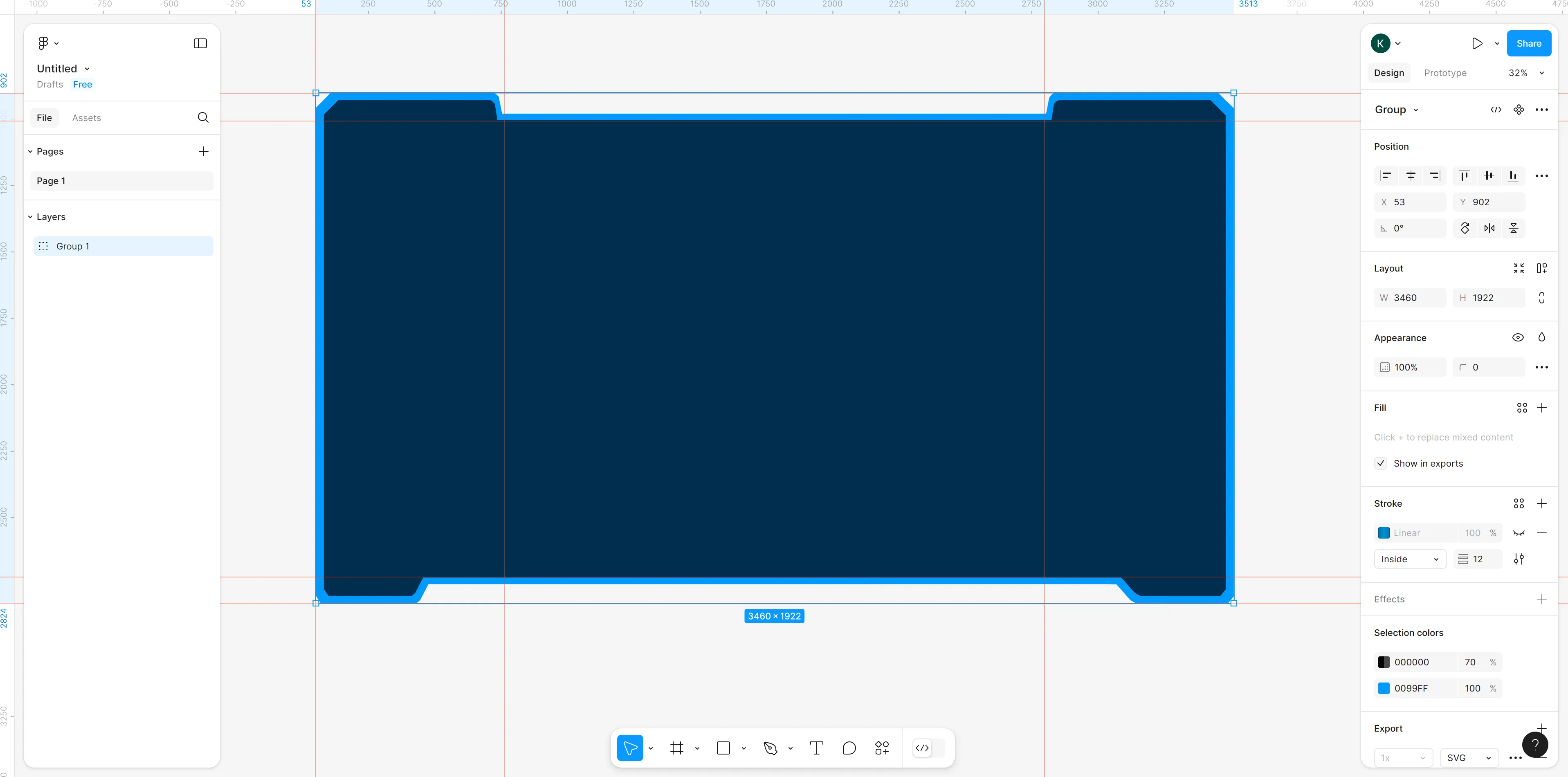
You can find the complete sample source within the ${Gameface package}/Samples/uiresources/UITutorials/NineSliceModal directory.
Preparing the border image
First, we need to design the image that will serve as the modal’s border. Tools like Figma or any other image editor can be used for this purpose.
In this design, we want to preserve the top-left, top-right, bottom-left, and bottom-right corners of the border when the modal resizes, while scaling the sections marked with red arrows.
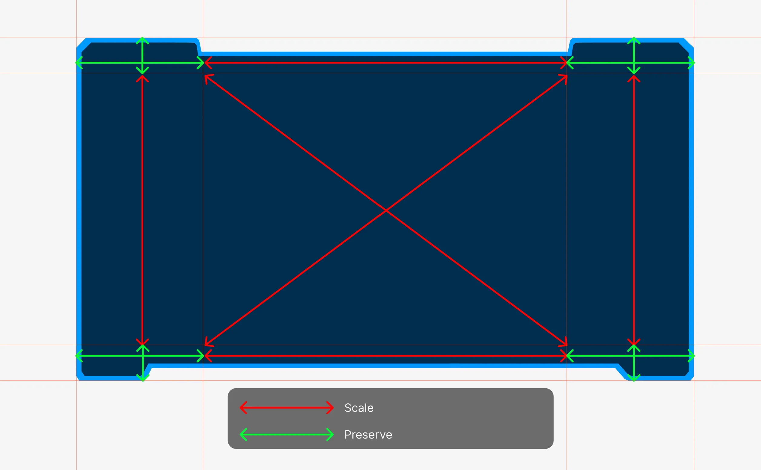
Once the border image is designed, export it as a PNG file.
Generating preview of the border image
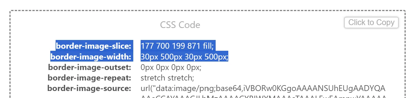
Because the border-image property can be complex and difficult to adjust by manually writing CSS, we’ll use an editor to preview the border image and generate CSS for us.
You can access the editor here .
Use the Upload image button to load your border image.
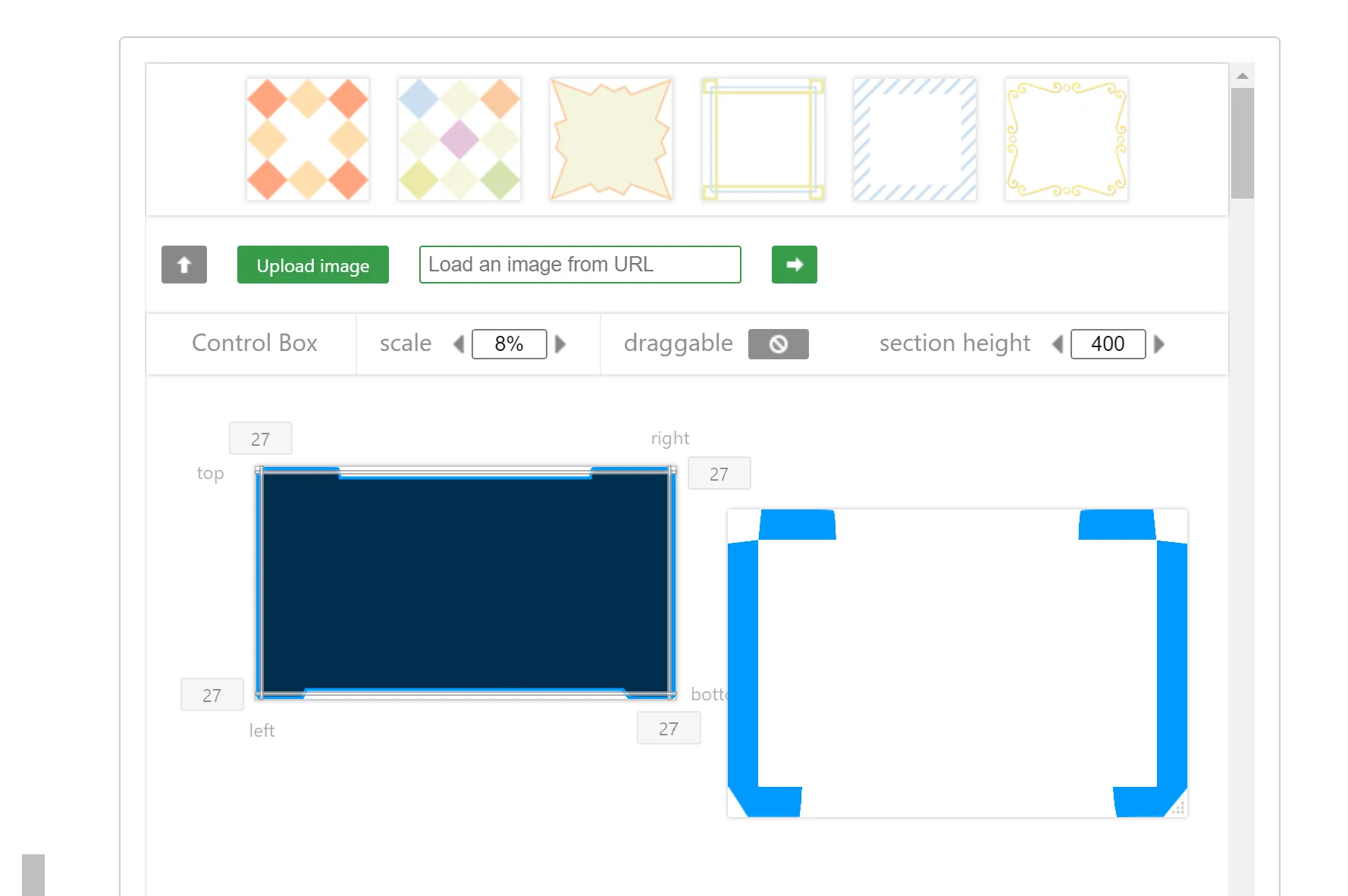
Initially, the default settings may not look right, so we’ll need to adjust the values.
First, set the border-image-slice property to define the 9-slice areas of the border that should either scale or be preserved.
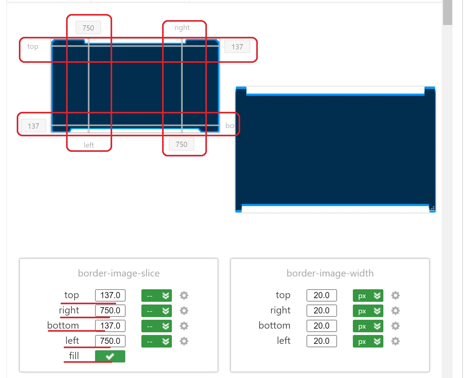
Be sure to check the fill option to avoid gaps in the middle of the modal. The preview might still show some issues, like the left and right borders appearing spliced.
To fix this, adjust the border-image-width settings. Experiment with different values to achieve the best fit. In this example, we’ve set the following values:
Displaying the border image in our HTML page
After finalizing the settings in the editor and achieving the desired appearance, it’s time to display the border image in your HTML.
First, define the element that will display the modal:
1<div class="modal"></div>Next, copy the border-image-slice and border-image-width properties generated by the editor.
Now we can apply these styles to our CSS file:
1.modal {2 width: 800px;3 height: 500px;4 border-image-source: url(./assets/border.png);5 border-image-slice: 137 750 137 750 fill;6 border-image-width: 20px 100px 20px 100px;7}The result will look like this:

If you adjust the .modal element’s width or height in the CSS, you’ll see that the edges of the border remain preserved while the other parts scale up or down, demonstrating how to do 9-slice in web using border-image.
Enhancing the modal
We will enhance the modal functionality by allowing it to open when a button is clicked and dynamically update its text content.
Additional elements to the modal
First, we’ll introduce additional elements to the modal and wrap it with a container:
1<button class="open-modal-btn">Open modal</button>2
3<div class="modal-wrapper visibility-hidden">4    <div class="modal">5        <div class="modal-content">6            <div class="modal-title">Title</div>7            <div class="modal-text"></div>8            <div class="modal-controls">9                <button class="prev-modal-btn modal-btn">Prev</button>10                <button class="next-modal-btn modal-btn">Next</button>11                <button class="close-modal-btn modal-btn">Close</button>12            </div>13        </div>14    </div>15</div>
We added an “Open Modal” button, which will have a click event listener to trigger the modal opening when clicked.
The modal is wrapped inside a modal-wrapper, which helps center it on the screen and adds a black transparent background with a blur effect to obscure the content behind the modal. This keeps the user’s focus on the modal.
Inside the modal, we added a modal-title, a modal-text (which will be dynamically updated with different content), and modal-controls that manage navigating through different text or closing the modal.
The modal-wrapper is initially hidden using the visibility-hidden class:
1.modal-wrapper.visibility-hidden {2 pointer-events: none;3 background-color: rgba(0, 0, 0, 0);4 backdrop-filter: blur(0);5}We set the background-color and backdrop-filter to zero when the visibility-hidden class is applied, so the modal stays invisible. When this class is removed, a transition will be triggered:
1.modal-wrapper {2 position: absolute;3 width: 100%;4 height: 100%;5 display: flex;6 justify-content: center;7 align-items: center;8 background-color: rgba(0, 0, 0, 0.3);9 transition: background-color 500ms, backdrop-filter 500ms;10 backdrop-filter: blur(10px);11}We also stop pointer-events when the modal-wrapper is hidden, preventing any interactions while it’s not visible.
Adjusting the modal
We will modify some properties of the modal itself. Instead of a fixed width, we’ll set it to 60% of the modal-wrapper. We’ll remove the height property so it can be dynamically adjusted via JavaScript, and update the border-image-width to use vw units for better responsiveness across different screen resolutions.
Additionally, we will add a transition to the modal for both the transform and height properties. This ensures a smooth scaleY transition when the modal opens, and a smooth height transition when the content inside the modal changes.
1.modal {2 width: 800px;3 height: 500px;4 width: 60%5 transform: scaleY(1);6 transform-origin: center center;7 transition: transform 300ms, height 300ms;8 border-image-source: url(./assets/border.png);9 border-image-slice: 137 750 137 750 fill;10 border-image-width: 20px 100px 20px 100px;11 border-image-slice: 214 728 fill;12 border-image-width: 2.5vw 8.5vw;13 overflow: hidden;14 padding: 2.5vw;15 display: flex;16 flex-direction: column;17 align-items: center;18}We adjusted the border-image-slice and border-image-width values to maintain a similar visual appearance as before. You may need to tweak these values using for example developer tools to get the desired look.
Lastly, we need to set the transform: scaleY(0) when the modal is closed, so the opening transition works correctly:
1.modal-wrapper.visibility-hidden .modal {2 transform: scaleY(0);3}Define modal messages
To modify the messages displayed in the modal, we first need to define them. We’ll create an array of strings to store these messages, and set up variables to track the current message index and the total number of messages for later use:
1const modalTexts = [2    `Lorem ipsum dolor sit amet, consectetur adipiscing elit. Fusce at nulla vitae velit auctor malesuada. Donec sollicitudin felis in turpis rutrum, nec consectetur dolor tempor. Orci varius natoque penatibus et magnis dis parturient montes, nascetur ridiculus mus. Vivamus in massa hendrerit, imperdiet nunc at, facilisis velit. Morbi viverra eget dui laoreet pharetra. Morbi aliquam nisi at mi euismod, sed rutrum metus egestas. Sed magna massa, egestas a ipsum at, convallis tincidunt sapien. Interdum et malesuada fames ac ante ipsum primis in faucibus.`,3    `Donec egestas nunc eu augue suscipit, a mattis lacus condimentum. Pellentesque quis nibh ligula. Sed condimentum metus risus, sit amet pulvinar velit porttitor vel. Pellentesque urna risus, porta et euismod sed, tristique ut risus. Fusce feugiat, risus id faucibus suscipit, dui magna tempor tortor, ac laoreet augue risus sed risus. Cras urna sapien, bibendum vitae diam et, ullamcorper finibus mi. In semper justo et ultricies commodo. Morbi urna orci, aliquet sed tempor id, mattis non diam. Sed vitae purus elementum, lacinia ante tempus, eleifend dolor. Vestibulum tincidunt dictum pulvinar. Proin eget tincidunt purus, eu auctor nisl. Morbi quis magna eget nisl ultricies laoreet ac ut neque. Fusce eu dui tellus. Praesent sit amet commodo justo, at varius diam. Mauris varius aliquam neque, eget commodo diam mollis nec.`,4    `Nulla placerat nisl eu lorem maximus ultrices. Duis vel dui ornare, faucibus nisi eu, molestie elit. Nam sed molestie sapien. Nam accumsan ac lectus mollis efficitur. Phasellus ut elit arcu. Proin volutpat, dolor non dignissim varius, quam lectus bibendum dui, id ullamcorper purus ligula ac est. Duis vitae ornare lorem. Nam vehicula tristique nisl. Nulla tempor nibh enim, ac fringilla libero iaculis a. Praesent tempus sodales magna, quis vehicula felis convallis eget.`5];6
7let currentTextIndex = 0;8const modalTextsLength = modalTexts.length;
Open modal on button click
To open the modal, we’ll add an event listener to the “Open Modal” button.
1const openModalBtn = document.querySelector('.open-modal-btn');2const modalWrapper = document.querySelector('.modal-wrapper');3
4...5
6openModalBtn.addEventListener('click', () => {7    modalWrapper.classList.remove('visibility-hidden');8    openModal();9});
Here we are removing the visibility-hidden class from the modal-wrapper, triggering the fade-in transition to make the modal visible.
Within the openModal function, the first message from the modalTexts array is displayed, and we disable the “Next” or “Prev” buttons based on the current message index using the changeControlsInteraction function. We also adjust the modal’s size to fit the new content via the changeTextContentAndResize function.
1const modal = document.querySelector('.modal');2const modalContent = document.querySelector('.modal-content');3const nextModalBtn = document.querySelector('.next-modal-btn');4const prevModalBtn = document.querySelector('.prev-modal-btn');5const modalTextEl = document.querySelector('.modal-text');6...7
8function onModalHeightTransitionEnds() {9    modalContent.classList.add('modal-content-visible');10    modal.removeEventListener('transitionend', onModalHeightTransitionEnds);11}12
13function updateModalHeight() {14    modal.style.height = `calc(${modalContent.clientHeight + 'px'} + 5vw)`;15}16
17function changeTextContentAndResize() {18    modalTextEl.textContent = modalTexts[currentTextIndex];19
20    waitForFrames(() => {21        modal.addEventListener('transitionend', onModalHeightTransitionEnds);22        updateModalHeight();23    });24}25
26function changeConstrolsInteraction() {27    nextModalBtn.classList.toggle('disabled', currentTextIndex === modalTextsLength - 1);28    prevModalBtn.classList.toggle('disabled', currentTextIndex === 0);29}30
31function openModal() {32    currentTextIndex = 0;33    changeConstrolsInteraction();34    changeTextContentAndResize();35}
The key functions here are changeTextContentAndResize and onModalHeightTransitionEnds.
In changeTextContentAndResize, the text is updated via the textContent property. After the text changes, we calculate the new modal content height. To ensure the height is correctly calculated, we wait 3 frames before accessing clientHeight (due to Gameface’s specific behavior). This delay is handled by the waitForFrames method, which defaults to waiting for 3 frames but can be customized if needed.
1function waitForFrames(callback, frames = 3) {2 if (frames === 0) return callback();3 requestAnimationFrame(() => waitForFrames(callback, frames - 1));4}Once the correct height is determined, the modal height is updated as follows:
1modal.style.height = `calc(${modalContent.clientHeight + 'px'} + 5vw)`;This sets the modal’s height to the clientHeight of its content plus the total top and bottom paddings (in total - 5vw).
Finally, we listen for the transitionend event to trigger the fade-in effect by adding the modal-content-visible class.
1modal.addEventListener('transitionend', onModalHeightTransitionEnds);After that, the transitionend event listener is removed inside the onModalHeightTransitionEnds.
Updating the active text in modal
The Next and Prev buttons are responsible for cycling through the active text in the modal. We need to attach click event listeners to both buttons to handle this functionality.
1nextModalBtn.addEventListener('click', () => setModalText(currentTextIndex + 1));2prevModalBtn.addEventListener('click', () => setModalText(currentTextIndex - 1));The text update is managed by the setModalText function.
1function setModalText(index) {2    if (index >= modalTextsLength || index < 0) return;3    currentTextIndex = index;4
5    changeConstrolsInteraction();6
7    modalContent.addEventListener('transitionend', onModalContentTransitionEnds);8    // Initiate the fade-out transition of the current text.9    modalContent.classList.remove('modal-content-visible');10}
First, we verify that the index is valid (within bounds). Then we update currentTextIndex with the new value and adjust the state of the Next/Prev buttons by calling updateControlState.
Next, we trigger the fade-out transition for the current text content by removing the modal-content-visible class. The transitionend event listener is added to ensure that once the fade-out completes, we proceed with updating the text and resizing the modal to fit the new content using the onModalContentTransitionEnds function.
The onModalContentTransitionEnds function removes the event listener and calls the changeTextContentAndResize function, which was previously defined for handling modal opening.
1function onModalContentTransitionEnds() {2 modalContent.removeEventListener('transitionend', onModalContentTransitionEnds);3 changeTextContentAndResize();4}Closing the modal
The modal can be closed when the Close button is clicked.
1function onModalContentHideTransitionEnds() {2    modalWrapper.classList.add('visibility-hidden');3    modalContent.removeEventListener('transitionend', onModalContentHideTransitionEnds);4}5
6function closeModal() {7    modalContent.classList.remove('modal-content-visible');8    modalContent.addEventListener('transitionend', onModalContentHideTransitionEnds);9}10
11okModalBtn.addEventListener('click', () => {12    closeModal();13});
When the Close button is clicked, the fade-out transition for the modal content begins by removing the modal-content-visible class. After the content transition ends, we wait to apply the visibility-hidden class to the modalWrapper, which triggers the fade-out effect for the entire modal.
Making the modal height responsive
To make the modal height adjust based on window resizing, you can use a ResizeObserver on the modal content element. This ensures that when the window size changes, the modal’s height is updated accordingly.
1openModalBtn.addEventListener('click', () => {2    modalWrapper.classList.remove('visibility-hidden');3    openModal();4    contentSizeObserver.observe(modalContent);5});6
7okModalBtn.addEventListener('click', () => {8    closeModal();9    contentSizeObserver.disconnect(modalContent);10});11
12const contentSizeObserver = new ResizeObserver(() => {13    updateModalHeight();14});