Radial menus in Gameface
5/13/2024
Kaloyan Geshev
Radial menus, integrated into game user interfaces, provide players with access to a variety of commands or items arranged in a circular layout. Users can effortlessly navigate through these options by moving in directions relative to the center of the circle. This intuitive approach not only simplifies interaction but also enhances the visual appeal of the game interface, providing players with quick access to actions without overwhelming them with complex menus.
Showcase overview
Creating a radial menu in Gameface is a straightforward process. We provide a custom component for the radial menu, which serves as an easily adaptable base. Additionally, its default styles can be overridden to suit your specific requirements.

Source location
You can find the complete sample source within the ${Gameface package}/Samples/uiresources/UITutorials/RadialMenu directory.
To review it, simply run the index.html page in Gameface. However, before doing so, ensure that you have executed the npm i command in the radial-menu directory to ensure proper installation and rendering of the radial menu component on the page.
Sample demonstration
In this sample, we have done the following:
- Utilized the
radial-menucomponent from the Gameface components suite. - Customized some default styles of the components to achieve the effects seen in the first image.
- Added appealing borders and animations when an item is selected.
- Modified the highlight of the currently selected item to resemble an arrow rather than a background.
- Implemented logic to rotate the radial menu with perspective effect based on the selected item.
- Displayed information in the center of the radial menu for the selected item.
Radial menu in details
Setting up the radial menu
Setting up a radial menu is remarkably simple. All it takes is importing the necessary styles, JavaScript, and custom elements into your HTML page.
1<head>2    <link rel="stylesheet" href="./node_modules/coherent-gameface-radial-menu/style.css"/>3</head>4
5<body>6    <div class="radial-menu-wrapper">7        <gameface-radial-menu class="radial-menu" data-name="Radial Menu" data-open-key-code="shift" data-change-event-name="radialMenuItemChanged">8             <div9                slot="radial-menu-center"10                class="radial-menu-center"11            >12                <div class="radial-menu-text-wrapper">13                    <span class="weapon-text"></span>14                    <p cohinline>15                        <img16                            class="ammo-icon"17                            src="./assets/ammo-icon.svg"18                        >19                        <span class="ammo-text"></span>20                    </p>21                </div>22            </div>23        </gameface-radial-menu>24    </div>25
26    <script src="./node_modules/coherent-gameface-radial-menu/dist/radial-menu.production.min.js"></script>27</body>
Additionally, you can specify a custom event name to trigger actions in JavaScript when the active element changes via data-change-event-name attribute.
Adding perspective view to the radial menu
To give the radial menu a perspective view based on the selected item, follow these steps:
- Apply a
perspectiveCSS property to theradial-menu-wrapper, allowing for perspective rotation. - Calculate the rotation of the
radial-menuin JavaScript when the active element changes.
Here’s an example of applying the perspective property to the radial-menu-wrapper in CSS:
1.radial-menu-wrapper {2 perspective: 150vh;3 perspective-origin: center;4}Following this adjustment, it becomes necessary to incorporate the transform: rotateX() rotateY() property, which will be handled via JavaScript to ensure the accurate calculation of the radial menu’s rotation.
Initially, we must attach a custom event to the radial menu, previously defined within the gameface-radial-menu element with the attribute data-change-event-name="radialMenuItemChanged".
1radialMenu.addEventListener('radialMenuItemChanged', onRadialMenuItemChanged);Upon triggering this event, we proceed to rotate the menu from a perspective angle, achieved through the rotateMenuInPerspective method.
1function onRadialMenuItemChanged() {2 const radialMenuItemsElements = radialMenu.querySelectorAll('.guic-radial-menu-item');3 rotateMenuInPerspective(radialMenuItemsElements);4}The rotateMenuInPerspective method calculates the necessary rotation based on the selected item’s position.
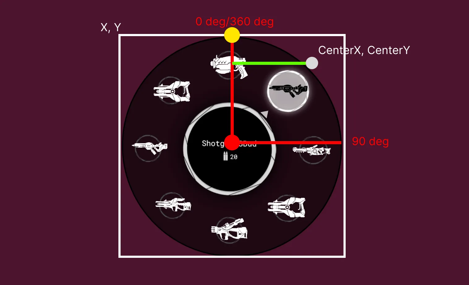
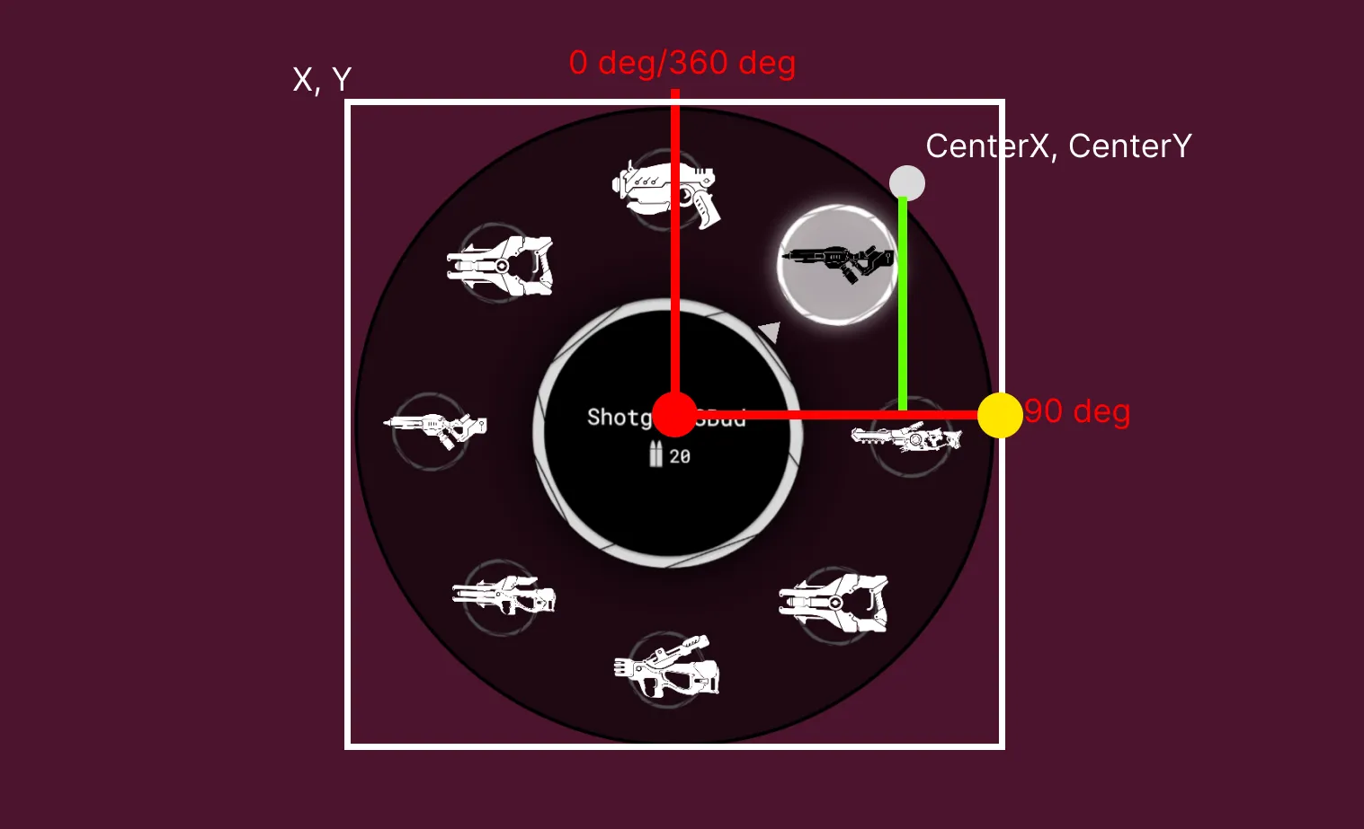
1function rotateMenuInPerspective(radialMenuItemsElements) {2    const { x, y, width, height } = radialMenu.getBoundingClientRect();3    const [centerX, centerY] = getSelectedItemElementCenterPoint(radialMenuItemsElements);4
5    const calcX = -(centerX - x - (width / 2)) / constrain;6    const calcY = (centerY - y - (height / 2)) / constrain;7    radialMenu.style.transform = `rotateX(${calcY}deg) rotateY(${calcX}deg)`;8}
This function operates by first determining the bounding box of the radial menu, capturing its top-left coordinates (x, y) and dimensions (width, height). Then, it retrieves the center coordinates of the selected item through the getSelectedItemElementCenterPoint function.
Next, the function calculates the X and Y rotation angles necessary to position the radial menu correctly within the perspective view. This calculation involves determining the distance between the selected item’s center and the radial menu’s center, adjusting for perspective constraints.
Finally, the function applies the calculated rotation using CSS transform property, ensuring that the radial menu aligns appropriately with the selected item while considering perspective effects.
We referred to this guide to help us achieve the desired perspective view.
Determining the center of the selected element
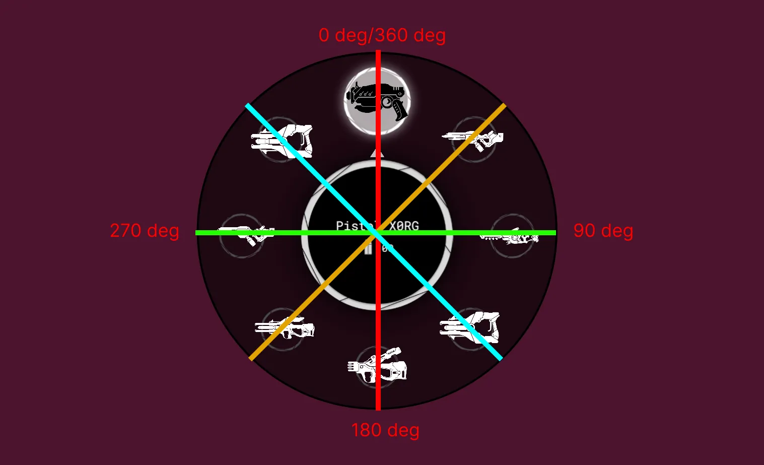
To find the center of the selected item, use the getSelectedItemElementCenterPoint method. This method calculates the center point based on the item’s angle and adjusts for different quadrants of the radial menu.
1function getSelectedItemElementCenterPoint(radialMenuItemsElements) {2 const selectedElementDegPosition = radialMenu.segmentDegrees * radialMenu.currentSegmentId;3 const selectedItemElement = radialMenuItemsElements[radialMenu.currentSegmentId];4 const { left, right, top, bottom } = selectedItemElement.getBoundingClientRect();5
6 if (selectedElementDegPosition >= 0 && selectedElementDegPosition <= 90) return [right, top];7 if (selectedElementDegPosition > 90 && selectedElementDegPosition <= 180) return [right, bottom];8 if (selectedElementDegPosition > 180 && selectedElementDegPosition <= 270) return [left, bottom];9 if (selectedElementDegPosition > 270 && selectedElementDegPosition < 360) return [left, top];10
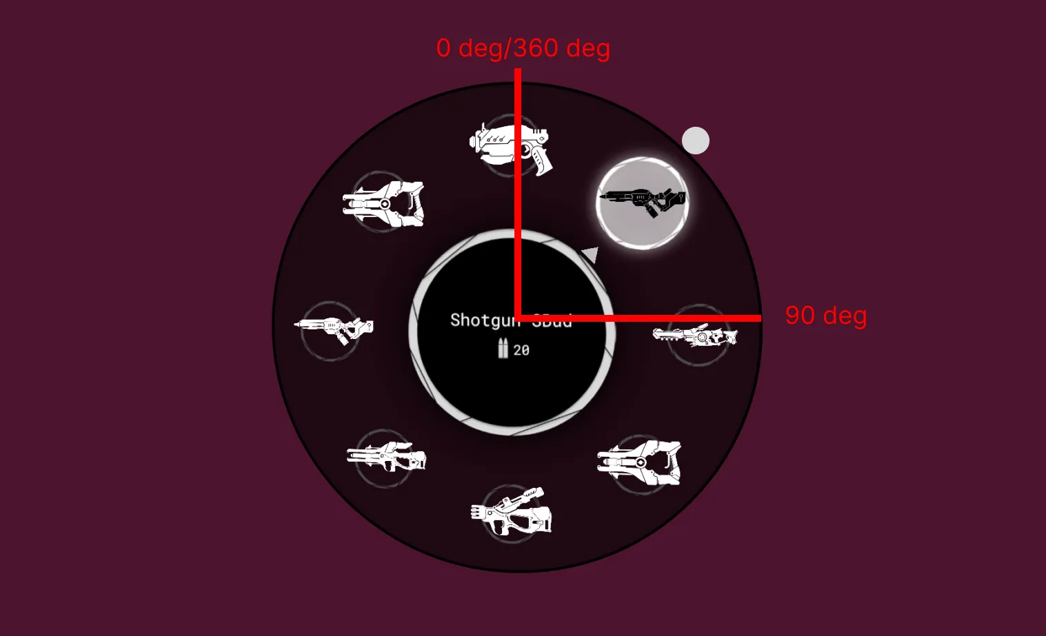
11 return [0, 0];12}This method ensures that the (x, y) center coordinates are correctly obtained based on the position of the selected item. This adaptation is necessary due to the way the radial menu segments are generated, as illustrated by the item wrapper elements depicted in the image below:
For instance, to determine the center of the orange line between 0 and 90 degrees, the right-top point of its bounding box must be retrieved, as demonstrated:
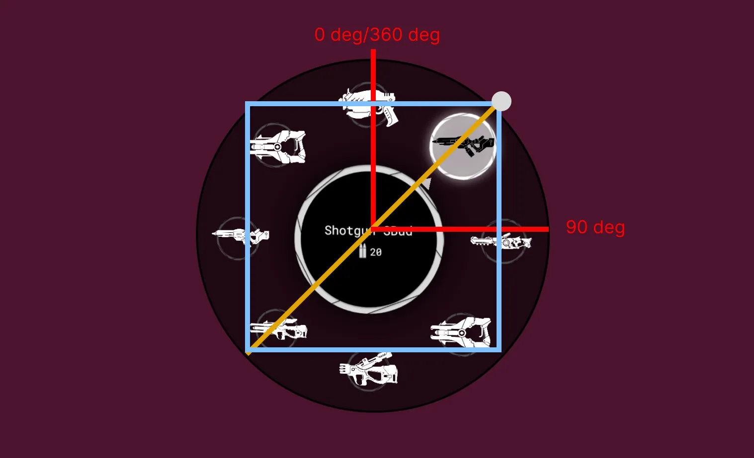
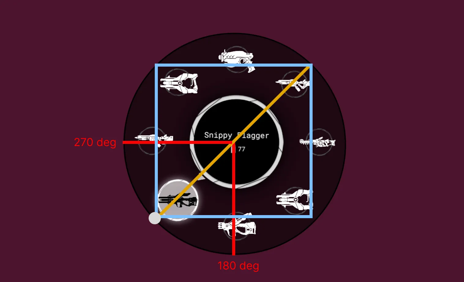
Because the item wrappers span multiple quadrants of the coordinate system, different points of their bounding boxes are required to accurately locate the center of the selected item. For instance, the same orange line covers also the range between 180 and 270 degrees, necessitating the retrieval of the left-bottom point as the center:
Update dynamically the information in the central circle
Achieving dynamic updates in the central circle is straightforward. You can accomplish this through radialMenuItemChanged event listener that respond to changes in the active item within the radial menu.
1function onRadialMenuItemChanged() {2    updateCenterTextValue();3    ...4}5
6radialMenu.addEventListener('radialMenuItemChanged', onRadialMenuItemChanged);
Where the updateCenterTextValue method does the following:
1const weaponTextElement = radialMenu.querySelector('.weapon-text');2const ammoTextElement = radialMenu.querySelector('.ammo-text');3
4...5
6function updateCenterTextValue() {7    weaponTextElement.textContent = radialMenu.items[radialMenu.currentSegmentId].name;8    ammoTextElement.textContent = radialMenu.items[radialMenu.currentSegmentId].ammo;9}
This script dynamically updates the central text whenever the active item changes. It changes the textContent of the elements with classes .weapon-text and .ammo-text that are defined inside the custom radial-menu-center slot that overwites the default circle background and text.
1<div2 slot="radial-menu-center"3 class="radial-menu-center"4>5 <div class="radial-menu-text-wrapper">6 <span class="weapon-text"></span>7 <p cohinline>8 <img9 class="ammo-icon"10 src="./assets/ammo-icon.svg"11 >12 <span class="ammo-text"></span>13 </p>14 </div>15</div>For more information on how this slot works you can check the following section of the radial-menu documentation.
Customizing default radial menu styles
Customizing the default styles of the radial menu involves several steps. Firstly, ensure that the active item is visually distinguished by adding a selected class. This step is essential since the radial menu may not do it automatically.
1function addSelectedClassToItem(radialMenuItemsElements) {2    radialMenu.querySelector('.guic-radial-menu-item.selected')?.classList.remove('selected');3    radialMenuItemsElements[radialMenu.currentSegmentId]?.classList.add('selected');4}5
6function onRadialMenuItemChanged() {7    updateCenterTextValue();8
9    const radialMenuItemsElements = radialMenu.querySelectorAll('.guic-radial-menu-item');10
11    addSelectedClassToItem(radialMenuItemsElements);12    rotateMenuInPerspective(radialMenuItemsElements);13}14
15radialMenu.addEventListener('radialMenuItemChanged', onRadialMenuItemChanged);
After ensuring the active item is visually indicated, proceed to overwrite default styles and introduce new ones tailored to your preferences.
For instance, to incorporate an arrow pointer style:
1.guic-radial-menu-selector {2 z-index: 2;3 clip-path: polygon(50% 25%, 48% 28%, 52% 28%) !important;4}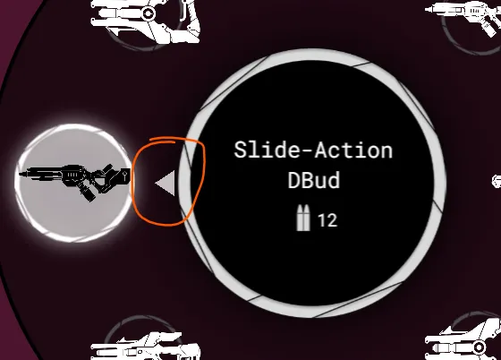
Alternatively, to modify the background of the custom center element:
1.radial-menu-center {2    width: 80%;3    height: 80%;4    position: absolute;5    display: flex;6    justify-content: center;7    align-items: center;8    flex-direction: column;9    background-color: black;10    background-image: url(./assets/selected-border.png);11    background-size: contain;12    border-radius: 50%;13
14}
Explore further style modifications and overrides in the specified CSS file - ${Gameface package}/Samples/uiresources/UITutorials/RadialMenu/style.css. This allows for extensive customization to match your game’s visual design.