Skewed settings menu - Gamepad support
5/16/2024
Kaloyan Geshev
Many modern games incorporate gamepad compatibility, enabling players to engage with the game, user interface (UI), and menus seamlessly.
Gameface supports the integration of gamepads into your UI. We provide a dedicated library for Gameface, known as the Interaction Manager . This library is capable of managing various interactions with the UI, including keyboard inputs, gamepad commands, touch gestures, and more.
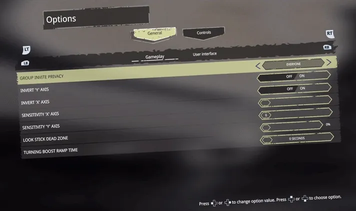
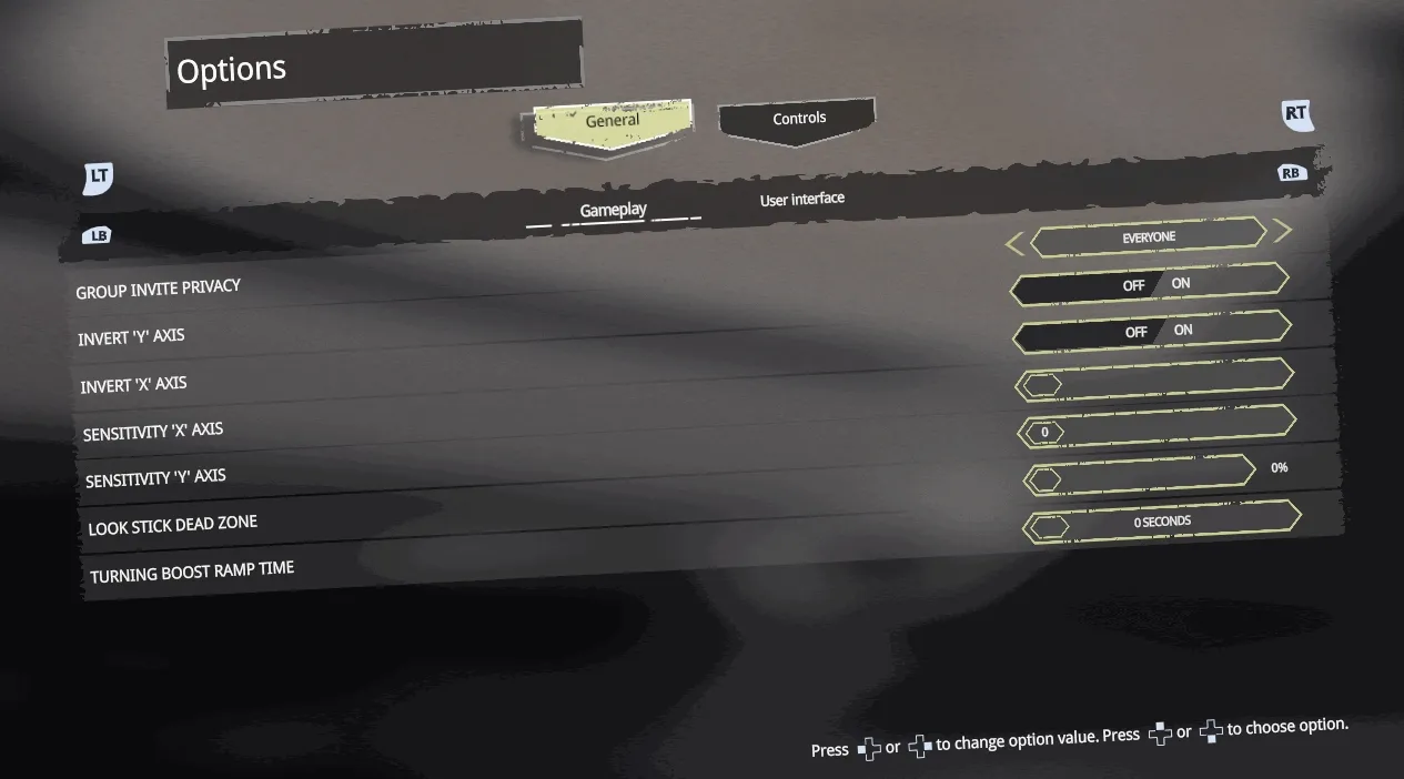
Showcase Overview
To illustrate the process of integrating gamepad support into your UI, we will expand upon the Skewed settings menu sample.
We will utilize the interaction manager to handle gamepad input and add our own logic to handle various actions. Notable additions in this sample include:
- Navigating through menus using gamepad controls.
- Selecting different options and adjusting their values via the gamepad.
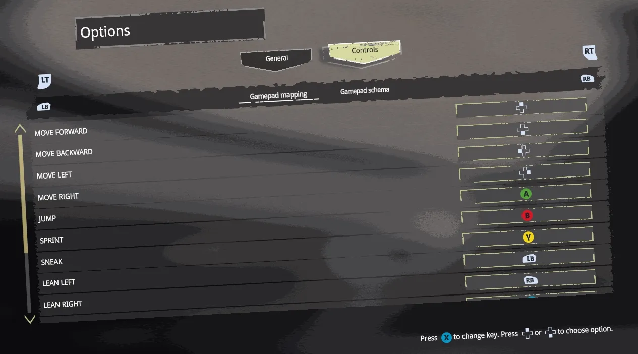
- Introduction of a new page for remapping in-game gamepad controls using the gamepad itself.
- Introduction of a new page displaying a graphic schema of the gamepad and providing tips for each button’s function in the game.
Source location and sample preview
You can find the complete sample source within the ${Gameface package}/Samples/uiresources/UITutorials/SkewedSettingsMenu directory.
To enable gamepad controls for the sample, follow these steps:
- Connect a gamepad to your PC.
- Build, run the sample, and play around using the gamepad. You can build and preview the sample in various ways:
- Run
npm run watch. This command starts a development server with a live reload. After running thewatchcommand, launch the Player using thePlayer.batfile and provide the followingurlargument:"--url=http://localhost:9000". - Run
npm run build. This command generates a production (minified) build in thedistfolder. Then you can run theindex.htmlfrom thedistfolder in the Player. - Run
npm run build:dev. This command creates a development build (non-minified) in thedistfolder. Then you can run theindex.htmlfrom thedistfolder in the Player.
- Run
Sample in details
Used assets
To showcase the gamepad buttons, we’ve utilized assets from the following free Figma file .
Interaction manager
To begin, we must install the interaction manager by running npm i coherent-gameface-interaction-manager within the ${Gameface package}/Samples/uiresources/UITutorials/SkewedSettingsMenu directory.
Define the gamepad controls mapping
The mapping for gamepad controls within the game is established through the gamepad-controls-model.js file. This file follows a structured format:
1[2 {3 actionName: 'Move forward',4 control: {5 alias: 'pad-up',6 icon: './gamepad-controls/dpad-up.svg'7 },8 },9 // other mappings10]In this structure:
actionNamespecifies the function of the control.control.aliasis utilized to designate the control alias, as defined in the interaction manager gamepad documentation.control.iconprovides the path to the control icon within theassets/gamepad-controlsdirectory.
Additionally, within this file, a flag named gamepadControls is defined. This flag toggles the gamepad support within the sample when it is built using relevant commands. When set to true, the sample will be built with gamepad support enabled. Moreover, the Controls/Keyboard mappings page will be hidden, and in its place, the Controls/Gamepad mappings and Controls/Gamepad schema pages will be visible.
Webpack configuration change
To enable the utilization of gamepad icons introduced in gamepad-controls-model.js, we must modify the webpack configuration slightly and integrate the copy-webpack-plugin. Follow these steps:
- Install the
copy-webpack-pluginby running:npm i --save-dev copy-webpack-plugin - Update the webpack configuration:
1...2 const CopyPlugin = require("copy-webpack-plugin");3...4new MiniCssExtractPlugin(),5new CopyPlugin({6 patterns: [7 { from: "assets/gamepad-controls", to: "gamepad-controls" },8 ],9}),],10module: {11...Enabling the gamepad in Gameface
Once the setup is complete, we can enable the gamepad in Gameface when gamepadControls variable is set to true.
src/index.js
1import { gamepad } from 'coherent-gameface-interaction-manager';2import { gamepadControls } from './gamepad-controls-model';3
4if (gamepadControls) {5    gamepad.enabled = true;6    gamepad.lessSensitive = true;7}
Disabling UI elements
When controlling the menu with or without a gamepad, it’s necessary to provide an option to disable parts of the UI that aren’t relevant. For instance, the Keyboard mappings submenu isn’t needed when a gamepad is connected. Instead, we require the ability to modify gamepad mappings, necessitating the enabling of two different submenus: Gamepad mappings and Gamepad schema. The same applies when the menu is controlled without a gamepad - in that case, we enable Keyboard mappings and disable the gamepad-related submenus.
To achieve this, upon initialization of the settings-page, we identify the elements to be hidden and remove them from the Document Object Model (DOM) using the .remove() method.
src/pages/settings-page/script.js
1import { gamepadControls } from '../../../../gamepad-controls-model';2...3removeNonRelevantElements() {4 if (gamepadControls) {5 this.querySelectorAll('[keyboard]').forEach((el) => el.remove());6 } else {7 this.querySelectorAll('[gamepad]').forEach((el) => el.remove());8 }9}10...11init(data) {12 this.setupTemplate(data, () => {13 components.renderOnce(this);14 // attach event handlers here15 window.requestAnimationFrame(() => {16 ...17 this.removeNonRelevantElements();18 ...19 });20 });21}Navigating options using gamepad controls
To facilitate option navigation within each page, a custom method is required to handle this functionality and trigger it upon pressing specific buttons on the gamepad. In this example, we’ll configure this operation for the pad-up and pad-down buttons (or the up/down arrows of the gamepad).

First, we need to implement an action in the interaction manager to manage the gamepad’s pad-up/down buttons. This is accomplished within the toggleGamepadActions method of the settings-page component.
1gamepad.on({2 actions: ['pad-up'],3 callback: () => this.selectOption(-1),4});5gamepad.on({6 actions: ['pad-down'],7 callback: () => this.selectOption(1),8});When selectOption is called with 1 or -1, it signifies the direction in which the next option should be selected. -1 indicates upward movement, while 1 indicates downward movement.
1selectOption(direction) {2    const activeSettingItem = this.activeOption;3    // If there is no selected option we need to select the first one4    if (!activeSettingItem) return this.activeSubPanel.querySelector('settings-item').classList.toggle('active', true);5
6    // We get like that the next options we need to select based on the direction - up or down7    const optionToSelect = direction === 1 ? activeSettingItem.nextElementSibling : activeSettingItem.previousElementSibling;8    if (!optionToSelect) return;9
10    activeSettingItem.classList.toggle('active', false);11    optionToSelect.classList.toggle('active', true);12    // If the option is not visible we need to scroll to it13    this.scrollToElement(optionToSelect);14}
Using the native nextElementSibling and previousElementSibling, we can obtain the previous and next elements to be selected. Since the options are arranged vertically within a gameface-scrollable-container, it’s possible to select an option that isn’t visible. Hence, scrolling the scrollable container is necessary to make the option visible. This is achieved by calling the scrollToElement method, which performs the following:
1scrollToElement(element) {2 // The element with class .guic-scrollable-container has overflow scroll so we need it.3 const scrollableContainer = this.scrollableContainerComponent.querySelector('.guic-scrollable-container');4 // element.offsetTop + element.offsetHeight will make the element visible at the bottom of the scrollable container so we multiply the element height by 3 so5 // it is scrolled in the middle of the container.6 const diff = element.offsetTop + element.offsetHeight * 3 - scrollableContainer.offsetHeight;7 scrollableContainer.scrollTop = diff >= 0 ? diff + element.offsetHeight : 0;8 // Call the onScroll method of the scrollable container to visually reflect the scrollTop changes9 this.scrollableContainerComponent.onScroll();10}Adjusting option values using a gamepad
When navigating through menu options, it becomes necessary to facilitate the modification of their values using a gamepad. To achieve this functionality, the pad-left and pad-right actions (or the left/right arrows on the gamepad) are utilized within the provided sample.
Each option within the menu may consist of various components such as rangeslider, stepper, or radio buttons, each requiring a different approach for value adjustment when the gamepad arrows are pressed.
To begin, an interaction manager action is added to handle the gamepad’s pad-left/right buttons. This is implemented within the toggleGamepadActions method of the settings-page component.
1gamepad.on({2 actions: ['pad-left'],3 callback: () => this.updateOptionValue(-1),4});5gamepad.on({6 actions: ['pad-right'],7 callback: () => this.updateOptionValue(1),8});The updateOptionValue method performs the following actions:
1updateOptionValue(direction) {2 if (!this.activeOption) return;3 // Retrieves the option - all options are gameface components.4 const option = this.activeOption.querySelector('[slot="option"]').children[0];5 switch (option.tagName) {6 case 'GAMEFACE-STEPPER': {7 option[direction === 1 ? 'next' : 'prev']();8 break;9 }10 case 'GAMEFACE-RANGESLIDER': {11 if (direction === 1) option.value += 1;12 else option.value -= 1;13 break;14 }15 case 'GAMEFACE-RADIO-GROUP': {16 option[direction === 1 ? 'setCheckedToNextItem' : 'setCheckedToPreviousItem'](option.querySelector('[aria-checked="true"]'));17 break;18 }19 }20}- The stepper component provides methods
stepper.nextandstepper.prevfor adjusting its value. - To adjust the value of a rangeslider, the
rangeslider.value += 1; or -= 1syntax is utilized. - The radio group offers
setCheckedToNextItemandsetCheckedToPreviousItemmethods, that accept the currently selected radio button as an argument. It can be retrieved throughradiogroup.querySelector('[aria-checked="true"]').
Navigating settings menus and submenus using a gamepad
To enable interaction with all menus using a gamepad involves implementing an interaction manager action to handle gamepad buttons such as left/right-shoulder-bottom and left/right-shoulder. The implementation is located within the toggleGamepadActions method of the settings-page component.

1// Actions for changing the main tabs2gamepad.on({3    actions: ['left-sholder-bottom'],4    callback: () => this.selectMainTab(-1),5});6gamepad.on({7    actions: ['right-sholder-bottom'],8    callback: () => this.selectMainTab(1),9});10
11// Actions for changing the subtabs of the current main tab12gamepad.on({13    actions: ['left-sholder'],14    callback: () => this.selectSubTab(-1),15});16gamepad.on({17    actions: ['right-sholder'],18    callback: () => this.selectSubTab(1),19});
The selectMainTab and selectSubTab methods perform the following tasks:
1selectMainTab(direction) {2    this.tabsComponent.selectTab(this.tabsComponent[direction === -1 ? 'getPrevTab' : 'getNextTab']());3    // If there is no active sub menu tab, select the first one4    if (!this.activeSubPanel) {5        const subTabs = this.activeMainPanel.querySelector('gameface-tabs');6        subTabs.selectTab(subTabs.getFirstTab());7    }8}9
10selectSubTab(direction) {11    const subGamefaceTabs = this.activeMainPanel.querySelector('gameface-tabs');12    subGamefaceTabs.selectTab(subGamefaceTabs[direction === -1 ? 'getPrevTab' : 'getNextTab']());13}
Utilizing the methods selectTab, getPrevTab, and getNextTab from the gameface-tabs component, we can efficiently manipulate the main and sub tabs programmatically via JavaScript.
Creating a gamepad mappings page
In the ${Gameface package}/Samples/uiresources/UITutorials/SkewedSettingsMenu/src/pages/settings/controls directory, we’ve implemented a page named Gamepad mappings. This page allows users to remap their gamepad controls for use within the game. Navigation through the options is facilitated by using the gamepad’s pad-up and pad-down controls. Upon selecting an option by pressing the X button, users can then press any button on the gamepad to replace the existing one.
Here’s how we accomplished this:
- Dynamically generated options based on the model outlined in
gamepad-controls-model.js. - Developed a
gamepad-selectcomponent, visually indicating when a key is being changed. - Implemented logic to handle gamepad input for remapping keys.
The dynamic options are generated by the setOptions method within the gamepad-mapping component, located in /SkewedSettingsMenu/src/pages/settings/controls/gamepad/script.js.
1setOptions() {2    const itemsContainer = this.querySelector('[slot="items"]');3    itemsContainer.innerHTML = '';4
5    model.forEach(({ actionName, control }) => {6        const settingsItem = document.createElement('settings-item');7        settingsItem.innerHTML = `8        <span slot="label">${actionName}</span>9        <div slot="option">10            <gamepad-select>11                <div class="gamepad-btn-icon" style="background-image:url(${control.icon})" slot="btn-icon"></div>12            </gamepad-select>13        </div>14        `;15        settingsItem.id = control.alias;16        itemsContainer.appendChild(settingsItem);17    });18}
To enable control changes, we’ve added an action for when the gamepad’s X button is pressed. This interaction is managed through the interaction manager:
1gamepad.on({2 actions: ['face-button-left'],3 callback: () => this.selectOption(),4});In the selectOption method, the selected control becomes active, awaiting input from another button on the gamepad to replace it.
1selectOption() {2    const option = this.querySelector(`settings-item.active`);3    if (!option) return;4
5    this.activeControl = option.id;6    option.querySelector('gamepad-select').classList.add('active');7    // A brief delay is implemented to prevent accidental selection due to fast polling in interaction manager.8    setTimeout(() => this.toggleButtonsGamepadActions(true), 300);9}
The toggleButtonsGamepadActions method is responsible for adding actions for all buttons on the gamepad defined in gamepad-controls-model.js. Its purpose is to detect the next clicked button from the gamepad to be chosen as the new one.
1toggleButtonsGamepadActions(on) {2 model.map((control) => control.control.alias).forEach((button) => {3 if (on) {4 gamepad.on({5 actions: [button],6 callback: () => this.onGamepadButtonPressed(button),7 });8 } else {9 gamepad.off([button]);10 }11 });12}Additionally, when a new button is selected, we need to deactivate the actions from the interaction manager to prevent their execution when unnecessary.
Once a new gamepad key is chosen, the old control is swapped with the new one both in the UI and in the model.
1onGamepadButtonPressed(button) {2    this.swapControls(button, this.activeControl);3    this.toggleButtonsGamepadActions(false);4}5
6swapControls(newBtn, oldBtn) {7    const oldBtnIndex = model.findIndex(({ control }) => control.alias === oldBtn);8    const newBtnIndex = model.findIndex(({ control }) => control.alias === newBtn);9    const oldOption = this.querySelector(`#${oldBtn}`);10    const newOption = this.querySelector(`#${newBtn}`);11
12    if (newBtn === oldBtn) {13        oldOption.querySelector('gamepad-select').classList.remove('active');14        return;15    }16
17    oldOption.id = model[newBtnIndex].control.alias;18    oldOption.querySelector('.gamepad-btn-icon').style.backgroundImage = `url(${model[newBtnIndex].control.icon})`;19    oldOption.querySelector('gamepad-select').classList.remove('active');20    newOption.querySelector('.gamepad-btn-icon').style.backgroundImage = `url(${model[oldBtnIndex].control.icon})`;21    newOption.id = model[oldBtnIndex].control.alias;22
23    const tempIcon = model[oldBtnIndex].control.icon;24    const tempAlias = model[oldBtnIndex].control.alias;25    model[oldBtnIndex].control.icon = model[newBtnIndex].control.icon;26    model[oldBtnIndex].control.alias = model[newBtnIndex].control.alias;27    model[newBtnIndex].control.icon = tempIcon;28    model[newBtnIndex].control.alias = tempAlias;29}
Creating the gamepad scheme page
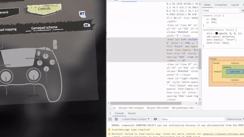
In Gameface, generating a detailed breakdown of each gamepad key’s function upon clicking is easily achievable with a small amount of JavaScript and SVG.
You can find the page showcasing this breakdown at /SkewedSettingsMenu/src/pages/settings/controls/gamepad-schema.
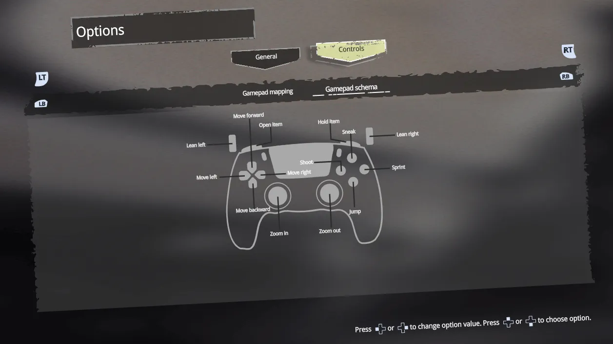
SVG gamepad preparation
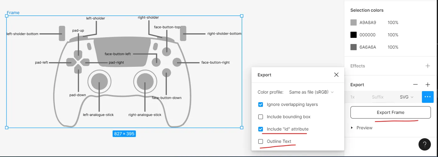
To create this breakdown, we first need to craft the gamepad in SVG format. We utilized Figma for this task because it allows direct export of textures into SVG while preserving element IDs. This feature is incredibly powerful as it enables dynamic control changes for each gamepad key.
You can directly access our design document on Figma here .
Once you’ve opened the file, select the frame, and navigate to Design -> Export. Change the export mode to SVG, then from the three dots, ensure that Include "id" attribute is checked and Outline text is unchecked. Afterward, export the frame into SVG. You can preview the SVG file’s content into /SkewedSettingsMenu/src/pages/settings/controls/gamepad-schema/template.html.
Following this step, some modifications are necessary to ensure everything functions properly:
- Add
xandyattributes to thetextelements to position them correctly within theSVGin Gameface. This task is easily accomplished using the inspector in Gameface. - Change the
fillto white. - Remove the
tspanelements as they are unnecessary. - Remove the
xml:space="preserve" style="white-space: pre" font-family="Inter" font-size="12" letter-spacing="0em"attributes from the text, as they are redundant. - Add the appropriate
text-anchorattribute (middle,start, orend) to each text element based on its position. This ensures that when new text is dynamically added, the space expands in the correct direction relative to the text element.
Adding the controls
After obtaining the SVG schema, the next step involves dynamically integrating controls into the SVG text elements associated with gamepad keys.
1init(data) {2    this.setupTemplate(data, () => {3        components.renderOnce(this);4        this.setControls();5        document.addEventListener('gamepad-controls-changed', this.setControls);6    });7}8
9setControls() {10    model.forEach(({ control, actionName }) => {11        const svgTextElement = this.querySelector(`#${control.alias}`);12        if (!svgTextElement) return;13
14        svgTextElement.textContent = actionName;15    });16}
In the setControls function, the script locates the SVG text element corresponding to each gamepad control from the model and updates its textContent with the relevant action name.
Furthermore, to ensure that the schema updates dynamically when the gamepad mappings change, a custom event listener is added via document.addEventListener('gamepad-controls-changed', this.setControls). This listener triggers the setControls function whenever the gamepad controls model is altered from the Gamepad mappings page.