Create Awesome Crosshair!

Hey guys, in this short tutorial we will show you how to create crosshair for you game ui, using HTML and CSS. The crosshair position will be always in the center of your game view.
Adding a simple crosshair to the page
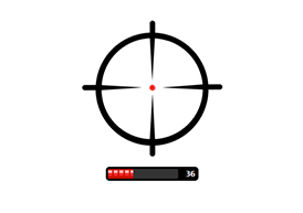
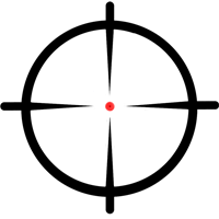
In most of the cases, we need to put the crosshair in the center of the screen without any other elements around it. In order to do that, you should first choose a picture of the crosshair. After that, we will show you the HTML markup of the page. We chose the following picture for the demo:

|
1 2 |
<img src="img/crosshair_small.png" class="crosshair" /> |
In this case, we need to put only one img tag with class crosshair in our body tag.
|
1 2 3 4 5 6 7 8 |
.crosshair { position: absolute; top: 50%; left: 50%; display: block; -webkit-transform: translateY(-50%) translateX(-50%); } |
In order to center the crosshair you have to set the top and left position to 50%. The property transform should be set to translateY(-50%) and translateX(-50%). The CSS property transform is usually used for rotating and scaling elements, but through the translateY and translateX function we can vertically and horizontal align elements.
Adding a crosshair with dynamic content
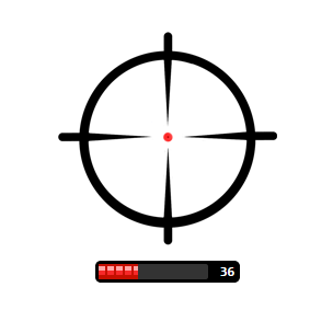
For the purposes of the example, let us accept that we would like to put some content, attached right after the crosshair. In the particular example we will attach ammo type and we will put the text for the ammo counter and progress bar.
|
1 2 3 4 5 6 7 8 9 10 |
<div class="crosshair-wrapper"> <img src="img/crosshair_small.png" class="crosshair" /> <div class="progress-outer"> <div class="progress-inner"> <div class="progress"></div> </div> <span class="progress-value">36</span> </div> </div> |
Again after body tag we have to put the following HTML snippet.
|
1 2 3 4 5 6 7 8 9 10 11 12 13 14 15 16 17 18 19 20 21 22 23 24 25 26 27 28 29 30 31 32 33 34 35 36 37 38 39 40 41 42 43 44 45 46 47 48 49 |
body { background: #DCD3CD; } .crosshair-wrapper { position: absolute; top: 50%; left: 50%; height: 200px; // important for the centering of the crosshair image transform: translateY(-50%) translateX(-50%); } .crosshair { display: block; } .progress-outer { position: relative; margin: 10px auto; padding: 3px; height: 14px; width: 126px; background: #000; -webkit-border-radius: 5px; } .progress-inner { width: 100px; background: #333; -webkit-border-radius: 2px; } .progress { width: 36px; height: 14px; background: #EE2524 url(../img/red-bullet.png); } .progress-value { position: absolute; top: 3px; right: 5px; color: #fff; font-size: 12px; font-weight: bold; font-family: monospace; } |
In this case we have to set the position and transform properties on our parent crosshair-wrapper element. Note that crosshair-wrapper must have a height property, which must be the same height as of our crosshair image. In such a way you will fix the vertical centering of crosshair icon relative to its height but, not to the height of the crosshair-wrapper. The final result will be:
Check out the live demo here
Download the source code here

