
Symbol Playback

In this tutorial, we will illustrate how to create a four-state button’s layout using Adobe Animate, export HTML markup and CSS styles with Coherent Exporter Add-on and show you how to control the playback of the button with Web Animations API.
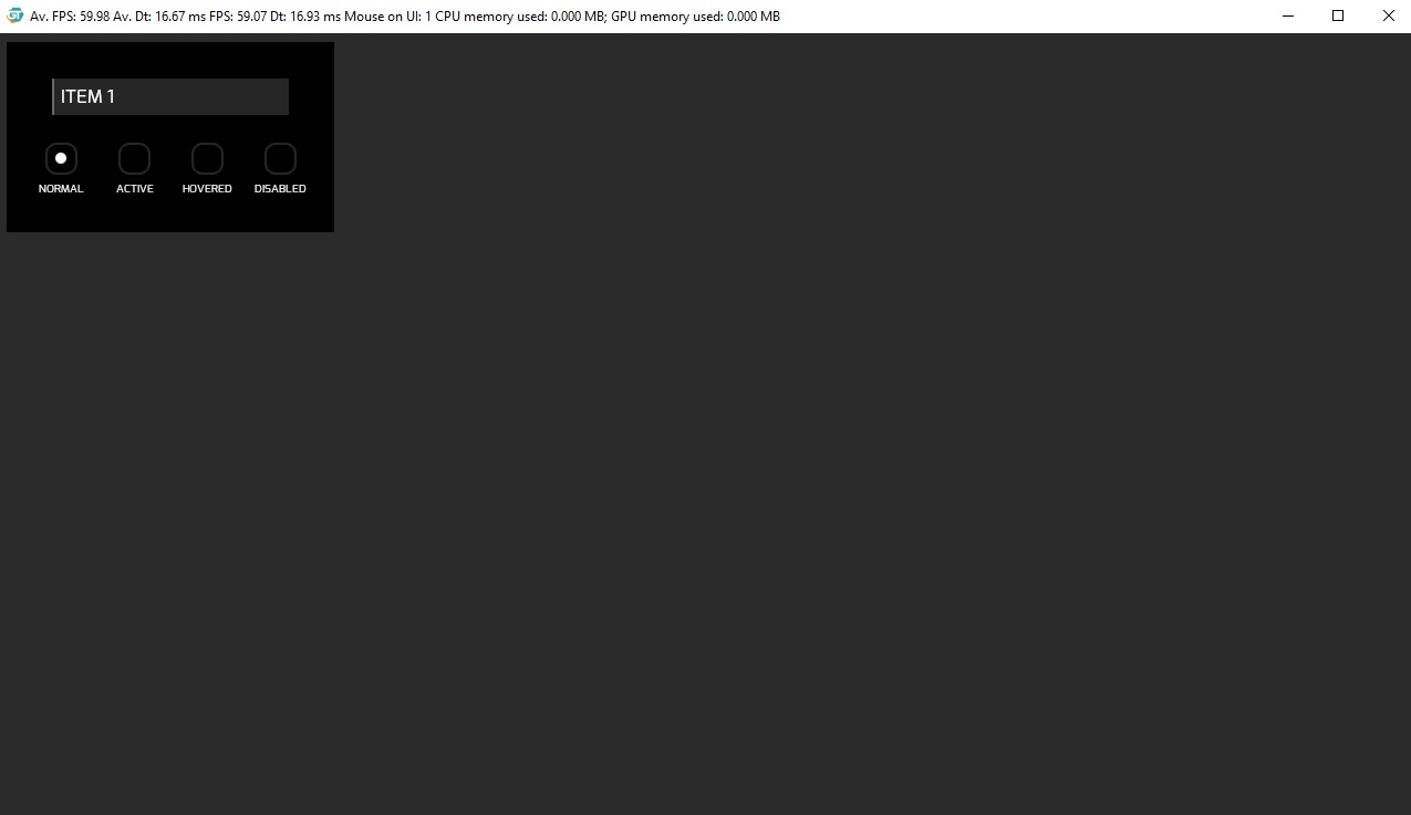
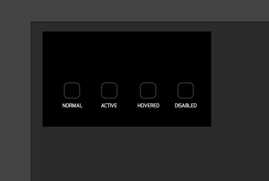
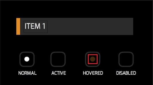
For design reference, we will use the four-state button, part of our Common Components Kit:
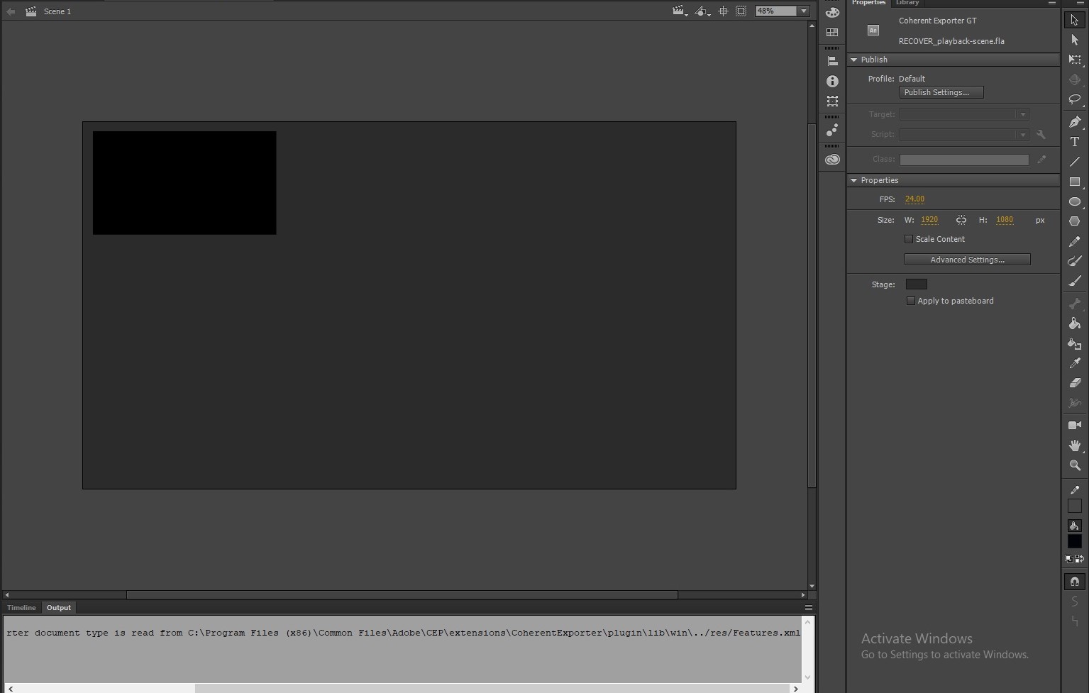
Create new scene
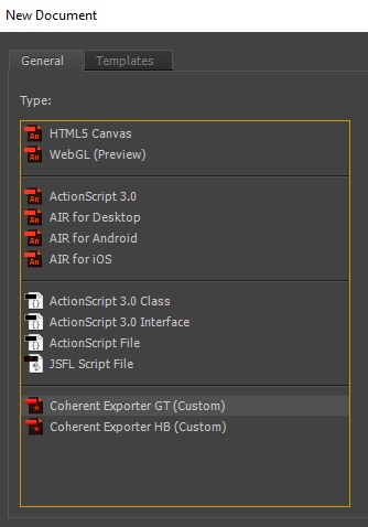
From the “File” menu choose “File/New”. From the window that opens select “Coherent Exporter GT (Custom)”:
A new Scene opens. From the Properties menu on the right side of the window, enter width and height of the Scene (we will use 1920px by 1080px). You can also set the background color of the scene from the Stage’s color picker (we will use #2B2B2B).
Arrange the layout
First of all, let’s create the background of our button. Select the Rectangle Tool and set its characteristics:
- from properties menu, set the stroke color to none
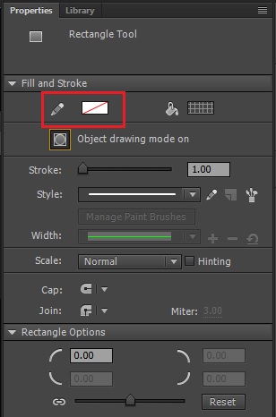
We are removing the stroke, because the Exporter will create extra elements for the border of the element, in that case, we don’t need it.
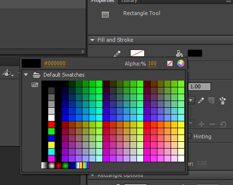
- choose black fill for the rectangle
- create a rectangle as in the reference image below (
540pxby300px)
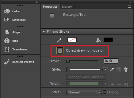
Note: When you are crafting geometric shapes, make sure the Object drawing mode on is active. If this mode is off, the shapes will be overlaid and when you attempt to move them they will tear.
- create the four states shapes of the button
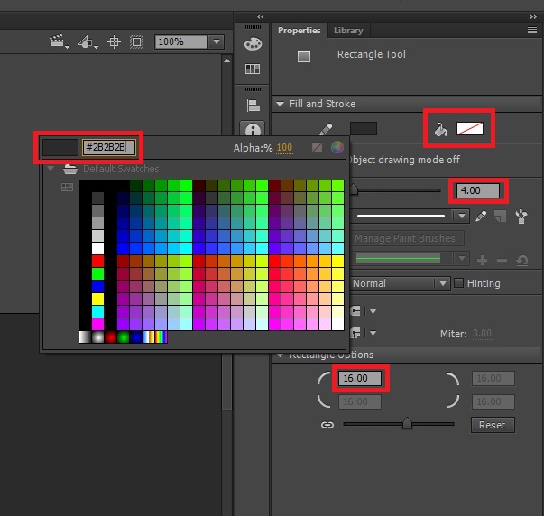
Select the Rectangle Tool again and set the following properties: choose 4.00 units for the width of the stroke, the color of the stroke will be #2B2B2B, then remove the Fill of the rectangle. In the Rectangle Options field choose 16.00 units, this feature is responsible for the border radius of the shape of our states. The image below shows these settings:
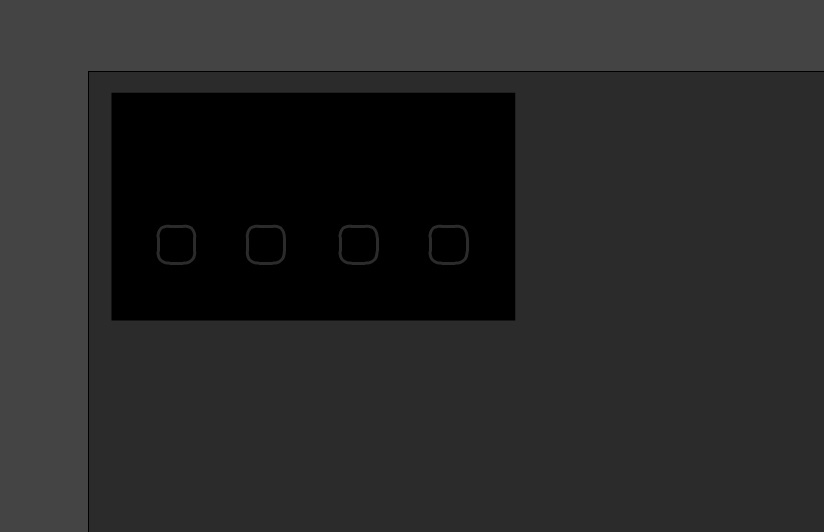
Now craft the state button shape with width and height 50px by 50px.
You can duplicate this shape, by selecting it with the Select Tool (shortcut: V) and copy/paste it three times (shortcuts: Ctrl + C and Ctrl + V). Now arrange the shapes to match the reference image:
- add text for the states
Choose the Text Tool from Properties menu, set its Family to a font of your choice, in this sample we use Exo font, set the size of the text to 16.0pt and the color to #FFFFFF. Type the following under every state shape:
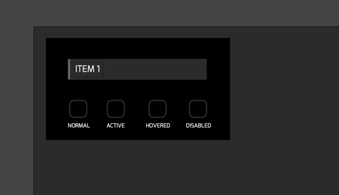
- create the button
With the techniques we’ve created the elements above, craft the button to match the reference image:
Now we’ve created the background of the four-state button, which will remain static. The rest of the elements will be animatable which require different techniques.
Create the animations
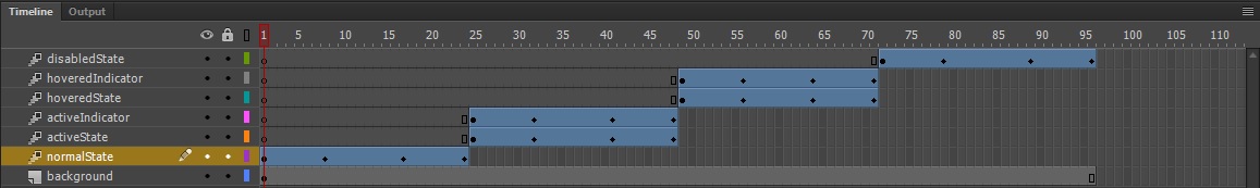
In order to add animations to the elements, we have to create a separate Layer for each element, convert it to Symbol and add an Animation Tween. To make the elements appear and disappear we will change their Alpha value at sequence time intervals.
Note: In Adobe Animate one second is equivalent to 24 frames by default. We will animate each of the four states of the button for one second, so the whole animation’s duration will last 96 frames.
As you can see Adobe Animate has already created a Layer 1 by default. It holds our button’s background. We have to add 96 empty frames to this Layer which will preserve the background static, during the animations. In order to do that right click the 96th frame and select Insert Frame:
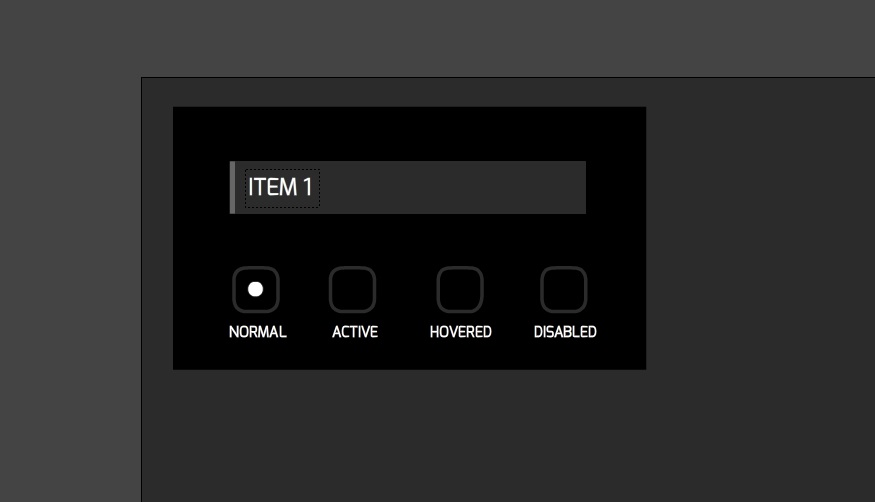
Now create a new Layer for the normal state of the button, this is the white dot in the center of the first rectangle. While you are in this Layer, craft a circle as in the reference image (d=18px):
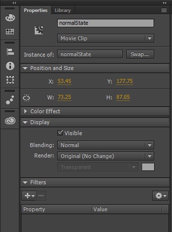
Select the circle, right click on it and choose Convert to Symbol option, in the window that appears add a Symbol name – normalState. From the properties menu, give it an instance name too.
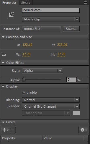
In order to animate the Symbol, add a Мotion Тween (right click on the Symbol and select Create Motion Tween). This will create 24 frames by default. Now let’s animate the Alpha value of the Symbol. At the beginning of the animation this value will be 0%. Navigate the Timeline’s playhead to the first frame. From the properties menu set the Alpha value to 0%:
Navigate the playhead to the 8th frame and change the opacity of the element to 100%. On the 18th frame, the opacity should stay 100%. At the end of the motion tween (the 24th frame), set the Alpha value again to 0%. You can quickly preview your animation by “scrubbing” the red playhead back and forth on the Timeline or click on the play button at the bottom of the Timeline.
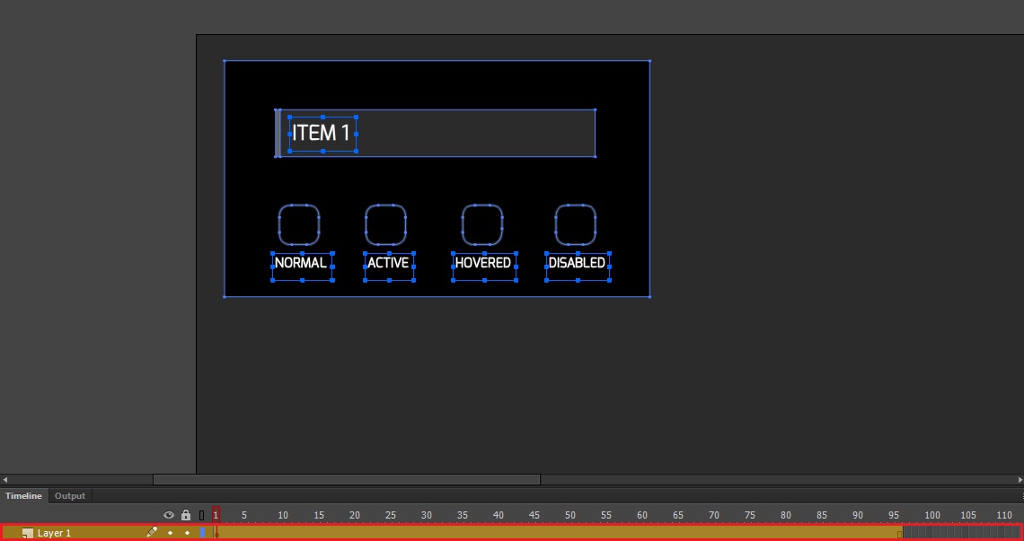
With the techniques we’ve created the normal state symbol and its animations, create the following Layers (highlighted with red), convert them to Symbols and add Motion Tweens:
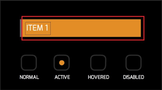
- the active state:
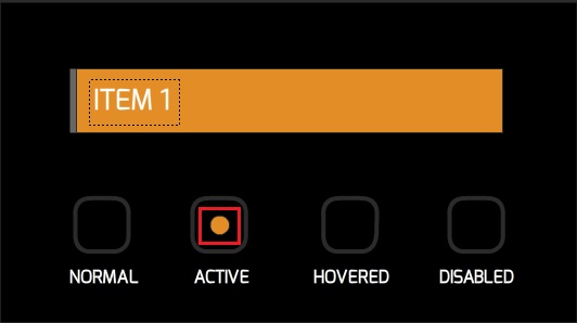
- the active state indicator
- the hovered state:
- the hovered state indicator
- the disabled state:
In the Timeline create the following animations changing the Alpha values from 0% to 100% of the elements:
Publish and preview
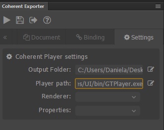
From the Coherent Exporter menu, go to Settings and navigate the Player path to the folder where your GT Player is. For Output Folder choose your working directory.
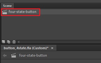
Click on the Publish then Preview button, a CoherentGT Player will appear with the four-state button. Check out your working directory. Coherent Exporter has created a folder with CSS styles, another one for images (when there are complex shapes, Exporter converts them to SVGs) and published the markup in Scene_1.html. You can change the name of the exported HTML by renaming the Scene, from the Animate’s Window drop-down menu select Scene and type a name of your choice:
Let’s look at the markup:
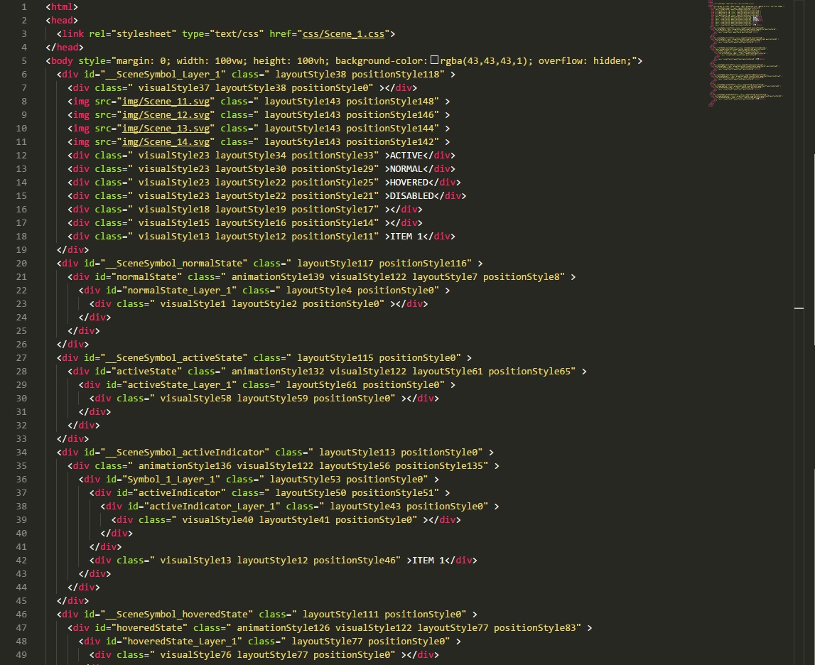
The DOM elements are nested correctly. The IDs for the elements are our Symbol’s names, also there are some classes that the Exporter has generated. The classes that start with visualStyle are responsible for the visual CSS properties like color, font-size, font-family etc., those with layoutStyle – for the element’s width and height, those with position – for the element’s position.
Add the JavaScript code
Thanks to the Exporter, you can add custom JavaScript files that allow you to create interactions that are not possible with the Timeline alone.
Note: In order to take advantage of the Web Animation API’s power, we will use the WAAPI polyfill. Here is the link to download the library, then include it in your project.
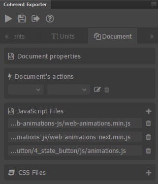
Go to Document tab of the Coherent Exporter menu and add web-animations.min.js and web-animations-next.min.js files. In your working directory, create a new folder with a JavaScript file that will hold the code which will control the animation of the four-state button:
Add the following code to your custom JavaScript file:
|
1 2 3 4 5 6 7 8 9 10 11 12 13 14 15 16 17 18 19 20 21 22 23 24 25 26 27 28 29 30 31 32 33 34 35 36 37 38 39 40 41 42 43 44 45 46 47 48 49 50 51 52 53 54 55 56 57 58 59 60 61 62 63 64 65 66 67 68 69 70 71 72 73 74 75 76 77 78 79 80 81 82 83 84 85 86 87 88 89 |
var normalState = document.querySelector("#normalState"); var activeState = document.querySelector("#activeState"); var activeStateIndicator = document.querySelector("#activeIndicator"); var hoveredState = document.querySelector("#hoveredState"); var hoveredStateIndicator = document.querySelector("#hoveredIndicator"); var disabledState = document.querySelector("#disabledState"); normalState.classList.remove("animationStyle124"); activeState.classList.remove("animationStyle117"); activeStateIndicator.classList.remove("animationStyle121"); hoveredState.classList.remove("animationStyle111"); hoveredStateIndicator.classList.remove("animationStyle114"); disabledState.classList.remove("animationStyle108"); var keyframes = [ { opacity: 0 }, { opacity: 1 }, { opacity: 1 }, { opacity: 0 } ] var normalAnimation = normalState.animate( keyframes, { duration: 1000, delay: 1000, iterations: Infinity }); var activeAnimation = activeState.animate( keyframes, { duration: 1000, delay: 2000, iterations: Infinity }); var activeIndicatorAnimation = activeStateIndicator.animate( keyframes, { duration: 1000, delay: 2000, iterations: Infinity }) var hoveredAnimation = hoveredState.animate( keyframes, { duration: 1000, delay: 3000, iterations: Infinity }); var hoveredIndicatorAnimation = hoveredStateIndicator.animate( keyframes, { duration: 1000, delay: 3000, iterations: Infinity }); var disabledAnimation = disabledState.animate( keyframes, { duration: 1000, delay: 4000, iterations: Infinity }); document.querySelector('.visualStyle37').addEventListener('mouseover', function() { normalAnimation.pause(); activeAnimation.pause(); activeIndicatorAnimation.pause(); hoveredAnimation.pause(); hoveredIndicatorAnimation.pause(); disabledAnimation.pause(); }); document.querySelector('.visualStyle37').addEventListener('mouseout', function() { normalAnimation.play(); activeAnimation.play(); activeIndicatorAnimation.play(); hoveredAnimation.play(); hoveredIndicatorAnimation.play(); disabledAnimation.play(); }); document.body.addEventListener('click', function() { normalAnimation.playbackRate = 1.8; activeAnimation.playbackRate = 1.8; activeIndicatorAnimation = 1.8; hoveredAnimation.playbackRate = 1.8; hoveredIndicatorAnimation = 1.8; disabledAnimation.playbackRate = 1.8; }); |
Now publish and preview the Scene, the code above allows you to pause the four-state button’s animation by hovering on it, when removing the mouse cursor, you will play the animation again. You can speed up the animations by clicking on the document’s body.