Using Coherent Menu Kit

One of our largest goals while developing Coherent UI is to create a product which makes your work easier. For the past two years we’ve been saving tons of time for many of our clients and the next step is to save even more! We’ve prepared several ready-to-use kits to easily kick-start your UI.
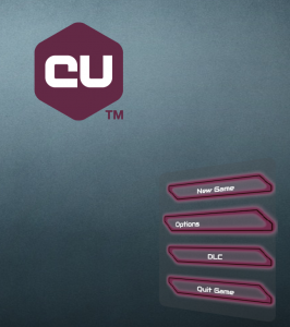
This post will introduce you to the first of our kits, namely the Menu kit available in Coherent UI 2.5.
What is it?
The Menu Kit is an extension to our JS Framework (see more here) that lets you save on boilerplate code when designing your menus.
You can see a live demo here.
How do I get started?
Firstly, include our stylesheet and JavaScript in your HTML document:
|
1 2 |
<link rel="stylesheet" type="text/css" href="menukit/lib/css/main.css" /> <script type="text/javascript" src="menukit/lib/js/menu.js"></script> |
Tell us what buttons you’d like to have in your menu and what should they do:
|
1 2 3 4 5 6 7 8 9 10 11 12 13 14 15 16 17 18 19 20 21 22 23 24 25 26 27 28 29 30 31 |
function resumeGame() { // Continue playing } function showSettings() { // So you'd like to change the volume? } function quit() { // Bye, bye } var mainMenuButtons = [ { label: 'Resume Game', callback: resumeGame }, { label: 'Player Options', callback: showSettings }, { label: 'Quit', callback: quit } ]; var settingsMenuButtons = [ // Audio, Video, Gameplay settings... ] // Next, create the menu: var mainMenu = new GameMenu({ buttons: mainMenuButtons, }); var settingsMenu = new GameMenu({ buttons: settingsMenuButtons, }); |
And that’s it – now you have two menus centered on your page.
What can I do with them?
Well, you can hide and show them. Recall the callback functions we declared above. Here’s a sample implementation:
|
1 2 3 4 5 6 7 8 9 10 |
function resumeGame() { // HIDE ALL THE THINGS! optionsMenu.hide(); mainMenu.hide(); } function showSettings() { mainMenu.hide(); optionsMenu.show(); } |
Use the Menu kit to customize the menus
The previous section outlined basic usage of the menu kit but we want to present several other useful features.
Predefined styles
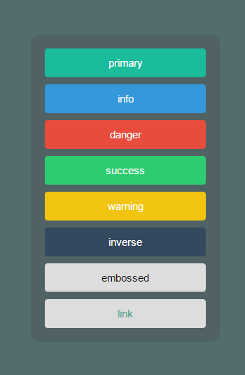
Our buttons come equipped with a few predefined styles.
- primary
- info
- danger
- success
- warning
- inverse
- embossed
- link
They are set on a per-button basis:
|
1 2 3 4 5 |
var mainMenuButtons = [ { label: 'Resume Game', style: "inverse", callback: resumeGame }, { label: 'Player Options', style: "info", callback: showSettings }, { label: 'Quit', style: "danger", callback: quit } ]; |
The default value is primary.
Custom styles
In the case that these styles don’t fit your needs, you can always roll a style of your own. All it takes to accomplish that is to override the css class named btn-my-style-name and pass my-style-name as the style property of your buttons:
|
1 2 3 4 5 6 7 8 9 |
btn-custom { background-color: rgba(0, 0, 0, 0); /* I need no background*/ } btn-custom:hover { background-color: #eee; /* But I'd like to highlight the selected button */ } |
|
1 2 3 4 5 |
var mainMenuButtons = [ { label: 'Resume Game', style: "custom", callback: resumeGame }, { label: 'Player Options', style: "custom", callback: showSettings }, { label: 'Quit', style: "custom", callback: quit } ]; |
It’s worth mentioning that you may need to increase the specifics of your css selector in order to override ours. The easiest way to do this is to use button.btn-custom instead of btn-custom. Read more about selector specificity at mdn.
Menu parent and offset
By default the menu is added as a child of the body element of your document.
In case you want to change the menu’s parent, set the parent option when creating the GameMenu:
|
1 2 3 4 5 6 7 8 |
var parent = document.getElementById("my-menu-wrapper"); // Alternatively, // var parent = "#my-menu-wrapper"; var mainMenu = new GameMenu({ buttons: mainMenuButtons, parent: parent, }); |
By default, menus are centered both horizontally and vertically in their parent.
Override the originPos property to change that:
|
1 2 3 4 5 |
var mainMenu = new GameMenu({ buttons: mainMenuButtons, parent: parent, originPos: "top-left", }); |
originPos can take the following values:
- A relative value as a string:
- ”top-left”, “top-right”,
- “center-top”, “center-left”, “center-right”, “center”, “center-bottom”,
- “bottom-left”, “bottom-right”
- An absolute value in pixels as an object:
- var position = { top: 300, left: 200 };
Finally, you can change the fixedOffset property which controls whether you use pixels or percents when computing the offset. By default we are using percents.
|
1 2 3 4 5 6 |
var mainMenu = new GameMenu({ buttons: mainMenuButtons, parent: parent, originPos: "top-left", fixedOffset: true, // Use pixels instead of percents }); |
Wrap-up
When designing the Menu kit, our main goal was to provide you with a framework that works out of the box. If you have any suggestion for improvement upon it, be it its ease of use or a feature you’d like to see, you are welcome to write to us in the forum or on twitter! Stay tuned for the other upcoming kits.


