Presentation of a complete FPS Interface Kit

For those of you who are interested in the creation of concept art and interface for video games, we created a complete FPS (First Person Shooter) Interface Kit. The Kit includes the most essential user interface components, commonly used in a modern FPS AAA game, and has the look and feel of such a game. This post covers all background illustrations rendered in sci-fi style.
Visual Style
For this FPS Interface Kit, we decided to create a “fictional” game and use it as a foundation and reference when producing the illustrations.This is the short description of the fictional world where the game takes place:
Working title: Voidzone
“500 years from now, in a post-apocalyptic Еarth, the humankind is almost extinct. All major cities and infrastructures are wiped out by unknown alien race. The player takes the role of Michael Jensen, a mech pilot guarding one of the last human outposts.”
We wanted to achieve nice contrast between slick and transparent UI and highly detailed background illustrations. We designed the UI to work on two platforms – PC and consoles.
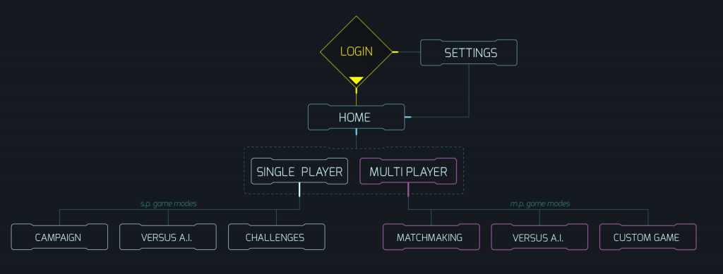 Flowchart diagram of our game screens
Login Screen
The login screen of the FPS Interface Kit has three main elements: main buttons,- on the left side of the screen,- login panel, logo and а footer.
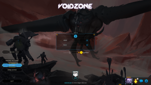 The final result for the login screen
Our goal here was to create simple minimalistic UI and full screen high detailed thematic background. We chose warmer color palette for the background image and colder color palette, with yellow accents, for the UI’s. Contrary to the standard approach to science fiction interfaces, we chose more simpler unobtrusive forms for the UI. Thus, the interface would be easy to read.
Home Screen
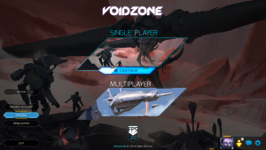
After login, the player can choose between two types of game modes – single player and multiplayer
 Final Image of the home screen
At the bottom right of the home screen there are player avatar, friends icon, chat and account settings options.
Setting Screen
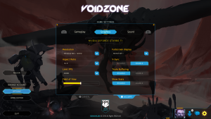
This screen has three tabs with the most common options in each modern videogame – gameplay, graphics and sound.
 This screen is modal and looks the same way in the game menus and in-game.
All UI components are modular and can be easily reused. The UI scales for all resolutions and aspect ratios.
Mission Selection Screen
This screen of the FPS Interface Kit appears when the player chooses single player mode:
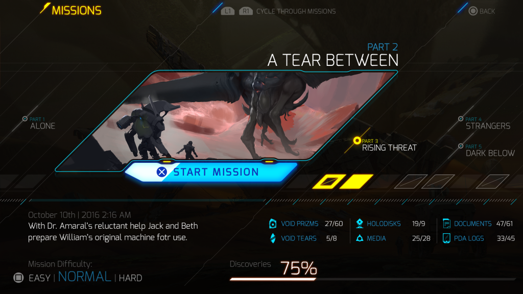 Final Image of the mission selection
The layout is divided in three main parts – header/navigation bar, selected mission and mission bar.
The missions are represented by the small glowing yellow circles which appear with animation on the diagonal grid. Every mission’s item has name, full color illustration, briefing and discoveries status. Тhe main element in this layout – the ‘mission selector,’- is made to contrast with the other elements. Also, all info panels are designed to be easy to read by lowering the alpha of the supporting graphic elements.
In-game interface
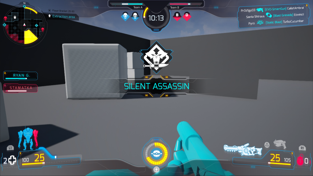
For this preview, we used the default assets in Unreal Engine 4. You can see that there are transparent ‘ornaments’ that represent the main character’s mech suite, which are located below the UI. These ‘ornaments’ are made to complement the UI in a non-intrusive way.
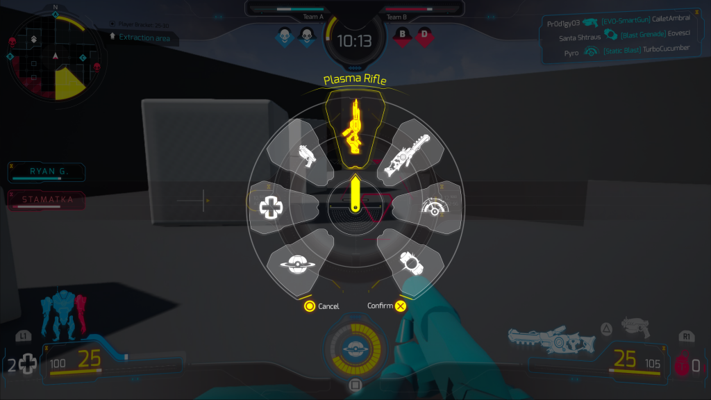
We have a visualisation of all common UI elements – equipment weapons, player/suite health, minimap, chat, team timer and reticle.
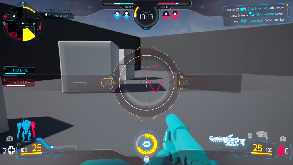 Final look and feel of the in-game interface
Final thoughts
We hope that you find this presentation interesting. Next time, we will share more technical information, details about the workflow and how we did the animations.
If you have any questions about the creation of concept art and interface for video games, write a comment below.

