
Data-Binding Common Game UI – Part II

In the first part of our Data-Binding Common Game UI blog post, we introduced Coherent’s declarative JavaScript data-binding and gave some easy to follow examples. In this second part, we will cover key moments in creating 4 data-bound elements.
Tip: If you are new to data-binding check out the first part of the post.
The elements covered in this post will be the following.
- Overview of the 4 State Button element
- Overview of the Drop-down Menu and Scroll List element
- Overview of the 9 Slice element
- Overview of the Sprite Sheet element
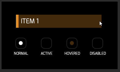
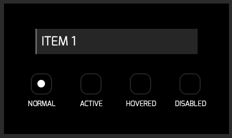
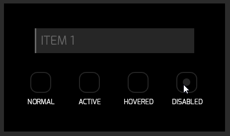
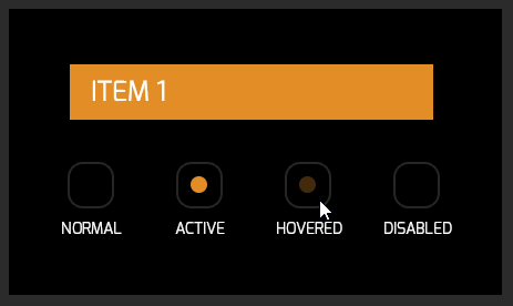
4 State Button
The first component is a button with 4 states. It can be used as a general purpose element that holds the state of a setting, or it can be used as a button for buying an item, which can be locked and purchased.
|
1 2 3 4 5 6 7 8 9 10 11 12 13 14 15 16 17 18 19 20 21 22 23 24 25 26 27 28 29 30 31 32 33 34 35 36 37 |
<body> <div class='state-button-wrapper'> <div id='state-button' class='state-button' data-bind-class-toggle='active:{{stateButton.state}}.indexOf("active") !== -1; disabled:{{stateButton.state}}.indexOf("disabled") !== -1; hovered:{{stateButton.state}}.indexOf("hovered") !== -1'> <div class='hover-piece' data-bind-if='{{stateButton.state}}.indexOf("hovered") !== -1'></div> <div class='button-label'>ITEM 1</div> </div> <div class='checkboxes-wrap'> <div class='checkbox-container'> <div class='checkbox' id='normal-checkbox'> <div class='dot normal-dot' data-bind-if='{{stateButton.state}}.indexOf("normal") !== -1'></div> </div> <div class='checkbox-label'>Normal</div> </div> <div class='filler'></div> <div class='checkbox-container'> <div class='checkbox' id='active-checkbox'> <div class='dot active-dot' data-bind-if='{{stateButton.state}}.indexOf("active") !== -1'></div> </div> <div class='checkbox-label'>Active</div> </div> <div class='filler'></div> <div class='checkbox-container'> <div class='checkbox' id='hovered-checkbox'> <div class='dot hovered-dot' data-bind-if='{{stateButton.state}}.indexOf("hovered") !== -1'></div> </div> <div class='checkbox-label'>Hovered</div> </div> <div class='filler'></div> <div class='checkbox-container'> <div class='checkbox' id='disabled-checkbox'> <div class='dot disabled-dot' data-bind-if='{{stateButton.state}}.indexOf("disabled") !== -1'></div> </div> <div class='checkbox-label'>Disabled</div> </div> </div> </div> |
The state button uses data-bind-class-toggle to apply classes corresponding to the state of the button’s model.The conditions check whether the state string contains “normal”, “active” or other states. Furthermore, the four checkboxes below the button and the hover-pieceuse data-bind-if, which will display all elements whose condition is true and hide the rest. The conditions for these elements are the same as the ones for the button.
|
1 2 3 4 5 6 7 8 9 10 11 12 13 14 15 16 17 18 19 20 21 22 23 24 25 26 27 28 29 30 31 32 33 34 35 36 37 38 39 40 41 42 43 44 45 46 47 48 49 50 51 52 53 54 55 56 57 58 59 60 61 62 63 64 65 66 67 68 69 |
engine.on('Ready', function () { var button = document.getElementById("state-button"); engine.createJSModel('stateButton', { state: 'normal', updateModel: function () { engine.updateWholeModel(stateButton); engine.synchronizeModels(); }, init: function () { button.addEventListener("click", function () { if (stateButton.state !== 'disabled') { if (stateButton.state.indexOf('active') !== -1) { stateButton.state = stateButton.state.replace('active', 'normal'); } else { stateButton.state = stateButton.state.replace('normal', 'active'); } stateButton.updateModel(); } }); button.addEventListener("mouseenter", function () { if (stateButton.state !== 'disabled') { stateButton.state += ' hovered'; stateButton.updateModel(); } }); button.addEventListener("mouseleave", function () { if (stateButton.state !== 'disabled') { stateButton.state = stateButton.state.indexOf('normal') !== -1 ? 'normal' : 'active'; stateButton.updateModel(); } }); document.getElementById('normal-checkbox').addEventListener('click', function () { if (stateButton.state.indexOf('hovered') !== -1) { stateButton.state = 'normal hovered'; } else { stateButton.state = 'normal'; } stateButton.updateModel(); }); document.getElementById('active-checkbox').addEventListener('click', function () { if (stateButton.state.indexOf('hovered') !== -1) { stateButton.state = 'active hovered'; } else { stateButton.state = 'active'; } stateButton.updateModel(); }); document.getElementById('disabled-checkbox').addEventListener('click', function () { stateButton.state = 'disabled'; stateButton.updateModel(); }); document.getElementById('hovered-checkbox').addEventListener('click', function () { if (stateButton.state.indexOf('hovered') !== -1) { stateButton.state = stateButton.state.indexOf('active') !== -1 ? 'active' : 'normal'; } else { if (stateButton.state.indexOf('active') !== -1) { stateButton.state = 'active hovered'; } else { stateButton.state = 'normal hovered'; } } stateButton.updateModel(); }); } }); stateButton.init(); }); |
The JavaScript model contains a string, which can hold the following states:
- normal
- normal hovered
- active
- active hovered
- disabled
What is more, engine.updateWholeModel(model) only marks the model as dirty, while engine.synchronizeModels() actually repaints the UI. However, in our example, the two actions happen simultaneously. As a result, we have included a function in the model that performs both of them together.
Essentially, the state of the button is changed to the appropriate one depending on which checkbox is clicked. Furthermore, if the actual button is pressed, it toggles from active to normal and back. In order to click the button, you have to enter it with your mouse, therefore, on every mouseenter the hovered state will be added and it will be removed on mouseleave.
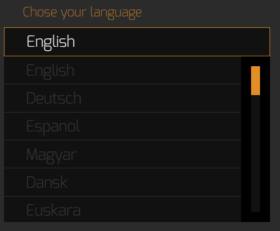
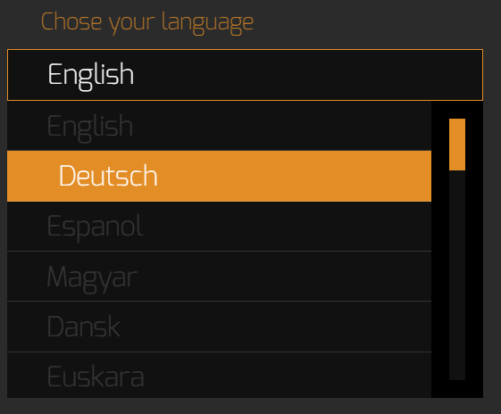
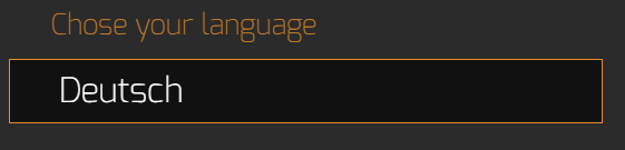
Drop-down Menu & Scroll List
The second element is a drop-down menu with a list of items to choose from. It is heavily used in UIs as a multiple choice menu like a language selection one or as a menu that changes the display resolution.
|
1 2 3 4 5 6 7 8 9 10 11 12 13 |
<body> <div id='my-menu' class='menu-wrap'> <div class='menu-label'>Chose your language</div> <div class='menu-head'> <div data-bind-value='{{dropdownMenu.currentChoice}}' class='current-choice'></div> </div> <div data-bind-class-toggle='visible:{{dropdownMenu.menuVisible}}' class='menu-body'> <div data-bind-for='i:{{dropdownMenu.dropdownOptions}}' class='menu-option' data-bind-value='{{i}}'></div> </div> </div> <script src='js/coherent.js'></script> <script src='js/dropdown_menu.js'></script> </body> |
|
1 2 3 4 5 6 7 8 9 10 11 12 13 14 15 16 17 18 19 20 21 22 23 24 25 26 27 28 29 30 31 32 33 34 35 36 37 38 39 40 41 |
engine.on('Ready', function () { engine.createJSModel('dropdownMenu', { menuVisible: false, currentChoice: 'English', dropdownOptions: [ "English", "Espanol", "Deutsch", "Magyar", "Dansk", "Euskara", "Hrvatski", "Italiano", "English", "Deutsch", "Espanol", "Magyar", "Dansk", "Euskara", "Hrvatski", "Italiano", "English", "Deutsch", "Espanol", "Magyar", ], init: function () { document.getElementById("my-menu").addEventListener("click", function (ev) { if (!dropdownMenu.menuVisible) { dropdownMenu.menuVisible = true; } else { dropdownMenu.currentChoice = ev.target.textContent; dropdownMenu.menuVisible = false; } engine.updateWholeModel(dropdownMenu); engine.synchronizeModels(); }); } }); dropdownMenu.init(); }); |
This component uses data-bind-for to iterate over the model’s array and multiply the menu-option div as many times as there are strings in the array. What is more, each of the texts is used as content for the data-bind-value in the menu-option tags. Together, these attributes create the menu and fill in the options. What is more, the body of the menu is displayed with the visible class, which adds display: block; to it, when the menuVisible flag is true. On occasion when the flag is false, the class is removed and the default display: none; kicks in. Lastly, the model has a variable currentChocie that is applied to the menu head and saves the current selection.
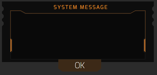
9 Slice
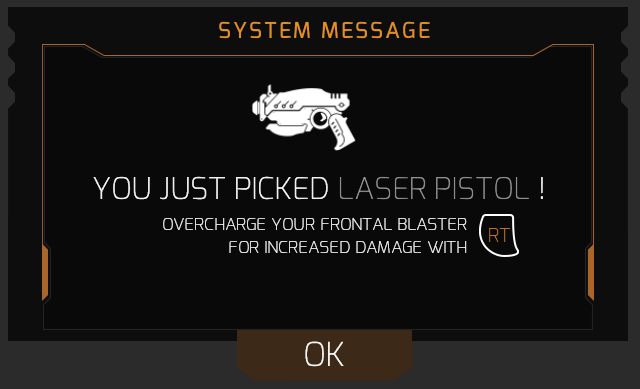
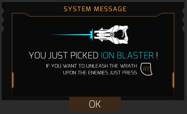
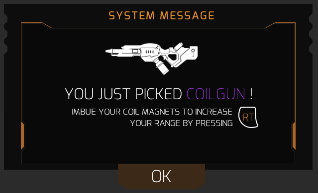
The third component utilizes a 9-sliced border, which preserves its proportions no matter what the size of the content is. It is used as a UI element which can prompt the user or inform them about events like picking up an item, finishing a game, etc.
|
1 2 3 4 5 6 7 8 9 10 11 12 13 14 15 16 17 18 |
<body> <div class='slice-wrap' data-bind-class-toggle='disappear:{{slice.sliceState}} === "hidden"; appear:{{slice.sliceState}} === "revealed";'> <div class='system-message'>system message</div> <div class='weapon-image' data-bind-style-background-image-url='{{slice.backgroundImg}}'> <img class='weapon-image-sizer' src='img/9slice_icon1.png'> </div> <div class='picked-item-message'>you just picked <span data-bind-style-color='{{slice.itemColor}}' data-bind-value='{{slice.pickedItem}}'></span> !</div> <div class='system-prompt'> <div class='prompt-message' data-bind-value='{{slice.itemAction}}'></div> <div class='prompt-button'> <p class='prompt-text'>RT</p> </div> </div> <div class='bottom-button' id='bottom-button'>OK</div> </div> <script src='js/coherent.js'></script> <script src='js/9slice.js'></script> </body> |
|
1 2 3 4 5 6 7 8 9 10 11 12 13 14 15 16 17 18 19 20 21 22 23 24 25 26 27 28 29 30 31 32 33 34 35 36 37 38 39 40 41 42 43 44 45 46 47 48 49 50 51 52 53 54 55 56 57 58 59 60 61 |
engine.on('Ready', function () { engine.createJSModel('slice', { currItem: undefined, backgroundImg: undefined, itemAction: undefined, itemColor: undefined, pickedItem: undefined, sliceState: 'initial', sliceOptions: [{ backgroundImg: 'img/9slice_icon1.png', itemAction: 'if you want to unleash the wrath upon the enemies just press', itemColor: '#1ce6fe', pickedItem: 'ion blaster', }, { backgroundImg: 'img/9slice_icon2.png', itemAction: 'to aim down the sights and increase accuracy press', itemColor: '#1eff00', pickedItem: 'sniper rifle', }, { backgroundImg: 'img/9slice_icon3.png', itemAction: 'overcharge your frontal blaster for increased damage with', itemColor: '#9d9d9d', pickedItem: 'laser pistol', }, { backgroundImg: 'img/9slice_icon4.png', itemAction: 'imbue your coil magnets with visibility crystals to increase your range by pressing', itemColor: '#a335ee', pickedItem: 'coilgun', }, ], updateModel: function () { var prevIdx = this.currItem; while (this.currItem === prevIdx) { this.currItem = Math.floor(Math.random() * 4); } this.backgroundImg = this.sliceOptions[this.currItem].backgroundImg; this.pickedItem = this.sliceOptions[this.currItem].pickedItem; this.itemColor = this.sliceOptions[this.currItem].itemColor; this.itemAction = this.sliceOptions[this.currItem].itemAction; engine.updateWholeModel(slice); engine.synchronizeModels(); }, init: function () { this.updateModel(); document.getElementById('bottom-button').addEventListener('click', function () { slice.sliceState = 'hidden'; engine.updateWholeModel(slice); engine.synchronizeModels(); setTimeout(function () { slice.sliceState = 'revealed'; slice.updateModel(); }, 750); }); } }); slice.init(); }); |
When the element is initialized, an event listener is added to the OK button, which hides the element by changing the sliceState to “hidden”. What is more, the sliceOptions array holds objects that have the same properties as the ones in the model, therefore, when the slice is hidden, a new element is applied by taking a random valid index and changing the properties of the model to the properties of the object from the array with that index. Furthermore, when the model is updated, the data-bind-style-background-image-url changes the background image of the weapon to the one whose URL is in the slice.backgroundImg string. The color of the picked item text is changed to the one in slice.itemColor with the data-bind-style-color attribute. Lastly, the item name and the action that the pickup can perform are applied via the data-bind-value attribute.
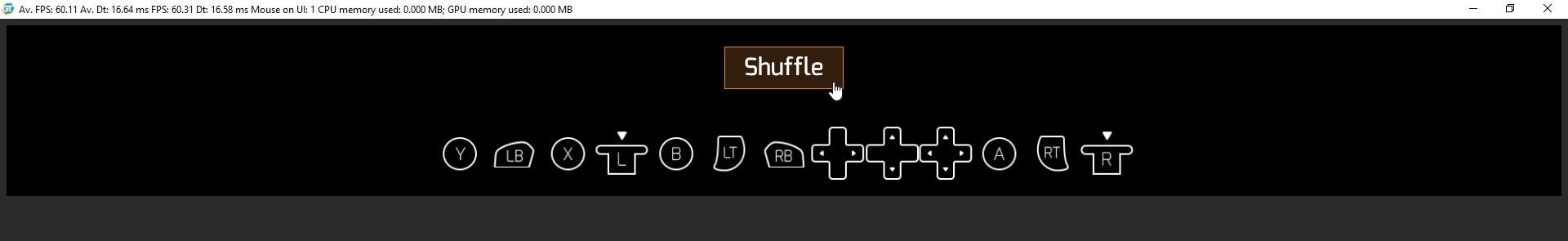
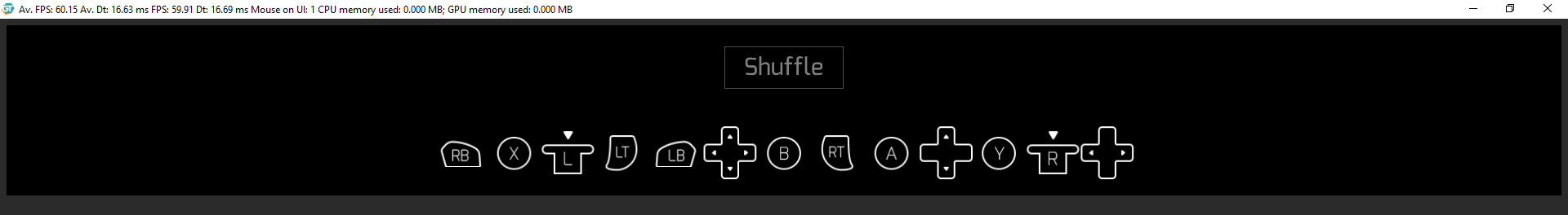
Sprite Sheet
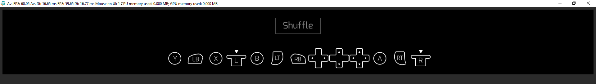
The last component uses a single background image and the background-position property to create multiple smaller images where only the biggest one is actually loaded. This approach saves memory as each element can be created multiple times by reading from the cached big image. The sprites component can be used in creating UI animations, buttons and others.
|
1 2 3 4 5 6 7 8 9 10 11 12 13 14 15 16 17 18 19 20 21 22 23 24 25 26 27 28 29 30 |
<body> <div class='shuffle-button-wrap'> <div class='shuffle-button-container'> <div class='shuffle-button' id='shuffle-button'>Shuffle</div> </div> </div> <div class='sprites-wrapper'> <div class='sprite-boxes-wrap'> <div class='sprite-box' data-bind-for='iter:{{sprites.spriteButtons}}'> <div data-bind-switch='{{iter}}'> <div data-bind-switch-when='background-lt-rt triggers lt' class='background-lt-rt triggers lt'></div> <div data-bind-switch-when='background-lt-rt triggers rt' class='background-lt-rt triggers rt'></div> <div data-bind-switch-when='background-lb-rb back-buttons lb' class='background-lb-rb back-buttons lb'></div> <div data-bind-switch-when='background-lb-rb back-buttons rb' class='background-lb-rb back-buttons rb'></div> <div data-bind-switch-when='background-lr-ud-udlr arrows udlr' class='background-lr-ud-udlr arrows udlr'></div> <div data-bind-switch-when='background-lr-ud-udlr arrows lr' class='background-lr-ud-udlr arrows lr'></div> <div data-bind-switch-when='background-lr-ud-udlr arrows ud' class='background-lr-ud-udlr arrows ud'></div> <div data-bind-switch-when='background-ls-rs sticks rs' class='background-ls-rs sticks rs'></div> <div data-bind-switch-when='background-ls-rs sticks ls' class='background-ls-rs sticks ls'></div> <div data-bind-switch-when='background-x-y-a-b front-buttons x' class='background-x-y-a-b front-buttons x'></div> <div data-bind-switch-when='background-x-y-a-b front-buttons y' class='background-x-y-a-b front-buttons y'></div> <div data-bind-switch-when='background-x-y-a-b front-buttons a' class='background-x-y-a-b front-buttons a'></div> <div data-bind-switch-when='background-x-y-a-b front-buttons b' class='background-x-y-a-b front-buttons b'></div> </div> </div> </div> </div> <script src='js/coherent.js'></script> <script src='js/sprite_sheet.js'></script> </body> |
|
1 2 3 4 5 6 7 8 9 10 11 12 13 14 15 16 17 18 19 20 21 22 23 24 25 26 27 28 29 30 31 32 33 34 35 36 37 38 |
engine.on('Ready', function () { engine.createJSModel('sprites', { spriteButtons: [ "background-lt-rt triggers lt", "background-lt-rt triggers rt", "background-lb-rb back-buttons lb", "background-lb-rb back-buttons rb", "background-lr-ud-udlr arrows udlr", "background-lr-ud-udlr arrows lr", "background-lr-ud-udlr arrows ud", "background-ls-rs sticks rs", "background-ls-rs sticks ls", "background-x-y-a-b front-buttons x", "background-x-y-a-b front-buttons y", "background-x-y-a-b front-buttons a", "background-x-y-a-b front-buttons b", ], shuffle: function () { var counter = this.spriteButtons.length; while (counter > 0) { var index = Math.floor(Math.random() * counter); counter--; var temp = this.spriteButtons[counter]; this.spriteButtons[counter] = this.spriteButtons[index]; this.spriteButtons[index] = temp; engine.updateWholeModel(sprites); engine.synchronizeModels(); } }, init: function () { document.getElementById('shuffle-button').addEventListener('click', function () { sprites.shuffle(); }); }, }); sprites.init(); }); |
The JS model is an array with all of the classes that use background-position to change the displayed image.
|
1 2 3 4 5 6 7 8 |
.background-lt-rt { background-image: url(../img/spritesheet_controls.png); background-size: 1000% 304%; } .lt { background-position: 2.65% 11.5%; } |
The data-bind-for attribute creates as many elements as there are strings in the sprites.spriteButtons array. Furthermore, for each element, the value of iter is passed as an argument to a data-bind-switch, which will create only the div whose data-bind-switch-when value is the same as the current iterator value. Last but not least, every time that the button is clicked, the model’s array is shuffled and the UI is updated, forcing the buttons to change their position.
Your feedback is important for us! If you have any questions about how to integrate data-binding in your workflow, write a comment below, Tweet us or start a discussion in our Forum.
