
Creating a Healthbar using the Coherent Exporter – Part 1

This tutorial describes how a Healthbar for an FPS HUD screen can be created using Adobe Animate and the Coherent Exporter Add-on. No previous Adobe Animate or HTML experience is necessary.
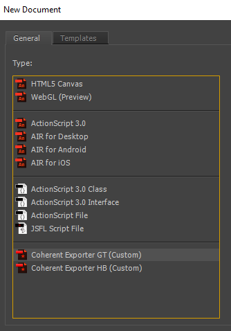
1. Create new scene
From the “File” menu choose “File/New”. From the window that opens select “Coherent Exporter GT (Custom)”.
Note: if you are targeting Hummingbird you can select “Coherent Exporter HB (Custom)”. This tutorial is applicable for both target configurations.
A new scene opens. From the properties window enter width and height of the scene (in this sample 1920px by 1080px).
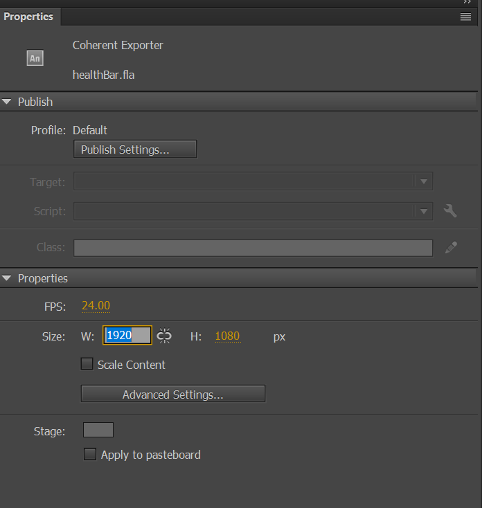
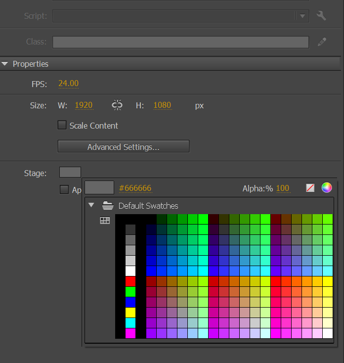
You can also set the background color of the scene from the color picker by left clicking on it.
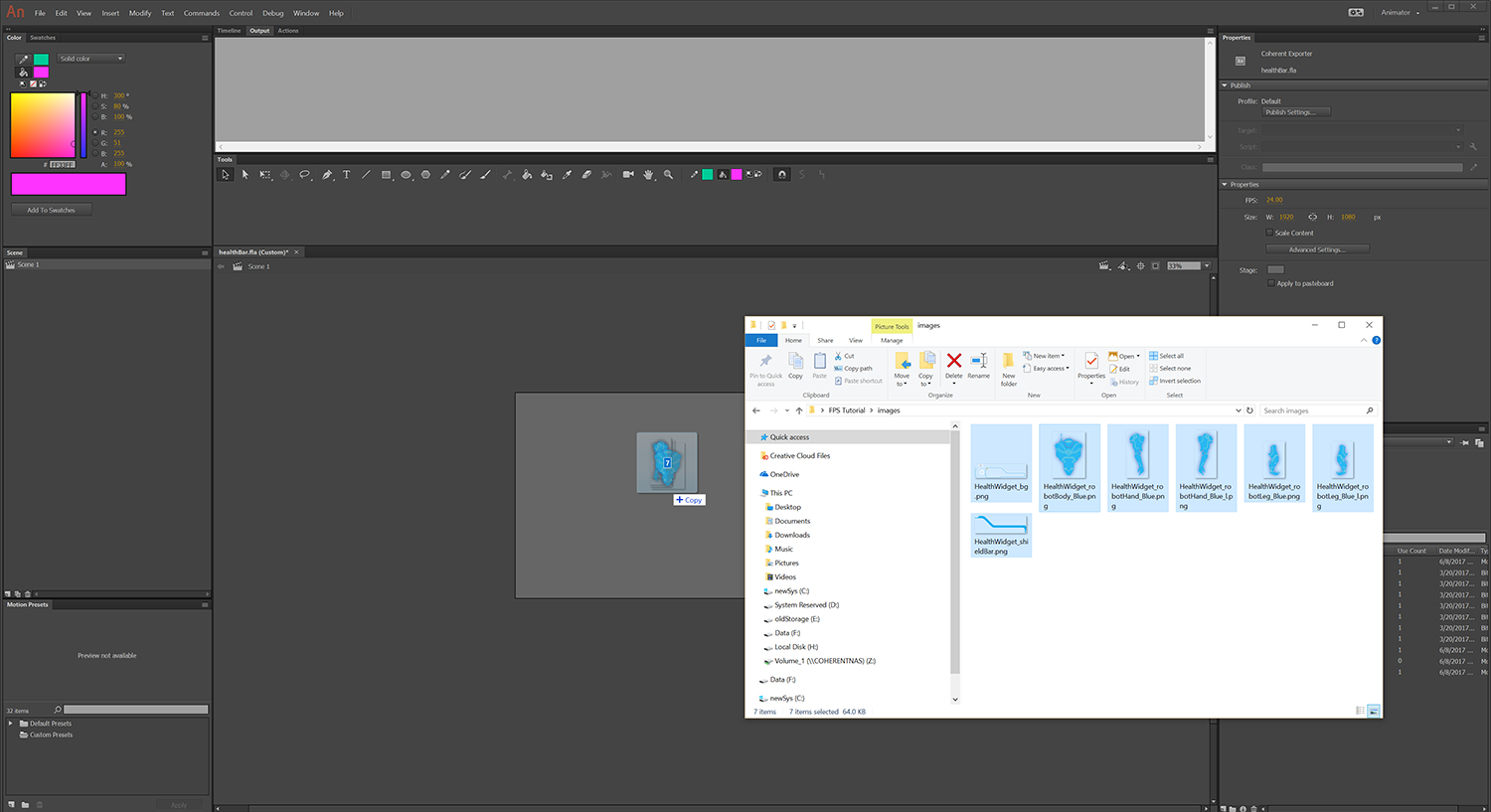
2. Import assets
The next step is to import the image assets. Simply drag and drop them from the folder to the scene.
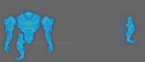
3. Setup positioning
Once the images are imported you can position them by left clicking on the UI element (to select it). When selected a rectangular mask will appear around the element.
Then drag and drop it to the new position.
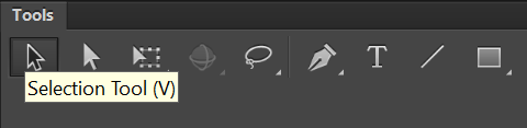
Note: Make sure that the Selection Tool is selected in the tools panel.
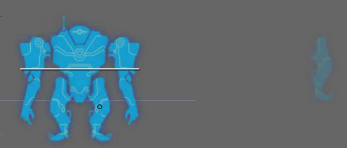
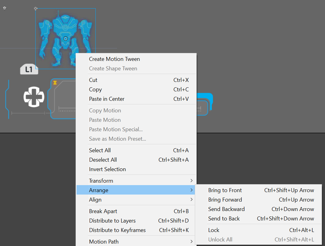
Tip: If there are elements that are overlapping and you would like to send a specific one to the front/back you can do this by right clicking on it and choosing “arrange/send to back/front” from the context menu.
Tip: when moving elements, automatic guide lines will appear to help you align the elements.
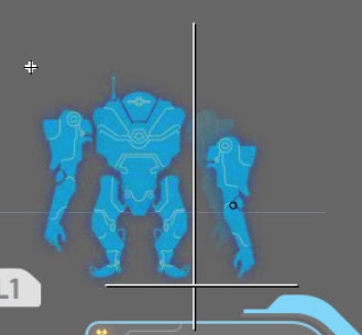
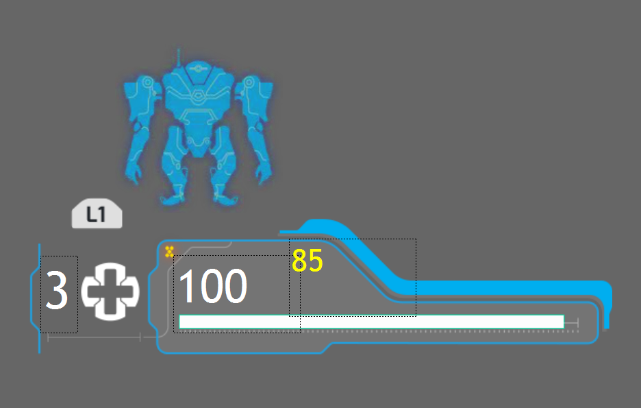
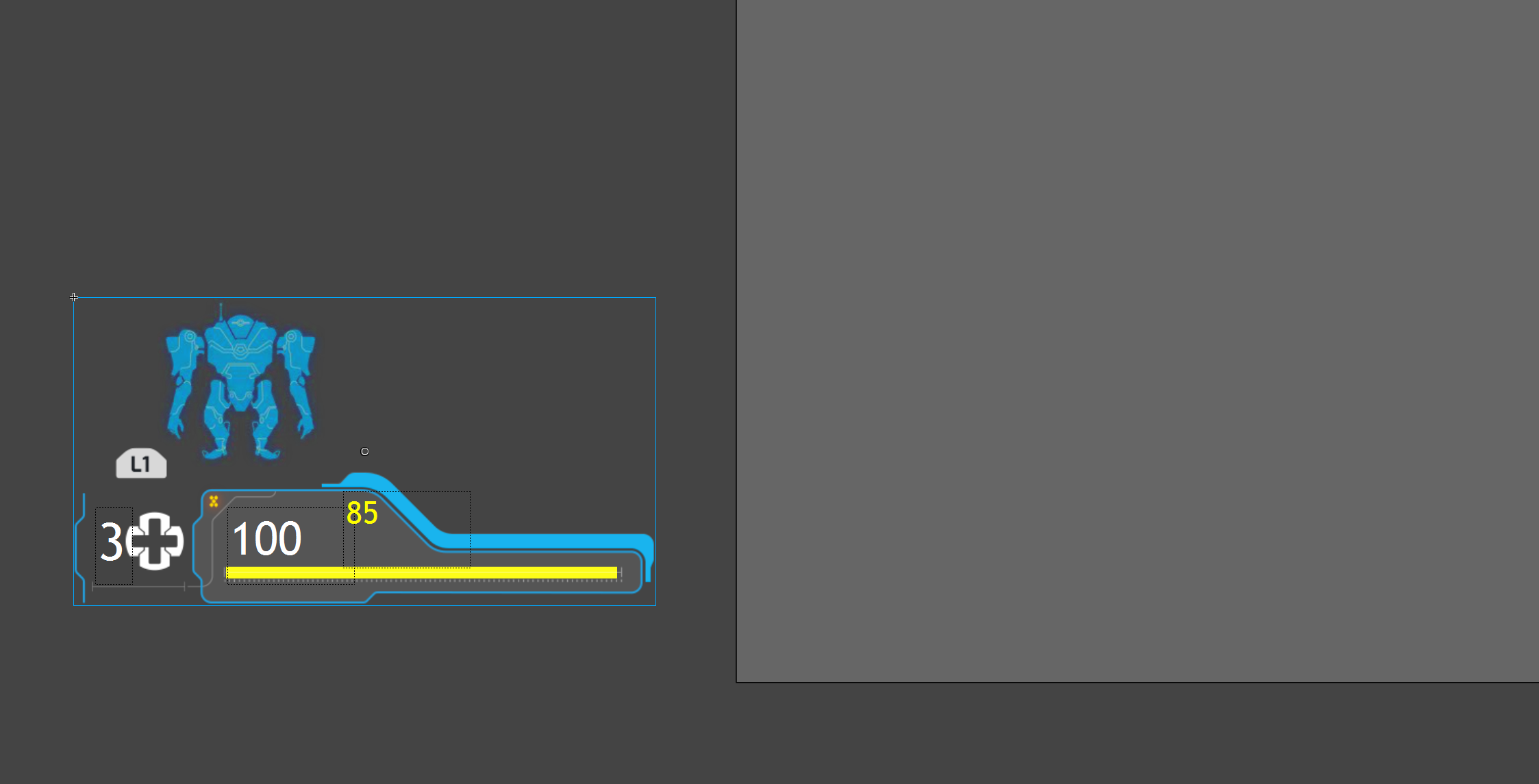
Use drag and drop to position all the elements as in the reference image.
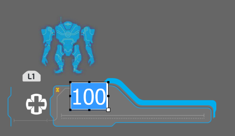
4. Add text
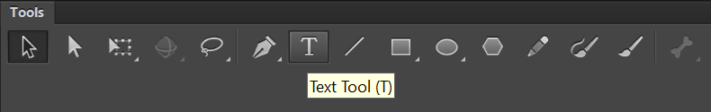
To add text first select the Text tool from the Tools panel.
Then left click on the scene in the place where you want the text to appear and enter the text itself by using the keyboard.
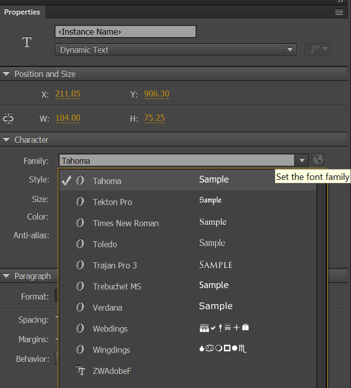
If you want to use a specific font, select if from the font dropdown menu in the “Character” menu in the “Properties panel” (in this sample we will use Tahoma)
To setup the color of the text left click on the color picker in the “Character” menu in the “Properties panel”.
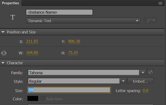
To set the size of the text left click on the size input field again in the “Character” menu in the “Properties panel”.
You can change the position of the Text element, as any other element, by selecting it with the select tool and drag and dropping it to the new position.
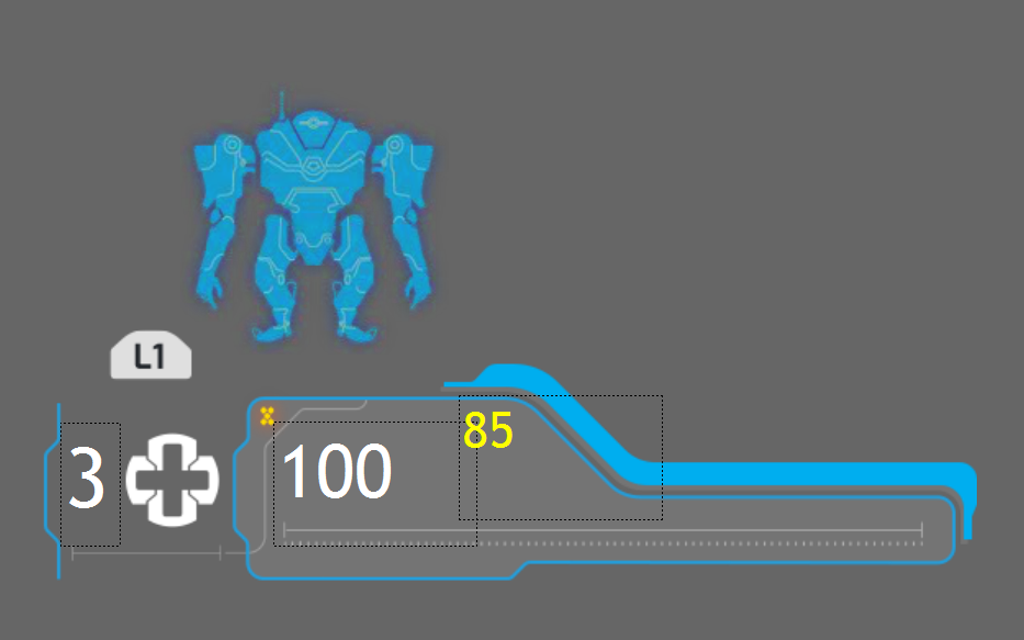
Using the described methods, add 3 text elements and set their size position, color and font to match the reference image.
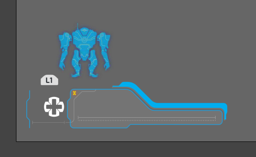
5. Add custom shape
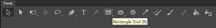
Apart from text and images the UI compositions can contain custom shape created with brush, ovals, rectangle and polystar tools. In this sample, we are going to use the rectangle tool to create a horizontal bar.
Select the rectangle tool from the Tools panel:
then simply draw a rectangle to match the reference image.
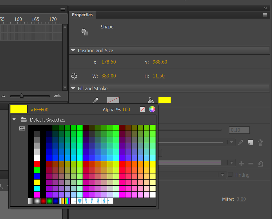
Change the fill color by selecting the element with the Select tool and left clicking the fill color menu in the properties panel.
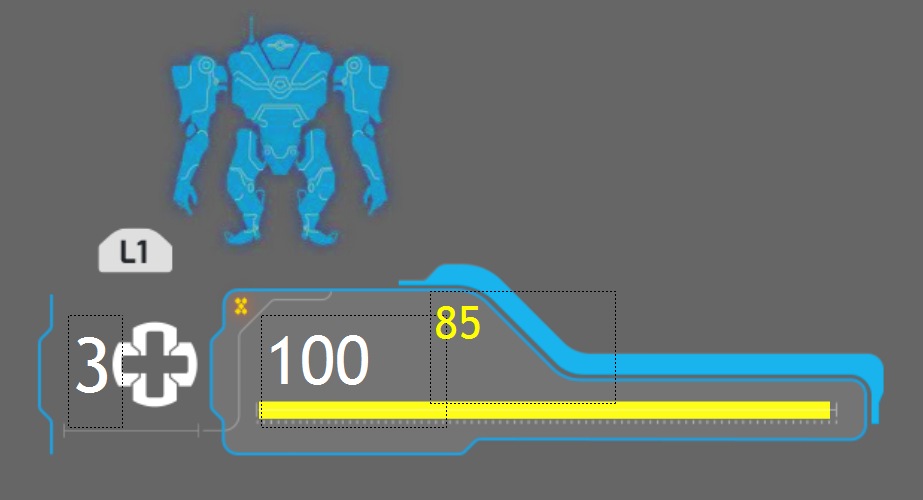
Next, select the outline of the shape with the select tool and delete it by using the delete key on the keyboard. This way the shape will have only fill and should match the reference image.
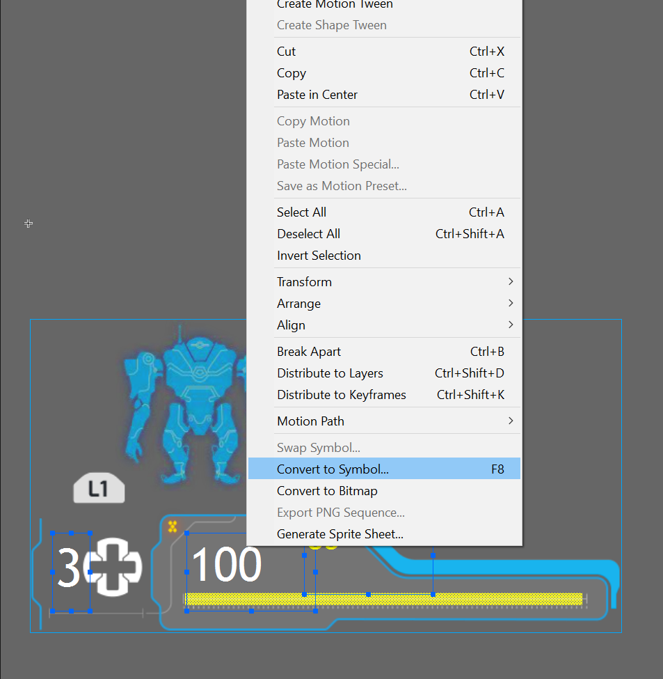
6. Group UI elements into a Symbol
For easier manipulation of all the UI elements, we can group them in a Symbol. To do this left click, hold and drag around all the elements to select them.
Then right click on the selection and choose “Convert to Symbol”.
In the next screen enter the symbol name and click OK.
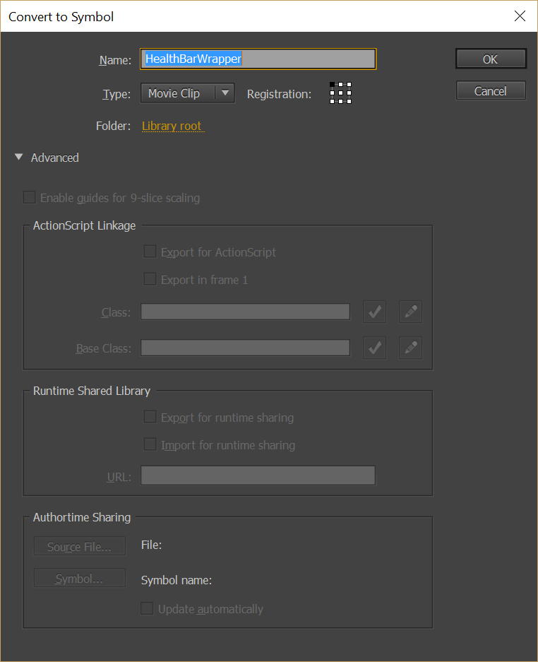
The symbol that holds all the elements is now created.
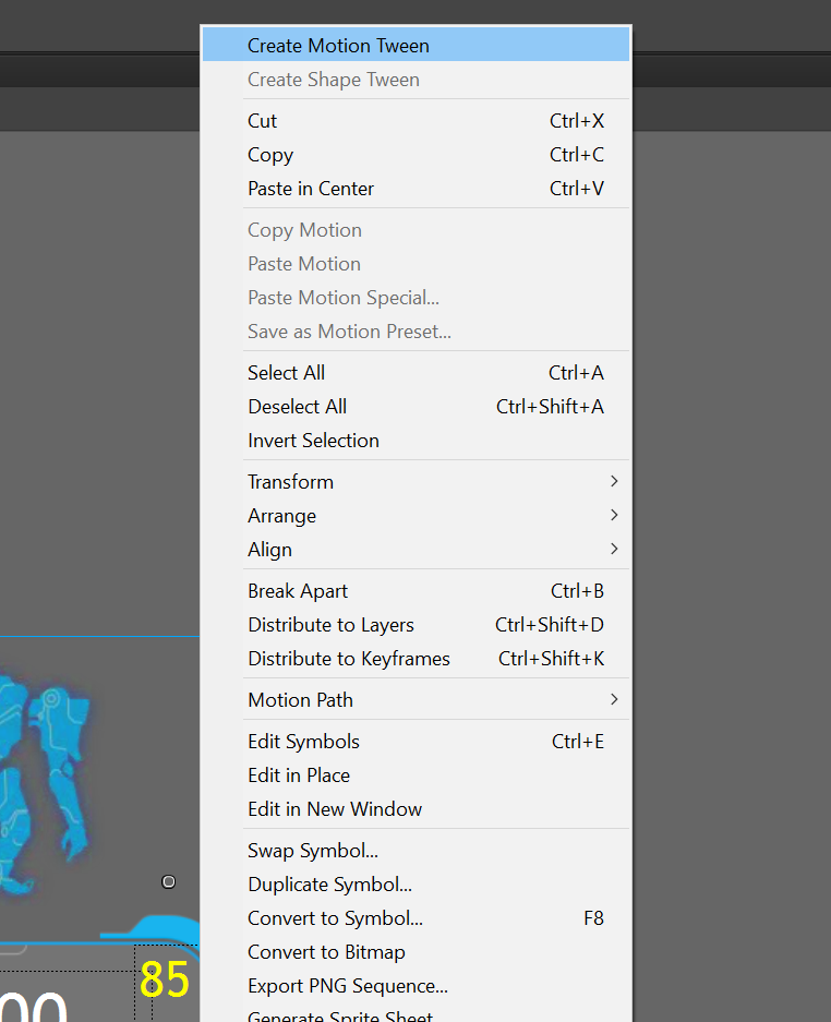
7. Add animation
To animate the newly created symbol, select it, right click on it and from the menu choose “Create motion tween”.
Go to the timeline panel and move the pinhead to a starting position as indicated on the image.
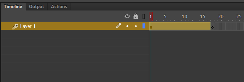
Then move the symbol to the left of the scene.
After that move the pinhead to the later position.
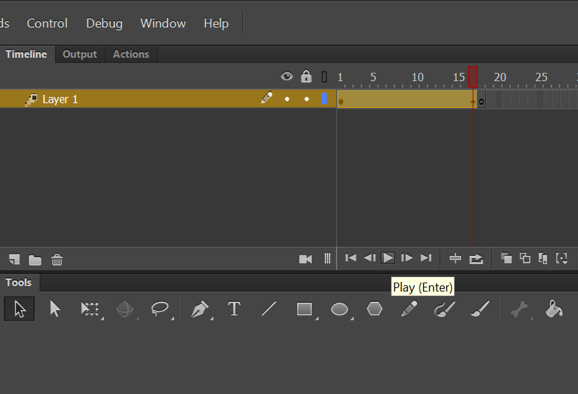
And then move the symbol to the right.
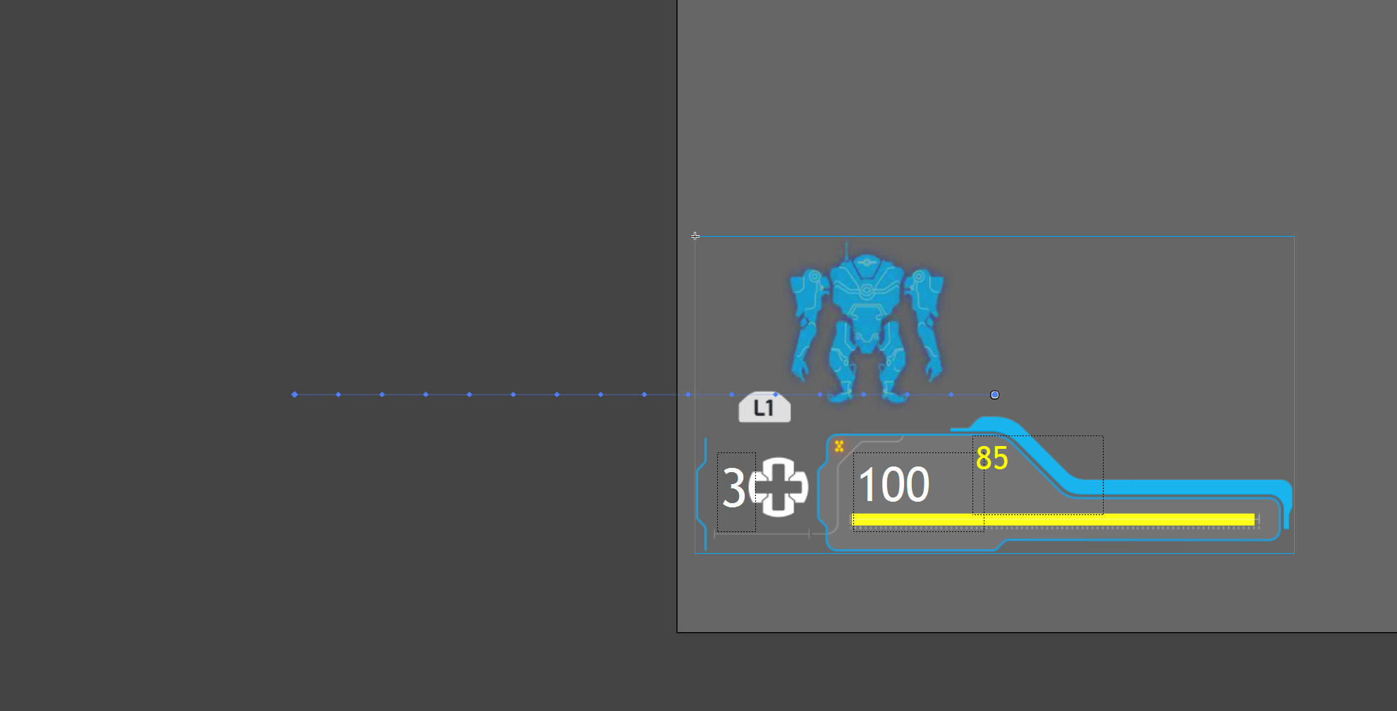
That way you animated the position of the symbol. You can preview the animation by pressing the play button.
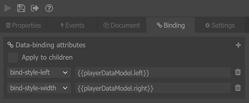
8. Add data-binding with Coherent Exporter
Data-binding attributes can be used to directly reference the UI from data models defined in the C++ code of the game. To add data-binding attributes, first select the symbol and enter instance name in the properties panel.
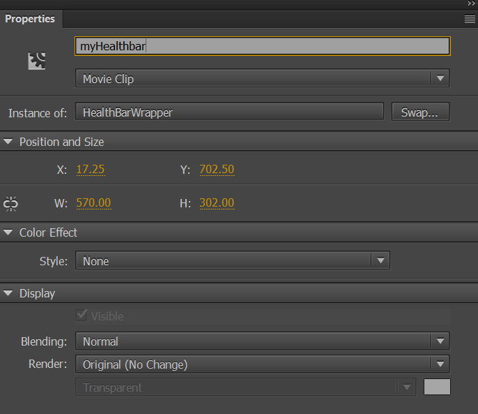
Then enter data-model info provided by your C++ developer. In this case will enter in the “bind-style-left” field {{playerDataModel.left}} in the “bind-style-right” field {{playerDataModel.right}}. That way the position of symbols would be automatically bound to a data model defined in the C++.
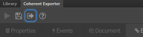
9. Publish the created content as HTML
To publish the scene as HTML simply choose Save as from the Coherent Exporter panel and select file name and location in the window that opens. Then click on the Save button.
Now the HTML page is ready to be integrated in a GT or Hummingbird View inside of a game engine.
More information about adding data-bind attributes with Coherent Exporter and creating a mock model in JavaScript, you can find in the second part of this tutorial here.


