
How to create a modern Battle deck screen for Mobile Strategy Game?
The strategy game genre is one of the most popular among the mobile game players. Clash of Clans, Game of War and Boom Beach are titles that attract thousands of players and generate billions of dollars in revenue. How do the mobile game development studios create such addictive gameplay so they make the players come back time after time?
To create an addictive mobile game you need to design a great user flow and user experience. You have to think through every element of the game from gameplay, reward system, user interactions to the user interface.
In this tutorial, I will show you how to get started on one mandatory screen for the strategy games genre – the battle deck screen. I will use the Coherent visual editor.
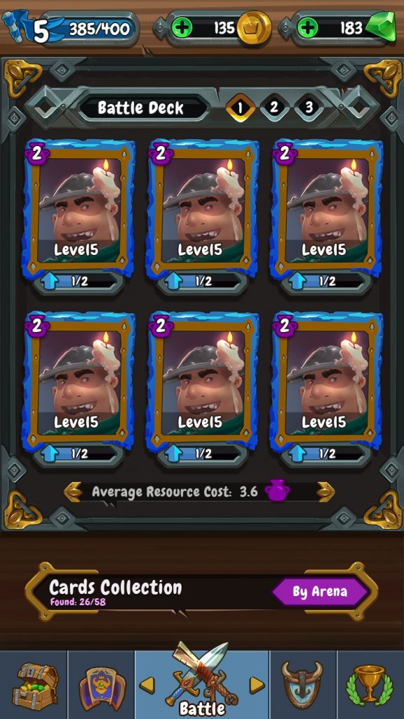
Here is an image of what you will get in the end of the tutorial. All images used for the sample are created by our designer in Photoshop. You will get them with the evaluation version of Hummingbird.
Open the Coherent Editor and start by creating a new file and setting the resolution to custom width: 750 px and height: 1334 px.
We will divide the screen into 3 main sections:
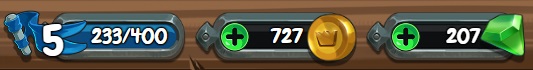
- Top section – containing the player level, experience, coins and emeralds collected.
- Middle section – for the battle deck tabs, hero portraits, and an average cost field.
- Bottom section – including elements for the background, cards collection information and a tab menu for different parts of the game UI
- Hero popup with title and text inside.
Top Section
1. Top section wrapper + background image
You are going to create a responsive image for the background of the top section and use it as a wrapper in which to nest the rest of the elements. A responsive image is essentially a div with а background image so we can use it as a wrapper.
Create a responsive image ( ID is topSection) use the bg_header.png image. It is going to be as wide as the screen, so set the width to 56.5vh. Rename it from the Properties panel to topSection.
Player Level Flag
1.1 The first inner element will be the shadow of the flag (levelFlagShadow – shadow_iconKingdom.png). Drag the image from the Assets Library or create it by using the panel on the left hand side. Click on “Responsive image” inside “Create elements”. Firstly, nest it inside topSection by dragging and dropping it in the Hierarchy panel. Then, place it in the left corner vertically centered. Rename the image to levelFlagShadow.
1.2 The second element is the actual flag icon which will sit on top of the shadow (levelFlag). Create it, nest it in topSection and place it over the flag shadow. Rename the image to levelFlag.
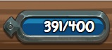
1.2.1 Inside the levelFlag, create a text element called mainLevel which will show the player level value. You can edit the text size and position from the left panel -> Properties -> Text properties. Change the size of the text to 4 and the color to white.
Experience field
1.3 For the next element create a responsive image named expBar (bg_Kingdom.png) and nest a text element inside it, just like in the previous element.
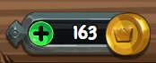
Coins collected
Create a responsive image named coinsBar ((bgGoldCrystals.png) with a text element (coinsValue) inside, just like in the previous element.
So far you have:
1.4 Coins image (wrapper)
1.4.1 The actual coins value
You need to add 3 more elements from the Asset Library panel:
1.4.2 Image for the “Plus” icon (coinsPlusIcon)
1.4.3 Image for the shadow of the coin underneath it (coinsIconShadow).
! It is important that the shadow image is placed higher in the hierarchy than the coin image. In such a way the shadow will be placed underneath the image.
1.4.4 Another image for the “Coin” icon (coinIcon)
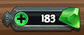
Gemstones count
To create the gemstone image, simply copy and paste the previous element (coinsBar), change the IDs to emerald, move it to the right and change the two images (for the emerald icon and its shadow).
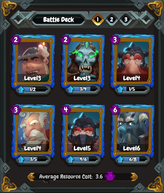
Middle Section
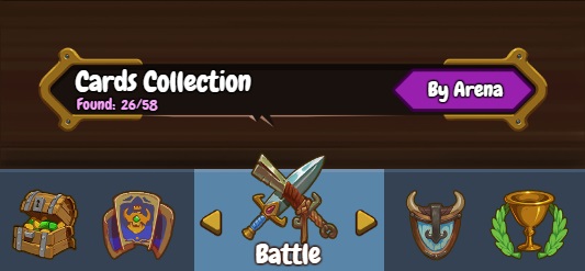
Here you have 4 distinctive elements the middleSection which is a background element with nine sliced background image; battle deck tabs for the list of heroes; hero boxes and average resource cost field.
2.1 The background image (middleFrame)
Create a nine sliced rectangle image from the Create element panel with width 33.7vh and height 41.4vh. Name it middleFrame and change the background color of the image from the Properties>Background>background to rgba(35, 31, 30, 1)
Create a *.css file in our CSS folder (..\Editor\uiresources\css) and name it rts.css. Copy and paste the following CSS script which will add a frame around the rectangular image.
#middleFrame {
border-top: 12.36vh solid transparent;
border-bottom: 12.36vh solid transparent;
border-left: 11.4vh solid transparent;
border-right: 11.4vh solid transparent;
border-image: url(“../images/frame_9slice.png”) stretch;
border-image-slice: 165;
border-image-width: 12.36vh;
}
From the Editor in the Assets Library, scroll down and you will see the Style menu, click on the “+” symbol, navigate to the CSS folder and “Open” the CSS file you have just created. It will be added at the bottom of the Style list, click on it to activate it – this will include it in the HTML.
Now, the width of middleFrame is a total of 56.5vh = 33.7vh + 2*11.4vh (border sides). Place the element in the left corner under the topSection element.
2.2 Battle Deck Tabs
2.2.1 You will create the next element with a flex wrapper – click on the second tab of Create elements>Flexible panel
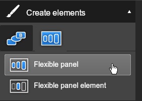
Create a flexible panel with width 56.5 vh name it deckCentering and from its Properties > Basic set JustifyContent to center. Set the background of the element to transparent.
2.2.1.1 Import the image bgDeckName.png and nest it in the battle deck wrapper. Rename it to battleDeckTabs.
2.2.1.1.1 Inside the battle deck wrapper create a text element for the title with name battleDeckLabel.
2.2.1.1.2 Create text element for the number of the tab (tab1), position it in the center of the first tab cell.
2.2.1.1.3 Add an image selectBattleDeck (it will be used for marking the current tab selected) and rename it to tabSelected1. Position the image so that it covers the border of the tab cell.
For the rest of the tab cells, copy and paste each tab and selected tab elements and position them in the intended places.
2.3 Hero Portraits
The Hero portrait (heroImage1) is made of several elements layered on top of one another. Be careful about Hierarchy position and the z-index of the elements. The position of the elements in the Hierarchy corresponds directly to how they are represented/nested/created/positioned in the HTML.
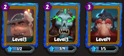
Here is the frame which you will use for every hero portrait:
The hero avatar should visually be inside the frame. Also, the progress bar at the bottom should be inside the frame.
2.3 Create a wrapper (heroImage1) which will contain the whole portrait and will be used for the hero avatar. Import image avatar1.png. Now, you will nest inside we need 3 more elements:
- The blue level progress bar
- The hero level
- The frame
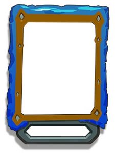
2.3.1 Start by importing and nesting the portrait frame element – cardFrame.png in the heroImage1 and rename it to heroDetails1. Use the frame to position all the other elements but keep in mind that in the Hierarchy panel, the frame should be under the elements for the blue level progress bar and the hero level.
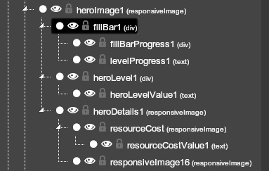
2.3.1.1 Nest the image iconElexir.png (resourceCost) and place it in the upper left corner of the frame.
2.3.1.1.1 Inside resourceCost create a text element resourceCostValue1 with the LevelX value.
2.3.1.2 Add the other decorative image element -> iconUpgrade.png and put it on the left side of the progress bar.
2.3.2. Now, create the blue level progress bar by creating a div (fillBar1). Set a black background color and position it in the frame. (Remember, this element should come above the resourseCost element in the hierarchy)
2.3.2.1 Inside this black wrapper, create another div representing the current advancement of the full level bar (fillBarProgress1 ). Position it, resize it and set the background to rgba(59, 119, 185, 1).
2.3.2.2 Create a text element which represents the current/level up portion values (levelProgress1) and put it at the center of the blue div.
2.3.3 To create the hero current level (heroLevel1), create a div with background color of rgba(0, 0, 0, 0.4)
2.3.3.1 Nest a text element with name heroLevelValue1 in it.
For the rest of the hero portraits -> copy and paste heroImage1, move it, change the IDs, change the avatar picture, the values and the fillBarProgressX div width.
2.4 Average Cost Field
2.4.1 Create one flex element (averageCostCentering) and set JustifyContent to center. It goes under the hero portraits and it is the last main item in the middle section.
2.4.1.1 Create a responsive image averageCostField with image -> bg_AVGResCost.png.
Add in it 3 more elements – 2 text elements and one image.
2.4.1.1.1 Create a text field for the title of the field (averageCostTitle) and change the text to “Average Resource Cost:”. Position it in the left side of the wrapper image.
2.4.1.1.2 Add another text field for the average resource value.
2.4.1.1.3 Add responsive image (iconElexir.png) which will be on the right side of the value.
Bottom section
For the background
3.1 For the background use image bgWoodenTile2.png, name it responsive image bottomBackground.
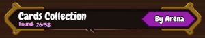
Cards Collection
3.2 Create a flex element (cardCollectionCentering) and set JustifyContent: center.
3.2.1 Inside the flex element create a responsive image (cardCollection) and use bgFilter.png
Inside the image you will have 4 main elements:
3.2.1.1 A responsive image bgFilter.png
3.2.1.1 Text field with the label: “Cards Collection” (cardsCollectionTitle).
3.2.1.2 Another text field with label: “Found:” placed under the main title (cardsFoundLabel).
3.2.1.3 Copy and paste the previous element we’ve created and position it to the right. In such a way you create the same element as the previous one and you can use it for the *found/total* values.
3.2.1.4 The last main element (byArenaBack) is an image for the “By Arena” button (btn_Filter.png) which holds the title.
3.2.1.4.1 Lastly, add the text element for the title of the button (byArenaTitle).
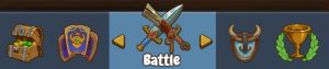
Bottom Menu
3.3 Create a div (bottomMenu) with a width of 56.5vh, set the height to 10.1vh and set a background color to rgba(52, 66, 83, 1) – the color of the buttons. Inside this div you will have the buttons, a top separator, the left and right arrow, and the button title.
3.3.1 Create a new div (chestButton), set it to a proper size, change the background color (rgba(52, 66, 83, 1)).
3.3.1.1 Inside the div create an image for the button icon (chestIcon** -> **iconChest.png).
For the rest of the buttons simply copy and paste the chest button. Place it, change the IDs, the icon, and the text.
3.4 Create div with background color – rgba(70, 88, 109, 1), the full width of the viewport, height of 0.4vh and place it as a separator on top of the buttons.
3.5 For the left arrow create a responsive image -> arrow_left.png
3.6 For the right arrow create another image -> arrow.png
You don’t need separate arrows for every button as you are trying to use less DOM elements to create the UI and achieve high performance. You can just change the positions of the two arrows when a button is clicked according to its position.
Hero Popup
The Hero Popup is activated when a hero portrait is clicked on.
4.1 Create a flex element (heroPopupCentering) and set JustifyContent to center.
4.1.1 Inside it create a div (heroPopup). Use the same nine sliced image for the borders and the same background as the middleFrame. Make it as big and wide as you want.
4.1.1.1 Hero name title – text element.
4.1.2.2 Hero description – text element.
In the sample, the popup is visually placed in the middle of the list for the hero portraits. When you activate it the popup is initially transparent (opacity: 0) and has little or no height, and when you click it the opacity transitions to 1 and the height to the proper size.
This concludes the tutorial of the Strategy Game UI. I hope that you have enjoyed it. Let me know if you want to see a tutorial for creating a specific mobile game UI.
If you want to try out Hummingbird and the Coherent editor download a trial from here.

