MOBA Sample UI Part 1: Designers view

We created game UI sample Kits because we want to help both developers and designers to kick-start their UI development process. In a previous post, we introduced you to FPS (First Person Shooter) Interface Kit, which includes the most essential user interface components, commonly used in a modern FPS AAA game. In this post, we will share our experiences with the design of the MOBA Sample (UI Kit for a MOBA-style mobile game), and how our web-based technology enabled us to iterate very fast and test in a browser environment without having to use a game engine.
This is the first of two blog posts in which we will introduce you to the different development perspectives – of designers and front-end developers.
MOBA game UI sample: Introduction
This is a presentation of a MOBA (Multiplayer Online Battle Arena) interface package from designers’ development perspective. Our primary visual reference is League of Legends – the most popular MOBA game at the moment. We wanted our sample to look like a small completed game.
Creating MOBA Sample was very pleasant, yet challenging, task to work on. The difficult part was to create an interface that works well on different devices and resolutions.
We divided the development in three stages:
⦁ Main Screen – initial screen with logo and the main buttons
⦁ Battle Screen – the main game screen
⦁ Skill Screen – displays the character’s skill progression
We are going to describe the challenges we encountered and the results we achieved in each of the stages.
Main Screen
The challenge we encountered here was to make both a visually appealing screen and an implementation which is not asset-heavy. Our goal was to create a good-looking solution without character portraits in the sidebars.
We decided to create interesting items that are anchored to the corners of the layout.
Instead of full-size hero illustrations in the sidebars, we added additional ornaments – a niche filled with skulls, – which were exported as separate images and seamless blends in the background. We designed this element to be always vertically aligned in the gap between the corner elements. Also, we designed the background texture to look good on changing screen aspect ratio and resolution.
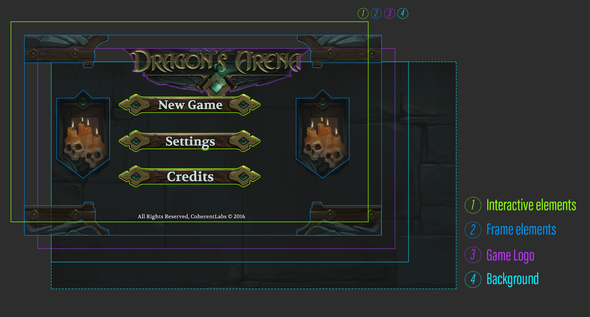
This scheme represents the Z-ordering of the elements
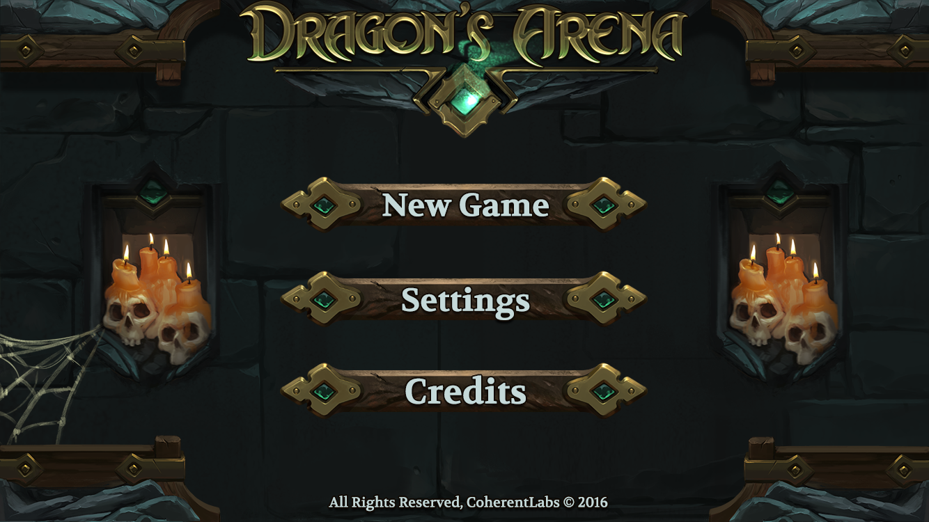 The final result
Game Screen
Our next challenge was to make the UI on the screen mobile-friendly. The interface we created for the Game screen includes 3 panels – Skill Panel, Hero Panel and Inventory, a panel with timer and indicator of wins and losses, and a level map. The most interesting and complex panel is the Hero Panel which consists of several bars – health, mana and level, hero portrait and level indicator. We decided to add more interesting idle animation in the health and mana-bar. The image below shows that there are two layers which are represented by loopable images below the progress bar. They make the progress bar look like a tube filled with moving liquid.
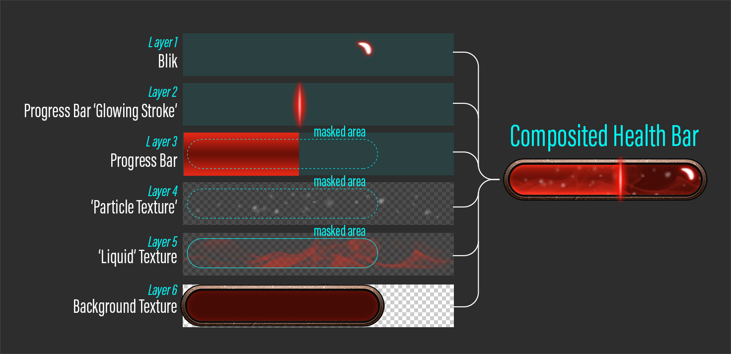 Anatomy of the progress bar
There are three masked elements – progress bar and textures for the ‘Particles’ and the ‘Liquid’. We tiled both textures horizontally and timed their movement speeds differently.
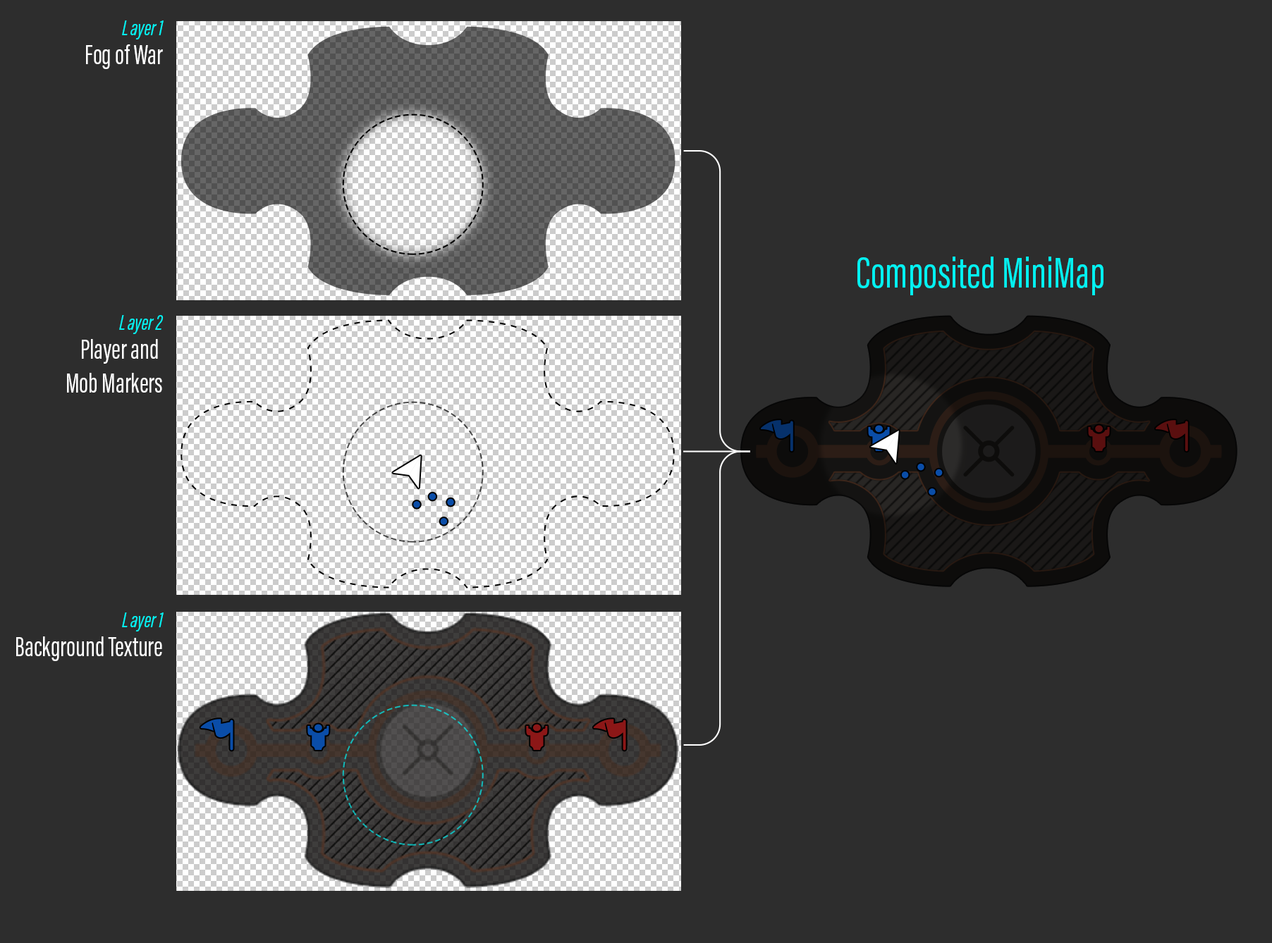 Level Mini-map
We created a Level Mini-map, which has three layers. The top layer, ‘Fog of war’, represents a mask that cuts through the texture with alpha set to 40%. The next layer consists of two elements – the Player Marker and the little dots that represent mobs. Both of them have the same mask as ‘Fog of war’. The final layer is the background of the map.
We separated the UI on major functional blocks and anchored them to specific positions, which allowed us to have design which is resolution independent and mobile friendly.
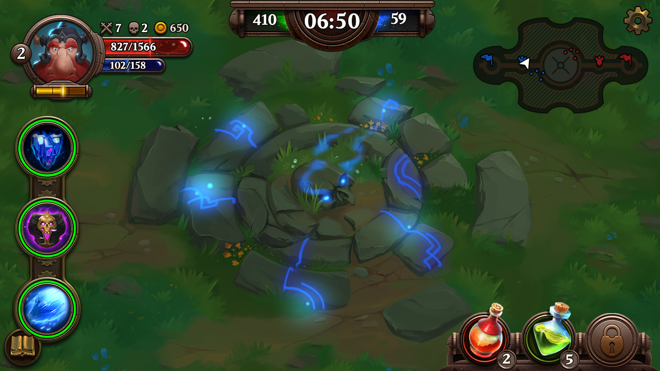 Final image of the battle screen
For the terrain, we created two different textures – grass and road, – which can be blended together. We also added a texture that represents the circular arena in the map center, and also serves as a point of interest.
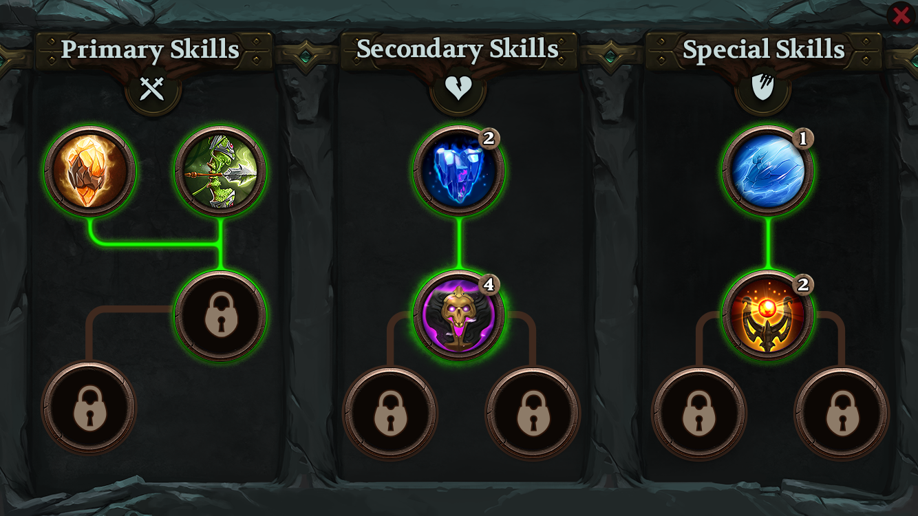
Skill Screen
What we encountered as challenge in the Skill Screen was the construction of the background frame and skill-trees, so that the screen can fit different resolutions.
We decided to paint the background in such way that it does not look distorted when changing the screen aspect ratio / resolutions. We achieved horizontal separation of the screen in three equal parts by designing vertical dividers that blend with the background horizontally at both sides.
 Final Image of the Skill Screen
See the presentation of the MOBA sample from the perspective of a front-end developer.
This MOBA sample is available with Hummingbird’s product package. If you have any questions about the creation of interface for video games, write a comment below.