
MOBA Sample UI Part 2: Developer’s view
In a previous blog post, we shared our experience with the development of the MOBA Sample (UI Kit for a MOBA-style mobile game) from the perspective of a designer. Now, we will tell you more about this project from the perspective of a front-end developer. Also, we will share the benefits of using the Coherent editor, the only HTML Editor, specially designed for Game UI.
The benefits of using a Visual Editor
Using a Visual Editor makes your workflow a lot easier. It eliminates the need to manually write the code, create the HTML elements, think of IDs and/or classes, position and style them. The Coherent visual editor saved us dozens of hours and accelerated the HTML building and styling process, so we could focus on more complex tasks of the UI development.
Such a complex task is to make sure that the game UI looks good on any screen size and resolution because creating a responsive design and building it afterwards are two substantially different things. For example, the design we used for the MOBA sample was made to look good in 16:9 aspect ratio with the idea that the elements will rescale on different resolutions. However, the HTML elements are not fixed and each one has its own positioning and geometry. So, the hard part was to keep a great user experience even in 5:4 aspect ratio. Here is what we did:
Sometimes full responsiveness is not the answer
We decided not to sacrifice the elements sizes so they could look good on resolutions/aspect ratios outside of the intended UI design. We chose maximum visibility of the elements over full responsiveness. This way, the UI looks and feels good even on small screens. We will illustrate this with the Main menu screen.
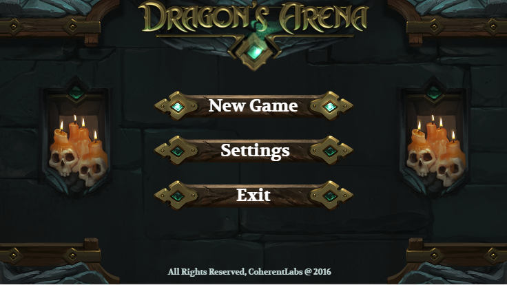
MOBA game UI Sample: Main Menu
Here is how the Main Menu looks on 16:9 (original design aspect ratio). Take a look at the buttons, notice their size and the space between them:
Now take a look at those two screenshots, both taken at 5:4 aspect ratio:

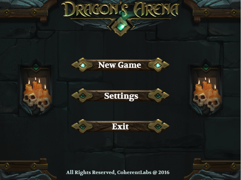
In the left one, the geometry of the elements is defined with vh units (relative to the height of the viewport), and in the second one with vw units.
Reaching without an effort
There are three things to notice in the first screenshot – the space between the buttons remains the same and the size of the buttons is larger compared to the one with 16:9 aspect ratio. Moreover, the size of the buttons is as big as the logo of the game.
In the second screenshot, when the UI is fully responsive, the buttons look skinnier, the space between them is bigger (not preserved) and they have not taken the full possible width the design can offer. Finally, the size of the buttons is smaller than the game logo. This translates to the buttons being hard to reach.
In conclusion, when building UI for a mobile game you have to consider what will improve your user’s experience and in this case, it is to sacrifice the full scalability of the elements.
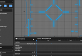
Skill tree
The second design, we completed, was the Skill tree which was integrated into the main game scene.
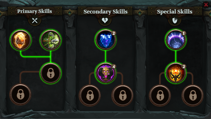
As you can see, the screen has a simple design and it is divided into three parts:
- A background
- A label element for each skill tree
- The actual skill trees
The background image is the frame of the screen and the filling, without the columns separating the skill trees. The background size is 100%. The columns fit in the background image and their width is according to the viewport width, and the height, according to the viewport height, which makes them stick to the background borders.
The label elements for each skill tree and its children are sized according to the viewport width.
As for the skill trees, we would recommend that you put each one in a flexbox and vertically align them inside. This will be useful for all common screen sizes and aspect ratios.
The actual skill tree and all of its elements are sized according to the viewport width. We do this because of the logic of the design – they are standing one next to another. If each skill tree had its own row, we would have made their size according to the viewport height.
The collision of the coolest and the hardest part
The last screen of the MOBA sample was the in-game UI. It was the most challenging one, but also the most rewarding. The problem here was, as this is the in-game scene, that the UI had to be easily accessible, but at the same time, it had to take away from the game scene as little as possible.
We started the development by creating the UI elements in ascending order by the level of difficulty:
– the top score/game time
– the potion bar
– the skills bar
– the map
– the hero avatar/stats
Note: The hero stats was the most complex element with over 20 elements within the wrapper, and with masks added to 3 of the elements.
Then, we evaluated which elements should be easy to click even on small screens. Both the potion bar and the skills bar are such elements. We decided not to resize the avatar and the skill sidebar according to the height of the viewport when the resolution gets squarer. This left more room for the game on the left side of the screen. While, on the right side, the higher the viewport is, the larger is the potions element.
This MOBA sample is available with Hummingbird’s product package. If you have any questions about the creation of interface for video games, write a comment below.


