
Web Components

What are Web Components?
Web Components are a set of web platform APIs that allow you to create new custom, reusable, encapsulated HTML tags to use in web pages and web apps. If you are familiar with building components in libraries like React or Angular, Web Components should feel similar. Thanks to them, developers are no longer limited to the existing HTML tags that the browser vendors provide.
To recap, Web Components are a collection of building blocks, consisting of:
- Custom Elements
- Shadow DOM
- HTML Imports
- HTML Templates
The four parts of Web Components are designed to work together, but you can also use each one individually.
Note: Web Components are not fully supported by all browsers yet. In order to apply them, you will need to use polyfills to fill the gaps in browser coverage. Web Components work properly in our newly released version of Coherent GT.
Custom Elements
Custom Elements give us the capability to create new HTML tags. You can do that by crafting your own elements, enhance existing HTML tags or extend components that other developers have authored.
Before we move on let’s look at the rules on how to name and define your Custom Elements:
- The name of a custom element must contain at least one hyphen (-). For example,
<drop-down>is a valid name for custom element, while<drop_down>is not. This is necessary in order to allow the HTML parser to differentiate between a custom element and a regular HTML element. - A custom element cannot be self-closing. For example,
<drop-down />is not a valid syntax for a custom element. It should always be written like this:<drop-down></drop-down>.
Create a custom element
- Create your own custom element:
One can craft a custom element using the customElements.define() browser API method and a JavaScript class that extends theHTMLElement like so:
|
1 2 3 4 5 |
class DropDown extends HTMLElement { // Define behavior here } window.customElements.define('drop-down', DropDown); |
You can also use an anonymous class if you do not want a named constructor in a current scope:
|
1 2 3 |
window.customElements.define('drop-down', class extends HTMLElement { // Define behaviour here }) |
Once the custom element is defined, we can use it in a web page:
|
1 |
<drop-down></drop-down> |
We can define properties on a custom element. For example, let’s add an attribute called fill to our element:
|
1 2 3 4 5 6 7 8 9 10 11 |
class DropDown extends HTMLElement { // Set the "fill" property set fill(option) { this.setAttribute("fill", option); } // Get the "fill" property get fill() { return this.hasAttribute("fill"); } } |
And the usage in the browser:
|
1 |
<drop-down fill="true"></drop-down> |
Note: this refers to the DOM element itself i.e. the instance of the class. So, in the example above, this refers to the <drop-down>.
You can also define a constructor in the class, just call the super() method to have access to the methods and properties of HTMLElement.
|
1 2 3 4 5 6 7 |
// Create a class for the element class DropDown extends HTMLElement { constructor() { // Always call super first in constructor super(); } } |
- Extending a custom element
You can do that by extending its class definition:
|
1 2 3 4 5 6 7 8 9 10 11 12 13 |
class FancyDropDown extends DropDown { constructor() { // Аlways call super() first in the constructor. // This also calls the extended class' constructor. super(); } fancyHoverMethod() { ... } } customElements.define('fancy-drop-down', FancyDropDown); |
- Extend already created components
Browse the element registry and check out if there are any components that you are interested in. Then go to the README tab and learn how to import and use the chosen element in your project.
A custom element can define special lifecycle callbacks for running code during several interesting times of its existence:
constructor(): Called when an instance of the element is created or upgraded. Useful for initializing state, setting up event listeners or creating Shadow DOMs.connectedCallback(): Called every time when the element is inserted into the DOM. Useful for running setup code, such as fetching resources or rendering.disconnectedCallback(): Called every time the element is removed from the DOM. Useful for running clean up code (removing event listeners, etc.).attributeChangedCallback(attributeName, oldValue, newValue): Called when an attribute is added, removed, updated, or replaced. Also called for initial values when an element is created by the parser or upgraded.
Note: Only attributes listed in the observedAttributes property will receive this callback.
adoptedCallback(oldDocument, newDocument): Called when the element has been moved into a new document.
Shadow DOM
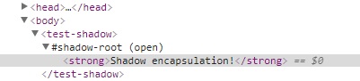
The main idea behind Shadow DOM is to hide all of the markup and styles of a custom element. Let’s look at the usage of a Shadow DOM in a custom element:
|
1 2 3 4 5 6 7 |
window.customElements.define('test-shadow', class extends HTMLElement { constructor() { super(); var shadowRoot = this.attachShadow({mode: 'open'}); shadowRoot.innerHTML = `<strong>Shadow encapsulation!</strong>`; } }) |
When you use in the browser it will be rendered like so:
|
1 2 3 |
<test-shadow> <strong>Shadow encapsulation!</strong> </test-shadow> |
If you open the browser’s console and inspect the DOM, you will see our new element under the #shadow-root.
The Element.attachShadow() method attaches a Shadow DOM tree to the specified element and returns a reference to its shadowRoot.
The mode in .attachShadow method is a string specifying the encapsulation mode for the shadow DOM tree. The value of the mode can be:
open: Specifies open encapsulation mode. It means elements of the shadow root are accessible from the outside world usingelement.shadowRoot.closed: Specifies closed encapsulation mode. This mode denies any access to node(s) of a closed shadow root from the outside world.
HTML Imports
Finally, we can include HTML documents into one another using HTML Imports. The import keyword is assigned to the rel attribute of the link element. You import HTML file using <link> tag in an HTML document like this:
|
1 2 3 4 5 |
<link rel="import" href="drop-down.html"> <drop-down> now available </drop-down> |
HTML Templates
The HTML <template> element defines how to declare pieces of markup at page load. In other words, the template tag allows you to store some markup on the page, which you can later clone and reuse. You can write HTML and CSS code within <template> tag to define how you want the component to be rendered in the browser.
Live Demo
Now we will show you how a drop down menu can be created with Web Components.
Create new .html file, drop-down.html. Here we will define the template, that holds the markup and the styling for our Web Component:
|
1 2 3 4 5 6 7 8 9 10 11 12 13 14 15 16 17 18 19 20 21 22 23 24 25 26 27 28 29 30 31 32 33 34 35 36 37 38 39 40 41 42 43 44 45 46 47 48 49 50 51 52 53 54 55 56 57 58 59 60 61 62 63 64 65 66 67 68 69 70 71 72 73 74 75 76 77 78 79 80 81 82 83 84 85 86 87 88 89 90 91 92 93 94 95 96 97 98 99 100 101 102 |
<template id="my-drop-down"> <style> .menu-wrap { width: 20.8334vw; display: block; background-color: transparent; font-family: 'ExtraLight'; user-select: none; margin: 20px 40px; } .menu-label { font-size: 1vw; color: rgba(227, 141, 39, .8); padding: 1% 0% 2.5% 7%; } .menu-head { border: 1px solid #e38d27; } .menu-head, .menu-body { background-color: rgba(0, 0, 0, .6); } .menu-head, ::slotted(.menu-option) { min-height: 2.2vw; } .current-choice { color: #fff; height: 2.2vw; overflow: hidden; text-overflow: ellipsis; white-space: nowrap; padding: .7vw .1vw .1vw 1.7vw; } .current-choice, ::slotted(.menu-option) { text-transform: capitalize; font-size: 1.2vw; } .menu-body { max-height: 13vw; overflow-y: scroll; overflow-x: hidden; } ::slotted(.menu-option) { color: rgba(255, 255, 255, .3); position: relative; padding-left: 1.7vw; display: flex; align-items: center; transition: padding .5s linear, background-color .25s linear, color .25s linear; } ::slotted(.menu-option::after) { content: ''; width: 100%; height: 1px; background-color: rgba(255, 255, 255, .15); position: absolute; bottom: 0; left: 0; } ::slotted(.menu-option:hover) { background-color: #e38d27; color: #fff; padding-left: 12%; } .menu-body::-webkit-scrollbar { width: 2.292vw; } .menu-body::-webkit-scrollbar-thumb { background-color: #e38d27; border: .78125vw solid rgba(0, 0, 0, 0); background-clip: padding-box; } .menu-body::-webkit-scrollbar-track { background-color: #111; border: .78125vw solid black; } </style> <div id="my-menu" class="menu-wrap"> <div class="menu-label">Choose your language</div> <div class="menu-head"> <div class="current-choice">English</div> </div> <div id="menu-body" class="menu-body"> <slot></slot> </div> </div> </template> |
Note: By default, if an element has shadow DOM, the shadow tree is rendered instead of the element’s children. To allow them to render, you need to add placeholders in your shadow tree. That is why we are using the <slot> tag. More information about this element can be found in the MDN documentation.
Now that we have the template, let’s create the custom element. After the <template> tag add a <script> tag. Here we will declare the class for our element. In this example we will use connectedCallback method to attach a shadow to the template and define the element’s behaviour:
|
1 2 3 4 5 6 7 8 9 10 11 12 13 14 15 16 17 18 19 20 21 22 23 24 25 26 27 28 29 30 31 32 33 34 35 36 37 38 39 40 41 42 43 44 45 |
<script> class DropDown extends HTMLElement { constructor() { super(); } connectedCallback() { // init the component let shadowDom = this.attachShadow({ mode: "open" }); let template = document.getElementById("my-drop-down"); let templateHtml = template.content.cloneNode(true); shadowDom.appendChild(templateHtml); // define the menu, menu body and hide it let menu = shadowDom.getElementById("my-menu"); let menuHead = menu.children[1]; let menuBody = menu.children[2]; menuBody.style.display = "none"; // toggle the menu body function toggleMenu() { menuHead.addEventListener("click", function() { if (menuBody.style.display === "none") { menuBody.style.display = "block"; } else { menuBody.style.display = "none"; } }); menuBody.addEventListener("click", function(ev) { if (ev.target !== ev.currentTarget) { menuHead.children[0].textContent = ev.target.textContent; } menuBody.style.display = "none"; }); } // init toggle listeners toggleMenu(); } } // init the element customElements.define("drop-down", DropDown); </script> |
And that is it! Now you can use the <drop-down></drop-down> tag multiple times in your project! So let’s see how it looks:
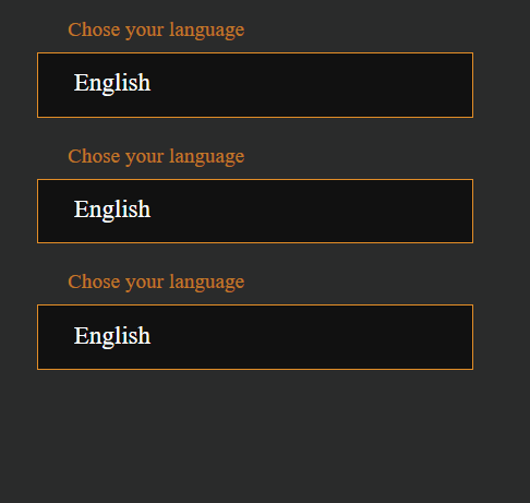
Тo explore the example in more detail, can check it out in codepen.
For more interesting information regarding Web compnents follow @CoherentLabs on Twitter or start a discussion in our Forum. Also, give Daniela, the creator of the post, some love by tweeting her @DannaGeorgieva.

