FPS HUD
This step by step tutorial of how to recreate the FPS HUD scene will be separated into sections, for each widget created.
In this section some techniques will be defined for creating the Scene. These techniques will help the integration of the UI to be as easy and smooth as possible after exporting it to HTML with Coherent Prysm.
Overview
This is a list of the widgets created.
- Health and Condition
- Weapon and Ammunition
- Nameplates
- Informational
- Main objective
- Initial loading
- Achievement widgets
- Crosshair and Reticle
- Battlelog
- Timer and Teams Status
- Minimap
The Exo 2 font will be used for the Text elements.
Good Practices
- Optimal structuring of Layers and Symbols.
Every Symbol should contain just one element inside it. On export this will produce a single element despite that in the Animate project the element is nested inside a Symbol which is inside a Layer. This is convenient, because the Animate project will look organized and at the same time the exported scene will have as few elements as possible.
- Nesting elements which are going to be used with the game's model or logic.
Some parts of a widget, like a bar which fills, needs to be composed of two elements within one Symbol. The first Shape defines the shape and dimensions of the bar. The second Shape will be the dynamic part of the bar which resizes according to the game model value that is provided to it. This will be explained further in the tutorial while creating such an element.
- Reusing Symbols in the Scene which are intended to change during gameplay.
Symbols (their content specifically) which change according to the game model should be unique within the Animate project.
For example if there are two identical Text elements - one that changes according to the player's maximum heath and another which changes according to the ammunition left in the magazine.
Each text element should be within a Symbol with a unique instance name. Coherent Prysm uses the Instance names to provide the html elements with IDs and data-bind-* attributes. If the IDs are the same, the data-bind-* attributes would also be the same and this would cause the two text elements to behave like one(bad).
Getting Started
Presuming that Coherent Prysm is already installed in Animate, create a new Coherent Prysm document and choose the scene size.
The sample project is 1920x1080 pixels (aspect ratio 16:9). Since Prysm uses responsive units by default, the UI will scale properly with the size of the screen as long as the screen's ratio is 16:9. The UI will grow and shrink, therefore it will look good on both 3840x2160 and 1280x720 resolutions.
Starting with the top and bottom - import "export_Filler_Top.png" and place it at the top. This should be separated in its own Layer with the name "top_background". Do the same for the "export_Filler_Bottom.png" image on a separate Layer "bottom_background".
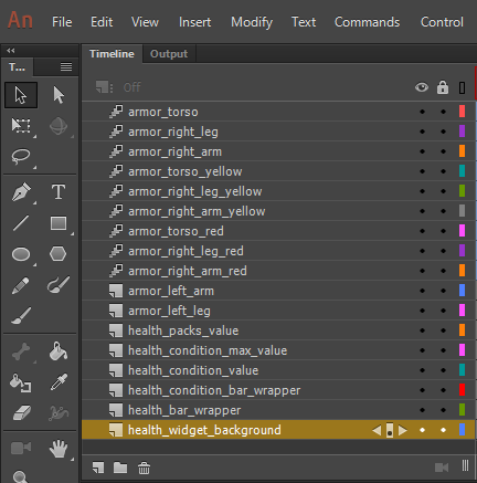
1. Health and Condition Widget
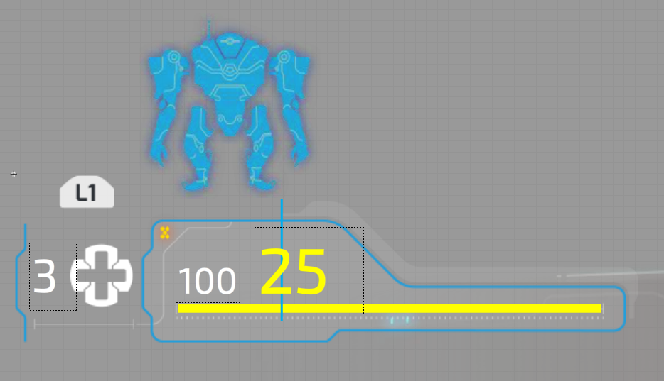
The Health widget will have an initial position animation. It will enter the screen from the left side, but let's start with the layout first.
1.1. Background
Create a Layer in the Timeline and name it "health_widget_move". Import the background image for the widget into the Scene - "HealthWidget_bg.png". Then convert the image to Symbol with name "health_widget_wrapper".
Enter the newly created Symbol and proceed with the next steps.
1.2. Texts
Create 3 text elements with the Text tool. Place them as seen on the reference image and convert them to Symbols. Then distribute each one to a separate Layer as follows:
- health_packs_value - The white number 3 on the left that represents the available med packs.
- Font: Exo 2 Medium
- Font size: 43 pt
- health_condition_max_value - The white number 100 in the middle for the maximum condition value for the armor.
- Font size: 33 pt
- health_condition_value - The yellow number 25 representing the current condition value.
- Color: #FFFF00
- Font size: 59 pt
Dynamic Texts that are going to change their value within the game are converted
to Symbols so data-bind-* attributes can be set to them. Data binding and how
it can be used with data-bind-* properties is another part of this tutorial.
1.3. Current Health Bar
This bar will be used to show the player's current health. Its width will come from the game model. This Scene element needs more attention.
Select the Rectangle Tool, "remove the stroke" and create a rectangle.
- Width: 385
- Height: 8
Place it in the correct position according to the reference image. This Shape represents the dimensions of the bar and its placement.
Change the Alpha of the fill color to 0%. Now make it into a Symbol with the name "health_bar_wrapper".
Enter the newly created Symbol and rename "Layer_1" to "health_bar_dimensions"..
Create a new Layer "health_bar_value". Inside it create another Rectangle Shape.
- Fill: #FFFF00
- Position X: 0
- Position Y: 0
- Height: 8
- The same as the dimensions bar.
Now after exporting the Scene, the "health_bar_value" can be conveniently resized with percent units. This is % from the full dimensions of the "health_bar_wrapper" symbol size which is defined by the first rectangle that we created.
Create a new Layer and name it "health_bar_wrapper" as well. Put the wrapper Symbol inside.
1.4. Average Condition Bar
Create a new Layer "health_condition_bar_wrapper". In it, another bar is created for the armor condition state. The same structure and principle goes for this bar as is for the Current health bar created above. Follow the reference image for the positioning.
The difference here is the Shape that defines the dimensions for the bar is different.
- Width: 325
- Height: 111
- Bar color: #00AEEF.
The bar will be masked through CSS with an image.
1.5. Armor Parts
The armor consists of 5 armor modules.
- Torso
- Left arm
- Right arm
- Left leg
- Right leg
Blue, yellow and red images are provided for the torso, right arm and leg representing the state of the armor.
Those 3 different colored part images will be stacked one on top of the other for every armor part. Each part is animated to visualize the principle.
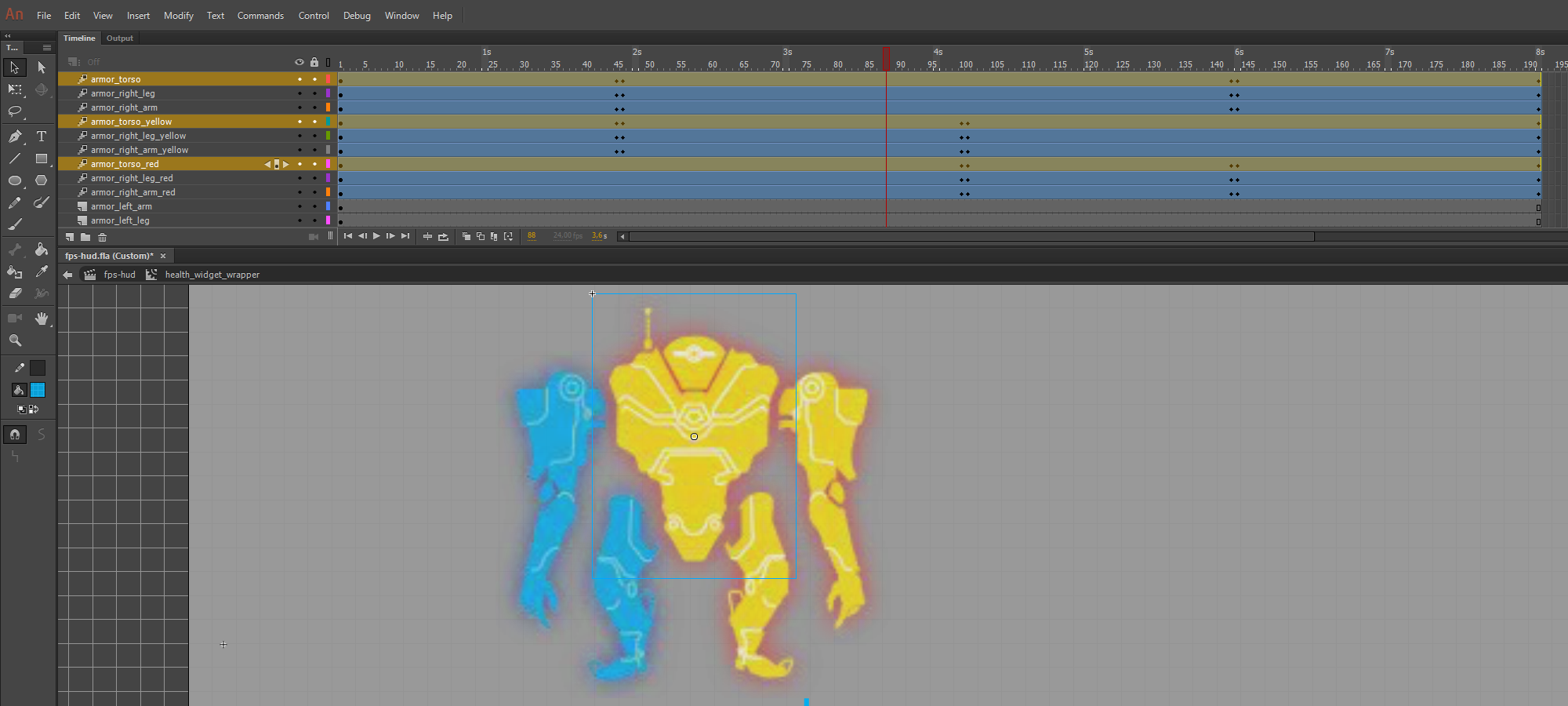
Import all of the needed images
- HealthWidget_robotBody_Blue.png
- HealthWidget_robotHand_Blue_l.png
- HealthWidget_robotLeg_Blue.png
- etc...
Each one is in a Symbol within a Layer of its own.
Place them as in the reference image. As you can see from the Timeline, the differently colored parts are synchronized so when the state changes, the appropriate Symbols are shown and the rest are hidden.
The animations are just for reference and exist to show how the layout should be while visualizing the principle. The final solution for this will be driven by the game model logic.
This is how to recreate the Health and Condition widget. The Timeline should look like this:
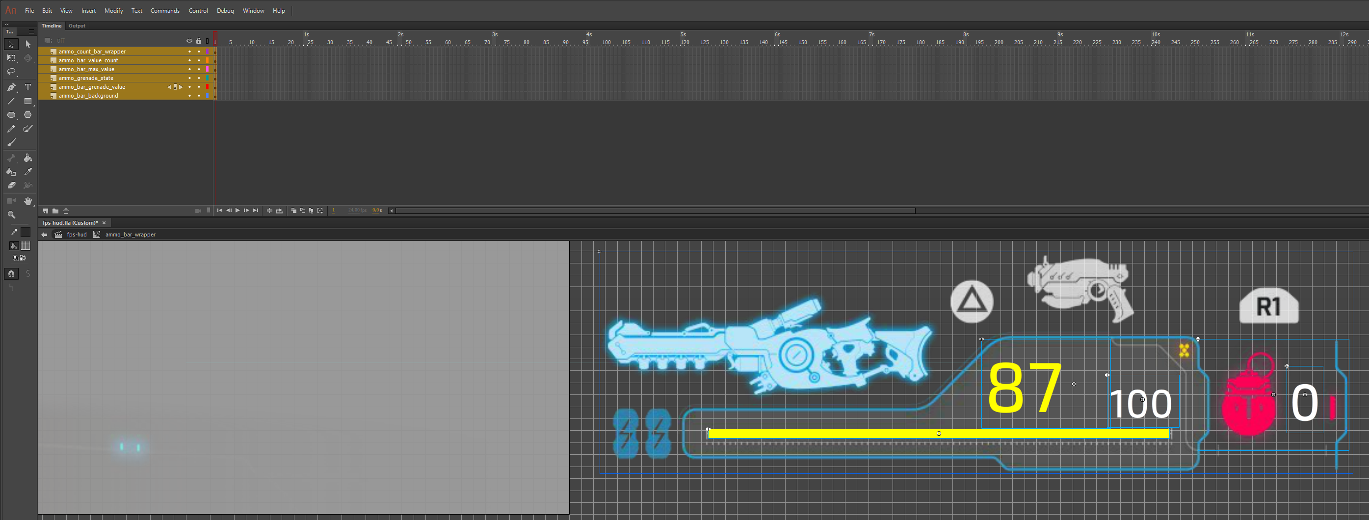
2. Weapon and Ammunition Widget
This widget is very similar to the one above. Remember that some elements may look the same as the previously created ones, but will have different purposes according to the game model. The color and font size of the number 87 and 100 may be the same with the numbers from the Health widget, but those numbers will change according to different values from the game model, so they should be unique in the Animate Scene as well.
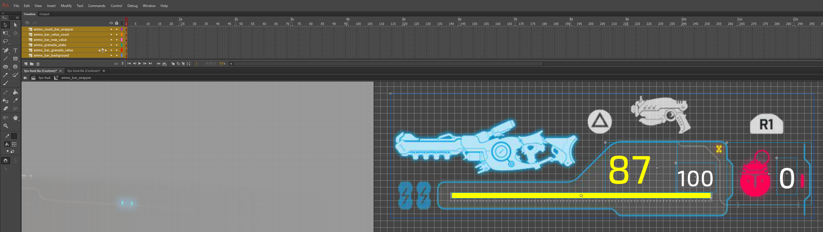
Create a new Layer "ammo_widget_move" and import the background image for it - WeaponWidget_bg.png.
Convert it into a Symbol "ammo_bar_wrapper" and get inside it. Rename the existing Layer to "ammo_bar_background".
2.1 Widget Elements:
- ammo_bar_grenade_value
- Text element converted to Symbol for the number of grenades the player carries.
- ammo_grenade_state
- The red grenade icon which changes to a white icon if the player owns any grenades.
- ammo_bar_max_value
- Each type of weapon will have different cap of maximum ammunition that the player can carry.
- ammo_bar_value_count
- The current count of ammunition in the clip/magazine.
2.2 Ammunition Bar
Create a new Layer "ammo_count_bar_wrapper".
Create a Shape for the dimensions of the bar and place it according to the reference image.
- Width: 385
- Height: 8
Convert it into a Symbol - "ammo_count_bar_wrapper". Once inside the newly created Symbol, rename the existing Layer to "ammo_bar_dimensions".
Make a new Layer "ammo_bar_width" for the bar that will change dynamically. Inside it, create another bar with the same height and set whatever width you like.
Now rotate the whole "ammo_count_bar_wrapper" symbol 180 degrees, so it can start filling from right to left.
These are the final pieces of the Ammunition widget.
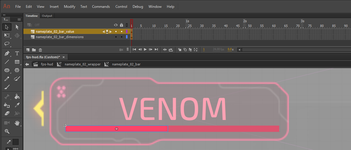
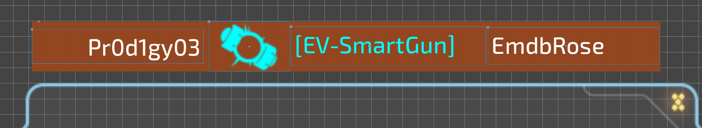
3. Nameplates
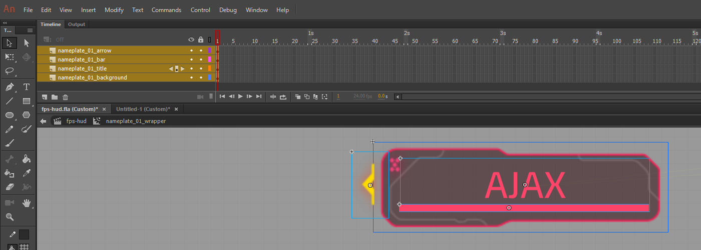
Again, the background image "GameMessage_namePlate_2.png" can be used to initially create the wrapper for the widget itself after importing it - "nameplate_01_wrapper".
The nameplate widget is fairly simple and consists of:
- nameplate_01_background
- The nameplate background.
- nameplate_01_title
- Title as the enemy or teammate's name.
- nameplate_01_arrow
- An arrow which by idea serves as an indicator when the targeted player goes outside of the view range.
- Source image - GameMessage_namePlateArrow.png.
- nameplate_01_bar
- A bar like the ones created in the previous two widgets.
- Maximum width: 188
- Maximum height: 5.50
- It also has two of its main components - nameplate_01_bar_dimensions and nameplate_01_bar_value.
Two more templates are created in the Scene. The background Layer can be reused, but the title, bar and arrow are unique as they will respond to what comes from the game model.
4. Informational Widgets
These are simple widgets for giving information to the player about the mission objective, achievement earned and if the game/round is fully initialized.
4.1 Main Objective Widget
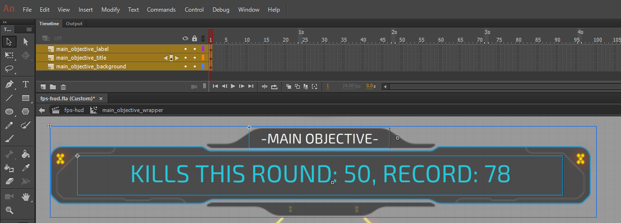
Another very basic widget consisting of only 3 elements.
Firstly, import the background image "GameMessage_bg4.png" and make a Symbol out of it - "main_objective_wrapper".
Once inside, the 3 elements are:
- main_objective_background
- A Layer for the background image.
- main_objective_label
- For the white top label.
- If the text will always be the same, it isn't needed to be converted to a Symbol.
- main_objective_title
- This is a Symbol as this text is dynamically changed according to the mission objective.
4.2 Initializing Widget
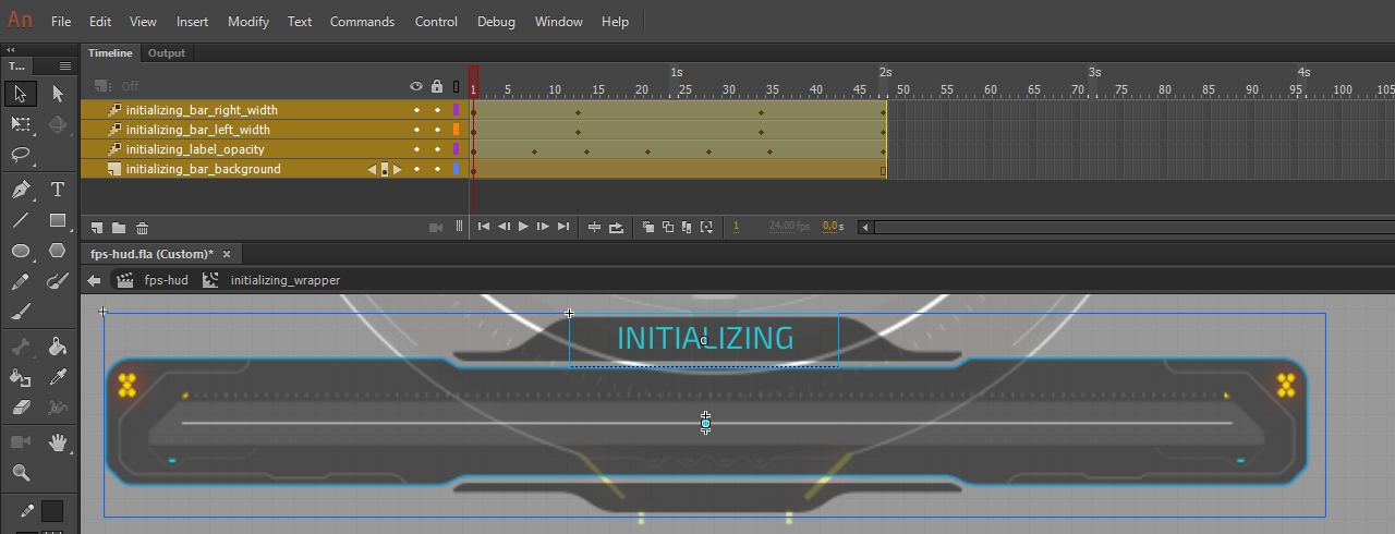
Very similar to the Main objective widget, but here there are two loading bars, one next to the other, which expand from the center outwards. The left bar is rotated 180 degrees, like the one in the Ammunition widget so it can expand from right to left when its width value is more.
Widget Layer name - "initializing_notification_alpha", consisting of:
- initializing_bar_background
- Objective background GameMessage_bg3.png.
- initializing_label_opacity
- The "Initializing" blue text at the top.
- initializing_bar_left_width
- The left loading bar.
- Height: 6.65
- Position X: 286
- Position Y: 55.75
- Rotation: 180 degrees
- initializing_bar_right_width
- Position X: 286
- Position Y: 49.10
4.3 Achievement Widgets
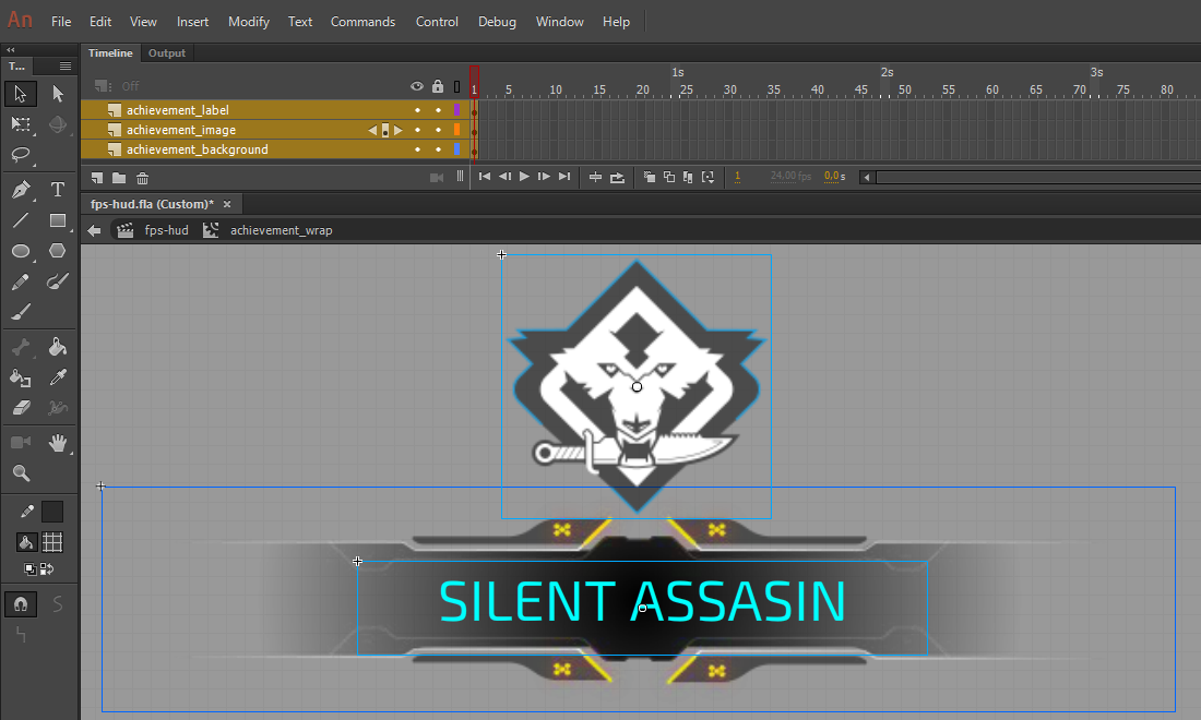
The Achievement widget has two elements which can change dynamically - the icon and the text for the different name of the achievement, so they both need to be converted to a Symbol.
This widget has the following Layers:
- achievement_background
- The background image is GameMessage_bg1.png.
- achievement_image
- Source image - GameMessage_AchievmentIcon.png.
- achievement_label
- The name of the achievement.
5. Crosshair and Reticle Widget
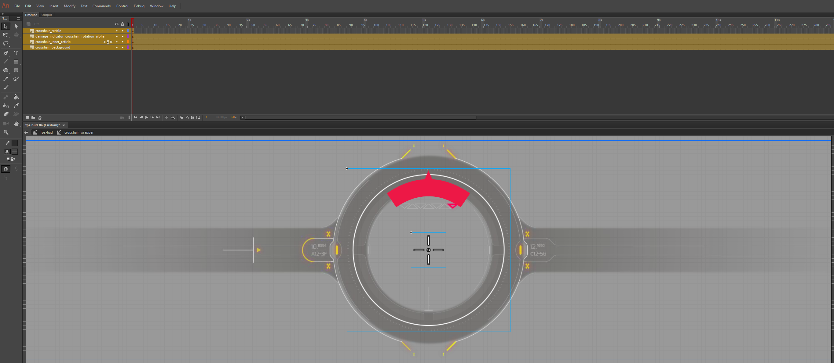
As with all widgets, we need a Layer to organize it in - "crosshair_wrapper". This widget is simplified to show the principle of how a reticle can be made.
The widget consists of:
- crosshair_background
- A static background - "Reticle_OuterCircle.png".
- crosshair_inner_reticle
- Image - "Reticle_InnerCircle.png".
- crosshair_reticle
- This is the crosshair itself - "Reticle_CrossHair_1.png".
- The crosshair image changes when an enemy is targeted.
- It would change with this image - "Reticle_CrossHair_2.png".
5.1 Damage Indicator Element
Create a shape which defines the dimensions of the damage indicator.
- Width: 390
- Height: 390
Convert it to a Symbol "damage_indicator_wrapper". Once inside it, rename the existing Layer to "damage_indicator_dimensions".
Create another Layer "damage_indicator_inner" and import these two svg files inside.
- damage_indicator.svg
- Reticle_DamageIndicator_Arrow.svg
Arrange and align them like the reference image.
The common wrapper "damage_indicator_crosshair" will be the element which will rotate and change its alpha.
6. Battlelog
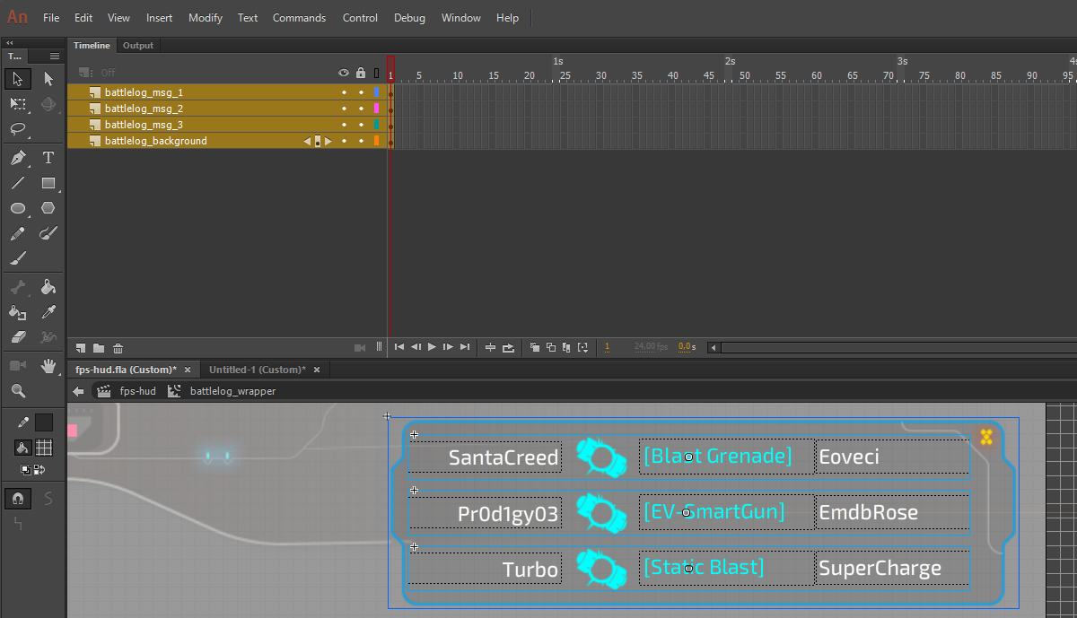
There are a few approaches on how to realize a battlelog. This is to showcase one of the ways - battlelog with a frame and a fixed amount of 3 messages.
Create a new Layer "battlelog_widget_move", import the image "battleLog_bg.png" and then convert it into a Symbol "battlelog_wrapper.
Once inside the Symbol, rename the existing layer to "battlelog_background".
6.1 Battlelog Message
The message consists of 3 Text elements and 1 icon. Each of those elements needs to be a Symbol with an Instance name, so data binding properties can be attached.
Create a rectangular Shape for the dimensions of the battlelog message.
- Width: 403,5
- Height: 32
Convert it into a Symbol with name "battlelog_msg_1". Inside it, let's rename the existing Layer to "battlelog_msg_1_dimensions".
From there create each text with the Text tool and import the icon "battleLog_icon3.png". The first text is aligned to the right.
This is one of the messages. Take note that the dimensions element can be reused when assembling the next messages, since the element is static and has no relation to the game model. The other elements should be unique as Symbols.
7. Timer and Teams Status Widget
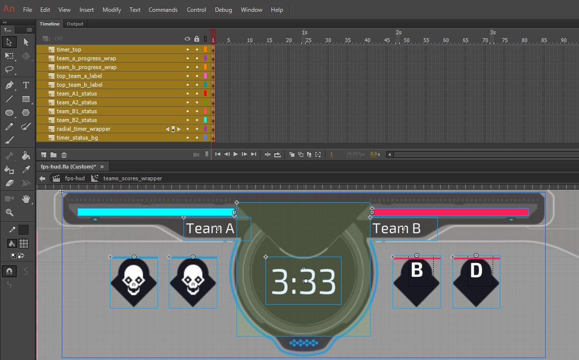
This widget consists 6 types of elements:
- The background for the widget.
- Two progress bars for each team.
- Two Text elements for the team labels.
- One Text element for the Timer in format
{minutes}:{seconds}. - Status indicator boxes with background, icon and a vertically filling bar.
- Four parts, combined in one main wrapper, which are going to be used to create a radial timer using CSS.
7.1 Background
Import "GameTimer_bg.png" and convert it into a Symbol "teams_widget_move".
This Symbol will define the dimensions of the whole widget. Inside the Symbol, rename the existing Layer to "timer_status_bg".
7.2 Progress Bars
There is nothing new into making the bars. They are the same as the previously created ones for the Health, Ammunition and Initializing widgets. The blue (left) bar fills from right to left, and the red (right) bar - from left to right. This means that after assembling the bar, it should be rotated to 180 degrees.
7.3 and 7.4 Team Labels and Timer Text
Simple text elements converted into Symbols and positioned according to the design. The Timer Text is aligned in the center.
7.5 Team Status Indicators
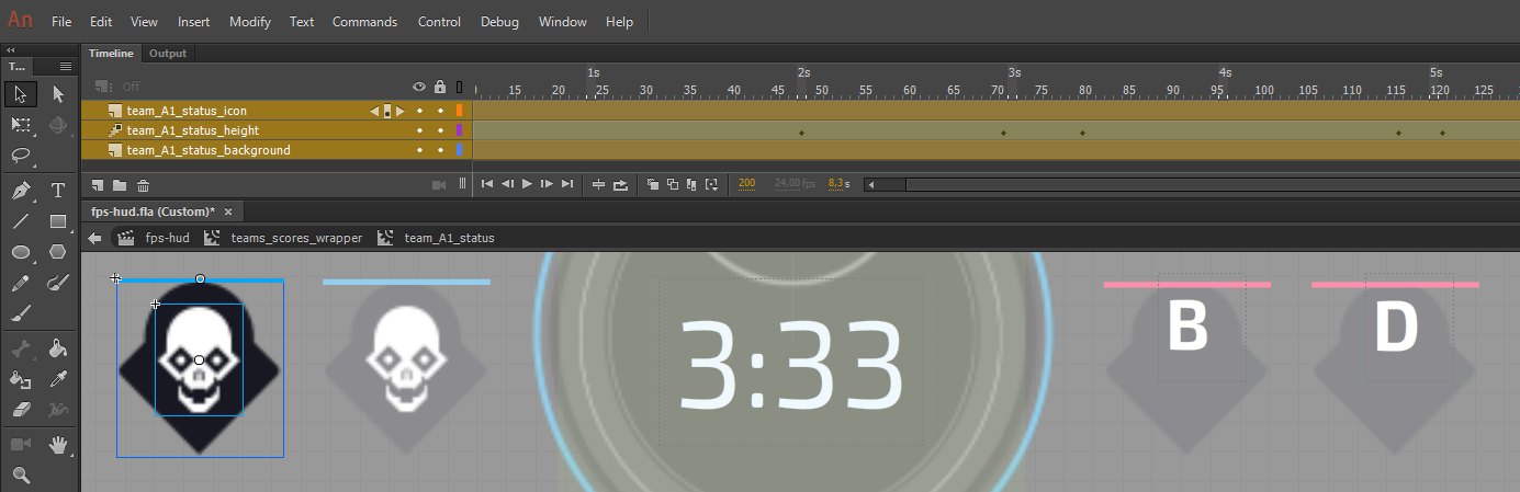
As for any other distinctive part of a widget, create a new Layer for it - "team_A1_status".
Import the background image "GameTimer_controlPoint_bg.png" which will define the geometry.
Convert it into a Symbol with the same name as the Layer. The background Layer name is "timer_status_bg".
A new Layer for the the status icon "Images_GameTimer_icon_Skull.png".
The bar is a Shape with width as the dimensions of the Symbol defined by the background. The height will change dynamically and for presenting purpose, it has little height.
Arrange the Layers so that the icon is on top, as it will be always visible, the background on the bottom and the icon in the middle. The bar itself will be masked with and image through CSS.
7.6 Radial Timer Parts
This timer is realized by having two half-circles opposite to each other, creating a full circle and one bar inside each of the half-circles. The time passed is represented by having the left bar rotate and get on top of the right bar which is static. When the time left is at a certain value, the left bar will disappear and then the right bar will start to move.
The half-circles are called slices. They are used for positioning and clipping the bars inside them using CSS.
In Animate, the radial timer consists of a wrapper and inside it - 4 square Shapes. These 4 elements are distributed into 2 wrappers. They are used for the above-mentioned slices and bars.
Create a square Shape.
- Width: 159
- Height: 159
Make it transparent just so it is barely visible. Convert it into a Symbol with name "radial_timer_wrapper".
Note that the background color is just so it is known that an element exists in that place while looking at the Scene in Animate.
The background color can later be removed with custom CSS or directly from Animate.
Once inside the newly created Symbol, create 4 more square Shapes with the same dimensions.
Convert these 4 Shapes each into a Symbol with the following names.
- radial_slice_left
- radial_slice_right
- radial_bar_left
- radial_bar_right
Cut the "radial_bar_left" Symbol, get inside "radial_slice_left" and paste it there. Rename the Layer to the same name as the pasted Symbol. Do the same with the right bar, but nest it inside "radial_slice_right".
Return to the wrapper "radial_timer_wrapper" and distribute each slice element into its own Layer.
The Timeline structure should look like this:
                        radial_slice_left -> radial_bar_left
radial_timer_wrapper <
                        radial_slice_right -> radial_bar_right
8. Minimap
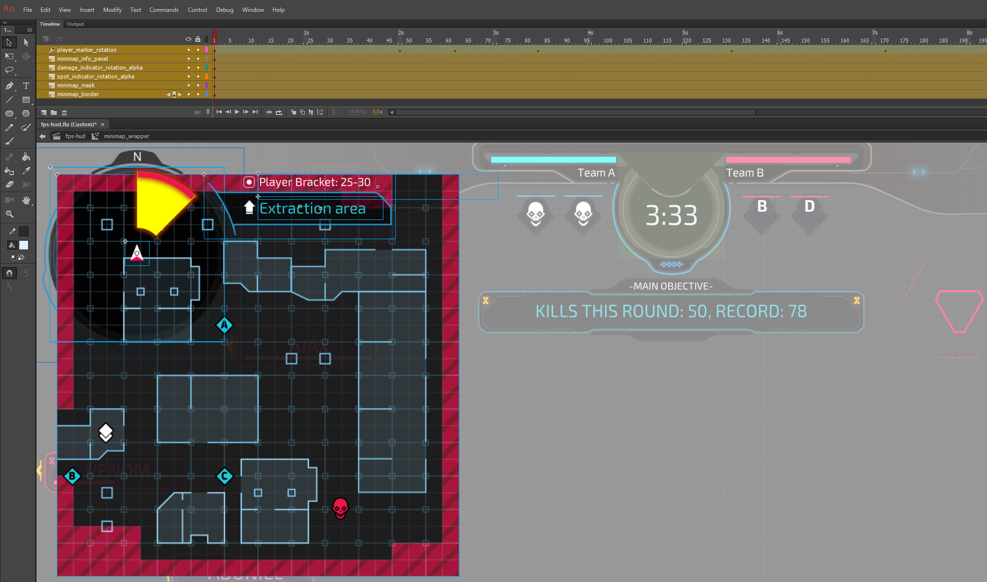
The Minimap has 6 main parts to it:
- Frame/background.
- Player marker in the center.
- Damage indicator.
- Spot indicator.
- Info panel
- Map terrain with icon which represent the objectives.
Back to the Scene, create a new Layer "minimap_widget_move" and then start with the background "miniMap_holder.png".
Convert it into a Symbol "minimap_wrapper".
Once inside the Symbol, rename the existing Layer to "minimap_border".
Once the frame is there, the rest of the elements can be aligned according to it.
Continue with the Player marker - import "miniMap_PlayerMarker.png" and place it in the center of the minimap black circle area.
- X: 142,4
- Y: 139,7
Convert it to a Symbol "minimap_player_marker".
The indicators, each in its own Layer - "miniMap_Damage.png" and "Images_miniMap_Scan.png".
They both have the same dimensions and positions.
- X: 30,7
- Y: 29,25.
The Damage indicator is in a Symbol "minimap_damage_indicator" and the Spot indicator - "minimap_spot_scan".
Create a new Layer "minimap_info_panel". Within it, there is the background image "miniMap_holderWaipoint.png" and two Text elements.
8.1 Minimap Terrain
The terrain image itself is big. It has to be masked, so it fits within the black circle in the frame.
For the masking, an additional Shape will be created and the masking is going to come from the CSS using:
clip-path: circle(50% at 50% 50%)
Create a new Layer in the "minimap_wrapper" Symbol and name it "minimap_mask".
Create a circle Shape with the Oval tool, while holding down the Shift key and make sure to remove the Stroke before that.
The Shape should fit within the black circle of the frame. Convert the element to a Symbol and name it "minimap_mask" - the same as the Layer it is in.
Once inside the newly created Symbol, rename the Layer to "minimap_mask_plate" and create a new one with the name "minimap_move". This will hold the actual minimap terrain.
Import the terrain image - "miniMap_terrain.png", place it at:
- X: 0
- Y: 0
Convert the image to a Symbol with name "minimap_terrain_image".
The minimap objectives are a part of the terrain itself. Import and place them according to the design. Images
- miniMap_iconCache.png
- miniMap_iconEnemy.png
- miniMap_iconObjectiveA.png
- miniMap_iconObjectiveB.png
- miniMap_iconObjectiveC.png
Each objective can potentially change its position, so convert each to Symbol.
This concludes the Animate tutorial for the layout of the FPS HUD Scene.