
Flexbox layout for game UI

The following blog post will look at what flexbox layout is all about as well as how one can use it in the creation of some common Game UI scenarios.
Flexbox Layout Overview
The Flex layout is a simpler, more efficient way to distribute space and align content in a container. Furthermore, flex containers can alter the width and height of their children to best fill available space, which makes responsive design much easier. For example, we can make flex children fill all of the free space, shrink to prevent overflow and also reorder themselves. What is more, the flexbox gives you total control over the vertical and horizontal alignment of elements with its flex directions idea.

Essentially, elements will be laid out on one of the axises, starting from the main-start point and going to the main-end point, or do the same, but in reverse. We will see how to specify where elements are aligned on the axises in the following examples:
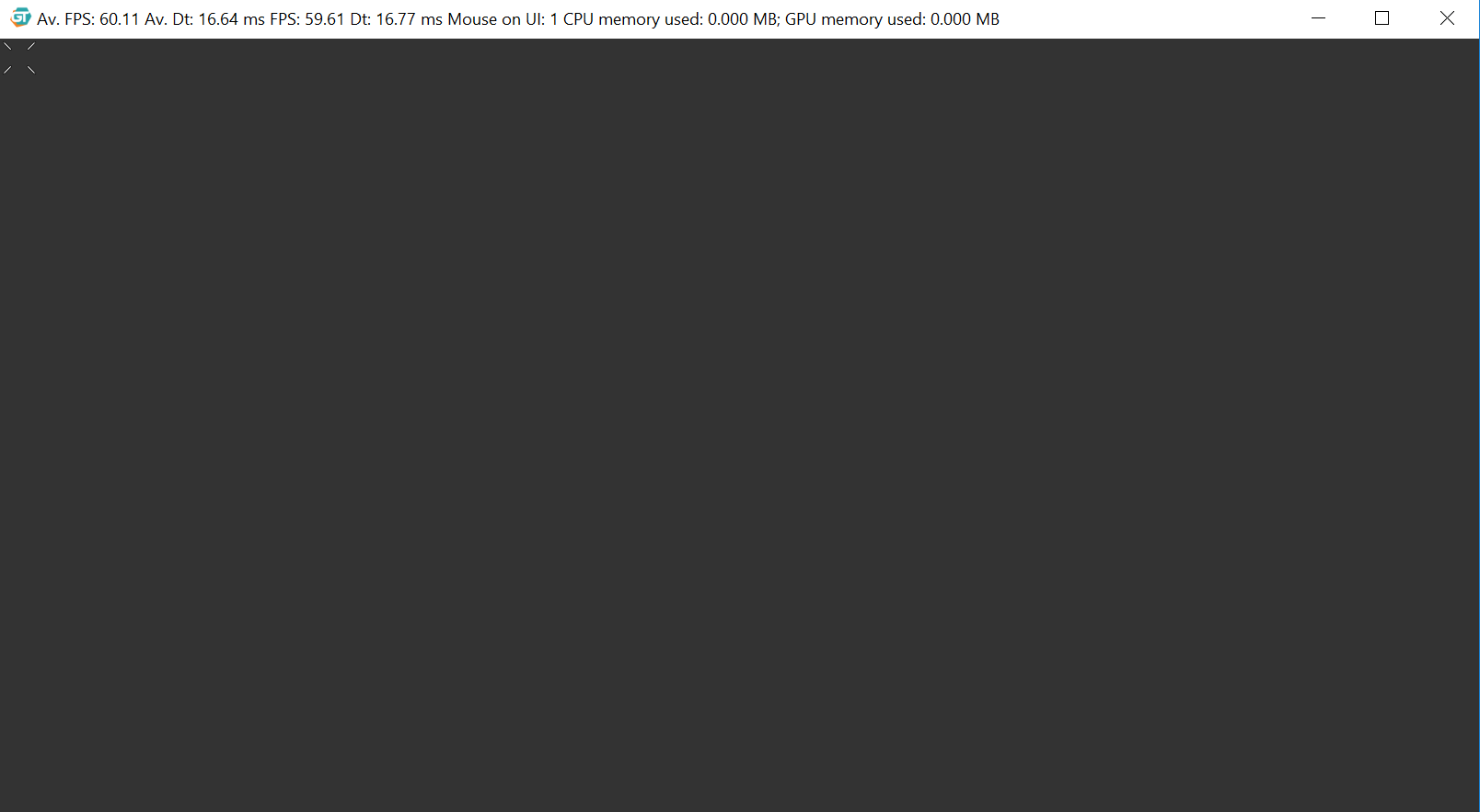
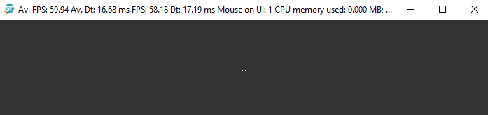
Centering A Crosshair
Let’s say that you are building a shooter game, where you want the crosshair of the player to always be in the middle of the screen. This is particularly easy with a flexbox. Тo do it create the following html file, which adds the scene wrap and the crosshair element.
<!DOCTYPE html>

<head>
  <link href='style.css' tyle='text/css' rel='stylesheet' />
</head>

<body>
  <div class='scene'>
    <div class='crosshair'></div>
  </div>
</body>

</html>
 We will use this 84x84px image for the crosshair, therefore, to center it let’s add the style.css.
body {
  background-color: #333;
  margin: 0;
  padding: 0;
}

.scene {
  display: flex;
  height: 100vh;
}

.crosshair {
  background-image: url(crosshair.png);
  background-repeat: no-repeat;
  background-size: 100% 100%;
  height: 5vmin;
  width: 5vmin;
}
The scene wrapper takes all of the space on the page and makes it a flex container, which means that the crosshair element becomes a flex child. By default, the flex container will align all children at the start of its main and cross axises.
We can use the align-items property to determine where the elements are positioned on the cross axis and use the center value to center our crosshair . Furthermore, the justify-content property aligns items on the main axis so we shall center that, as well.
/* ... */
.scene {
  align-items: center;
  display: flex;
  height: 100vh;
  justify-content: center;
}
/* ... */
The crosshair is now centered on both axises and will remain centered on every resolution.
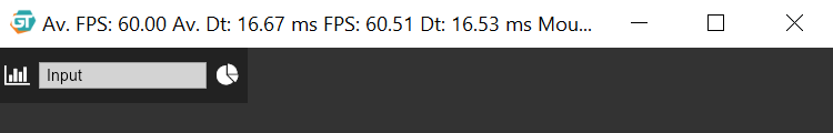
Input Fields Filling The Remaining Space
For some UI menus we want to have a few elements with a static size and others that scale to fill the empty space. Therefore, let’s create an input field that expands and shrinks depending on the space between the two static icons.
<!DOCTYPE html>

<head>
  <meta charset="utf-8">
  <title></title>
  <link href='style.css' tyle='text/css' rel='stylesheet' />
  <script src="https://use.fontawesome.com/523925ea87.js"></script>
</head>

<body>
  <div class='header'>
    <div class='icon-bar'>
      <i class='fa fa-bar-chart fa-2x'></i>
    </div>
    <input class='input-box' type='text' placeholder='Input'>
    <div class='icon-bar'>
      <i class='fa fa-pie-chart fa-2x'></i>
    </div>
  </div>
</body>

</html>
body {
  background-color: #333;
  color: white;
  margin: 0;
  padding: 0;
}

.header {
  align-items: center;
  background-color: #222;
  display: flex;
  height: 50px;
  width: 30%;
}

.icon-bar {
  align-items: center;
  display: flex;
  flex-basis: 35px;
  font-size: 10px;
  justify-content: center;
}

.input-box {
  flex: 1;
}

::-webkit-input-placeholder {
  color: black;
}
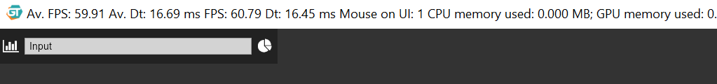
We have added a header menu, which is a flex container that aligns its children vertically, similar to the last example. Although, the icons have a fixed size, the input-box has the flex: 1 declaration which expands to the following.
flex-grow: 1;
flex-shrink: 0;
flex-basis: 0;
The grow property instructs the input box to expand and fill the empty space, while the 0 value for the shrink property prohibits the element from shrinking when it overflows the container. Finally, the flex-basis property defines the default size of an element before the remaining space is distributed. It thinks of it like the ideal size of the elements, which might grow or shrink if the container’s space is not enough.

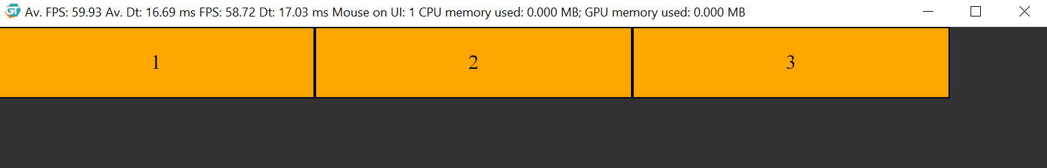
Wrapping Inventory Elements
When we are dealing with a different number of elements in an inventory, we want to have a way to wrap them in different rows and columns when required. We will show you how to do that with a small data-bound example:
<!DOCTYPE html>

<head>
  <meta charset="utf-8">
  <link href='style.css' tyle='text/css' rel='stylesheet' />
</head>

<body>
  <div class='inventory'>
    <div data-bind-for='iter:{{inventoryModel.items}}'
         data-bind-value='{{iter}}'
         class='item'>
    </div>
  </div>
  <script src='coherent.js'></script>
  <script src='bind.js'></script>
</body>

</html>
body {
  background-color: #333;
  margin: 0;
  padding: 0;
}

.inventory {
  display: flex;
  height: 100vh;
}

.item {
  align-items: center;
  background-color: orange;
  border: 2px solid black;
  display: flex;
  font-size: 3vh;
  height: 10vh;
  justify-content: center;
  width: 30%;
}
engine.createJSModel('inventoryModel', {
  items: [
    1,
    2,
    3,
  ]
});
Here, we have used data-bind-for to multiply the item div as many times as there are elements in the inventoryModel’s items array. What is more, the text value of the boxes will be the number in inventoryModel.items[iter], where iter will change from 0 to inventoryModel.items.length -1. Since we have 3 elements in the items array and each element takes 30% of the parent’s width, we will have just enough space to fit them all in the container.
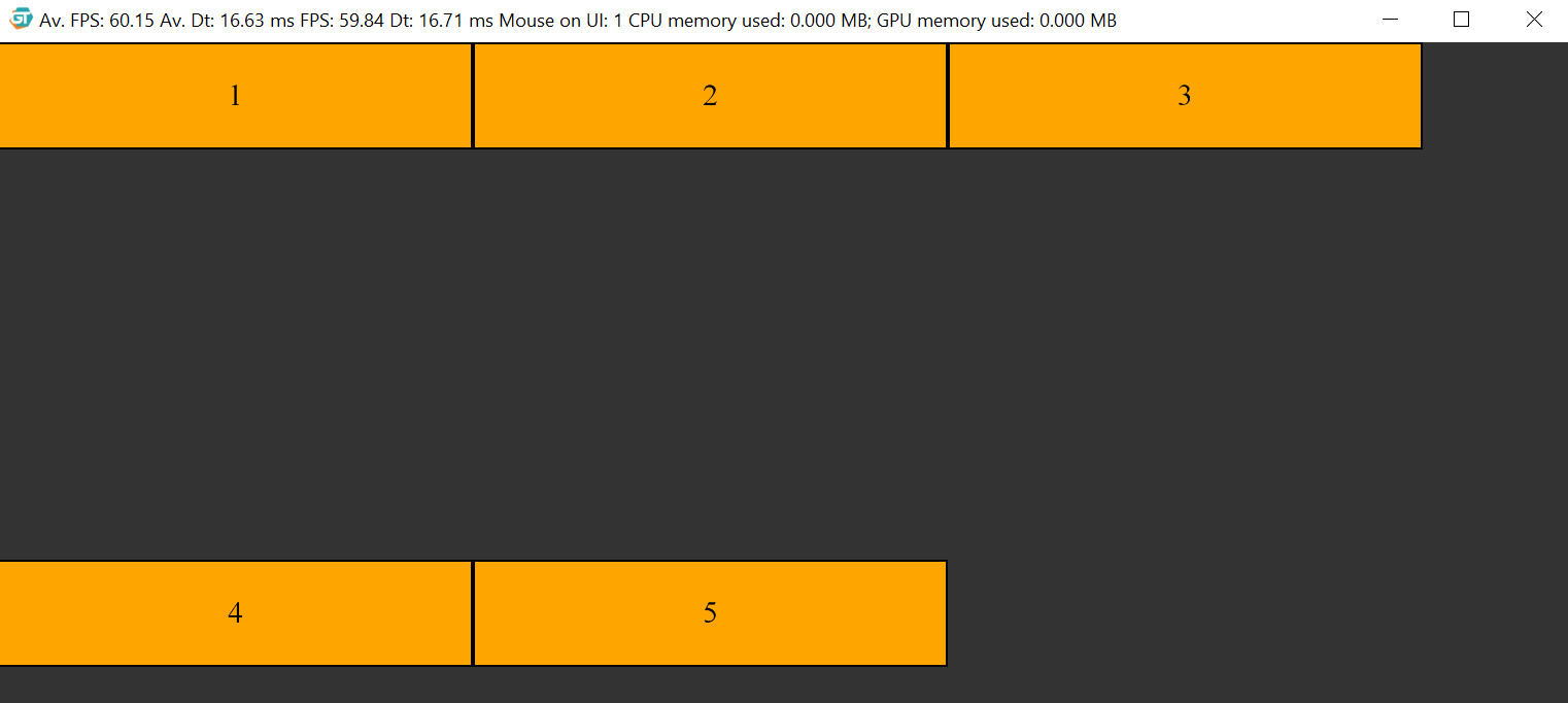
But what will happen if we add two more?
engine.createJSModel('inventoryModel', {
  items: [
    1,
    2,
    3,
    4,
    5,
  ]
});
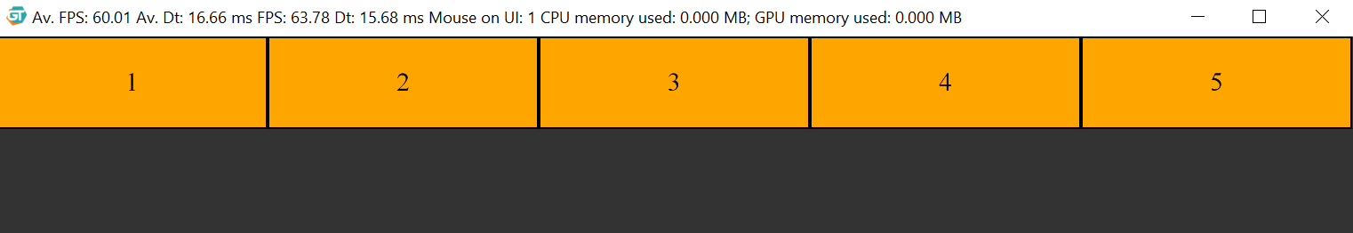
By default, all flex children have the flex-shrink: 1 property, they shrink, so that all elements can fit in a single line. Therefore, if we want to preserve the original size of the elements and make them wrap to the next line, we have to use flex-wrap.
/* ... */
.inventory {
  display: flex;
  flex-wrap: wrap;
  height: 100vh;
}
/* ... */
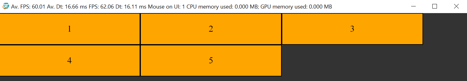
Furthermore, since the inventory takes the whole screen and the align-content property, which defines how the browser distributes the space between elements on the cross-axis, defaults to stretch, the elements wrap too deep. To fix that behavior we can change its property to something different, like flex-start.
/* ... */
.inventory {
  align-content: flex-start;
  display: flex;
  flex-wrap: wrap;
  height: 100vh;
}
/* ... */
In conclusion, we hope that you saw how powerful and easy the flex layout is and if you would like to read a bit more on the subject, check out the following links:

