Components
Overview
Coherent Prysm version 2021.1.2 introduced support for components. Symbols from an Adobe Animate document can be exported as components or can be replaced with components generated from other documents.
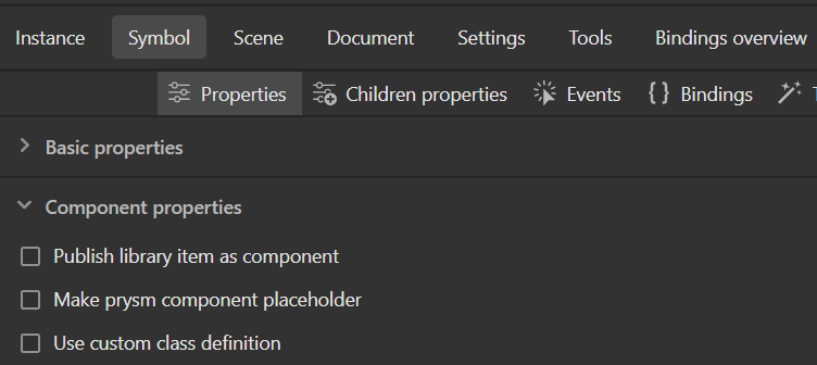
Publishing symbols as components
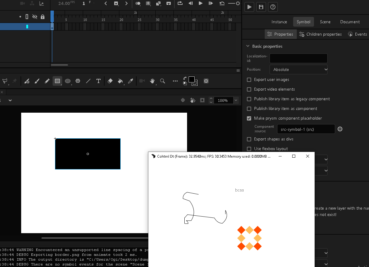
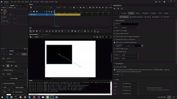
The Publish library item as a component checkbox in the Symbol / Properties tab instructs Prysm to generate a component from a symbol.
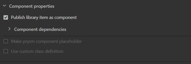
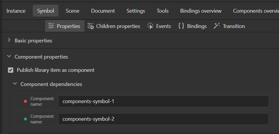
If the symbol has symbol instances in its timeline that are marked as prysm component placeholders then the component names will be shown under the Component dependencies accordion. The dependencies have a status light that is red when the component is not imported to the document and green when everything is fine.
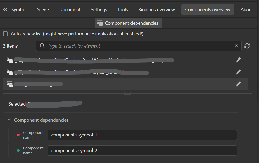
You can also do a quick preview of all the component dependencies through the new Components Overview tab. This tab shows all the symbols that will be published as prysm components in the document and their dependencies if they have any.
When the document is published all symbols marked as components will be generated in the components_library_documentName folder in the output folder.
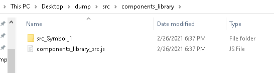
Each component symbol is generated in its own folder. The naming convention is documentName_symbolName.
The components folder contains a library script named components_library_documentName.js that manages all components.
When a document that contains components is published, all of the generated components are added to the HTML page, so the output looks exactly like expected.
Using components in different documents
Components can be added to different documents. This is done by adding a library script that manages components generated from a source document to a destination document and then marking a symbol to be replaced with a component from the library.
Adding libraries is done through the Prysm component libraries menu of the Document tab.
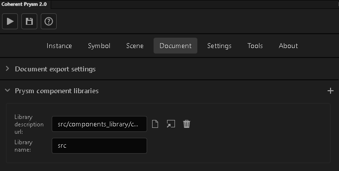
Once the library is added, all components from it can be used in the page. To mark a symbol to be replaced with a component, the Make prysm component placeholder checkbox in the Symbol tab is used.
The target selection button opens a new extension that lists all components from all libraries added to the document. The component to be used is selected from the extension.
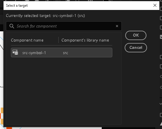
When a component is selected, the symbol that is marked to be replaced will not be exported, rather the component will be added in its place.
All styles and animations applied to the symbol marked as a component will be applied to the component. This makes it possible to float a component in the page, show it, hide it, mask it, add filters to it, etc.
Animations, masks, and nine slices that are part of the component are also present in the output.
It is important to note that the units used when generating the component take effect as well, so if a component is generated using pixel, vh, or vh units its size in the importing document is the same as in the source document. Scaling, rotating, or translating the component in the destination will take effect.
Pairing with author-time sharing
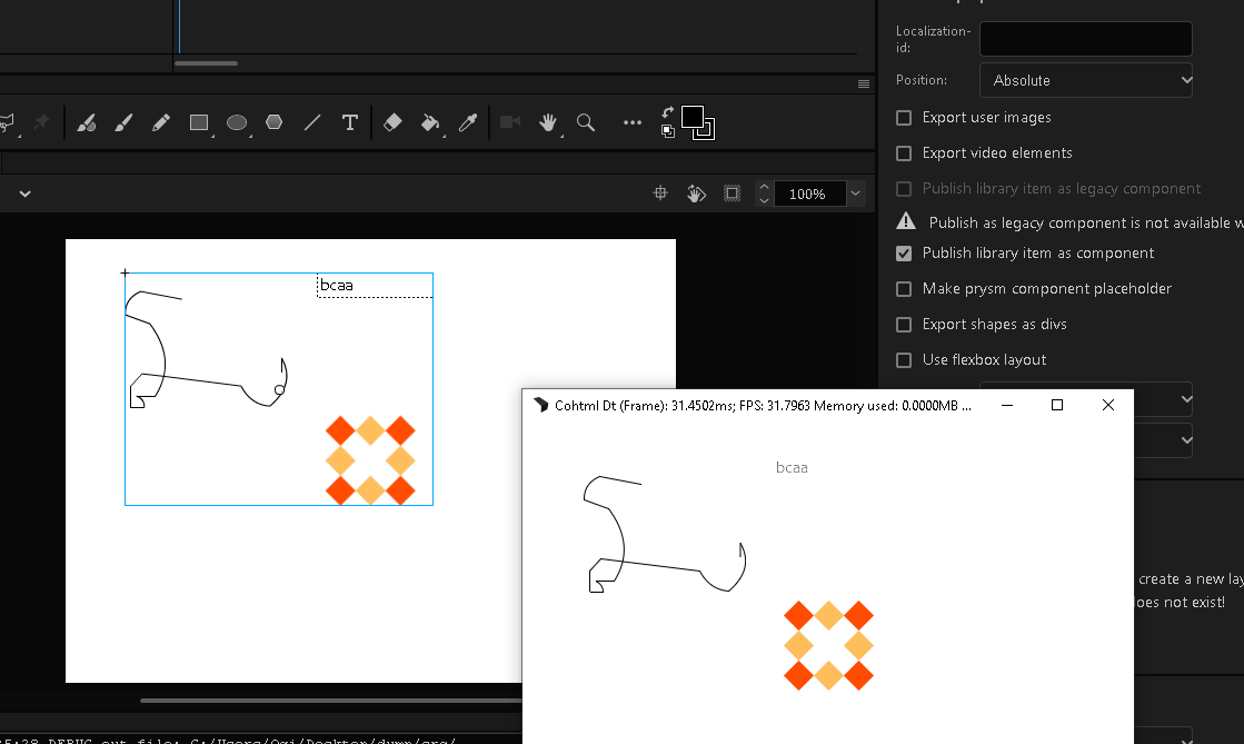
Since components replace symbols it is not straightforward to figure out how the document will look like when exported. One way to make it more understandable is to use the same size for the placeholder and the component as illustrated in the animated gif above.
Another way is to use the author-time sharing feature to aid when designing. Since author-time shared symbols can't be edited in the destination documents, they have to be wrapped with another symbol and the wrapped symbol has to be marked as a component placeholder. Since the symbol marked as a component placeholder is replaced with the component, the extra symbols don't have overhead.
Author-time sharing can be used in the following way. A document is used to generate components, the symbols that are made into components are then author-time shared into a document that uses components. A shared symbol is wrapped with a symbol and the wrapper symbol is marked to be replaced with the component generated from the shared symbol. This way an artist sees exactly what is exported in the end. The use case for that workflow is that artists can work with a version of the component that is similar to the end result, while the creators of the components can change them if needed. Since components are loaded from the generated HTML the end result will always use the final version of the components, even if the author-time shared symbols are not updated in the destination documents.
Updating components
Components are implemented such that each time that an HTML page is loaded, it loads the component source files. This means that once the component sources are updated, all documents that use them, load the updated version. That makes it possible to update all screens that use components, without having to re-export them.
The structure of components
Components are implemented such that the structure of the generated folder is important. The library needs to know about all component files that it manages. Therefore, the component folders can be moved to different locations and loaded from them, but changes to the names of the files or changes to the structure of the component folder can lead to unexpected results.
Components implementation
The following documentation is more code-oriented and focuses on the exact implementation of Prysm components. It is aimed at developers or people who want to load components dynamically.
The CLComponentsLibrary.js file contains all library-related logic. Users seeking more insight should check it out.
Components are implemented as HTML customElements that make it possible to define new HTML tags.
Components are managed by a library object that knows about all components generated for a document. The library is defined in outputFolder/js/CLComponentsLibrary.js and a library instance is created in the componentsFolder.
All documents create different components, hence they create different instances of the library. All library instances are global and are kept in the window.prysmComponentLibraries variable.
Each library instance file creates a variable attached to prysmComponentsLibraries object and is named with the name of the document that generated the library.
window.prysmComponentLibraries["src"] = new PrysmComponentsLibrary({
    "src-symbol-1": {
        scriptUrl: "src_Symbol_1/src-symbol-1.js",
        className: "src_Symbol_1"
    },
});
The variable instance is filled with information about all components that it manages. It is global so that it can be accessed from any script, and any script can be made responsible for initializing components to be used in the page.
A library instance is used to simplify component initialization. It knows where components are located relative to the library script. It deals with loading components and making sure that a component isn't initialized more than once.
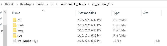
Components are self-contained. The folder of a single component contains a script that defines the HTML custom element and all resources that the element uses, like CSS files, video files, font files, etc.
To use a component in the page, its script file and its CSS files have to be added to the page and a custom element that uses the class from the script has to be defined. When a custom element is defined a name for the HTML tag that instantiates the element is set. When a new tag with that name is created it is an instance of the class from the script. The class has a connectedCallback that is called when the tag is added to the DOM. Prysm generates elements that add the DOM of the component in its connectedCallback.
As mentioned the library simplifies the initialization of components. It does that through the initializeComponent(componentName) method. When called, the method loads the script of the component, loads the CSS files that contain its styles, registers any data binding attributes that are used by the component, initializes all other components used by the current one, and defines the HTML tag that is used to make instances of the component.
To make components self-contained, their structure is very important. The JavaScript class that defines the custom element knows about the paths of CSS files relative to the script. It also knows about the data binding attributes that have to be registered and about all dependant components generated from Prysm that have to be instantiated as well.
The library knows about the paths of component scripts, relative to the library script. To load a component it has to add its script to the document. For that reason, the library needs to know about its path relative to the HTML document. When the path is set, and the initialize method is called, the library loads the component script in the page. When the script is loaded the library queries the CSS files that have to be loaded for the component from the JavaScript class of the component. When the library adds all of the classes it queries the class for the data binding attributes and registers them with the engine object if any of them are present. After that, it queries the class for the dependant components and initializes all of them. Finally, it defines the component tag name, where the HTML tag name is the same as the component name. For that to work, the component name has to be a valid HTML tag name that contains at least 1 dash.
If you want to dynamically load a component, you need to create an HTML node and add it to the document. To know exactly when that can happen, the initializeComponent method returns a promise that resolves once the component is initialized. Furthermore, the library has a whenComponentInitialized(componentName) method that returns a promise that resolves once the library initializes a component with the given name. Any script can query actions to happen when a component is initialized.
whenComponentInitialized("my-component")
.then(() => {
    const element = document.createElement("my-component");
    element.style.position = "absolute";
    element.style.top = "150px";
    element.style.left = "100px";
    document.body.appendChild(element);
})
.catch(() => {
    console.error("Failed to initialize my-component.");
});
The library makes it possible to manage new components. To do that it exposes an addComponent(componentName, componentDescription) method. The method makes it possible for the library to initialize the new component based on its name and script data. This is useful, as you can copy a single component somewhere and then add it to a new or existing library and manage it easily.
To use a library in a new page, the path of the library must be set to the variable so that the library can work.
window.whenLoaded().then(() => {
    window.prysmComponentLibraries["src"].libraryScriptUrl = "components_library_src/components_library_src.js";
    window.prysmComponentLibraries["src"].initializeComponent("src-symbol-1");
});
Changes in 2020.4.0
It was our goal in the previous version to have component libraries that provided scoping for components from different documents, however, the implementation brought overhead and there were still scenarios where scoping wasn't properly achieved. To mitigate that we removed the component libraries and optimized our code.
Firstly, we simplified the ids of the components. In the previous versions, components had a name for the custom element and a component id, which was unnecessary. In the current version, the custom element name is used as a component id to simplify the workflow.
What is more, the component system now works like the animation system. There is a single system in an HTML page that loads components. Its job is to load all resources required by a component and when that is done to define a custom element that can be added to the page to initialize it.
In the previous version, component resource loading was synchronous, when a component required multiple resources, the first one was loaded and when ready the next was loaded, etc. This was a bit slow, so we changed our implementation and now the component system loads all resources immediately. The custom element is still defined when all resources are loaded, for the system to work correctly.
To squeeze more performance, we changed the initializeComponent method to the loadComponents method that accepts an array of components to be loaded and all of them are loaded immediately. For some unique cases, we added a loadComponent method that loads a single component, but it should be avoided.
Since we removed component libraries the loadComponent method accepts two arguments - the name of the component and the URL to its definition script. The URL is relative to the HTML file that loads the component and we need it to correctly load its resources.
window.prysm.componentSystem.loadComponents([
    { name: "untitled-1-symbol-1", url: "Untitled_1_Symbol_1/untitled_1_symbol_1.js" }
]).catch(err => {
    console.error(`Failed loading a component: ${err}`);
});
We substituted the whenComponentInitialized method with the whenComponentLoaded method to match the current workflow.
In the current workflow initializing a component is much simpler. Instead of creating a library initializing it and then calling initializeComponent you just have to call loadComponent and that's it.
Last but not least, all components should be correctly loaded when the animation system starts, so we removed the whenComponentInitialized checks.
Changes in 2023.1.1
- Added a
lazyDisplayproperty to the component system. When set to true, all component instances have their DOM nodes generated and inserted in the page when the component has to be shown. This can be used to reduce the big initial advance of a page. - The
domNodesstring in component instances is cleared after its child nodes are generated and inserted. This reduces the memory footprint of components.
Changes in 2023.4.0
- Added complete support for dependant components. When a component is loaded it also loads all dependant components.
- Added the
componentSystem.unloadComponentmethod that unloads a component. Check the method documentation in theCLPrysmComponentsSystem.jslibrary for additional information. - Added the
componentSystem.unloadComponentsOnDisconnectflag that when set totrueforces the system to unload components when the appropraite DOM nodes are removed from the DOM.
Note: unloadComponent does not remove the component DOM nodes. To both remove the nodes and unload the components you can set componentSystem.unloadComponentsOnDisconnect to true and remove DOM nodes. When a component node is removed from the DOM it decrements its use count. When the useCount becomes 0 the component is unloaded.
Note: You can also unload components without removing the DOM nodes e.g. when you want to unload resources and load them again at a later point. To do that you can do the following componentSystem.unloadComponent(name, unloadDependantComponents, true /* forceUnload */);.
Backward compatibility
We know that a lot of components are already generated and we want to provide backward compatibility. This is why we created the CLPrysmComponentsSystemBackwardsCompatability.js script. When added after the component system script, all previous components should work. It is our goal for all components to be generated with the latest version, so when all components are updated we will remove the script.
Furthermore, there are changes to the UI. Previously, component libraries were added to FLA files, and movie clips on the page could be substituted with components. Since there are no longer component libraries the Add component and Add folder with components buttons are added. They make it possible to add a single component or a folder with components to the FLA file and use them as before.
If you open a FLA file from an older version that included component libraries, Prysm will automatically add the backward compatibility script and include all necessary files for the document to work correctly when exported. You should still aim to update all of your components to the latest version as everything is faster and better.
Implementation notes
- Components are generated in the
outputFolder/components_library_documentName/folder. - The component library definition is generated in
outputFolder/js/CLComponentsLibrary.js. - The component library instance is generated in
outputFolder/components_library_documentName/components_library_documentName.js. - Each component is generated in
outputFolder/components_library_documentName/documentName_symbolName, where the symbol name is the symbol that the component is generated for. - Each component can have
css,fonts,img,svgfolders that contain various resources. A JavaScript class that defines the HTML tag is generated inoutputFolder/components_library_documentName/documentName_symbolName/documentName_symbolName.js. The JavaScript of a component is added to the script with the class name. - A JavaScript file that initializes the components used in the document is generated in
outputFolder/js/components_initialization_documentName_sceneName.js. - The CSS styles used by components are prefixed with
documentName_symbolNameto reduce collisions when multiple components are added to the same page. - SVG files that are generated for components are also prefixed with
documentName_symbolName. - The library implementation doesn't allow reinitializations of components.
- Since the
initializeComponentmethod recursively initializes nested components a parent component can't depend on itself. This will lead to crashes.