Responsive UI - Units
Overview
The Units tab of the Prysm governs what kind of output units will be used for different CSS properties in the exported files for the selected element.
Unit properties can be set only for Symbols.
Since the options are applied on a per-element basis, the tab will change its content based on the current selection.
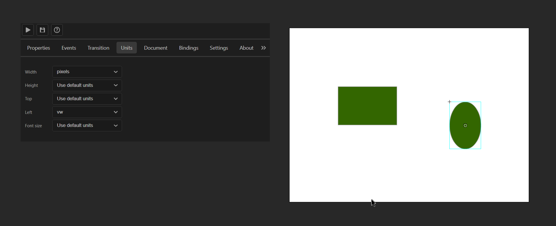
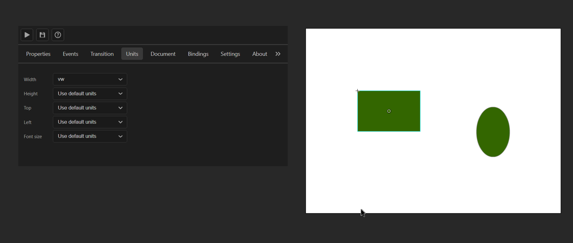
Values
The options of the Units tab are the initials of CSS units, hence their meaning comes implicitly.
- vw
- Viewport units based on the width of the page.
- vh
- Viewport units based on the height of the page.
- percents
- Relative units based on the value of a specific property of the parent.
- pixels
- Static units representing the screen’s pixels.
- auto
- The UI engine calculates the value of that property depending on the Layout rules.
- For instance sizes depend on the sum of the sizes of children. Positions are automatically changed when another element in the same sub-tree moves and “bumps” the current element.
- Use default units
- The document default units will be used.
Purpose
The Units tab exists to provide customizations for the UI. It provides an easier way to create flexible and responsive screens.
Pixels
By default, Animate uses a static unit of measurements like pixels, cm, inches, or something similar meaning that if we resize the screen, the UI will stay fixed. That behavior is kept via the pixels units.
![]()
![]()
VW and VH
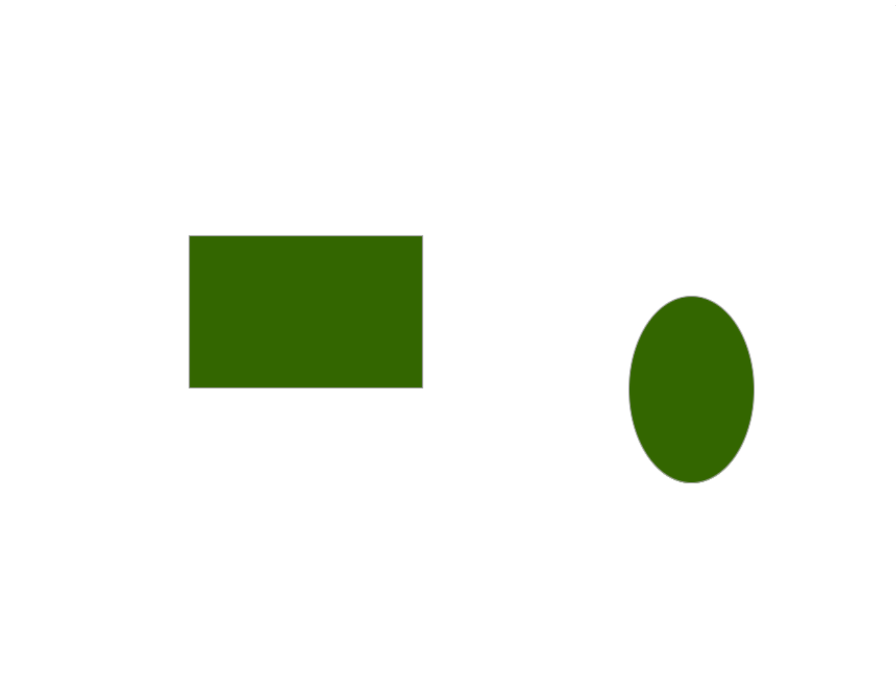
HTML makes it possible to export the same scene but resize the properties of the elements based on the size of the scene.
Via the vw and vh properties CSS makes it possible to create a single UI file that works well on a specific aspect ratio.
Percents
percent units are often used to resize an element based on the size of its parent. That is really convenient when creating bars since the child can easily be calculated.
<div class="parent">
  <div class="child"></div>
</div>
.parent {
  width: 200px;
  height: 20px;
  background-color: black;
}

.child {
  width: 20%;
  height: 100%;
  background-color: orange;
}
setInterval(function() {
  document.getElementsByClassName("child")[0].style.width = `${Math.random() * 100}%`;
}, 300);
The code illustrated in a fiddle.
The parent has fixed dimensions while the child's width is set to a percentage of the parent, therefore, it fills a percentage of the space of the parent with its content.
Every 300ms the percent value is changed to a random value between 0 and 100 and the child fills the appropriate space.
Again, this can be quite useful when making health, ammo, etc bars. In our plugin, it can be combined with different data-bind-* properties to use that functionality.
To create a very simple bar that illustrates that, we can an Animate file and fill it as described in the diagram.
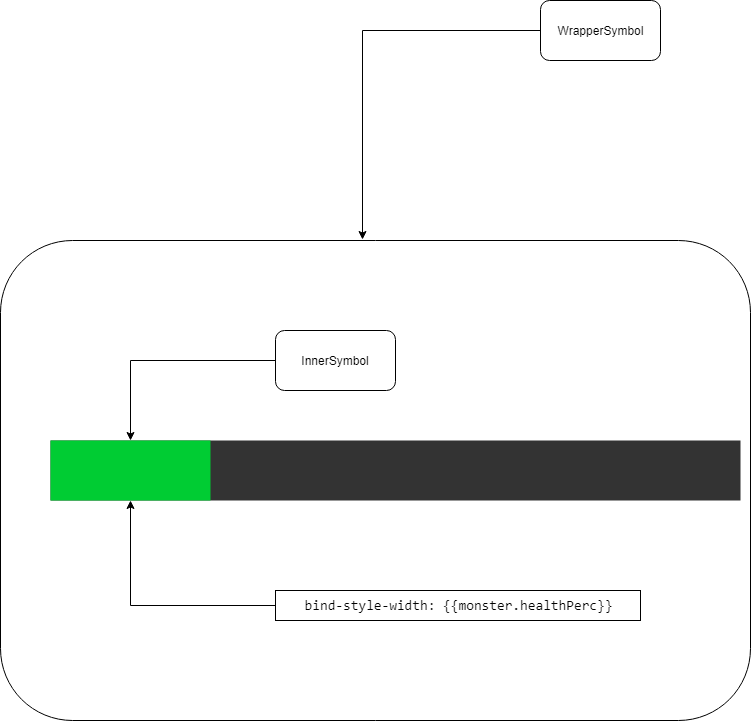
Attach a JavaScript file with the following code.
engine.on("Ready", () => {
    engine.createJSModel('monster', {
        health: 100,
        maxHealth: 400,
        healthPerc: "25%"
    });


    setInterval(() => {
        monster.health = Math.random() * monster.maxHealth;
        monster.healthPerc = `${monster.health / monster.maxHealth * 100}%`;
        engine.updateWholeModel(monster);
        engine.synchronizeModels();
    }, 1000);
});
And finally link with cohtml.js we have set an example, where the darker bar is used to set up the maximum size of the bar.
The attached bind-style-width property binds to a value with percent units - monster.healthPerc
Therefore, the green bar will always have its size relative to the dark bar.
Auto
auto units make sure that there is enough space for the element to be placed.
They are sometimes used when there is dynamic content that needs to rescale its dimensions according to their content.
Default
Use default units to set the units of the selected element to the default units for the document.
Default Document Units
As some units require a baseline, there is an option to set the units of the document. The drop-down menus can be found in the Document tab
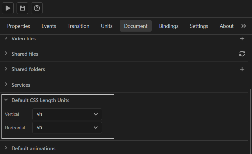
All elements have default units for every property set by default, meaning that their units will be the units stated in the Document tab.
Properties with vertical semantics infer from the Vertical default units and the same logic applies for horizontal units and the Horizontal default units.
- Font size infers from the Vertical units.
- Width infers from the Horizontal units.
- Height infers from the Vertical units.
- Top infers from the Vertical units.
- Left infers from the Horizontal units.
By default, the Default CSS Length Units are vh for both Horizontal and Vertical.