OMS Kit
The OMS Kit is a card inventory that has a collection of cards. There is an overview of the current card when selecting it and additional information about the current card is shown.
Overview
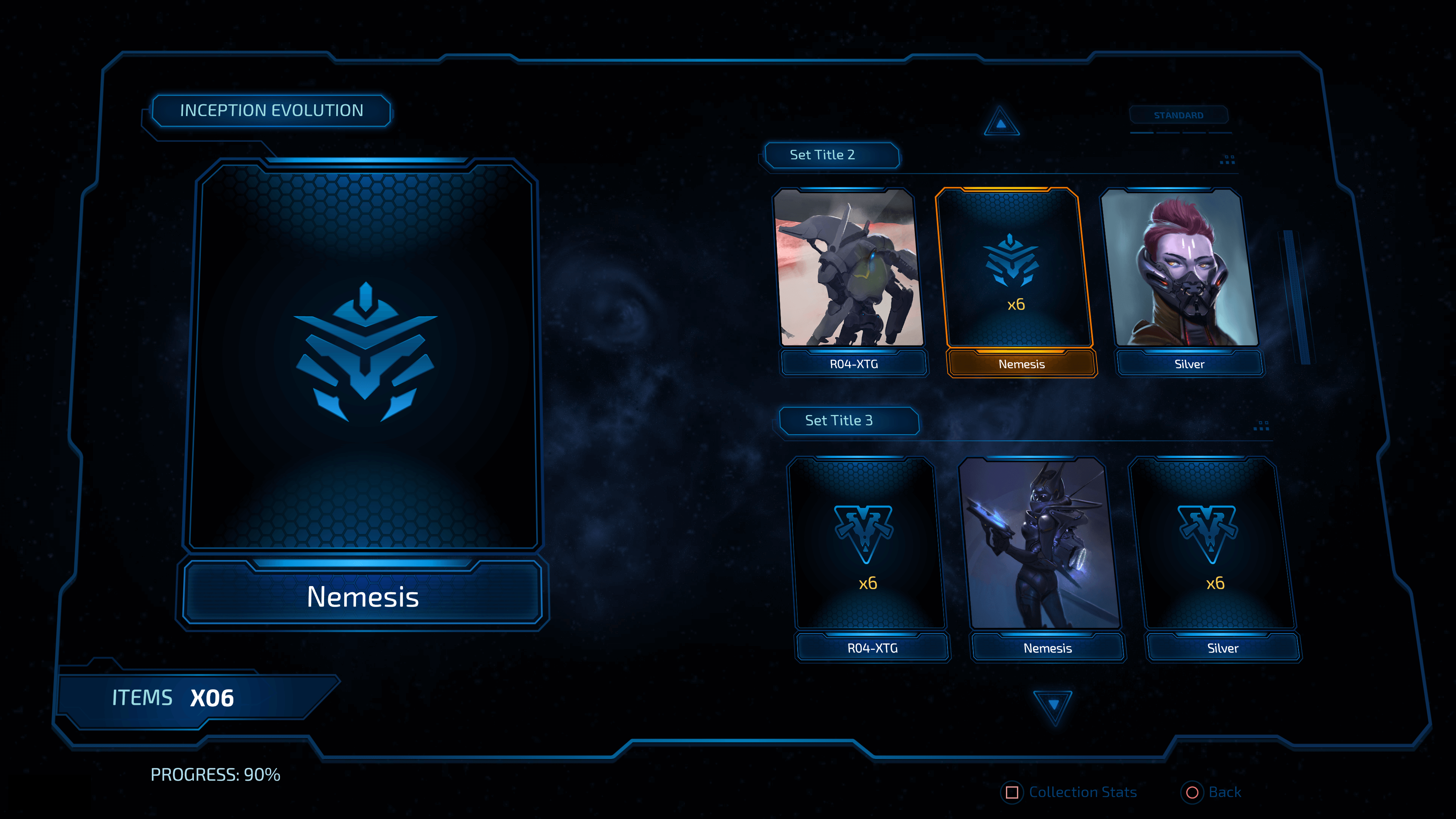
When the screen is loaded it is populated with cards on the right and the first card is set to active, therefore, it is displayed on the left and has a yellow border on the right.
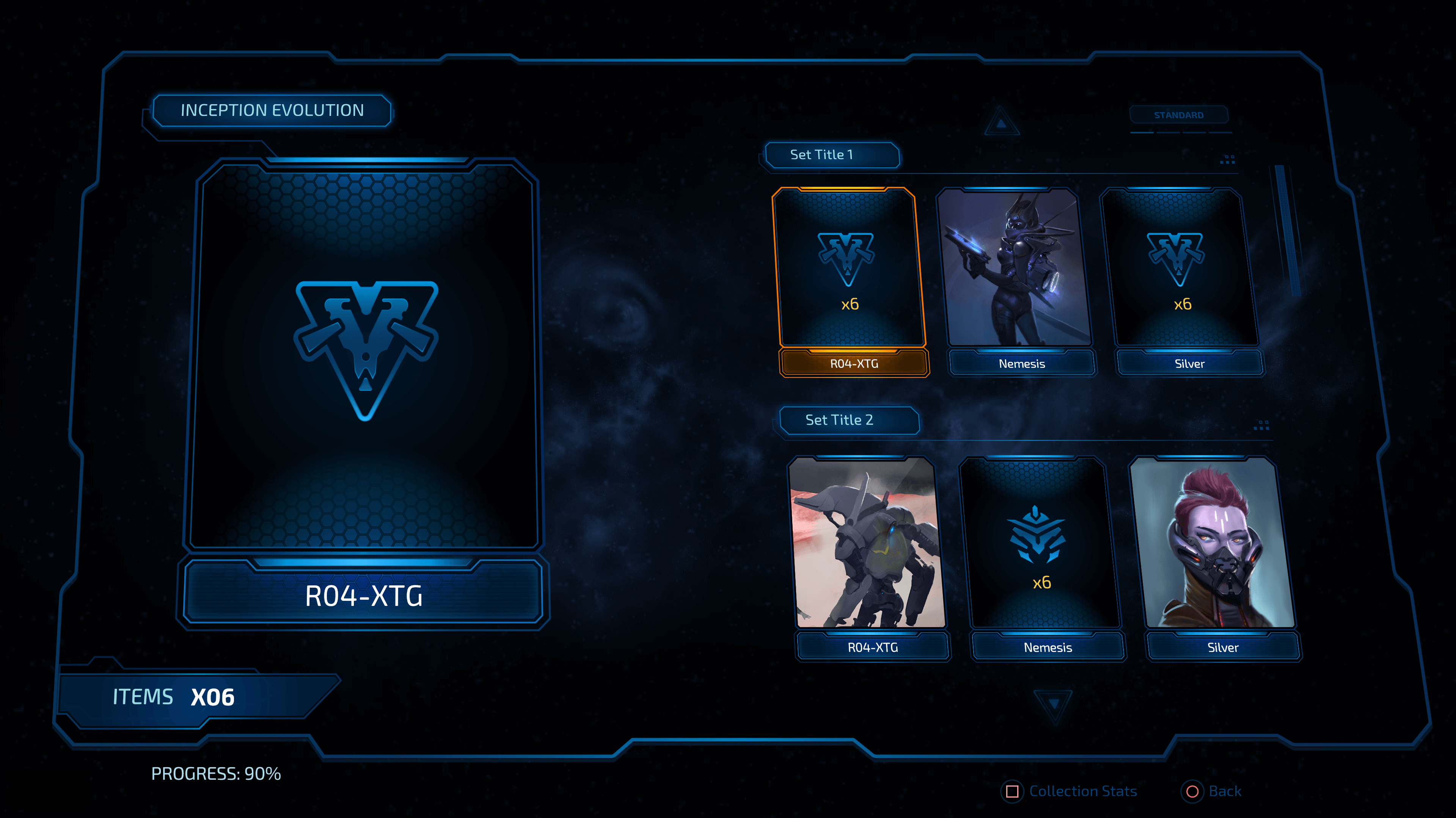
When the arrows are used you can navigate through the different cards and each new card that you reach will become active. The scrollbar on the right will move down on every new row to help you with the navigation.
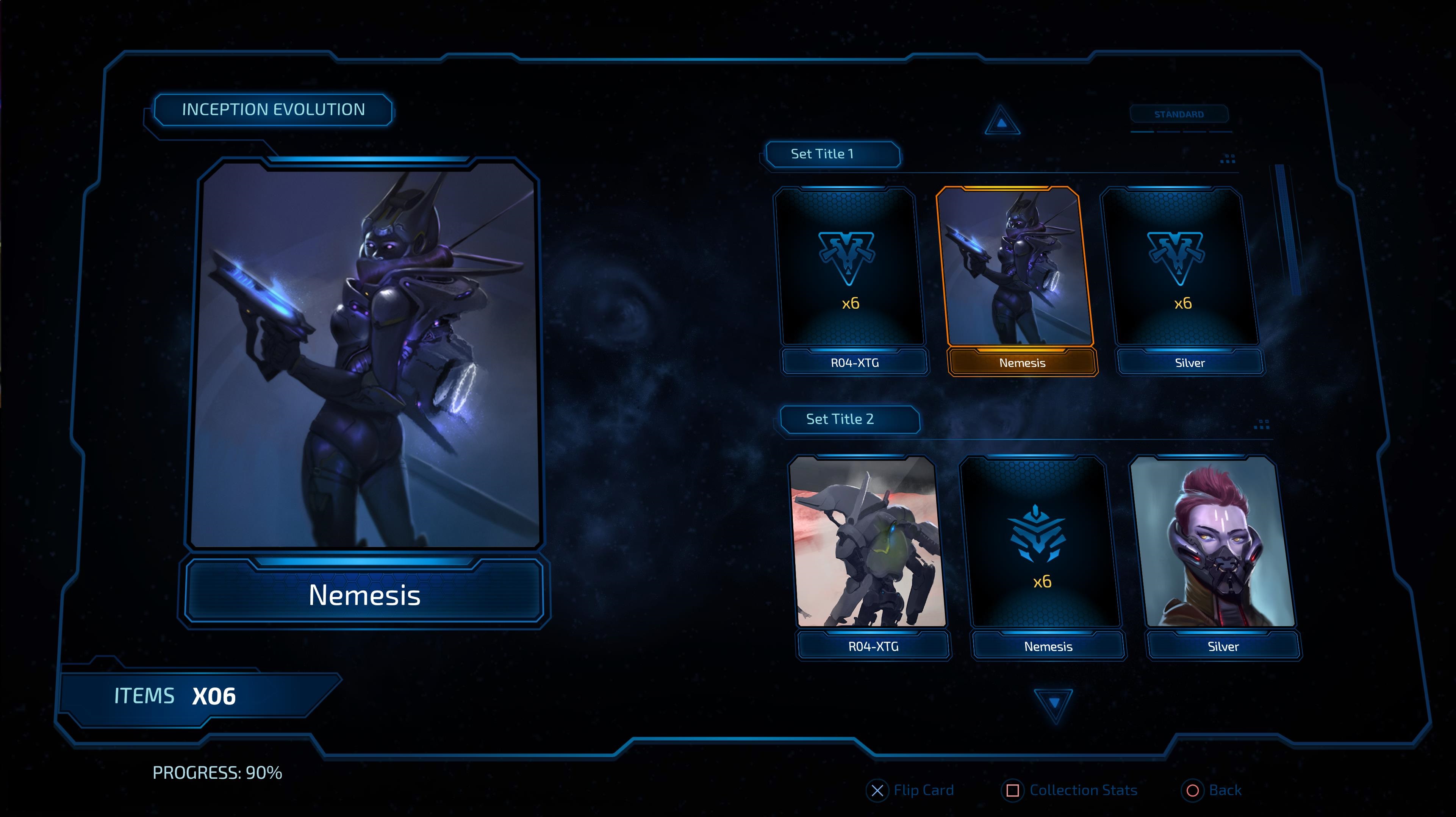
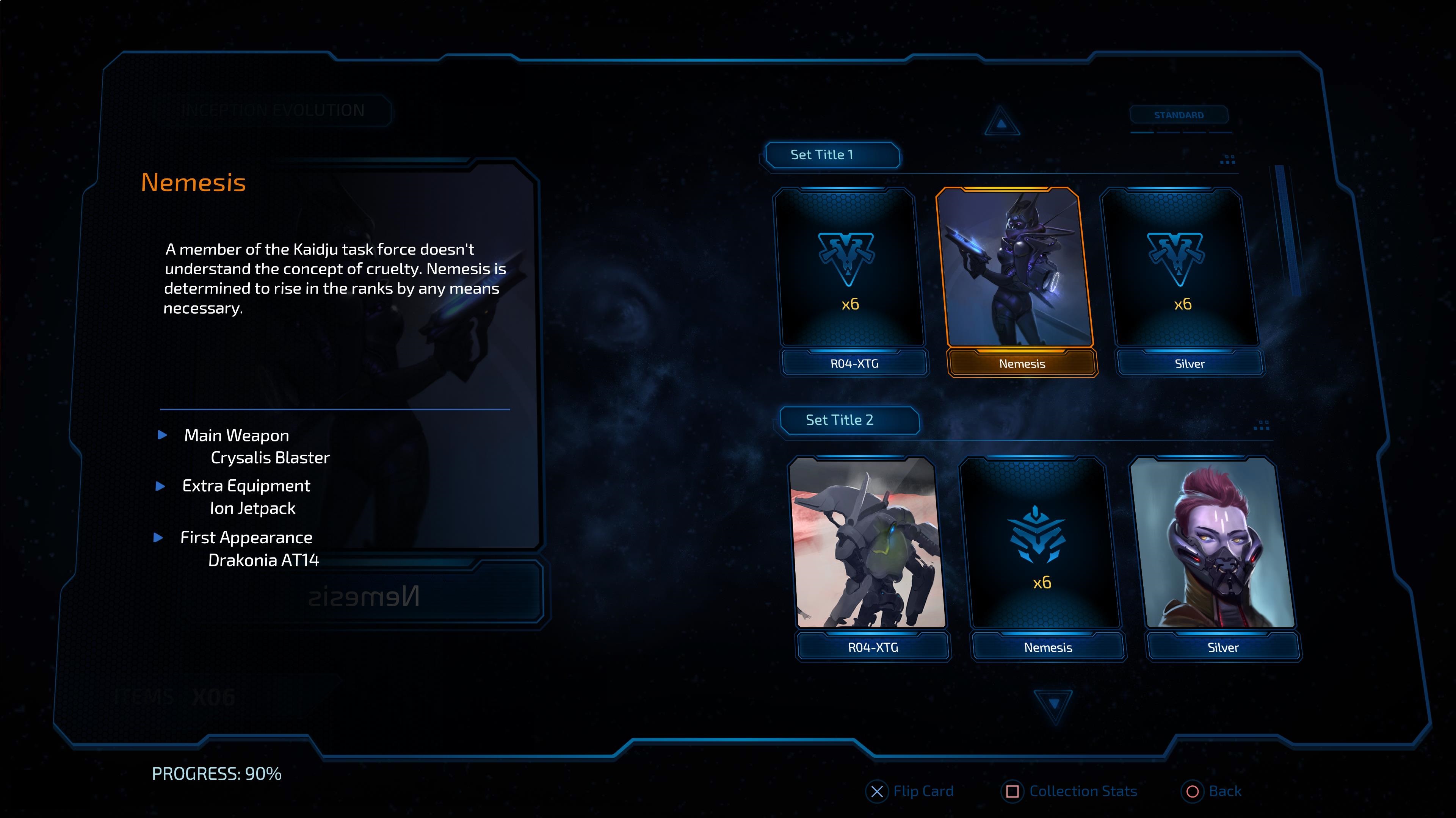
The unlocked cards are the ones that have a full size image like Nemesis above. When an unlocked card is active you can press Enter to flip it and get additional information.
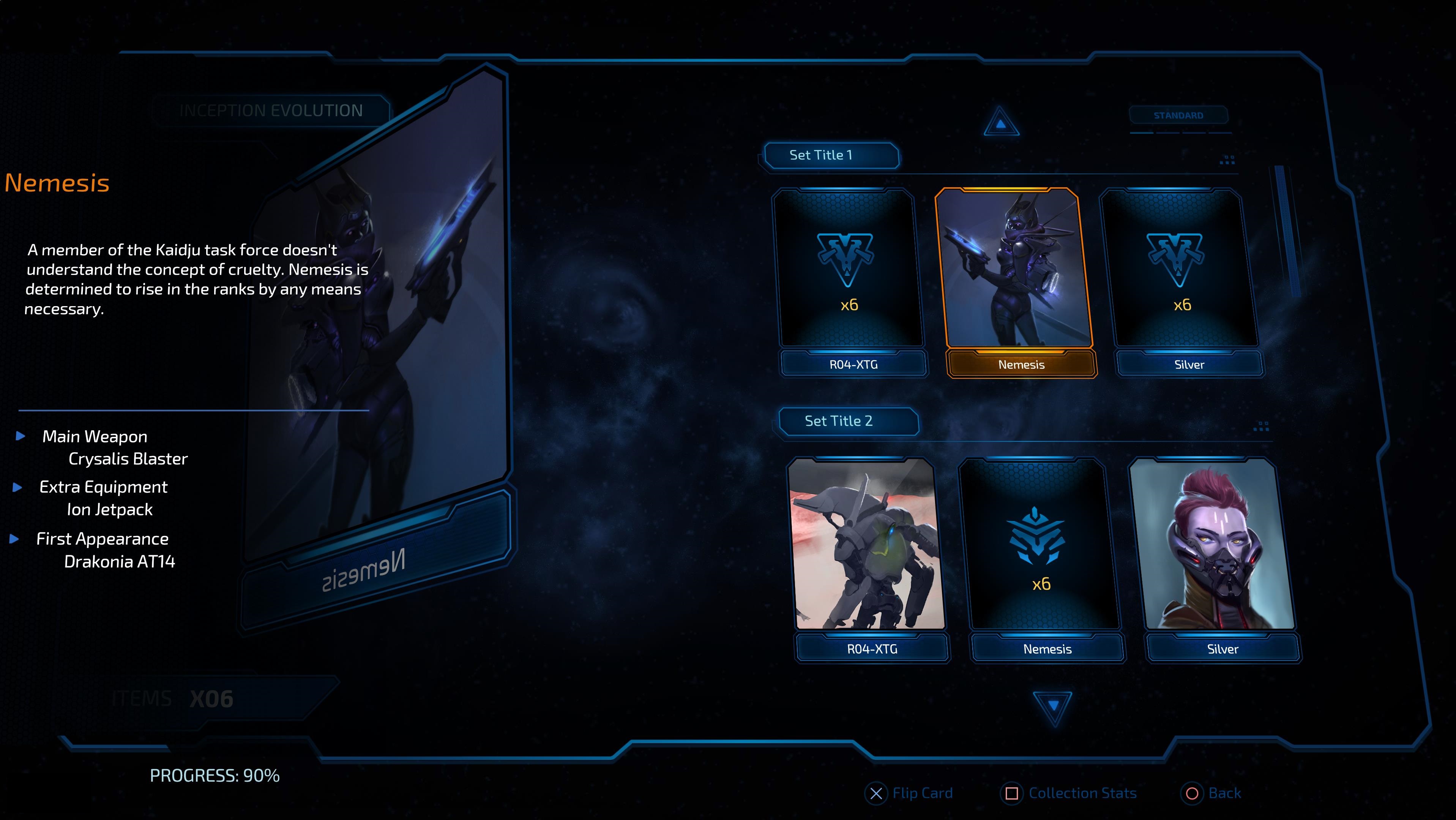
When a locked card is selected it can't be flipped. What is more, the flip button at the bottom will be hidden. Each locked card has a different Symbol depending on its type.
Adobe Animate Implementation
Most of the assets can be created through Adobe Animate and exported to HTML with the help of Prysm.
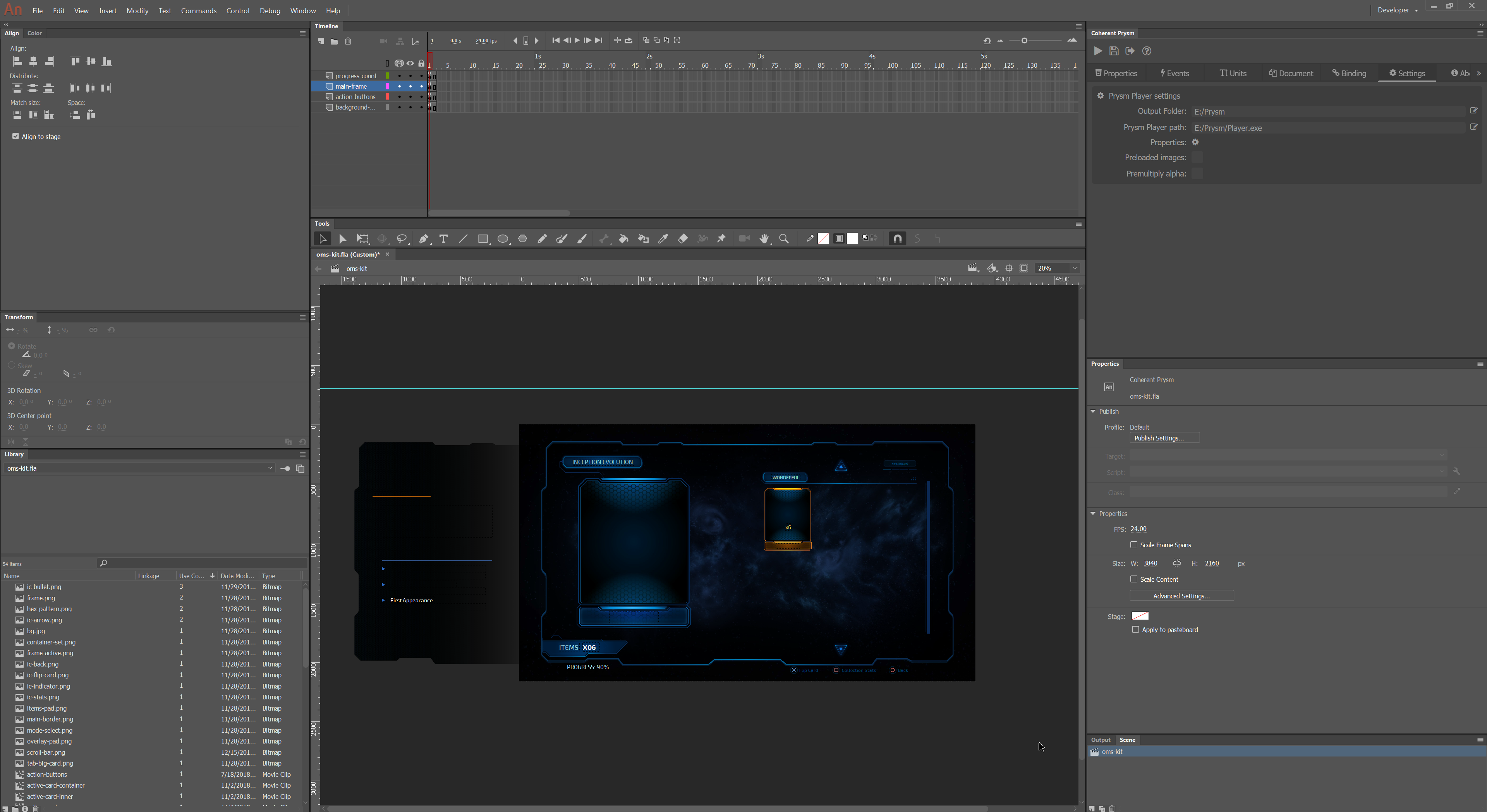
Important things to consider for the HTML export
- Most elements will be exported as a
div. Only some simple shapes will be exported as ansvg.

- When there are several Layers in a Symbol each Layer will have an ID and its children will be nested in it.

- Each Symbol will have a special ID and its children will be nested within it.

- Only Symbols with instance names can be manipulated with Coherent Prysm.
Most notable elements in the animate file
- Almost every element is inside the
main-frameLayer of the scene.
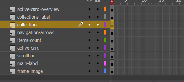
- The
active-card-overviewLayer contains a bunch of data-bound elements that change according to the active card. When there is a new active card the overview is updated, so that when it comes into view it is relevant. It starts from the left and will come into view through a CSS animation.
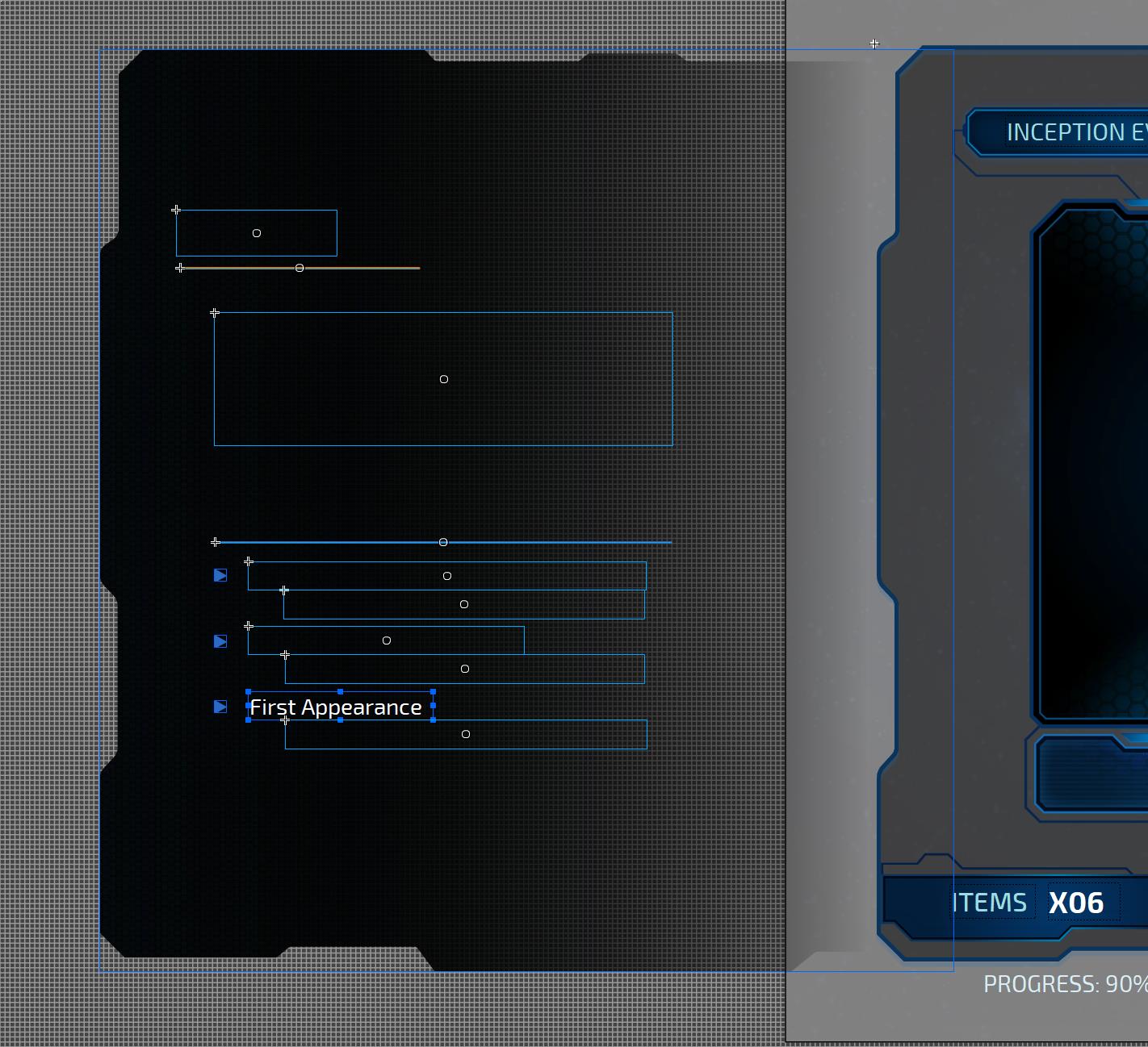
- The
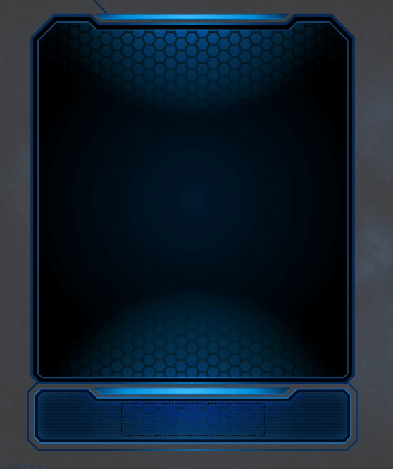
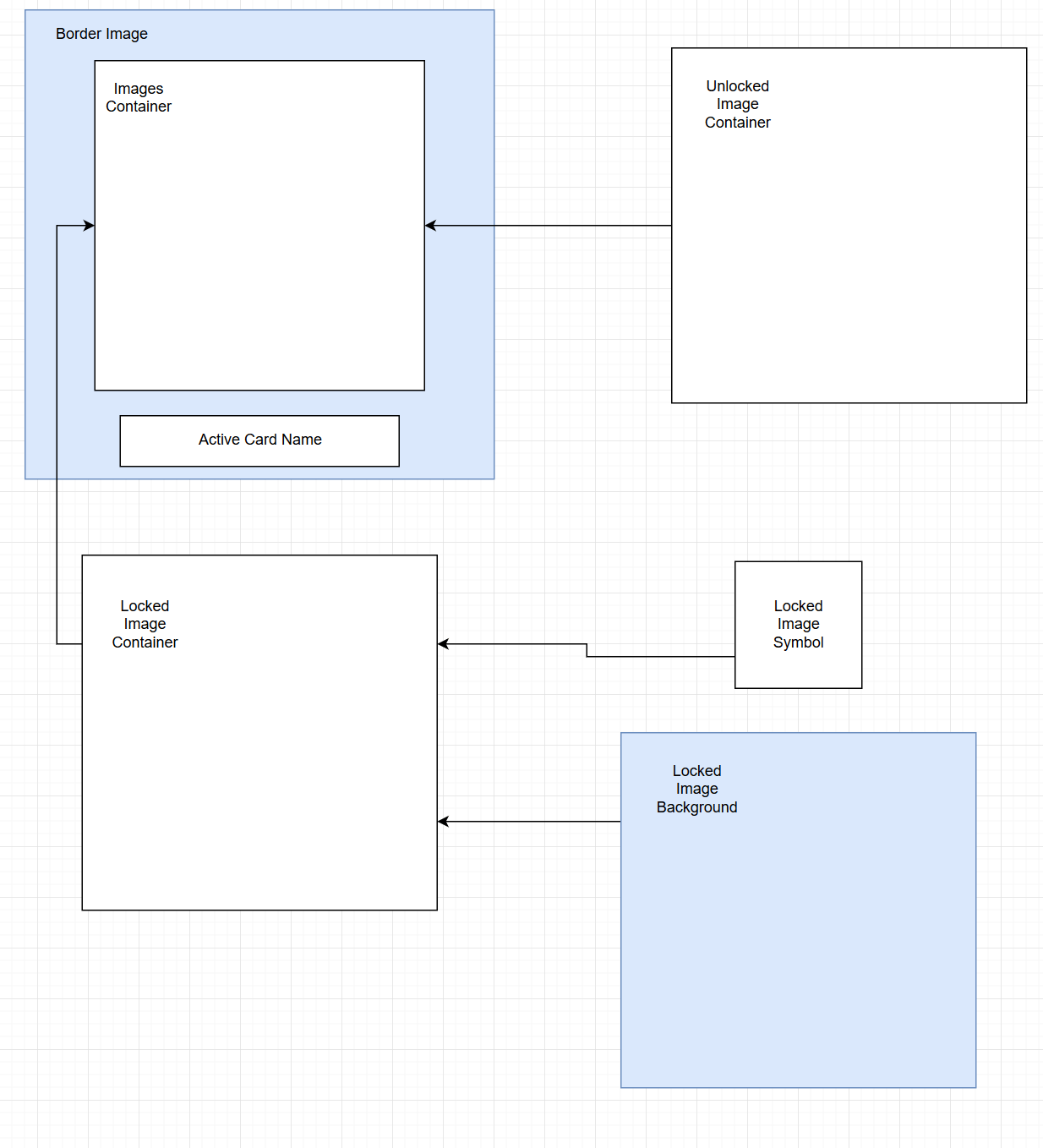
active-cardLayer contains the big card on the left of the screen that represents the current active card on the right.
- The
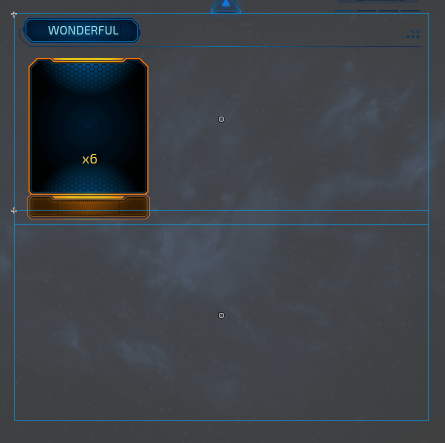
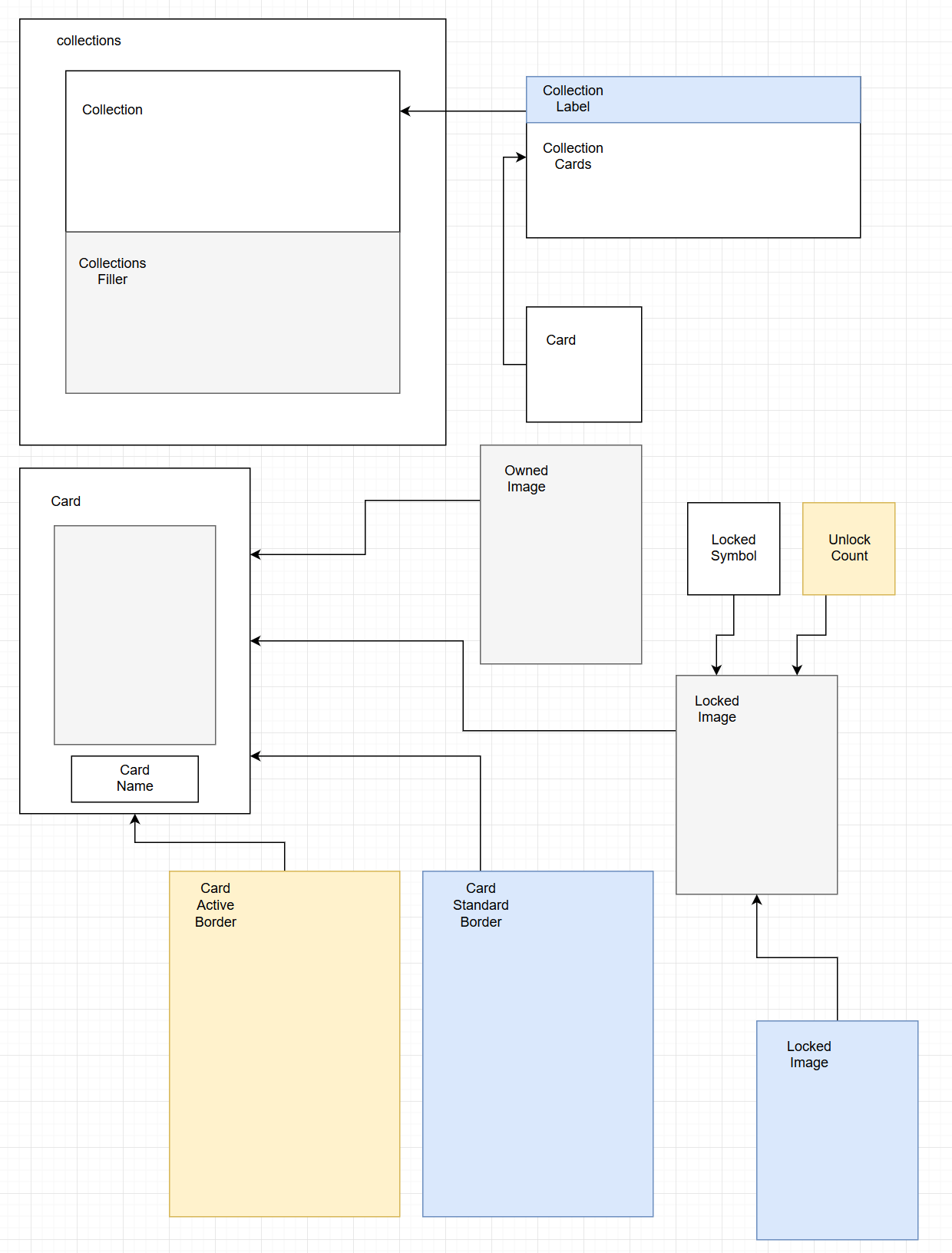
collectionsLayer contains the data-bound cards and a filler that helps the scrollbar.
- The
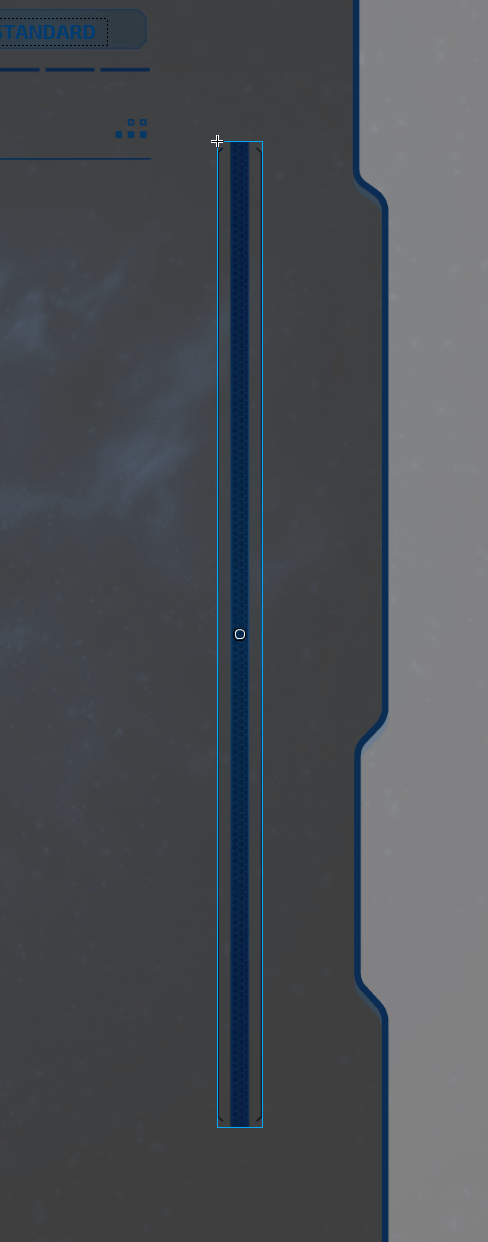
scrollbarLayer holds the scrollbar image which is scripted through JS.
Custom CSS
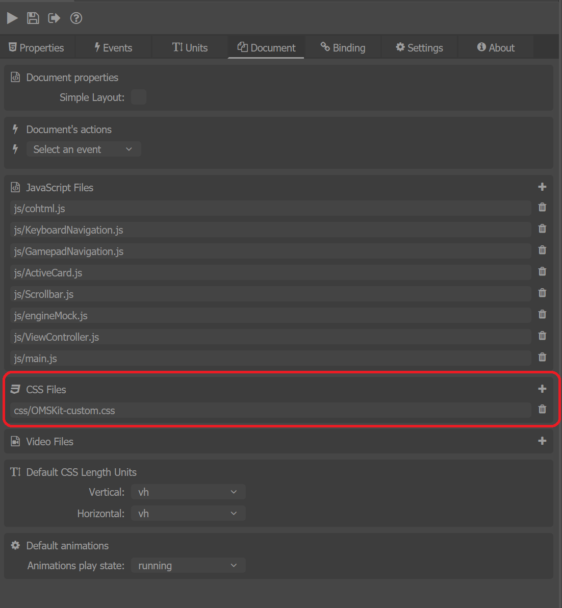
There is a single custom CSS added that contains keyframe animations that make the arrows blink, make the card overview appear and disappear. Two of the animations hide and show the flip button and rotate the active card. The collections are set to have overflow: scroll so that the scrollbar can be implemented. Keyframe animations, transforms and flexed elements are preferred because of the performance gains. There is also a perspective set on the screen and on the active / focused card, which perspective is set in the CSS.
Custom JavaScript
The JavaScript relies on the Keyboard API to implement keyboard navigation. What is more, most of the logic is separated into different files which are easy to read and pretty self-explanatory.
cohtml.jsis the Coherent Library.keyboard_navigation.jsis the Keyboard API that deals with keyboard navigation.ActiveCard.jsdeals with the flipping of the active card.Scrollbar.jsdeals with the scrollbar scrolling.ViewController.jsdeals with all the modules working together.
The keyboard bindings for navigating in the list are set to the keyboard arrows and Enter.
With the gamepad, the navigation is done with the left stick and previewing a card is triggered with X or A button, depending on the type of gamepad.
Scrollbar
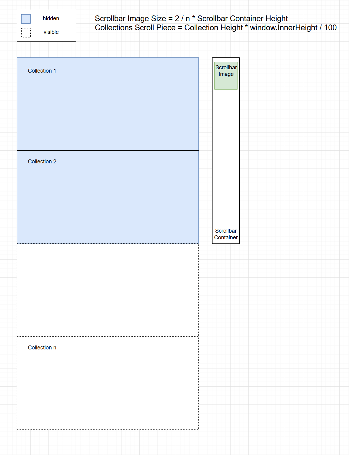
The scrollbar calculates how much the scrollTop value should be changed and uses transform: translateY() to change its position. It provides two methods:
ScrollUp()- moves the collection and the image up.ScrollDown()- moves the collection and the image down.
Active Card
The active card controller provides the FlipCard() method that flips the active card and shows the overview when it is not flipped and on the opposite hides the overview when it is flipped. The flag isActiveCardFlipped is checked in the grid to forbid navigation when the card is open.
View Controller
The ViewController.js sets up the active card and scrollbar classes. It also queries the flip button. The View Controller also sets up a grid and the keyboard navigation class which updates the active card according to the grid index. The method used is ccGame.updateActiveCard(rowIdx, colIdx) provided by the data binding.
Data Binding / Mock data model
Mock model ccGame is created from engineMock.js. In it, there is a collection of cards which is populated in the cards list. Each card has an active and owned state, title, provided path for the background and symbol images and other values for the description. The active and owned states are updated according to the type of interaction/event in the screen.