Making custom components
Making a components in Prysm is doable with the visual workflow described here. However, this approach sometimes is inconvenient for making more complex components using features that currently are unsupported in the Exporter but supported in the Prysm Player (like inline SVGs). That is why you can make custom Prysm components independently from Animate and then import them to your .fla project. Using this approach you can inject unmodifiable content to the .fla project that won't be changed when the document is exported. However, making a custom component requires some developer skills and it won't be possible to edit it with Animate.
Setup
Let us have the following project structure
|_ custom-components.fla
|_ custom-components-output-dir
   ...
|_ custom-components-src
   |_ custom-component-one
      |_ component-one-definition.js
      |_ css
         |_ component-one-styles.css
   |_ custom-component-two
      |_ component-two-definition.js
      |_ css
         |_ component-two-styles.css
   |_ custom-components-library.js
   ...
...
Here the output folder of the .fla document will be custom-components-output-dir.
Initialize new component
To initialize a new component we need to make a script with the definition of the component. Let we do that for the component-one in component-one-definition.js script.
window.prysm.components["ComponentOne"] = class ComponentOne extends window.prysm.MovieClip {
    static PRYSM_ANIMATION_DATA_ROOT_TIMELINE = {
        isPaused: true //If you don't want to animate the component set this to true
    }; //Used to set the component timeline properties
    static PRYSM_ANIMATION_DATA = {
        "component-two": {
            //You need to set animation state to the component-two so it will be visible when component-one is added to the DOM
            //If you don't want to animate the component-two then simply set showTime to 0 and hideTime to 1.
            animationState: {
                showTime: 0,
                hideTime: 1
            }
        }
    }; //Used to set animation data to elements in the component
    static DEPENDANT_CSS_FILE_URLS = ["css/component-one-styles.css"]; //Used to set the CSS files related with the component
    static DEPENDANT_DATA_BINDING_ATTRIBUTE_DESCRIPTIONS = []; //Used to register custom binding attributes to elements in the component
    static DEPENDANT_COMPONENTS = [
        "component-two"
    ]; //Used to link the components that are used from the current

    constructor() {
        super();
        this.domNodes = `
        <div>
            <h1>Component 1</h1>
            <component-two data-prysm-id="component-two"></component-two>
        </div>`; // This is the template of the component
    }

    connectedCallback() {
        //Initialize component when it is added to the DOM
        window.prysm.animationSystem.updateElementAnimationDataTimeline(
            this.dataset[window.prysm.animationSystem.constructor.REGISTRATION_ATTRIBUTE_NAME],
            this.constructor.PRYSM_ANIMATION_DATA_ROOT_TIMELINE
        );
        super.connectedCallback();
        this.insertAdjacentHTML("beforeend", this.domNodes);
    }
}
In the template of the component-one we use another custom component that is component-two. That is why we will define it as well with the component-two-definition.js
window.prysm.components["ComponentTwo"] = class ComponentTwo extends window.prysm.MovieClip {
    static PRYSM_ANIMATION_DATA_ROOT_TIMELINE = {}; //Used to set the component timeline properties
    static PRYSM_ANIMATION_DATA = {}; //Used to set animation data to elements in the component
    static DEPENDANT_CSS_FILE_URLS = ['css/component-two-styles.css']; //Used to set the CSS files related with the component
    static DEPENDANT_DATA_BINDING_ATTRIBUTE_DESCRIPTIONS = []; //Used to set custom binding attributes to elements in the component
    static DEPENDANT_COMPONENTS = []; //Used to link the components that are used from the current

    constructor() {
        super();
        this.domNodes = `
        <div>
            <h1>Component 2</h1>
            <svg class="icon" viewBox="0 0 20 20">
                <path class="icon-path" d="M17.218,2.268L2.477,8.388C2.13,8.535,2.164,9.05,2.542,9.134L9.33,10.67l1.535,6.787c0.083,0.377,0.602,0.415,0.745,0.065l6.123-14.74C17.866,2.46,17.539,2.134,17.218,2.268 M3.92,8.641l11.772-4.89L9.535,9.909L3.92,8.641z M11.358,16.078l-1.268-5.613l6.157-6.157L11.358,16.078z"></path>
            </svg>
        </div>`; // This is the template of the component
    }

    connectedCallback() {
        //Initialize component when it is added to the DOM
        window.prysm.animationSystem.updateElementAnimationDataTimeline(
            this.dataset[window.prysm.animationSystem.constructor.REGISTRATION_ATTRIBUTE_NAME],
            this.constructor.PRYSM_ANIMATION_DATA_ROOT_TIMELINE
        );
        super.connectedCallback();
        this.insertAdjacentHTML("beforeend", this.domNodes);
    }
}
In this component, we render an inline SVG.
Add styles to the custom components
Let add some styles to component-one with the component-one-styles.css that is set as a dependant CSS file to the component.
body {
    background-color: black;
    color: white;
}
Let do the same for the component-two with the component-two-styles.css.
.icon {
    width: 10em;
    height: 10em;
}

.icon-path {
    fill: white;
}
Initialize custom components library
The custom components library initialization happens by defining the custom-components-library.js with the following script:
window.prysm.componentLibraries["custom-components"] = new window.prysm.ComponentLibrary({
    "component-one": {
        scriptUrl: "component-one/component-one-definition.js",
        className: "ComponentOne"
    },
    "component-two": {
        scriptUrl: "component-two/component-two-definition.js",
        className: "ComponentTwo"
    }
});
We will need this library definition to include the component in our project in Animate.
Inject the component to the UI
Here we can inject our custom component with two different approaches:
- Directly in Animate with the visual workflow.
- Dynamically load via JavaScript.
Visually
We defined our library with custom-components-library.js. Now we need to import that library into the .fla document. That is happening from the Document tab.
Follow these steps to add the custom components library to the document and make some symbol a prysm component placeholder.
Now when you export the document the symbol that you made a placeholder will be replaced with the custom component you defined. That makes the symbol unmodifiable when you re-export the scene and any change made to this symbol in Animate will not overwrite the custom components templates defined with this.domNodes in their definitions above.
Dynamically
To add dynamically custom component to the stage you can follow these steps.
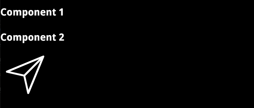
Result
The final result after the component is added to the stage will be similar to