Responsive UI - Flexbox
Flex layout is a very popular way of making responsive UI. Its purpose is to use all the available space on the page so all the blocks to fit the best inside it. Like this, in each resolution, the flex layout will provide the best result for the user.
For more information, you can check this post about the flexbox layout.
Flexbox
In Coherent Prysm you can initialize a movie clip to be displayed flex (makes it to behave as a flex container). It will enable a flex context for all of its direct children inside its timeline.
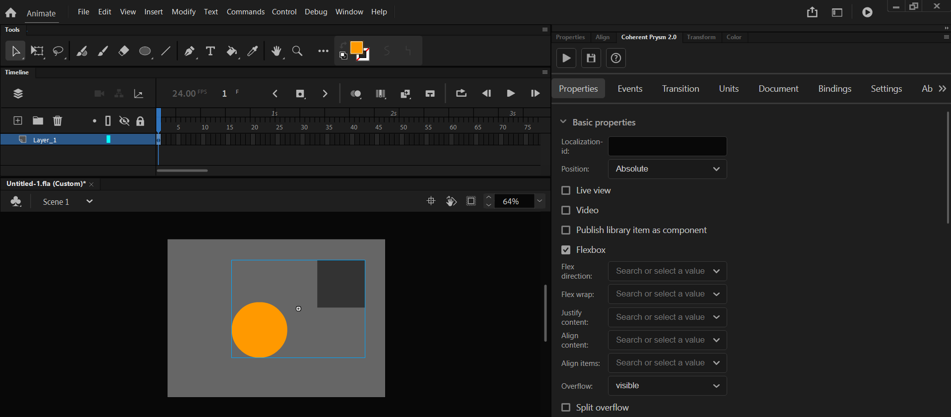
This can be achieved by simply enabling the flexbox on the selected symbol from the Properties Tab.
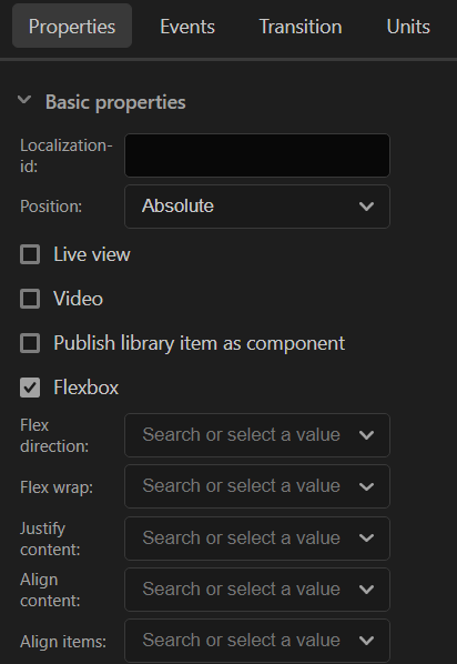
Flexbox options
When a flexbox is enabled then additional properties can be configured from the Prysm panel. Each of them will make the children of the selected symbol to be displayed in a different way.
- Flex-direction - sets the direction of the children items.
- row - items will be ordered in a row starting from left to right.
- row-reverse - items will be ordered in a row starting from right to left.
- column - items will be ordered in a column starting from top to bottom.
- column-reverse - items will be ordered in a column starting from bottom to top.
- inherit - will inherit the flex-direction from the parent.
- initial - will set default flex-direction.
- unset - won't set any flex-direction to the items.
- Flex-wrap - defines if the items inside the container should fit onto one line or they can be wrapped in many lines if the overflow the container.
- nowrap - all the items will be on one line.
- wrap - items will be wrapped onto multiple lines from top to bottom.
- wrap-reverse - items will be wrapped onto multiple lines from bottom to top.
- inherit - will inherit the flex-wrap from the parent.
- initial - will set default flex-wrap.
- Justify-content - Specifies how to align the items along the main axis and distribute the best the empty space between each item.
- center - the items are centered along the line
- flex-start - all the items are packed toward the start of the flex-direction.
- flex-end - same but from the end of the flex-direction
- space-between - items are distributed with space between them. Space between elements is calculated when the first element in on the start line and the last in on the end line.
- space-around - same as space-between but the space calculation is performed with same space, between elements and different at the start and end.
- inherit - will inherit the justify-content from the parent.
- initial - will set default justify-content.
- Align-content - Same as Justify-content but align is performed on the flex container's lines within when there is an extra space in the cross-axis.
- stretch - the lines are stretch to take up the remaining space.
- The rest props are the same as the Justify-content props.
- Align-items - Same as Justify-content for cross-axis.
- stretch - items will fill the be stretched to fill the container.
- The rest props are the same as the Justify-content props.
Flexbox and element's positions
By default all HTML elements produced by the exporter are positioned absolute.
According to the CSS standard using display flex on an absolutely positioned element doesn’t change its position.
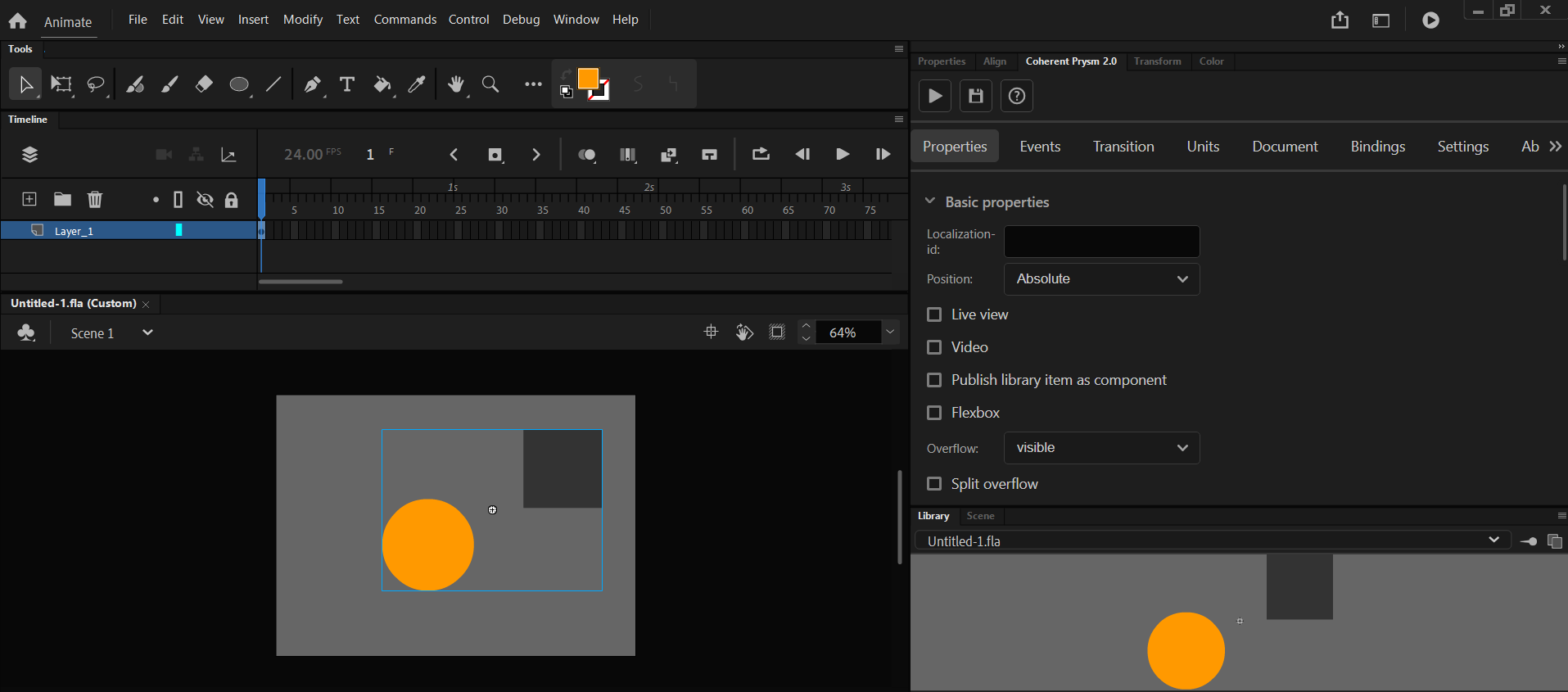
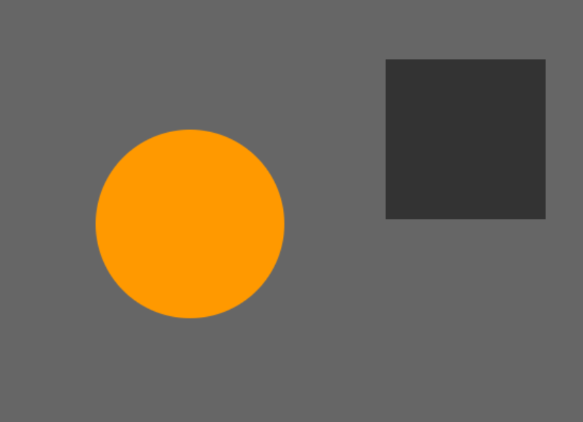
Therefore, to align elements side-by-side we have to change their position type. We can change the position type of symbols, through the Symbol -> Properties -> Position menu of the Coherent Prysm panel. To enable the flex display to align elements, we need to set their position type to Relative.


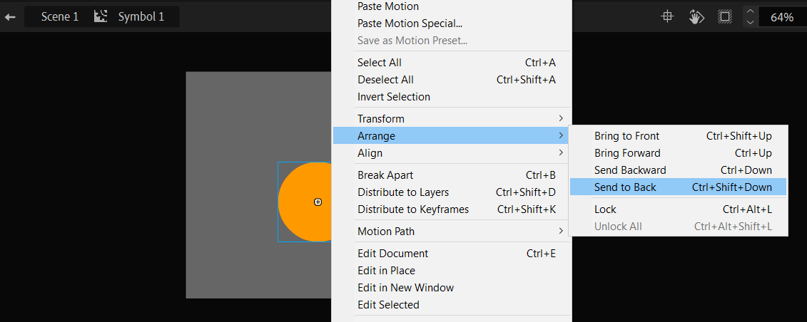
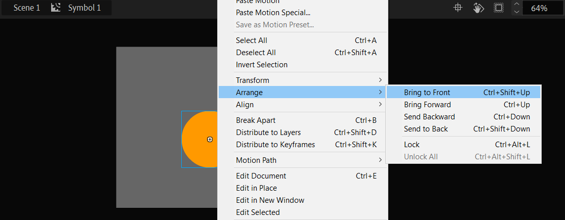
We can arrange the order of elements inside the flex container via their depth arrangement.
In Animate we change the depth of elements via the "Arrange" menu.

Flexbox will preserve the dimensions of the elements produced via Prysm since they all have width and height set.
When flexbox is useful?
The best scenario when you need the flexbox is when you are generating some elements dynamically with data binding. When they are generated inside some container they need to be responsively positioned. This cannot be done with Animate so here comes the flexbox.
If you want to check this scenario you can navigate to the tutorial about creating a list with items.
Relative Position
- When applying Relative Position to a clip via the Properties Tab, please note that it will behave like
position: relativedoes in CSS. - Keep in mind that the timeline element's vertical order in HTML is ascending from the bottom-most layer to the top-most one.