Responsive UI - Media queries
Overview
In HTML and CSS world, media query is a technique that can enable or disable different style properties on the same element when the screen size is changed making the UI responsive to different resolutions. In Animate it is possible to change an element property when the screen is resized using ActionScript code. These changes won't be visible to the document in edit time. That's the reason designers use workflow with making different documents in different sizes for a specific resolution.
Coherent Prysm makes it possible to edit one document in different sizes. What is more, with the power of the CSS feature - media queries, Coherent Prysm can export each size of the UI so each style property is changed when the screen size is changed.
It's no more necessary to create different documents. Coherent Prysm will try to give you the best experience in making game UIs responsive.
Making different document resolutions
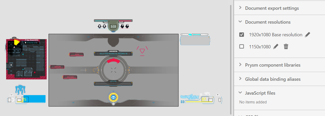
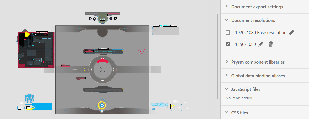
With the "Media queries" feature we introduce a new accordion where the user can add/edit/remove different resolutions. This accordion has the name - "Document resolutions" and it is located inside the Document tab.
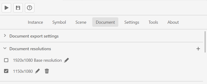
The "+" button will initialize a new resolution. A window with the resolution-specific setting will be opened.
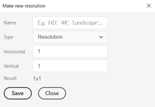
You can check the result from the settings in the "Result" field.
The result could be like "500x300" where 500px is the document width and 300px is the document height.
Pressing the "Save" button will close the window and save the new resolution to the "Document resolutions".
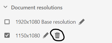
Removing document resolution
If you want Coherent Prysm not to export the document styles in some resolution you can directly remove it from the bin button present for each resolution item in the "Document resolutions".
Editing the resolutions settings
If you want to change some resolution settings, e.g. resolution name, horizontal or vertical values, you can press the pen button present for each resolution item in the "Document resolutions".
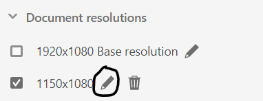
When this action is performed then the window with the resolution settings will be opened so they can be edited.
Editing the UI in different resolution
You can toggle between resolutions in the "Document resolutions". When you enable some resolution via the checkbox button then the current resolution will be saved and the UI inside Animate's editor will be automatically reconstructed with the styles saved for the selected resolution. The currently selected resolution is saved when you publish the document as well.
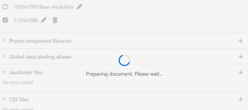
When you are toggling between the resolutions a loader may appear.
When you have selected a current resolution you can continue with using the Animate's editor to edit the UI for the current resolution.
Supported elements and element's properties in different resolutions
| Elements | Support | Supported properties | Note |
|---|---|---|---|
| Shape, shape group, drawing objects | NO | Shape elements will preserve their size, fill and their rest properties when changing between the resolutions. | |
| Non animated text | PARTIAL | Position, transformations (scale, skew, rotation), depth, fill, size, left/right margin, indent, font-style, font-name, line spacing, alignment. | The text bounding box will stay the same on each resolution. |
| Animated (Tweened) text | PARTIAL | Position, transformations (scale, skew, rotation), depth, fill, size, left/right margin, indent, font-style, font-name, line spacing, alignment, filters. | |
| Bitmap instance | YES | Position, transformations (scale, skew, rotation), depth. | |
| Non animated symbol instance | PARTIAL | Position, transformations (scale, skew, rotation), depth, hide object. | |
| Animated (with Motion tween) symbol instance | YES | Position, transformations (scale, skew, rotation), depth, hide object, filters, color effects. | |
| Animated (with Classic tween) symbol instance | PARTIAL | Position, transformations (scale, skew, rotation), depth, hide object. |
Generated files
When you export a document with more than one (base) resolution then a couple of new .css files will be generated for each resolution and will be prefixed with _${resolution}.css (for example Document_1_Scene_1_1000x500.css).
However, a single HTML file will be generated for each scene and a media attribute for the linked .css files.