Tutorials - List with items
In this tutorial, we will create a list that holds any number of items in it. For this purpose we will do the following steps:
- Define our binding model where the items data will be stored.
- Will design the UI inside Animate.
- Add data binding to the items in our scene via the Coherent Prysm panel.
For this tutorial you need the following knowledge related with the Coherent Prysm:
- How to use flex layout with relative positioned elements.
- How to use data binding attributes and create your own data binding model.
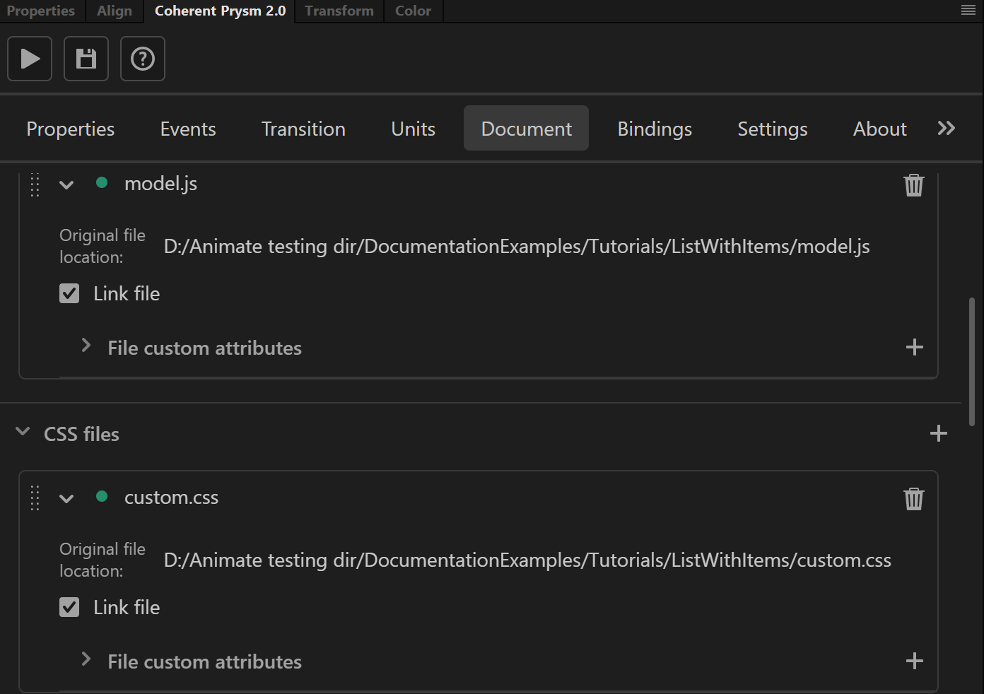
- How to add your JavaScript and CSS files as external from the panel.
The final result from the tutorial will be a responsive list that holds cards as list items.
Preparing the UI
Creating the list wrapper
-
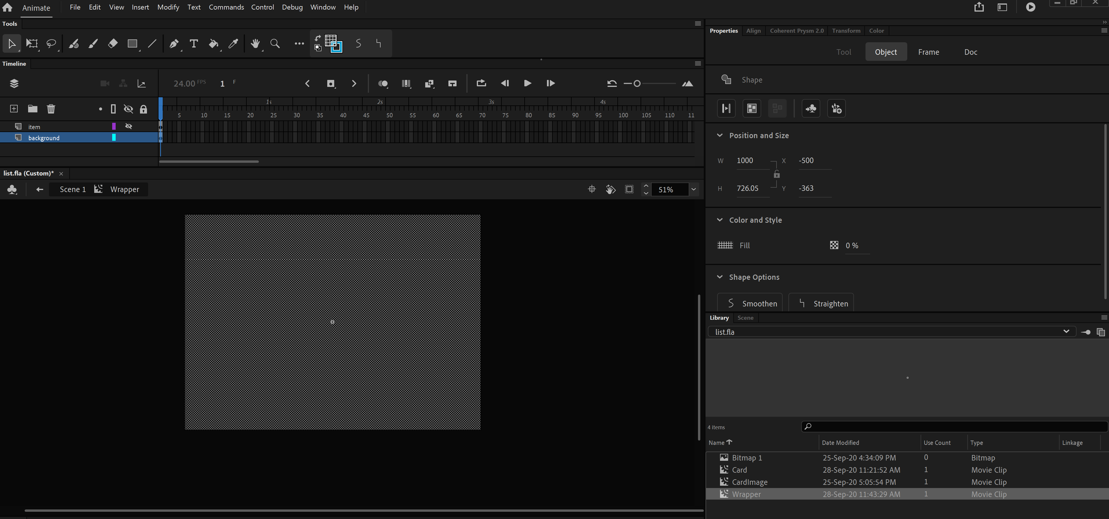
Create a new layer with name background and add a rectangle element.
- The rectangle should be with the size of the scene.
- The rectangle should have fill with any color and alpha - 0%.
-
Convert the rectangle to symbol with name Wrapper.
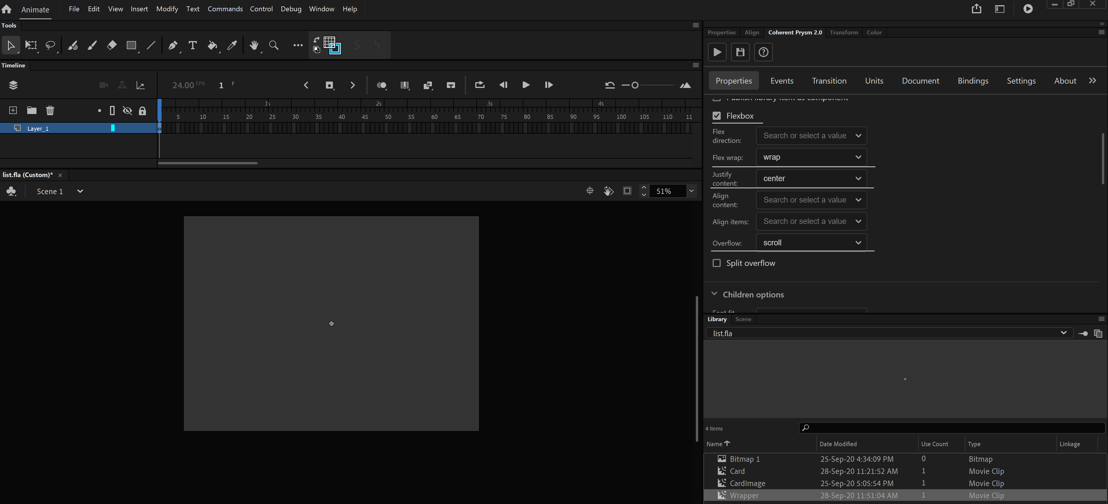
- Make the wrapper to be displayed flex from the properties tab with the following options:
- Flex-wrap - wrap.
- Justify-content - center.
- Make the wrapper scrollable when item inside overflows from the wrapper boundaries.
- Set Overflow option from the properties tab to scroll
-
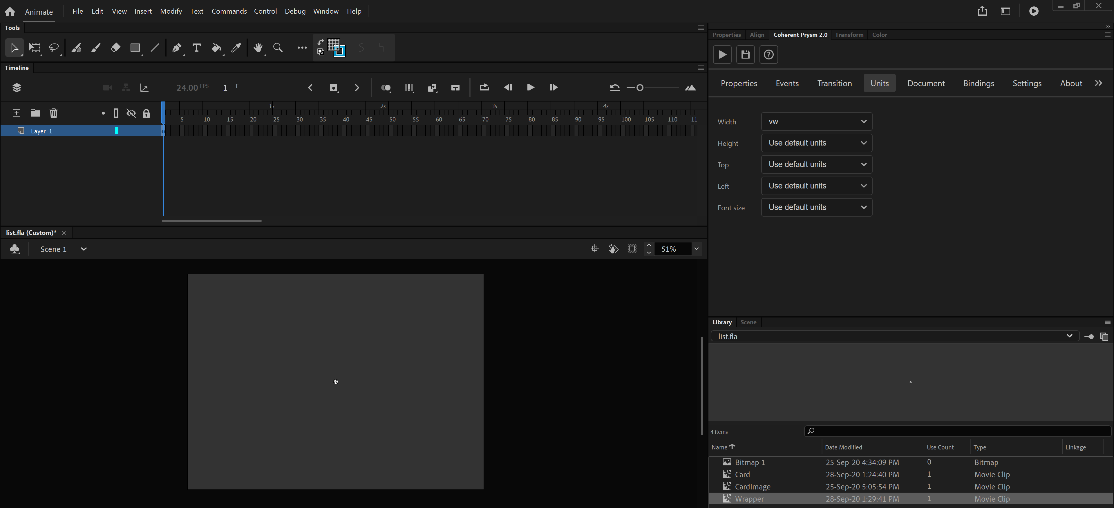
Make the Wrapper's width to be based on the window width.
- From the units tab set vw to the Width property
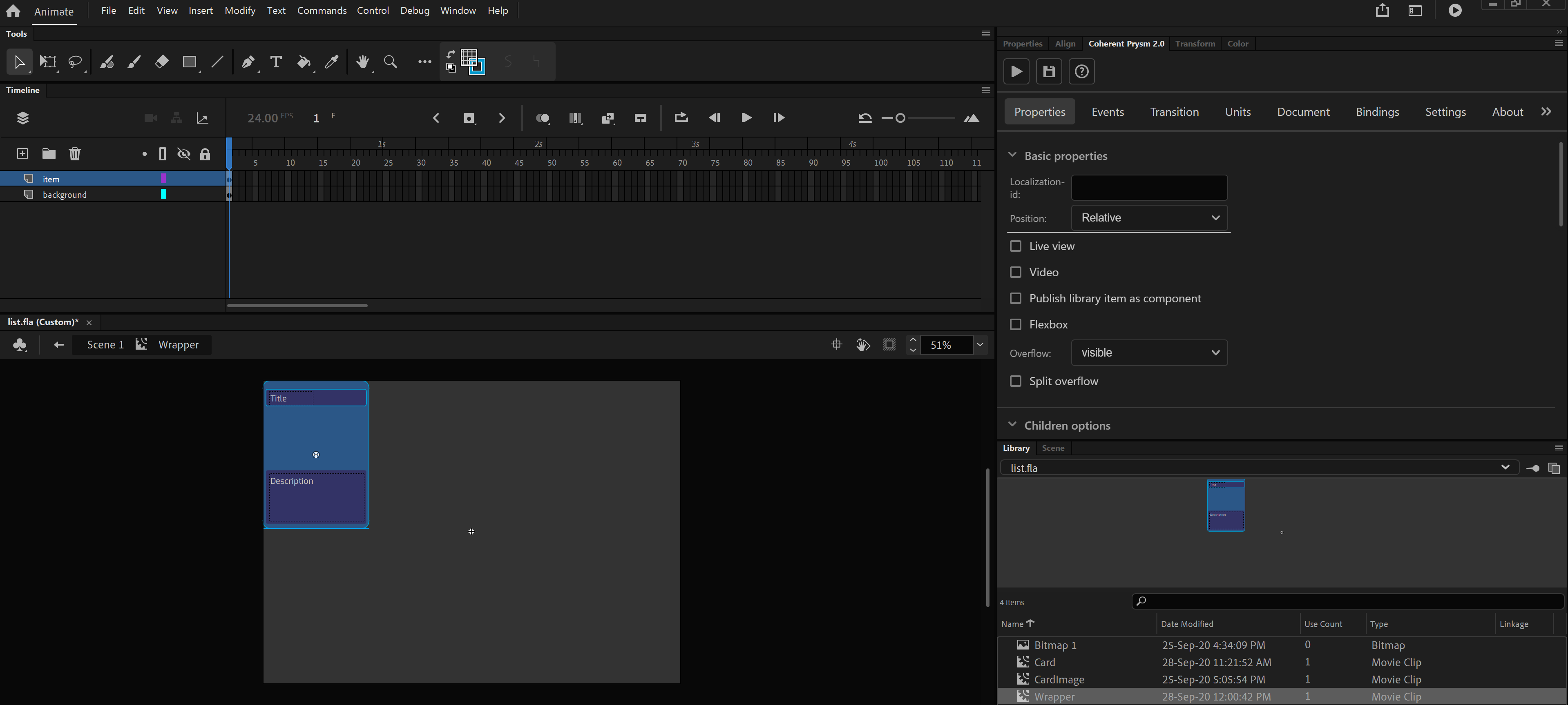
Creating the card item
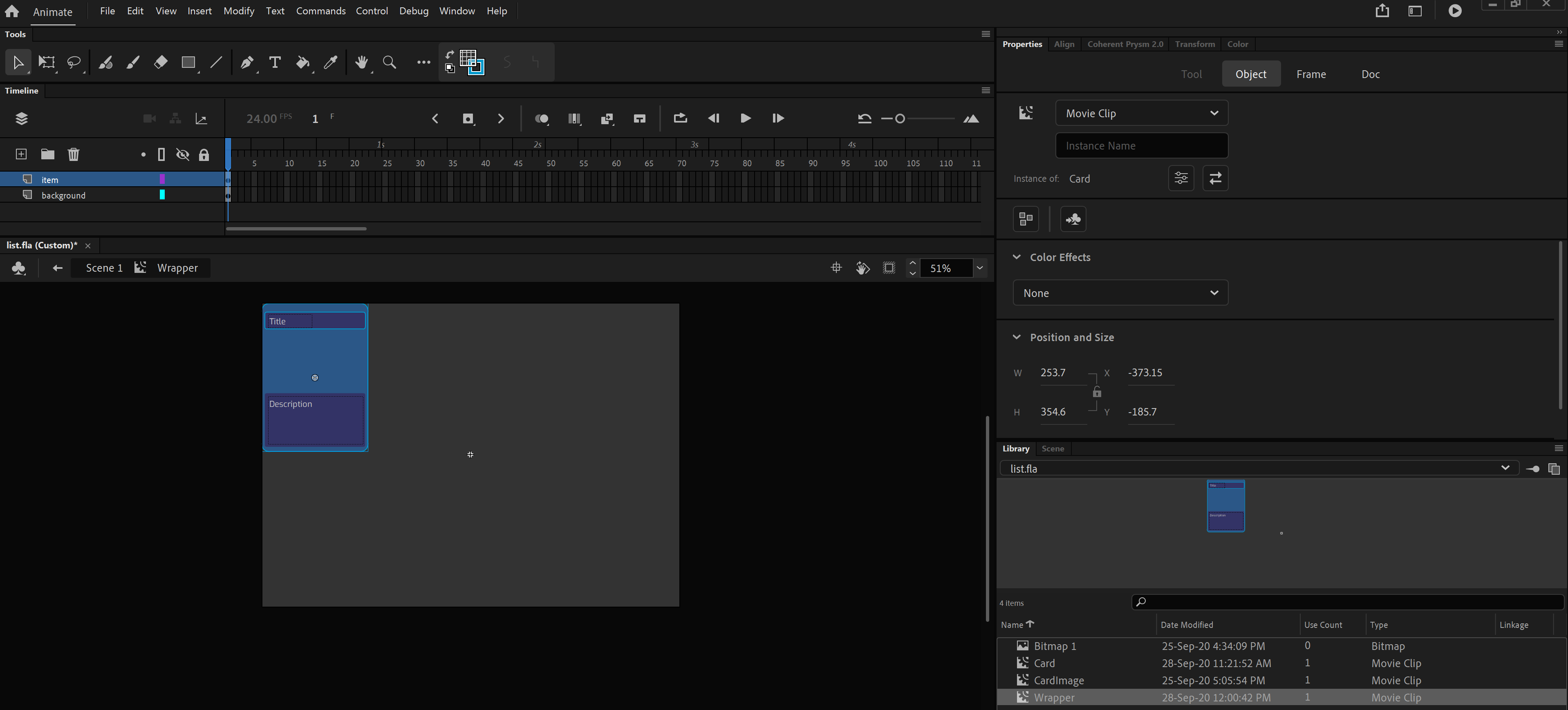
- Enter inside the Wrapper's timeline and create a new layer item with a new symbol in it named Card.
- Enter inside the Card's timeline and design your preferred Card UI. For this example, the card is designed to look like in the previous image. This symbol will also display data-bound information for the card about:
- Card title - text element.
- Card description - text element.
- Card image - A symbol with the name CardImage that has a rectangle with fill alpha - 0% inside its timeline.
- Make the position of the Card to be on the top left corner of the Wrapper's symbol.
- Make Card to be relatively positioned inside the Wrapper.
- From the properties tab set Position to be Relative.
Create the model of the items
- Create a new JavaScript file with the following lines of code:
const itemsArr = [];
const NUMBER_OF_ITEMS = 10;

for (let i = 0; i < NUMBER_OF_ITEMS; i++) {
    // set default info for each card
    itemsArr.push({ title: `Card ${i + 1}`, description: `${parseInt(Math.random() * 10)}/10`, image: 'resources/placeholder.png' });
}

const model = {
    itemsArr: itemsArr
}

engine.createJSModel('model', model);
engine.synchronizeModels();

setTimeout(() => {
    for (let i = 0; i < NUMBER_OF_ITEMS; i++) {
        // when the items are loaded set their corresponding card images and update the model.
        // resources/img${parseInt(Math.random() * 3) + 1}.png can be any valid image url
        model.itemsArr[i].image = `resources/img${parseInt(Math.random() * 3) + 1}.png`;
        engine.updateWholeModel(model);
        engine.synchronizeModels();
    }
}, 0);
- Save the file with name model.js for example.
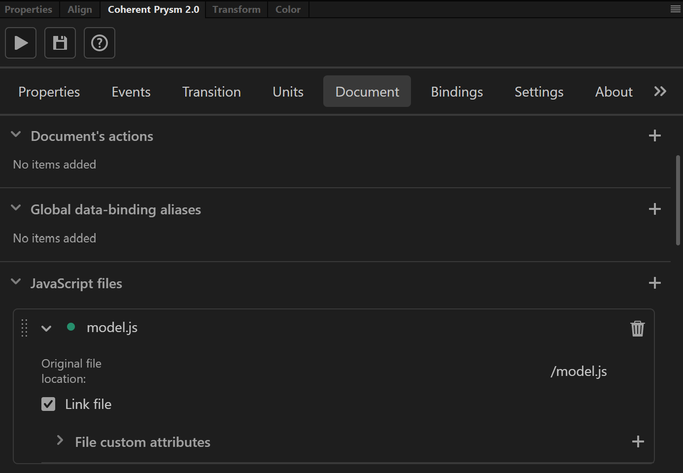
- Import the file from the Document tab as a JavaScript file.
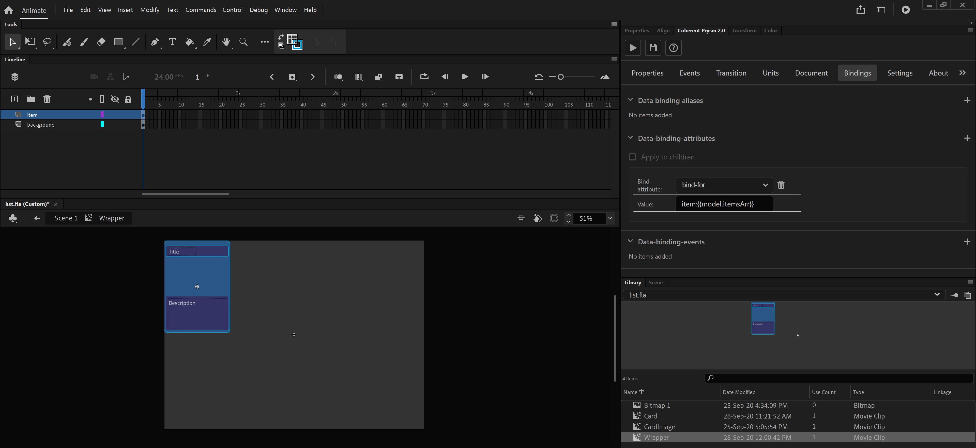
Bind the elements from the panel
- Enter inside Wrapper's timeline and select Card symbol.
-
Add a new data binding attribute with the following options:
- Data binding attribute - bind-for
- Value - item:{{model.itemsArr}}
-
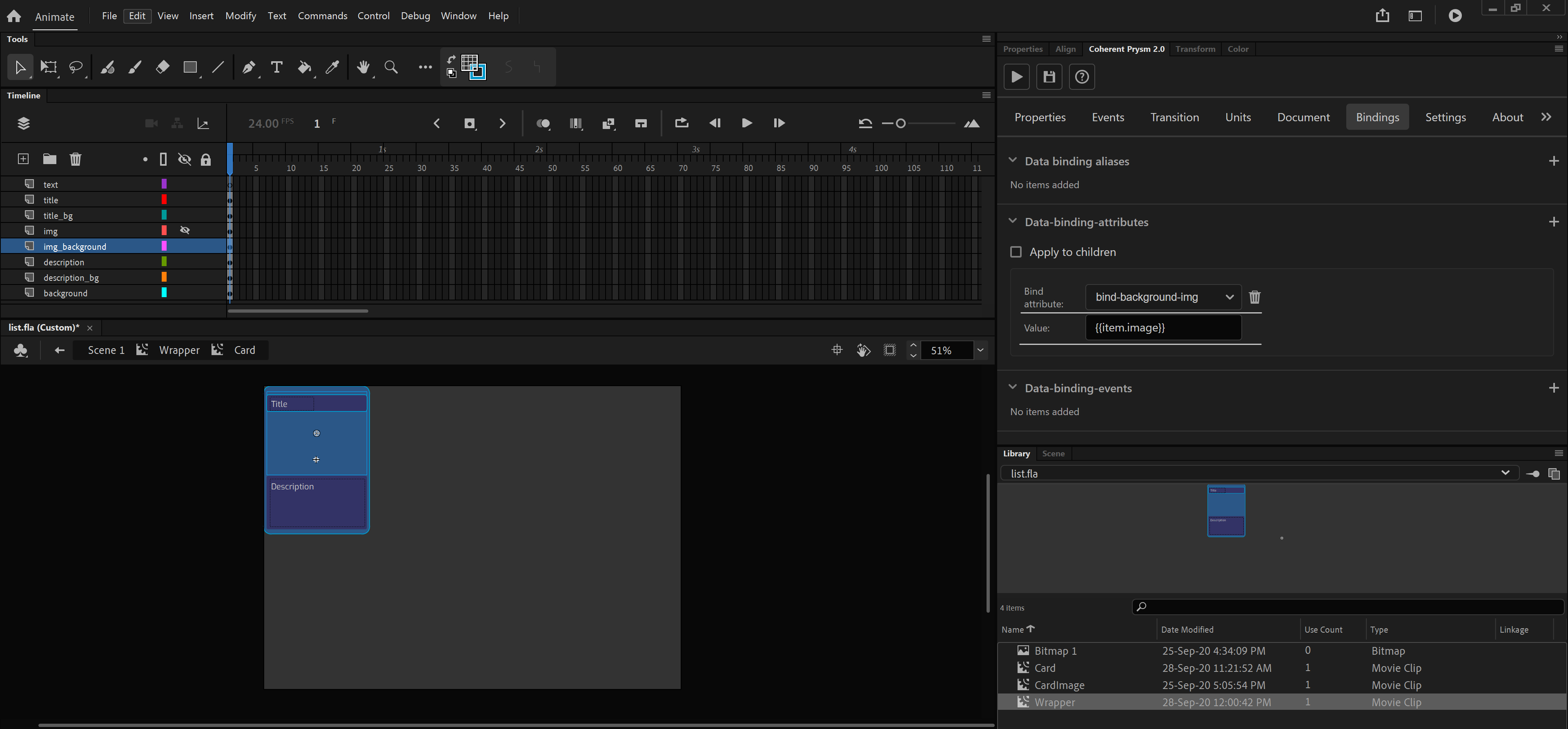
Enter inside Card's timeline and select CardImage symbol located in img_background layer.
-
Add a new data binding attribute with the following options:
- Data binding attribute - bind-background-img
- Value - {{item.image}}
If you export the document with the changes made till now you will get the following result:
As you can see you have a responsive UI list that holds all the cards defined in the binding model. Well, there are few problems with the provided result that for now can be solved just with a custom CSS. Anyway, it shouldn't bother you because there are just a few lines that should be typed. With CSS we will do: * Add margins between each card. * Fix the image to fit in its container with the preferred size and that will not repeat.
Make some CSS magic
- Create a new CSS file custom.css with the following lines:
// add some margins between each card
.Card {
    margin-left: 2.5vw;
    margin-right: 2.5vw;
    margin-top: 2.5vh;
    margin-bottom: 2.5vh;
}

// fix the image inside each card
.CardImage {
    background-size: contain;
    background-repeat: no-repeat;
    background-position: center;
}
- Import the file from the Document tab as a CSS file.
If you play the scene now your result will have better looking.
Extended example
With the knowledge of how you can use the data binding, you can also set dynamically the title and description for each card.
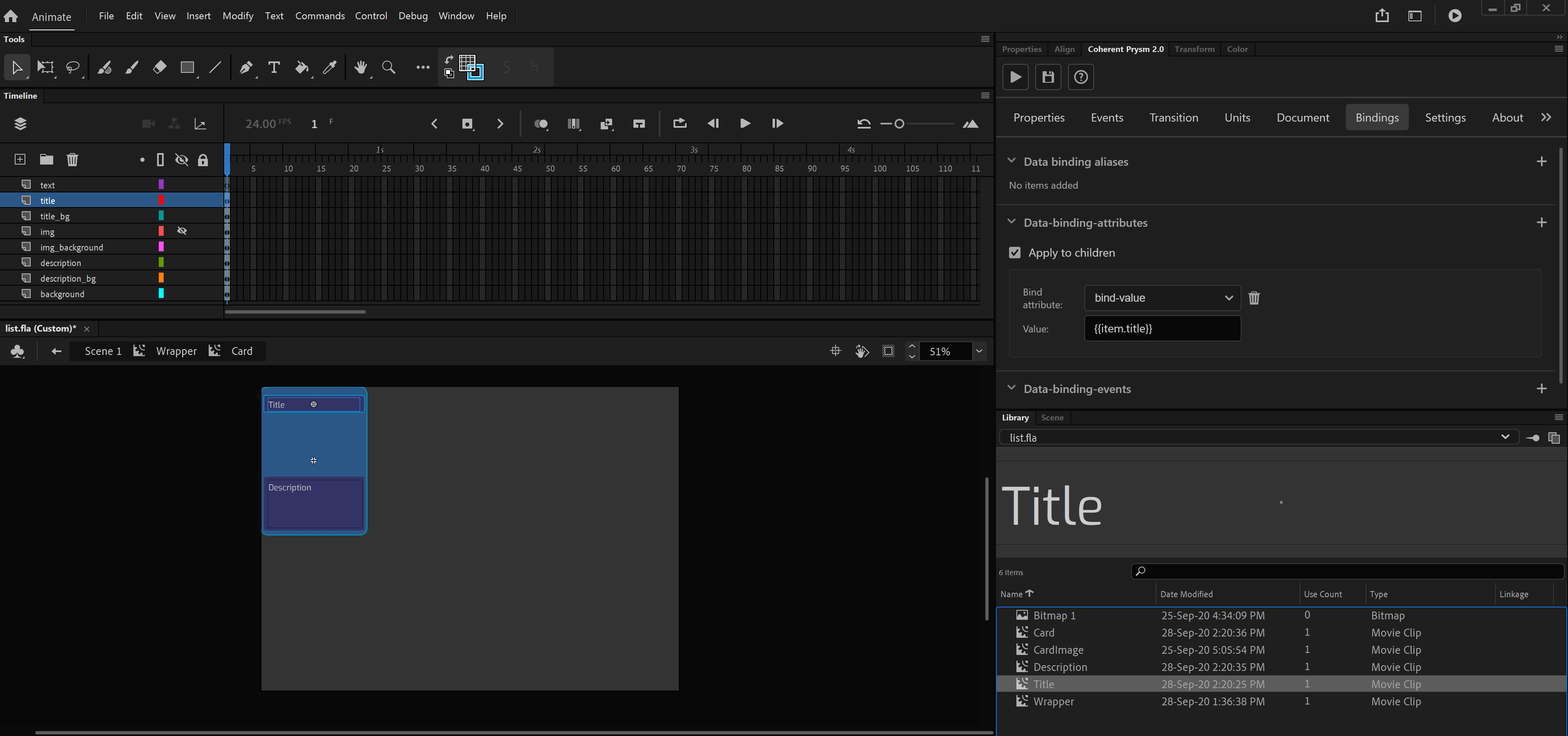
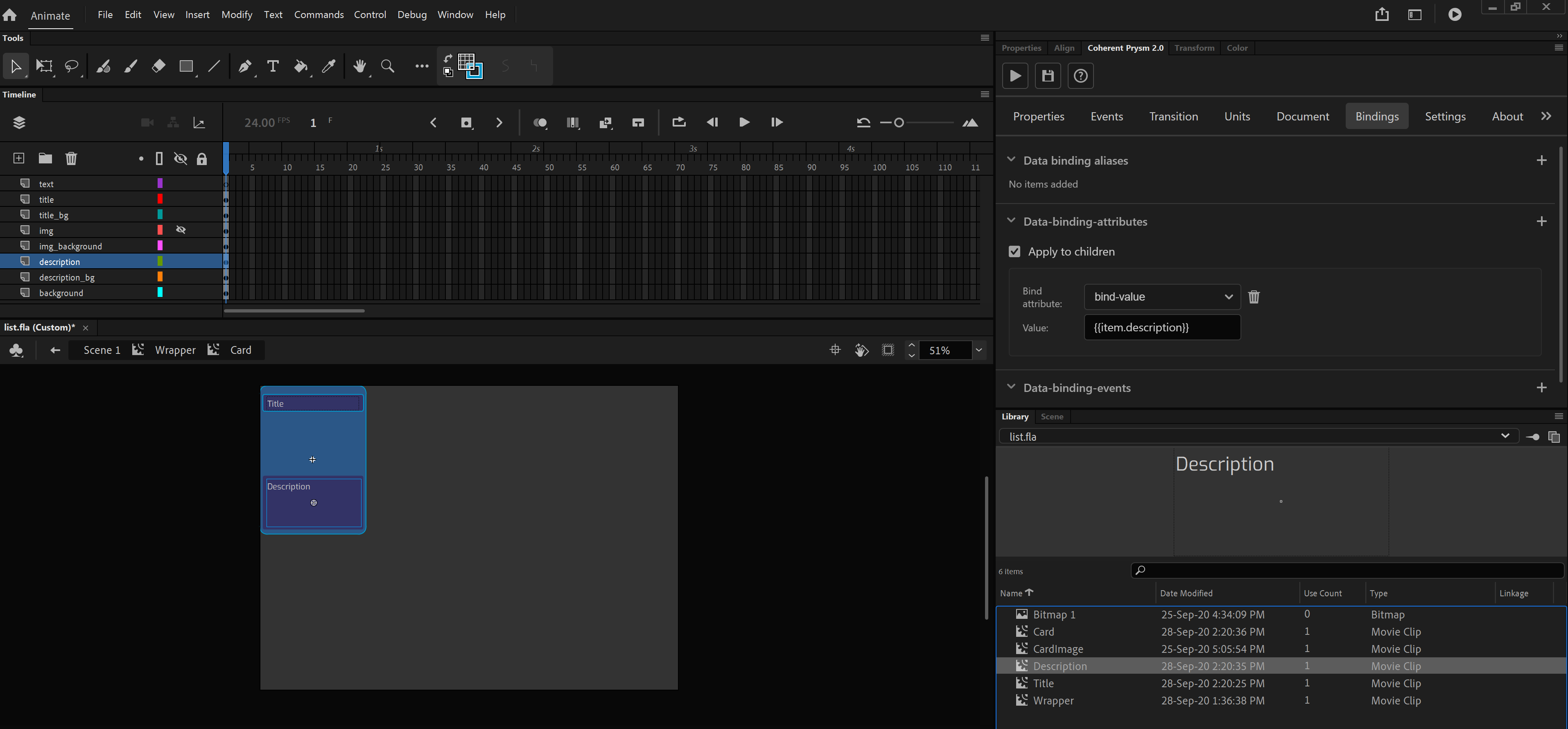
To achieve this you need to convert the text Title and Description to symbols and add a bind-value to them.
- For the symbol Title you can set bind-value attribute with value - {{item.title}}
- For the symbol Description you can set bind-value attribute with value - {{item.description}}
Now you've connected the whole model with the UI that will result to this:
Check the tutorial
To check and download the whole working tutorial you can click here.