Tutorials - Modal dialog
In this tutorial, we will create a modal dialog. For this purpose we will do the following steps:
- Define our binding model which will be used as a state for the modal dialog.
- Will design the UI inside Animate.
- Add data binding to the modal elements in our scene via the Coherent Prysm panel.
For this tutorial you need the following knowledge related to the Coherent Prysm:
- How to use data binding attributes and create your own data binding model.
- How to add your JavaScript and CSS files as external from the panel.
- How to use data binding events.
- How to use 9-slice.
The final result from the tutorial will be a modal dialog that will be opened when a button is clicked.
First, we will make a working static dialog and then we will add some fancy animations.
Preparing the UI
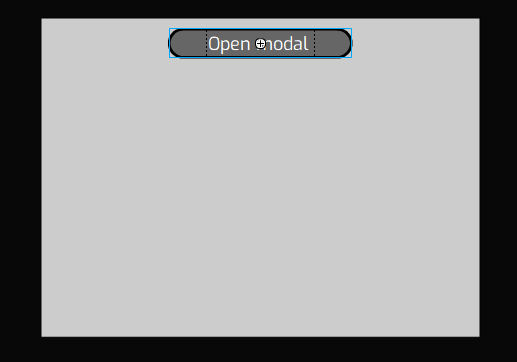
Creating the button that will open the dialog
- Create a new symbol OpenModalBnt on layer btn inside the current scene timeline - This will be the button that will open the modal when it is clicked.
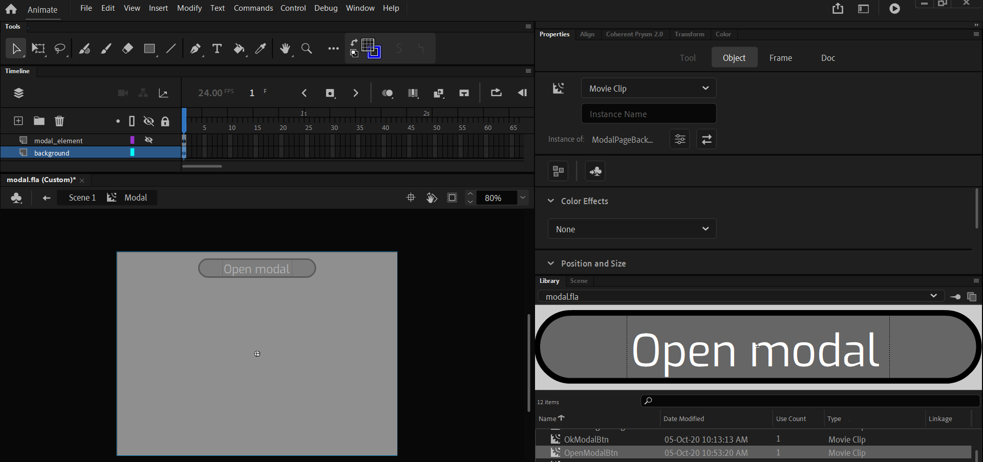
Creating the scene background when modal is opened
- Create a new layer modal and create a new symbol - Modal.
- Enter in Modal's timeline and add a rectangle with the scene's dimensions and having black fill and alpha - 30%.
- Make this rectangle symbol with name ModalPageBackground - We will need this later.
- Name the layer with ModalPageBackground - background.
- Add a new layer inside Modal's timeline - modal_element
Creating the modal dialog
- Create a new symbol ModalDialog on layer modal_element.
- Enter inside ModalDialog's timeline.
-
Design the modal dialog as you want. For this example we've designed it like this:
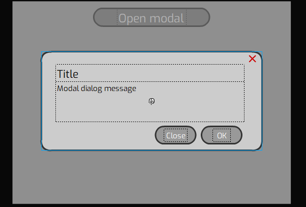
Here for the modal dialog we have:
- Background - a rectangle with stroke radius ~10-20.
- Custom cross icon made with the line tool. Converted to symbol with name QuitBtn.
- Title - Single line dynamic text. Converted to symbol with name ModalTitle.
- Modal dialog message - Multiline dynamic text. Converted to symbol with name ModalMessage.
- Confirm button - Symbol with name OkModalBtn.
- Close modal button - Symbol with name CloseModalBtn.
After you've designed the modal go back to the ModalDialog's timeline.
- Enable 9-slice for ModalDialog.
-
Position the grids for example like this
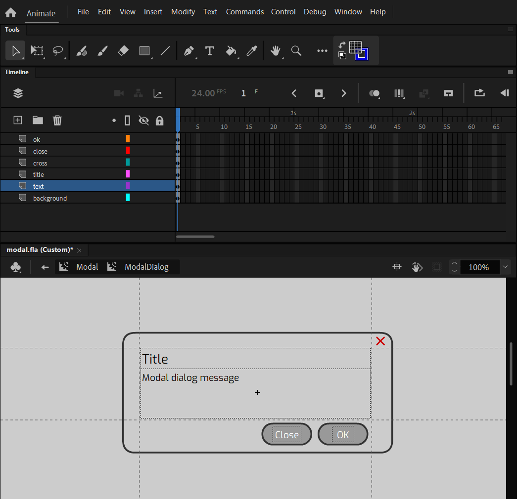
The 9-slice will be needed later.
Create the model state of the dialog
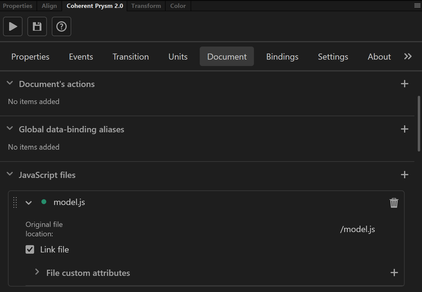
- Create a new JavaScript file with the following lines of code:
const model = {
    isModalOpen: false,
    title: 'Modal opened!',
    message: 'Click onto "Close", "OK", "X" or outside the modal to close it!'
}

function updateModel() {
    engine.updateWholeModel(model);
    engine.synchronizeModels();
}

function openModal() {
    model.isModalOpen = true;
    updateModel();
}

function closeModal() {
    model.isModalOpen = false;
    updateModel();
}

function onCloseClick(event) {
    //You can add your logic here when the "Close" button is clicked.
    console.log('Close clicked')
    closeModal();
}

function onOkClick(event) {
    //You can add your logic here when the "Ok" button is clicked.
    console.log('Ok clicked')
    closeModal();
}

function onCrossClick(event) {
    //You can add your logic here when the "X" button is clicked.
    console.log('Cross clicked')
    closeModal();
}

engine.createJSModel("model", model);
engine.synchronizeModels();
modelis the variable where the state of the dialog will be stored.-
We have callbacks when there is an interaction with the buttons inside the modal dialog. We will bind these buttons from the panel later with the callbacks.
-
Save the file with name model.js for example.
- Import the file from the Document tab as a JavaScript file.
Connect UI elements with the model
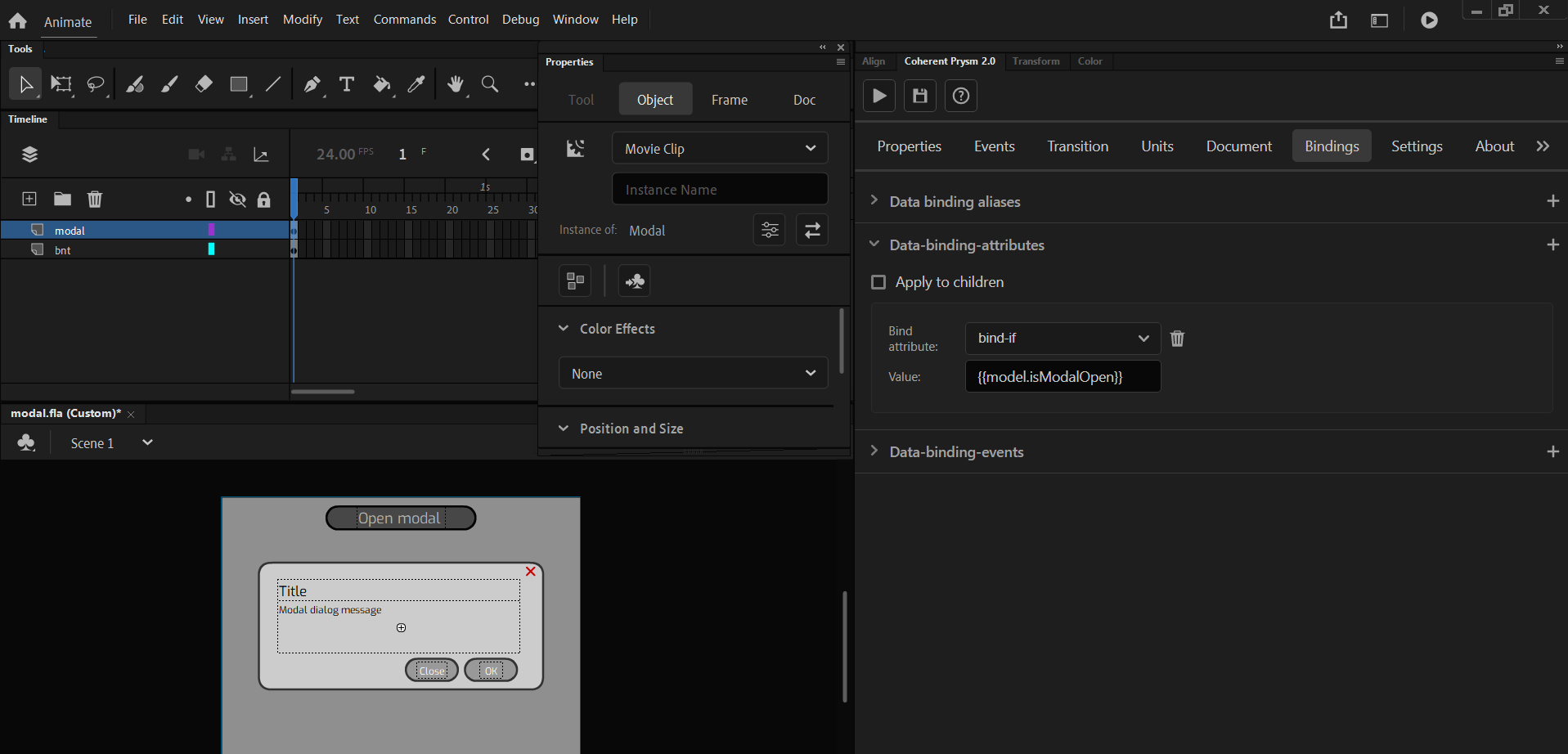
- Select the Modal symbol located in the current scene's timeline
- Add a new bind attribute with the following options:
- Data binding attribute - bind-if.
- Value - {{model.isModalOpen}}.
- Disable Apply to children.
Like this, your modal dialog will be shown when the modal.isModalOpen is changed to true and vice versa.
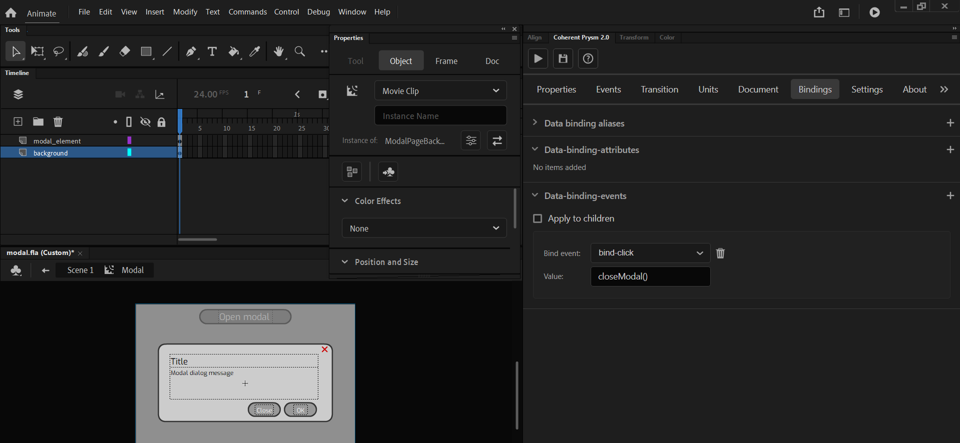
- Enter inside Modal's timeline and select ModalPageBackground.
- Add a new binding event with the following options:
- Data binding event - bind-click.
- Value - closeModal()
Like this when you click onto the modal background the closeModal method from model.js will be called and the modal will be closed.
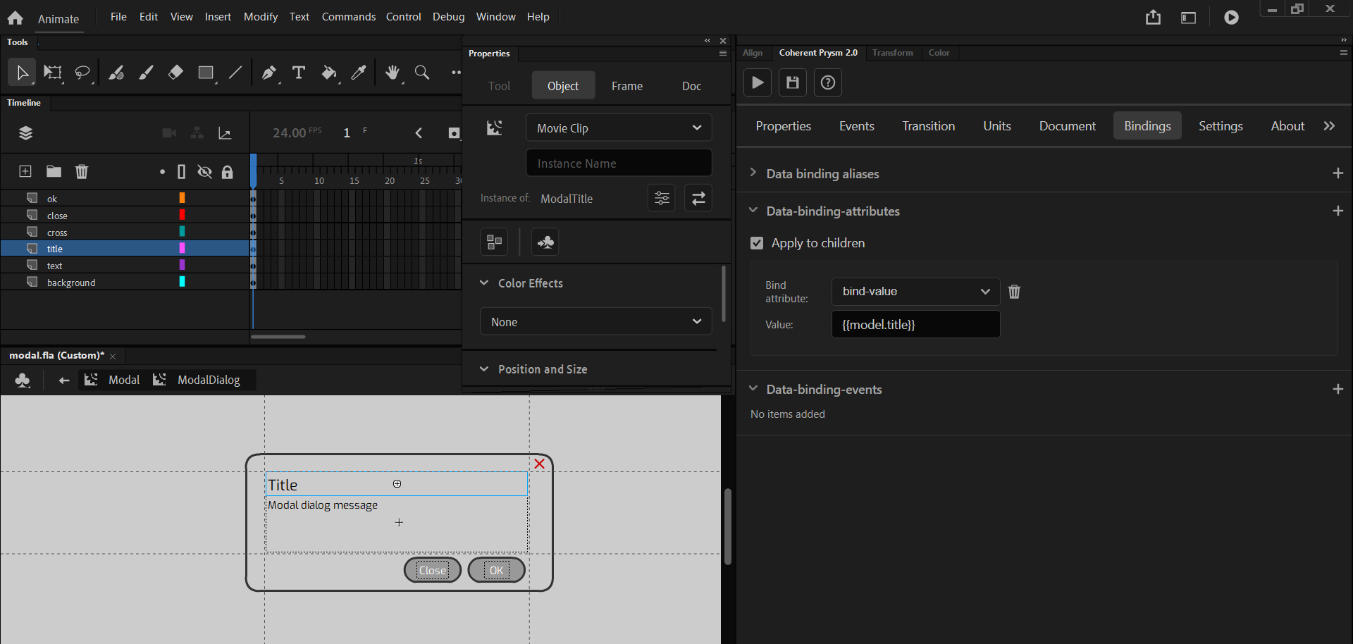
- Enter inside ModalDialog
- Select ModalTitle and add a new bind attribute with the following options:
- Data binding attribute - bind-value.
- Value - {{model.title}}.
Changing the modal.title and updating the model after it will change the title value of the modal dynamically.
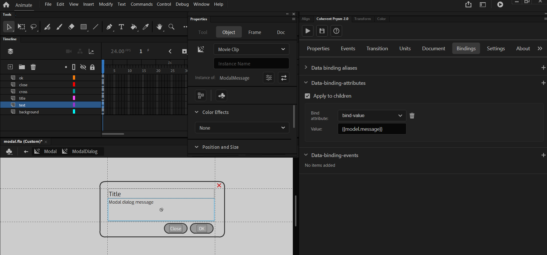
- Select ModalMessage and add a new bind attribute with the following options:
- Data binding attribute - bind-value.
- Value - {{model.message}}.
Changing the modal.message and updating the model after it will change the message value of the modal dynamically.
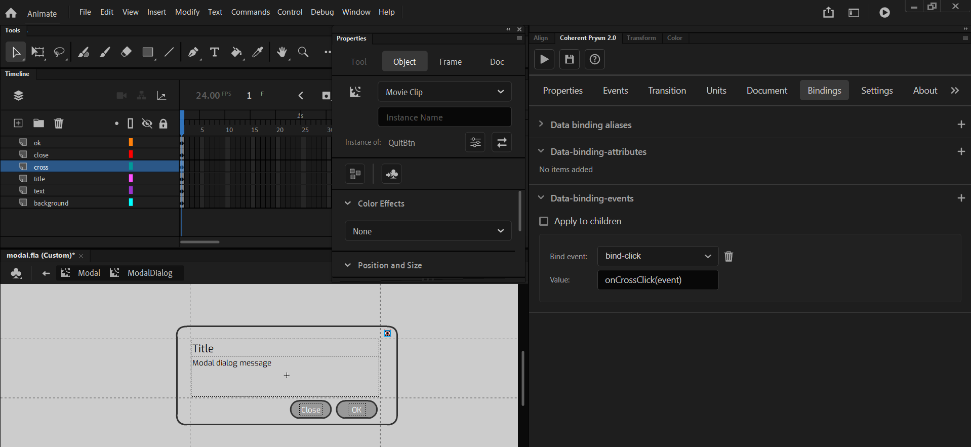
- Select QuitBtn and add a new data bind event with the following options:
- Data binding event - bind-click.
- Value - onCrossClick(event).
- Disable Apply to children.
Like this when you click onto the modal cross icon the onCrossClick method from model.js will be called and the modal will be closed.
- Select CloseModalBtn and add a new data bind event with the following options:
- Data binding event - bind-click.
- Value - onCloseClick(event).
- Disable Apply to children.
Like this when you click onto the close button the onCloseClick method from model.js will be called and the modal will be closed.

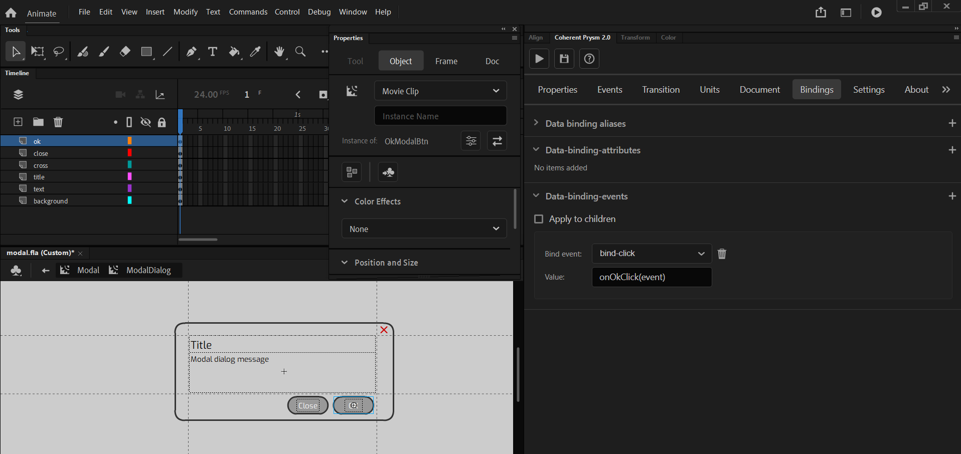
- Select OkModalBtn and add a new data bind event with the following options:
- Data binding event - bind-click.
- Value - onOkClick(event).
- Disable Apply to children.
Like this when you click onto the close button the onOkClick method from model.js will be called and the modal will be closed.
Now if you export the document you will get the following result:
You can check and run the example from here.
Animated modal
Until now you will have a working modal that can be opened or closed. To make it fancier we can add some animations with the power of Animate that modal background will fade in and the modal dialog will be expanded.
The details about the animations won't be described so you can directly check the source files here and see the result.
You can also animate the modal as you think it would be best for your needs.
If you remember in the previous sections we enabled and set a 9-slice grid onto the ModalDialog. We needed this to preserve the corners of the modal background when it is animated. So a 9-sliced symbol can be also animated and Prysm will correctly apply this animation on the element.
In the animated sample are made some changes and it is used additional knowledge related to the Coherent Prysm:
- Playing animations from/to labels via CLAnimations API.
- 9-slice grid to animate the modal background and preserve its corners.
- The
model.jshas some differences as well as its name -model_animate.js.
The final result: